Zyre Widgets Toggle

Toggle

Toggle

Enhance User Control
with Interactive Toggle
Functionality.

Features.

That Make This Widget the Ideal Selection

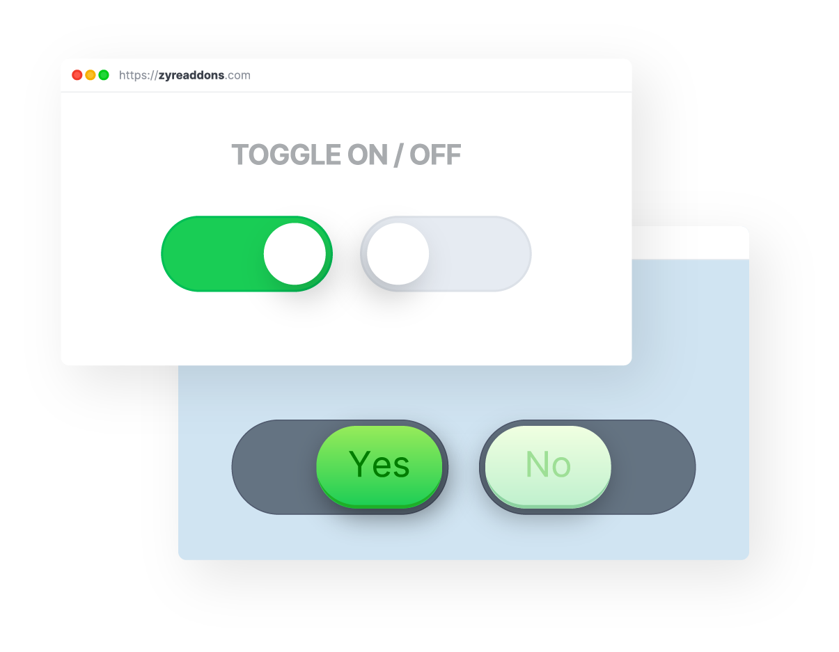
A toggle is an interactive UI element that allows users to switch between two states, such as on/off or visible/hidden. It simplifies navigation, enhances user control, and can be used for settings, themes, or displaying additional content with ease.

Flexible and Personalizable Design

Create A Unique Look That
Aligns Perfectly With Your Brand

Choose from a wide range of layouts and styles to match your vision. Customize colors, fonts, and designs effortlessly.
Fully Customized

Tailored to Perfection for
Your Unique Design Needs.

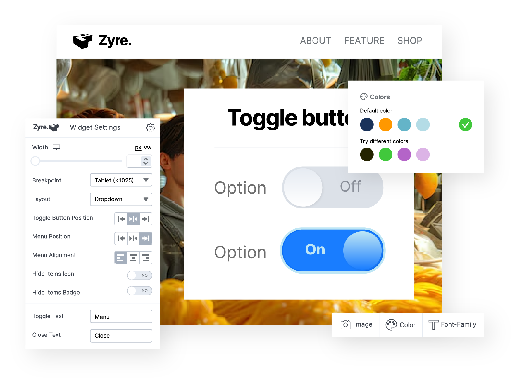
Customize every aspect of your Toggle, from type and alignment to colors, direction, scale, and more, to achieve the perfect design.

Mobile-Friendly

Designing Mobile-Friendly Toggles
for a Better User Experience

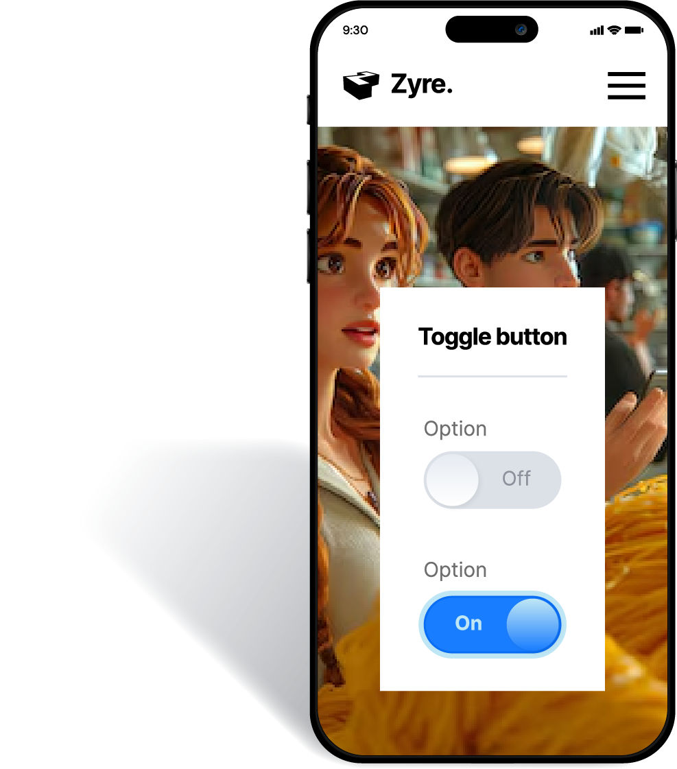
Mobile-friendly Toggles should be large, well-spaced, and responsive to different screen sizes. Use touch-friendly designs and provide visual feedback, like color changes, to improve interactivity.
Feature-Rich

Create Toggle— Visually Appealing, User-Friendly & Functional

Binary Options

Switch between two states, like on/off or yes/no.

Customizable Design

Adjust colors, sizes, and labels to match your interface.

Smooth Animations

Include sliding or fading effects for a polished user experience.

User-Friendly

Simple to use with clear visual cues for state changes.

Mobile-Friendly

Responsive and optimized for touchscreen interaction.

State Indicators

Visual feedback (e.g., text, icons) to show the current state.

Accessibility

Compatible with screen readers and keyboard navigation.

Multiple Usage

Can control settings, themes, filters, or content visibility.

Real-Time Updates

Instant changes in content or settings when toggled.

Pre-Built Toggles

Style 1 - Primary

Toggles are vital for guiding users and driving actions
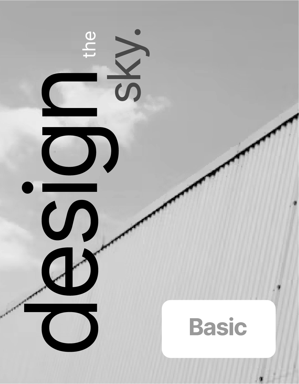
Primary Toggle with Full Rounded Corner

One

Off or Disabled

Two

Use as Basic or Primary

Three

Grey or Regular

One

On or Enable

Two

Use as Advance or Professional

Three

Color or Premium

Style 2 - On/Off

Toggles are vital for guiding users and driving actions
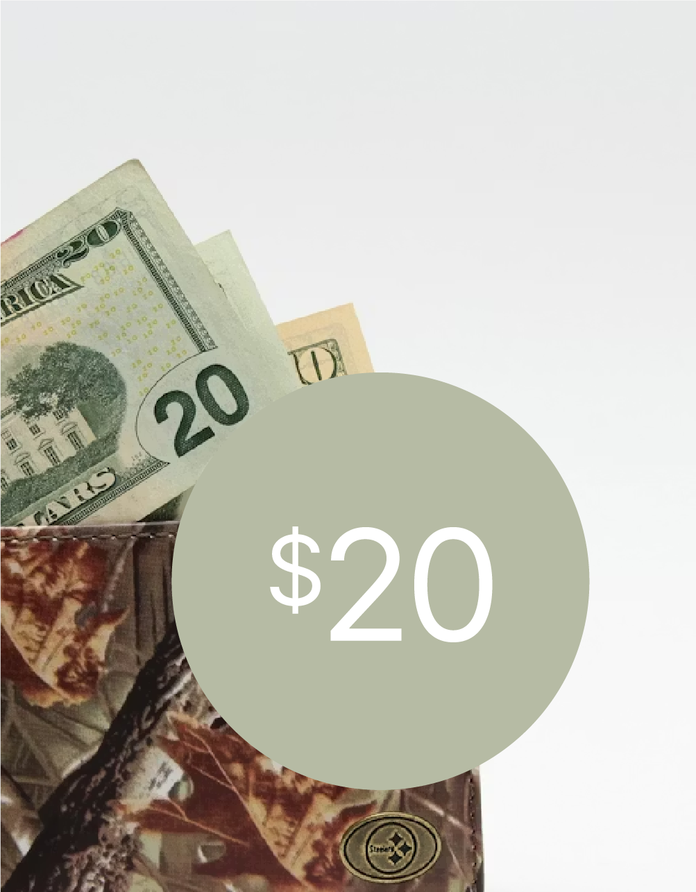
On/Off Toggle with Text on Gradient BG

One

Off or Disabled

Two

Use as Basic or Primary

Three

Grey or Regular

One

On or Enable

Two

Use as Advance or Professional

Three

Color or Premium

Style 3 - Minimal

Toggles are vital for guiding users and driving actions
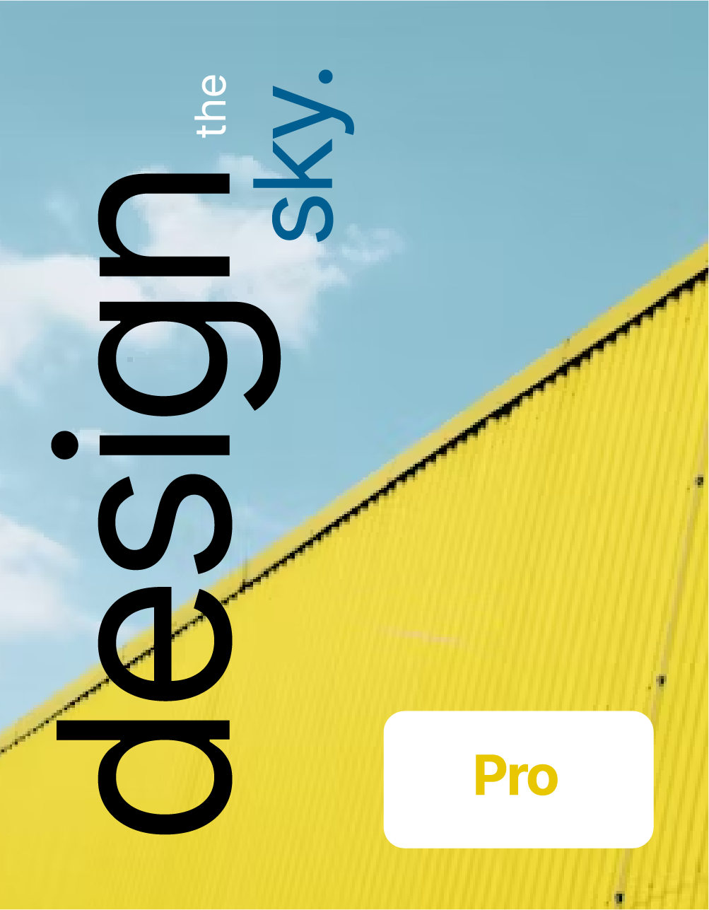
Simplify Your Interface with Minimal Line Toggle

One

Off or Disabled

Two

Use as Basic or Primary

Three

Grey or Regular

One

On or Enable

Two

Use as Advance or Professional

Three

Color or Premium

Style 4 - Modern

Toggles are vital for guiding users and driving actions
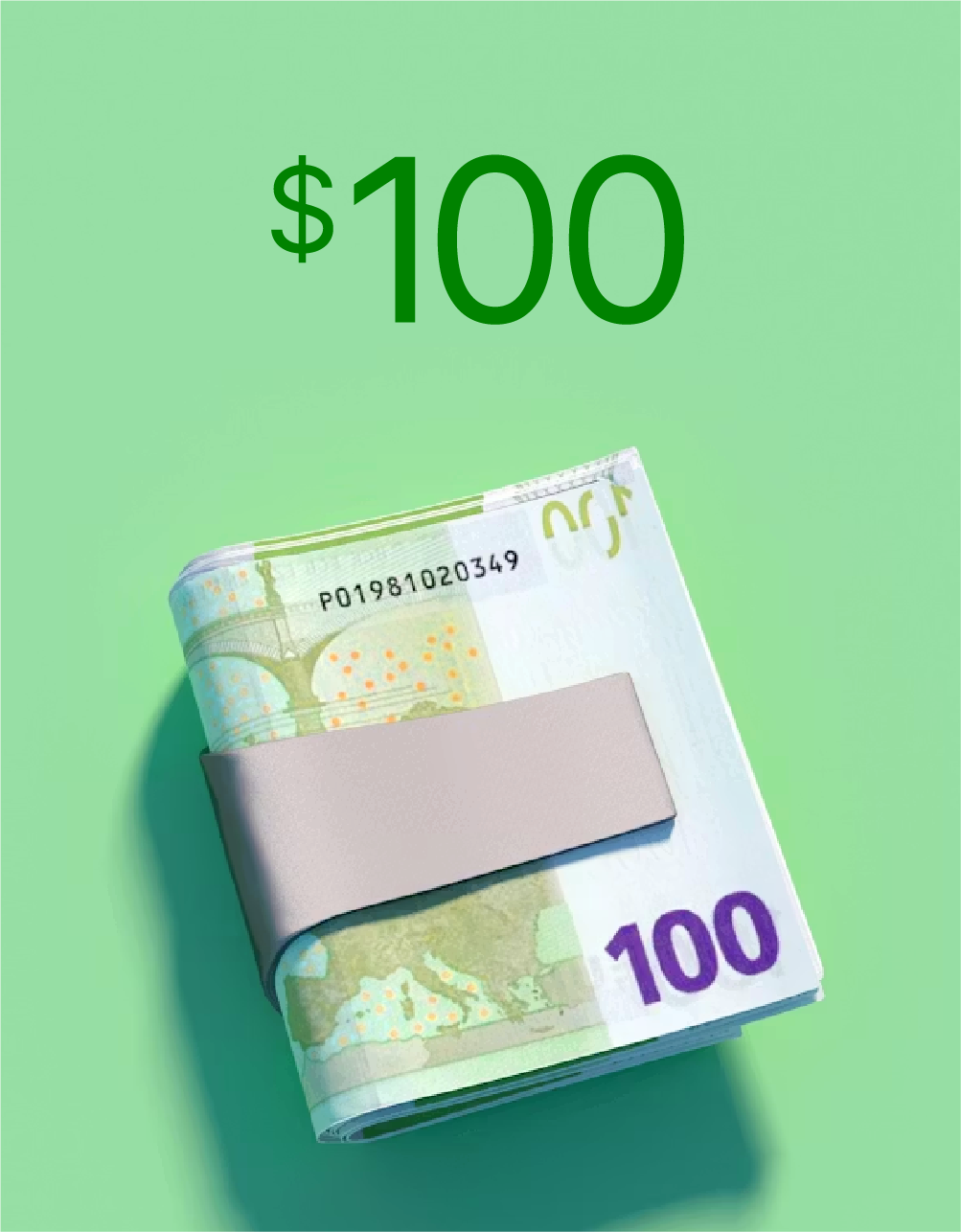
Enhance Your Interface with Modern Toggle Designs

One

Off or Disabled

Two

Use as Basic or Primary

Three

Grey or Regular

One

On or Enable

Two

Use as Advance or Professional

Three

Color or Premium

Get Started Now

Get free ZyreAddons, and start making beautiful websites today.