
Navigation Menu
Step-by-Step Tutorial on Using the Navigation Menu Widget of Zyre Addon
Navigation is the backbone of any website. A well-structured menu not only helps visitors find what they’re looking for but also enhances the overall user experience. With Zyre Addons’ Navigation Menu widget, you get complete control over your site’s menus—from layout and alignment to styling and responsive behavior.
Learn How To Use Navigation Menu Widget:
Exploring the Features of Navigation Menu Widget
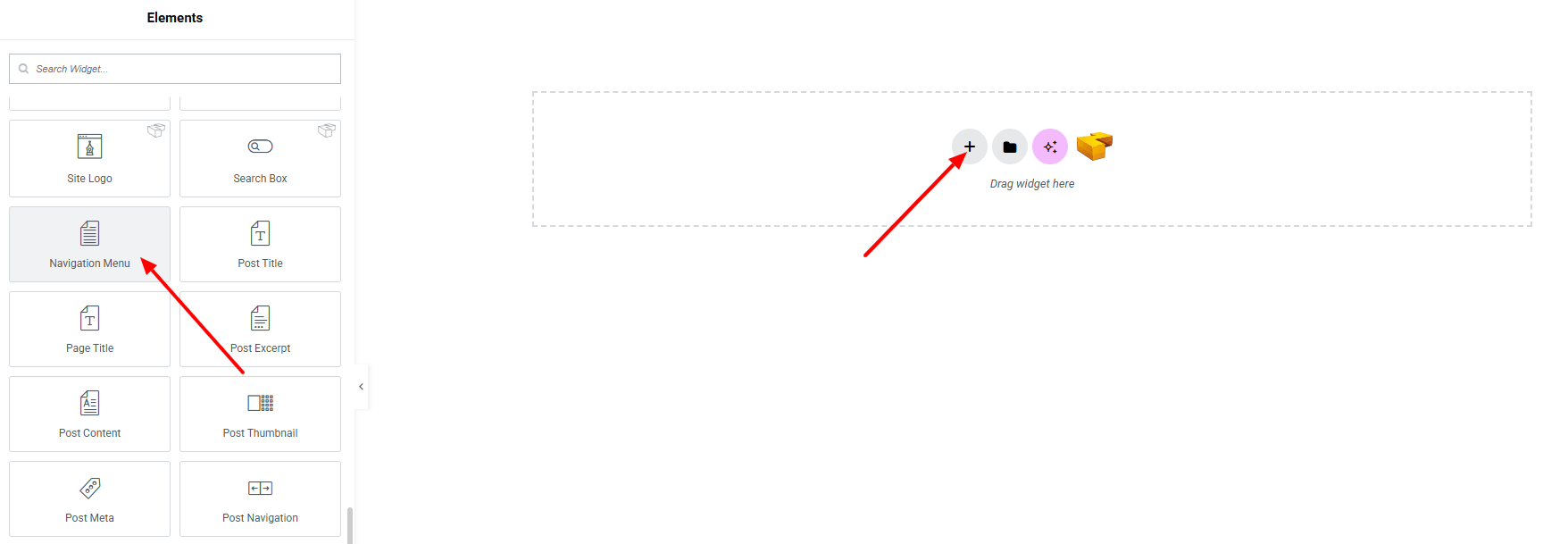
Step 1: Drag the widget
From the left panel, search or choose the Navigation Menu Widget of Zyre Addon and simply drag it into your desired section.
Step 2: Content tab
Navigation Menu:
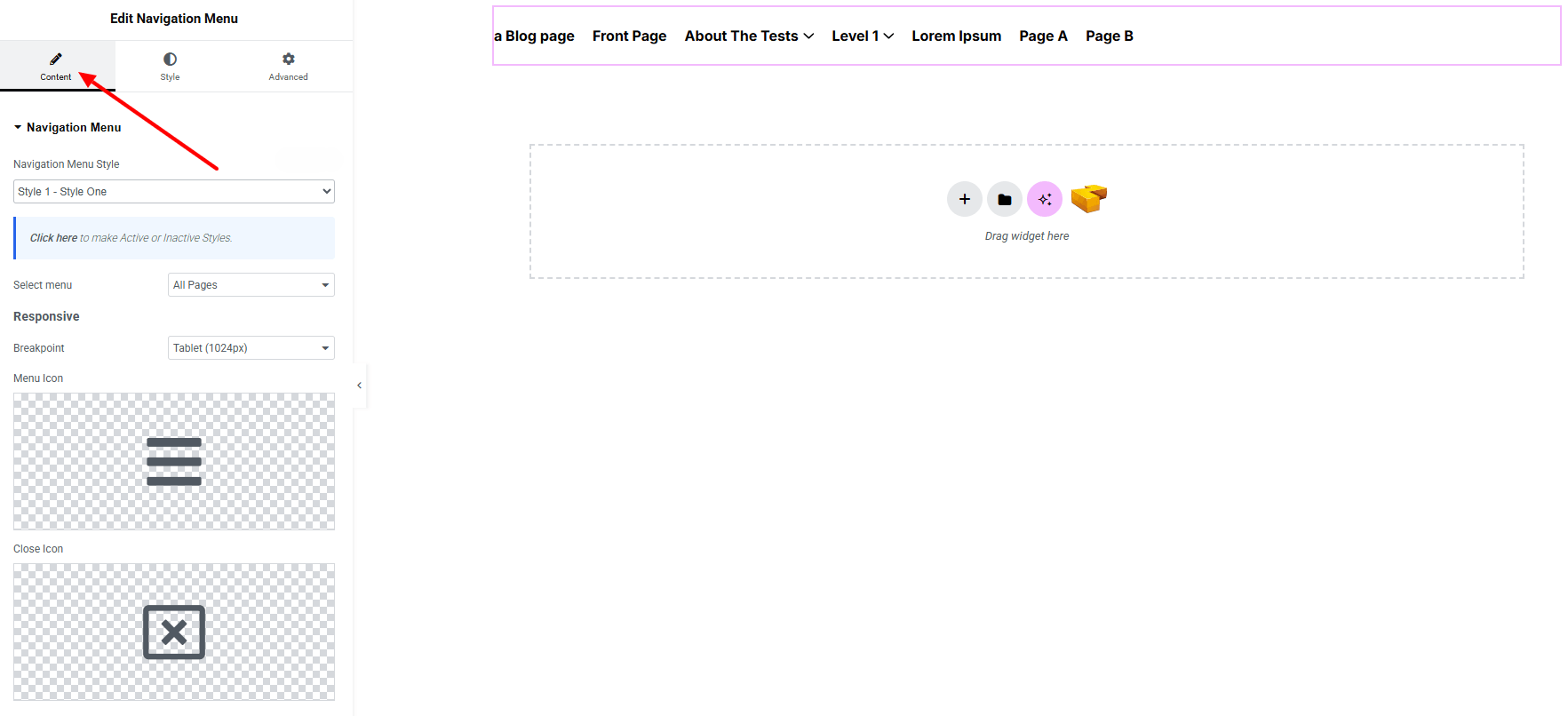
- Navigation Menu Style : Currently, only one style is available.
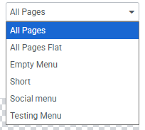
- Select Menu : Select which menu you want to display.
Responsive:
- Breakpoint : Define the screen width at where the navigation turns into tablet & mobile menu (e.g., 768px, 1024px).
- Menu Icon : Set the icon for opening the responsive/mobile menu.
- Close Icon : Set the icon for closing the responsive/mobile menu.
Step 3: Style tab
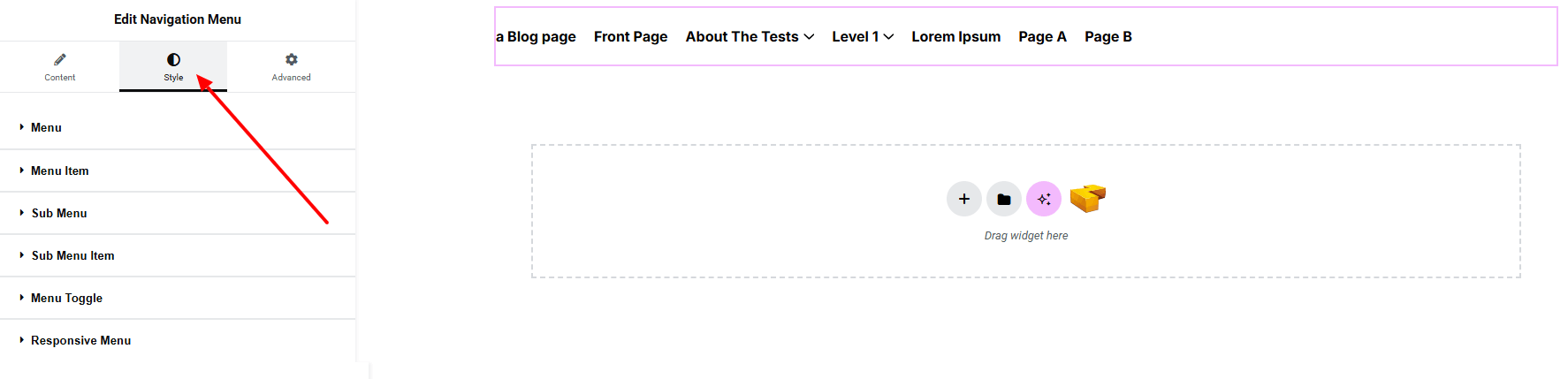
Menu:
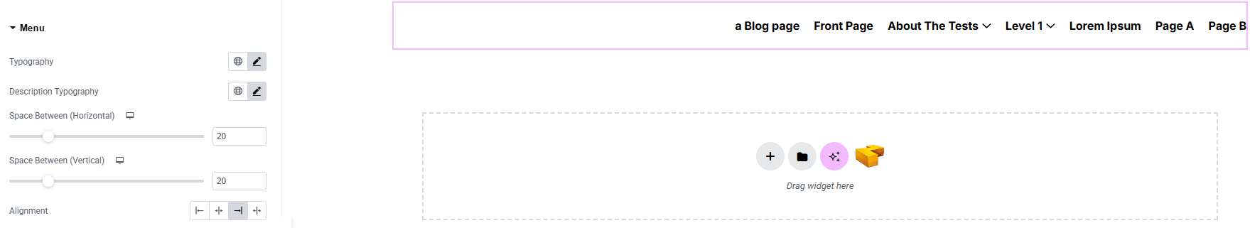
- Typography : Here you can customize the font family, size, weight, transform, style, decoration, line height, letter spacing, and word spacing for your text. Explore full typography settings here.
- Description Typography : Define separate typography settings for the description text under menu items (make sure description added from Appearance > Menus > Menu Items. If Description field not shown, check Description in Screen Options)
- Space Between (Horizontal) : Control the horizontal spacing between menu items.
- Space Between (Vertical) : Control the vertical spacing between menu items.
- Alignment : Set the alignment of the menu items (left, center, right, or justified)
Menu Item:
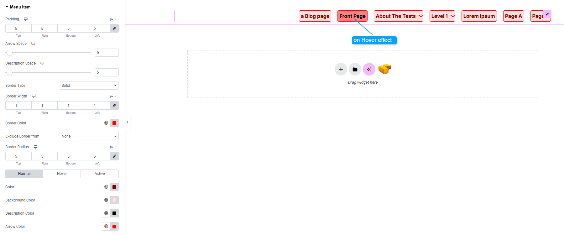
- Padding : Add inner spacing around each menu item.
- Arrow Space : Adjust the distance between the menu text and dropdown arrow icon.
- Description Space : Set the spacing between the menu item text and its description.
- Border Type : Define border style, width and color.
- Exclude Border From : Exclude border from first item or last item.
- Border Radius : Apply rounded corners to each item.
- For Normal / Hover / Active States :
- Text Color : Set the text color for each state.
- Background Color : Define the background color on each state.
- Description Color : Control the color of the menu item description.
- Arrow Color : Adjust the arrow icon color for each state.
Sub Menu:
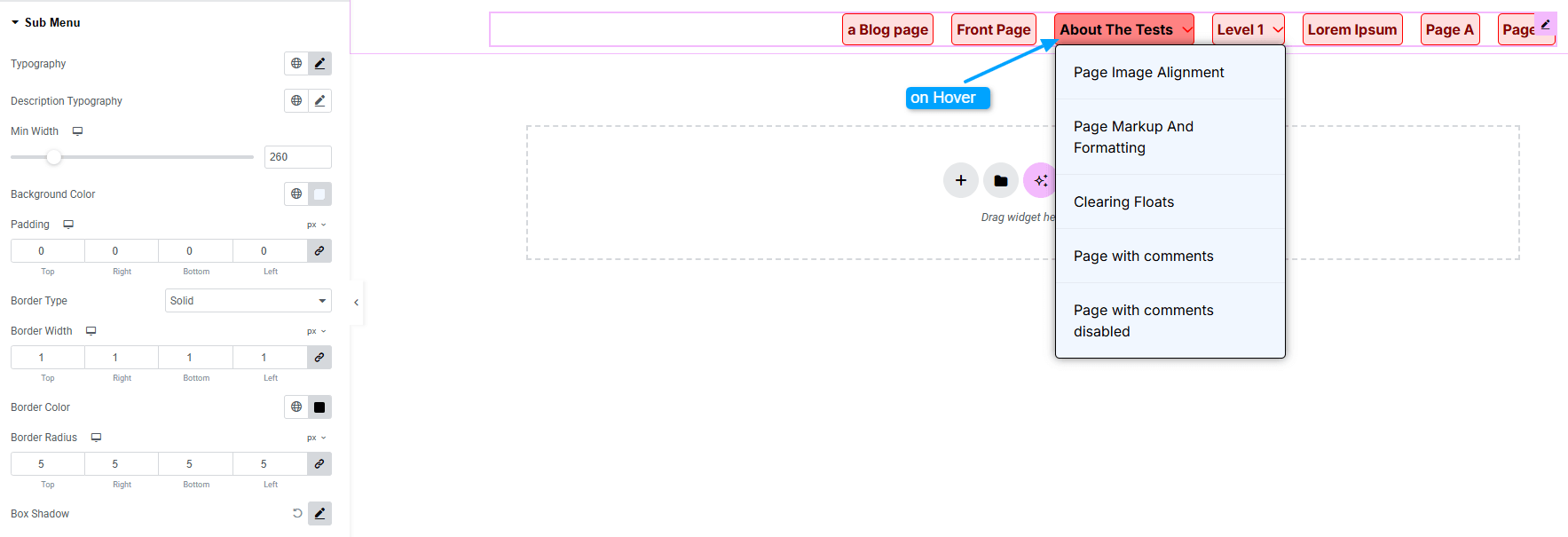
- Typography : Here you can customize the font family, size, weight, transform, style, decoration, line height, letter spacing, and word spacing for your text. Explore full typography settings here.
- Description Typography : Define separate typography settings for the description text under menu items (make sure description added from Appearance > Menus > Menu Items. If Description field not shown, check Description in Screen Options)
- Min Width : Set the minimum width of submenu items.
- Background Color : Define the background color of submenu items.
- Padding : Add inner spacing inside submenu items.
- Border Type : Define border style, width, color.
- Border Radius : Control corner roundness.
- Box Shadow : Add drop shadow effects.
- Horizontal Offset : Set the sub menus position horizontally.
Sub Menu Item:
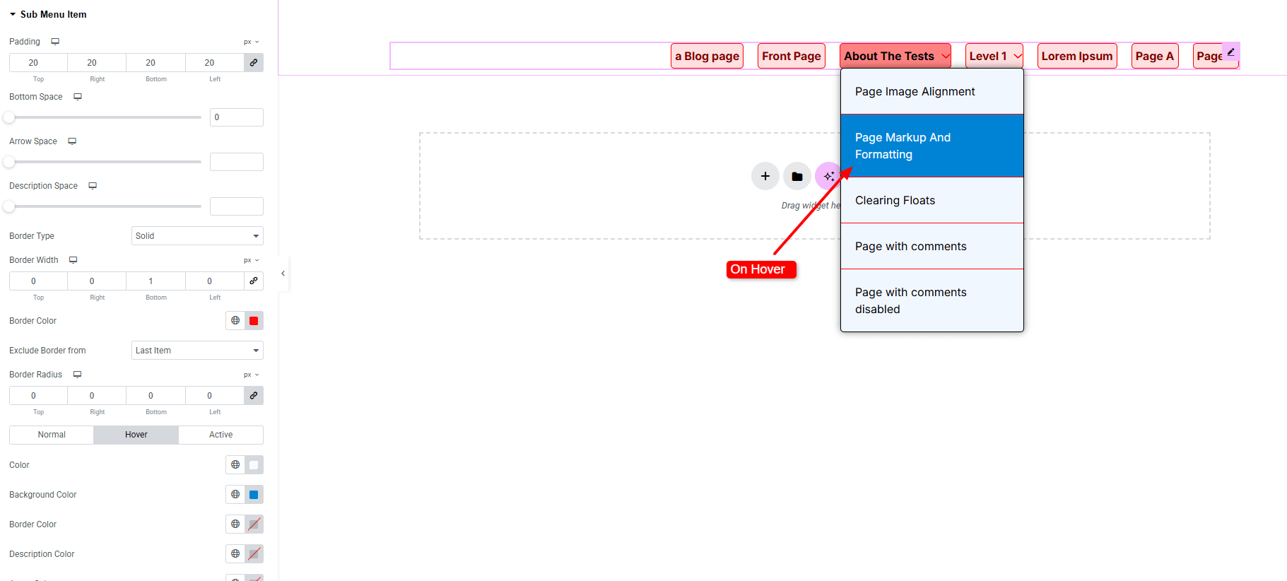
- Padding : Add inner spacing inside submenu items.
- Bottom Space : Set spacing below each submenu item.
- Arrow Space : Control the distance between the submenu text and its arrow.
- Description Space : Define spacing between the submenu title and its description.
- Border Type : Define border style, width and color.
- Exclude Border From : Exclude border from first item or last item.
- Border Radius : Apply rounded corners to each item.
- For Normal / Hover / Active States :
- Color : Customize submenu text color.
- Background Color: Set background color for submenu items.
- Description Color : Style the description text color.
- Arrow Color : Change the arrow color for visibility.
Menu Toggle:
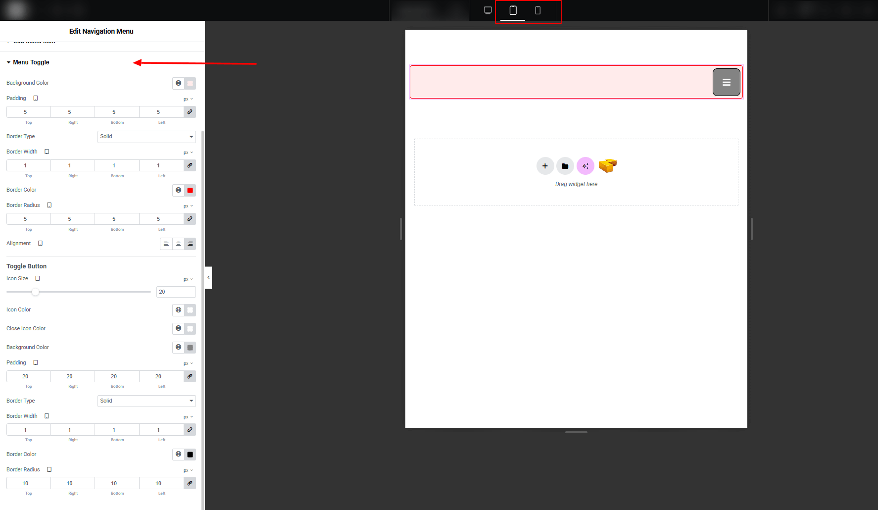
- Background Color : Set the background color of the submenu toggle area.Explore full background settings here.
- Padding : Add inner spacing inside the full container of toggle.
- Border Type : Define border style, width, color.
- Border Radius : Control corner roundness.
- Alignment : Adjust the horizontal alignment of the submenu toggle.
Toggle Button:
- Icon Size : Define the size of the toggle icon.
- Icon Color : Set the toggle icon color.
- Close Icon Color : Set the toggle close icon color.
- Background Color : Customize the background color of the toggle button.
- Padding : Add spacing inside the toggle button.
- Border Type : Define border style, width, and color.
- Border Radius : Control corner roundness.
Responsive Menu:
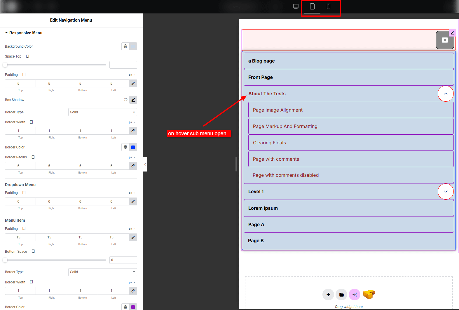
- Background Color : Set the background color of the responsive menu container.Explore full background settings here.
- Space Top : Control the top spacing between the menu and other elements.
- Padding : Add inner spacing for balanced structure.
- Box Shadow : Apply drop shadow effect.
- Border Type : Define border style, width, color for the container.
- Border Radius : Control corner roundness.
Dropdown Menu:
- Padding : Adjust inner spacing of the dropdown area.
Menu Item: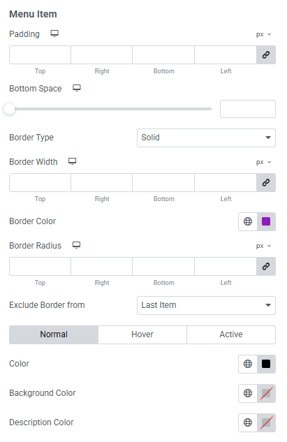
- Padding : Add spacing inside each menu item.
- Bottom Space : Control vertical spacing between menu items.
- Border Type : Apply border width, color, and style.
- Exclude Border From : Exclude border from first item or last item.
- For Normal / Hover / Active States:
- Color : Customize the text color of menu items.
- Background Color : Set background color variations for each state.
- Description : Define the description text color across different states.
Submenu Toggle: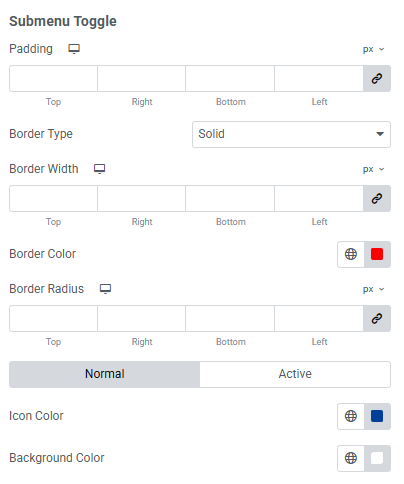
- Padding : Add inner spacing around the submenu toggle button.
- Border Type : Apply border styles, width, and color.
- Border Radius : Control corner roundness.
- For Normal / Hover / Active States:
- Icon Color : Customize the text color of menu items.
- Background Color : Set background color variations for each state.
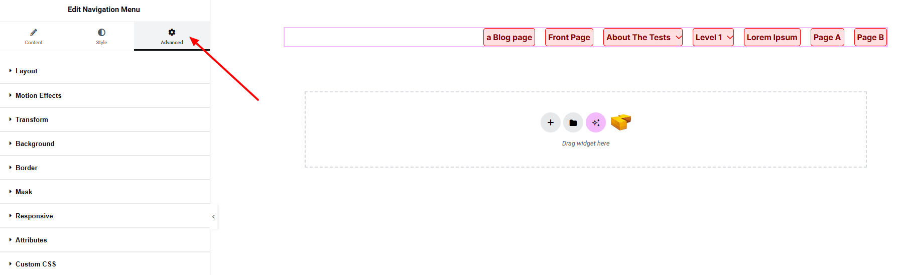
Step 4: Advance tab
If you want to customize the layout, backgrounds, or make your design more engaging, head over to the Advanced section. The Advanced panel is a default Elementor feature. Check out this document to learn more about its features.
Finally, hit the Publish button and watch your stunning Navigation Menu come to life on your webpage!
Everything’s good to go!