
Contact Form 7
Step-by-Step Tutorial on Using the Contact Form 7 Widget of Zyre Addon
With Zyre Addon’s Contact Form 7 Widget, you can take the power of the Contact Form 7 plugin and style it your way. From form fields to buttons, spacing, and colors—you get full design freedom to match your site’s branding while keeping all the functionality of CF7 intact.
Learn How To Use Contact Form 7 Widget:
Exploring the Features of Contact Form 7 Widget
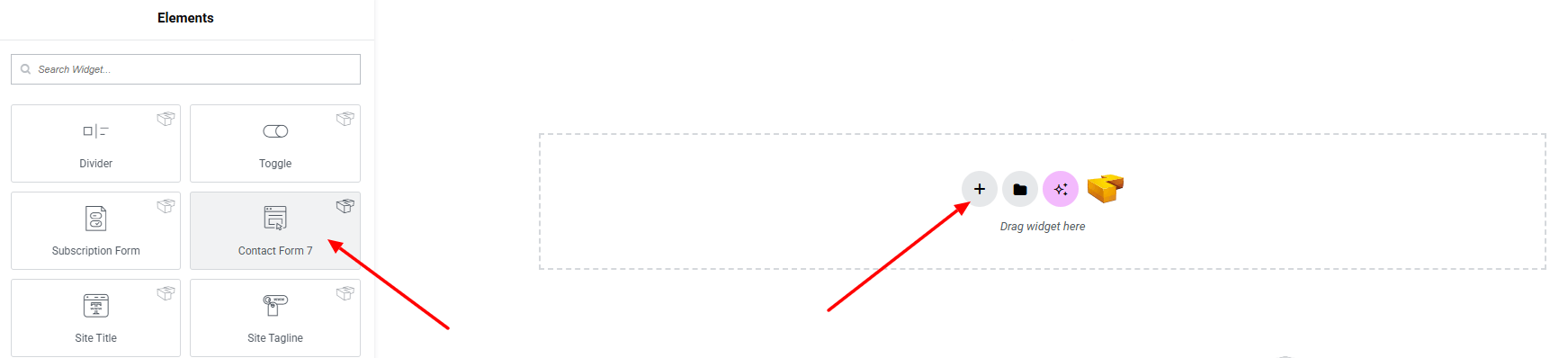
Step 1: Drag the widget
From the left panel, search or choose the Contact Form 7 of Zyre Addon and simply drag it into your desired section.
Step 2: Content tab
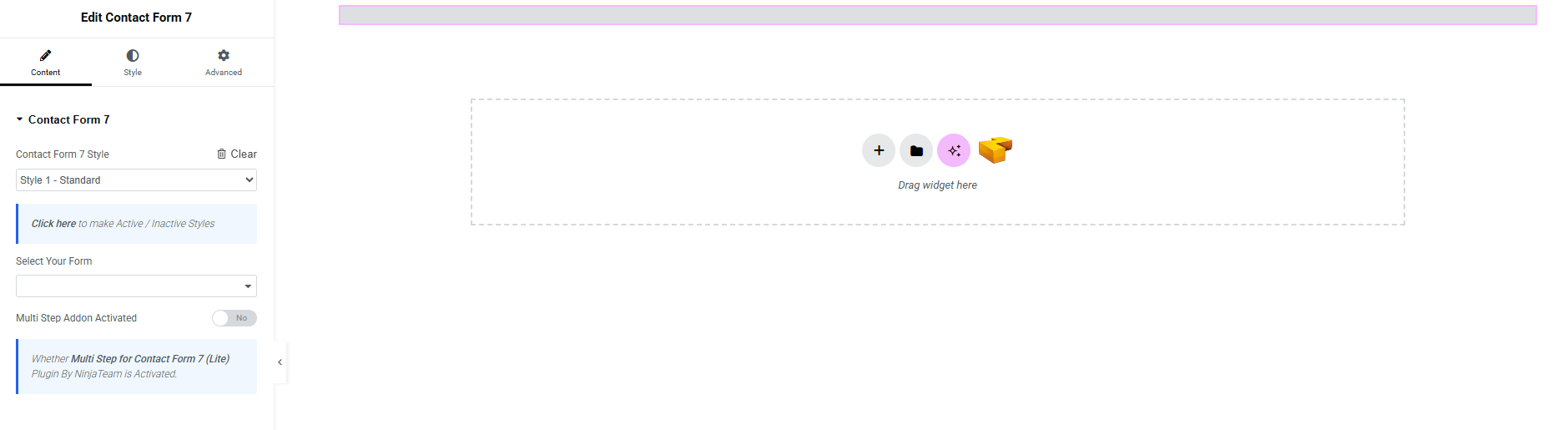
Contact Form 7:
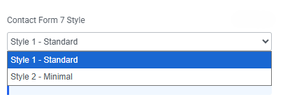
- Contact Form 7 Style : You can choose a predefined style from here
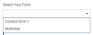
- Select Your Form : Select a form template you created.
- Multi Step Addon Activated : Active this button if you select Multistep option. and make sure Multi Step for Contact Form 7 (Lite) Plugin By NinjaTeam is Activated.
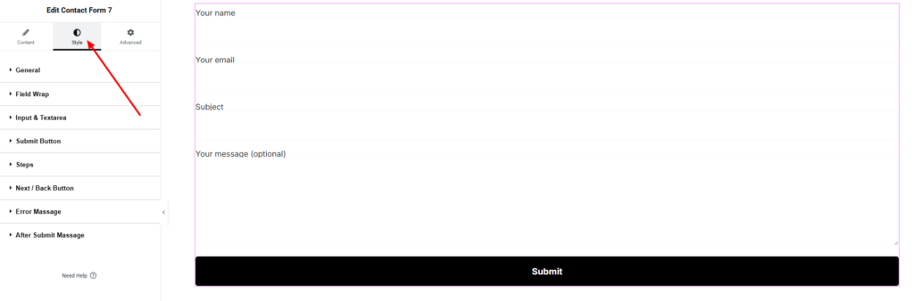
Step 3: Style tab
In the Style section, you can customize the General, Input & Textarea, Submit Button, Error Message, After Submit Message.
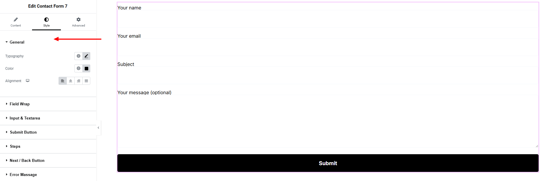
General:
- Typography : Adjust font family, size, weight, transform, style, decoration, line height, letter spacing, and word spacing. Explore full typography settings here.
- Color : Set the text color.
- Alignment : Set the alignment of the text.
Field Wrap:
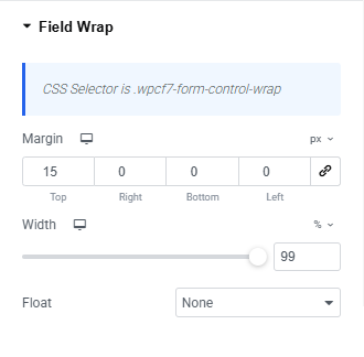
- Margin : Adjust outer spacing.
- Width : Set width of the field .
- Float : Set the alignment of the field(None, Left, Right).
Input & Textarea:
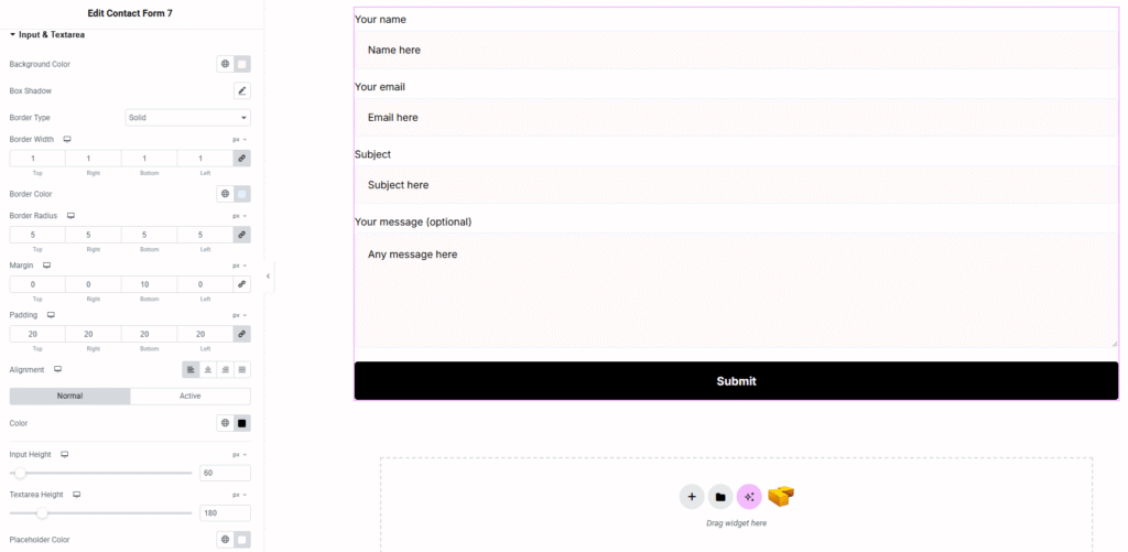
- Background Color : Set the input and textarea background color. Explore full background settings here.
- Box Shadow : Apply drop shadow effects.
- Border Type : Set border style, width and color.
- Border Radius : Control corner roundness.
- Padding : Adjust inner spacing.
- Margin : Adjust outer spacing.
- Alignment : Align the form fields within the container.
- For both Normal and Active states:
- Color : Define the text color.
- Input Height : Set a custom height for input fields.
- Textarea Height : Set a custom height for textarea.
- Placeholder Color : Customize the color of placeholder text.
Submit Button:
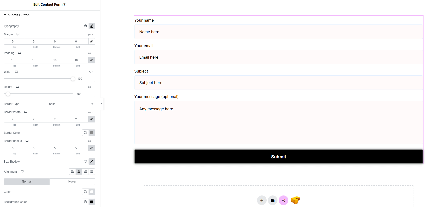
- Typography : Adjust font family, size, weight, transform, style, decoration, line height, letter spacing, and word spacing. Explore full typography settings here.
- Margin : Adjust outer spacing.
- Padding : Adjust inner spacing.
- Width : Set width of the button.
- Height : Set height of the button.
- Border Type : Set border style, width and color.
- Border Radius : Control corner roundness.
- Box Shadow : Apply drop shadow.
- Alignment : Align the button text within the container.
- Color : Set text color of the button for both normal and hover state.
- Background Color : Set background color of the button for both normal and hover state. Explore full background settings here.
Steps: (Only if you set Multi Step Addon Activated)
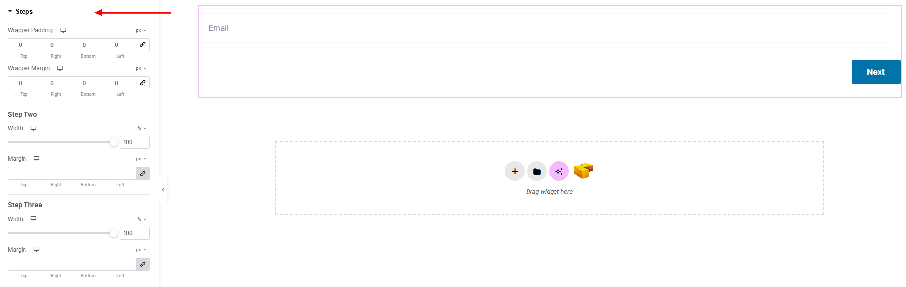
- Wrapper Padding : Adjust inner spacing of the wrapper.
- Wrapper Margin: Adjust outer spacing of the wrapper.
Steps : (Depends on how many steps did you set)
- Width: Set width of each textarea of steps.
- Margin : Set outer spacing of textarea.
Next / Back Button : (Only if you set Multi Step Addon Activated)
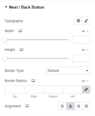
- Typography : Adjust font family, size, weight, transform, style, decoration, line height, letter spacing, and word spacing. Explore full typography settings here.
- Width : Set width of the button.
- Height : Set height of the button.
- Border Type : Set border style, width and color.
- Border Radius : Control corner roundness.
- Alignment : Align the button text within the container.
Button Container:
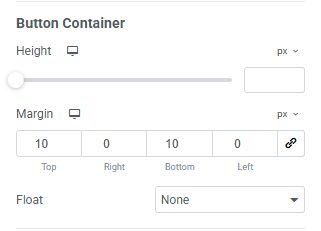
- Height : Set height of the button container.
- Width : Set width of the container of the button.
- Float : Set the alignment of the container(None, Left, Right).
Next Button:
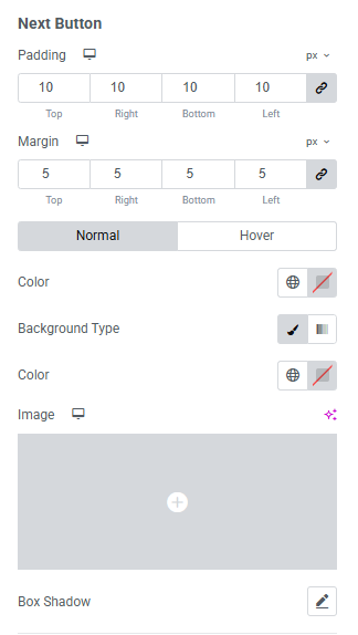
- Padding : Adjust inner spacing of the button
- Margin : Adjust outer spacing of the button
- Color : set the text color
- Background Type : Set the color or image of the background of the button. Explore full background settings here.
- Box Shadow : Apply drop shadow.
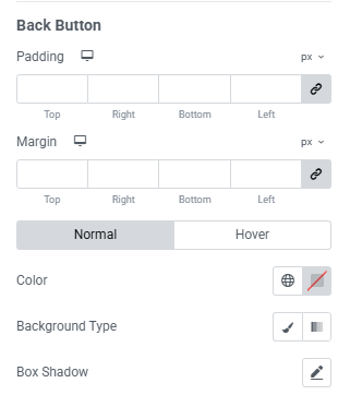
Back Button:
You will get same options for Back button as same as for Next button.
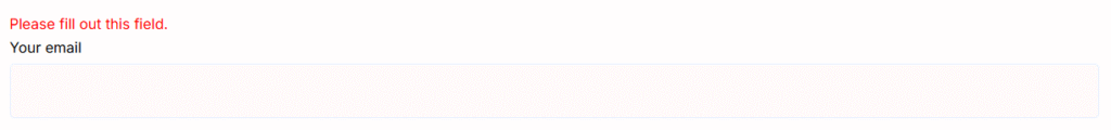
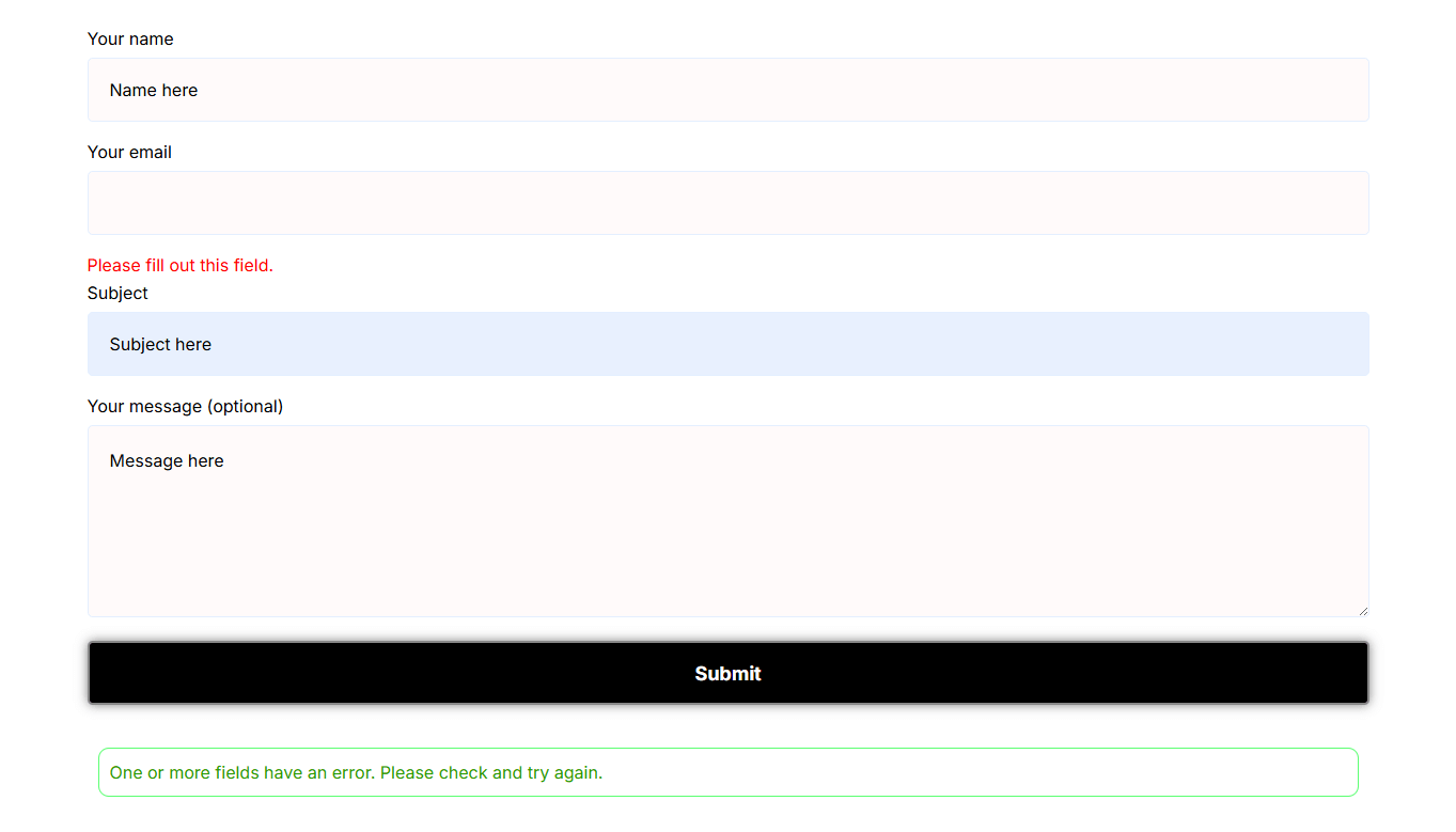
Error Massage:
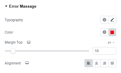
- Typography : Adjust font family, size, weight, transform, style, decoration, line height, letter spacing, and word spacing. Explore full typography settings here.
- Color : Set the error text color.
- Margin Top : Adjust the margin top of the error massage.
- Alignment : Set the alignment of the error text.
After Submit Massage:
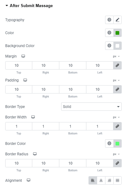
- Typography : Adjust font family, size, weight, transform, style, decoration, line height, letter spacing, and word spacing. Explore full typography settings here.
- Color : Set the text color of the message.
- Background Color : Set the color of the background of the message. Explore full background settings here.
- Margin : Adjust outer spacing.
- Padding : Adjust inner spacing.
- Border Type : Set border style, width and color.
- Border Radius : Control corner roundness.
- Alignment : Set the alignment of the message.

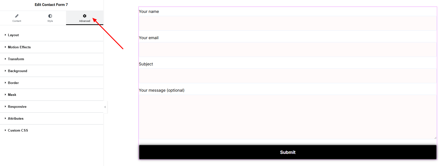
Step 4: Advance tab
If you want to customize the layout, backgrounds, or make your design more engaging, head over to the Advanced section. The Advanced panel is a default Elementor feature. Check out this document to learn more about its features.
Finally, hit the Publish button and watch your stunning Contact Form 7 come to life on your webpage!
That’s a wrap — you’re ready!