
Flip Box
Step-by-Step Tutorial on Using the Flip Box Widget of Zyre Addon
Design with impact using the Flip Box Widget from Zyre Addon for Elementor. Whether you’re building a sleek landing page or a professional website, this widget gives you endless creative control to craft headings that truly stand out.
Learn How To Use Flip Box Widget:
Exploring the Features of Flip Box Widget
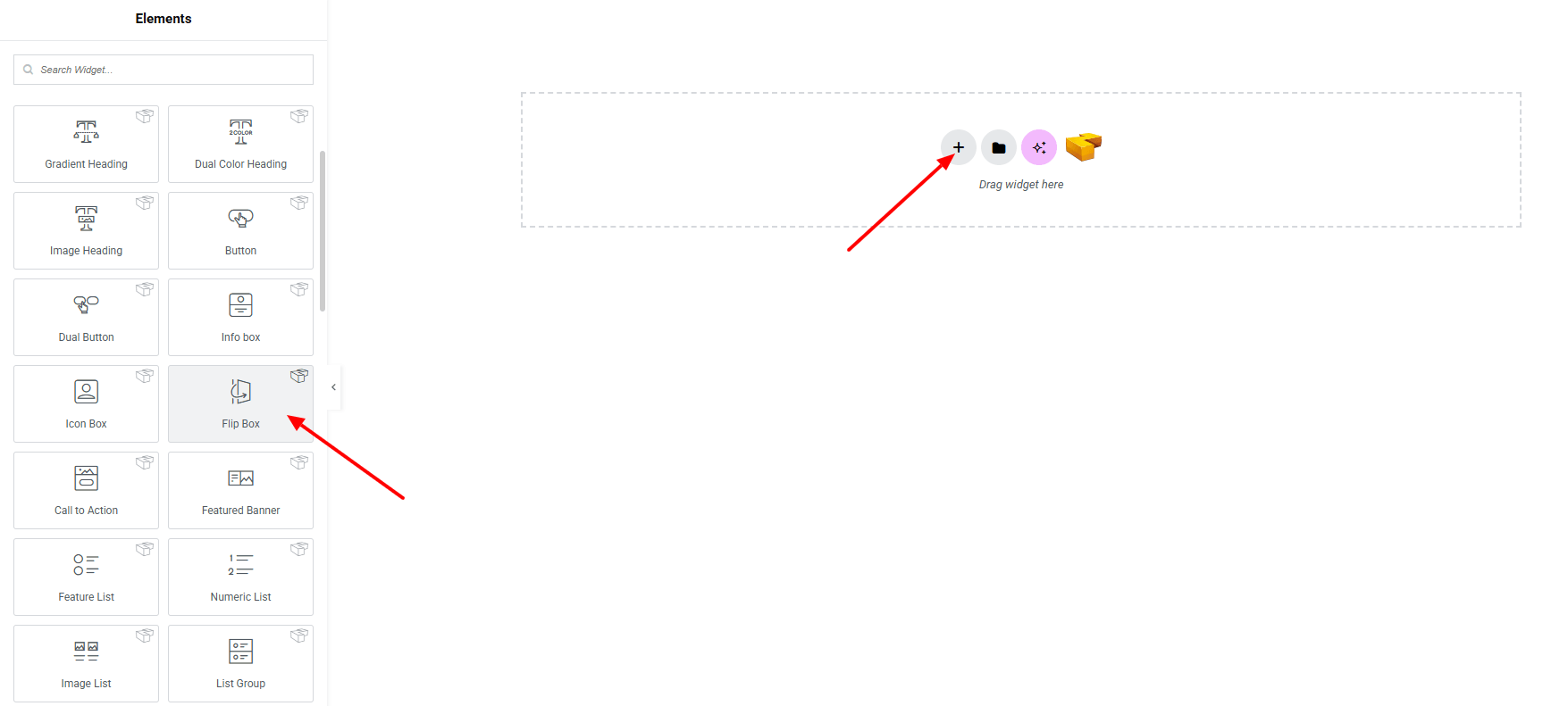
Step 1: Drag the widget
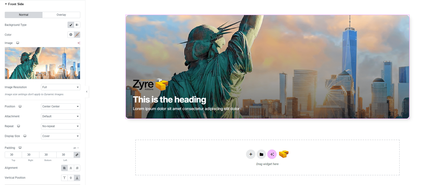
From the left panel, search or choose the Flip Box Widget of Zyre Addon and simply drag it into your desired section.
Step 2: Content tab
On the Content section, you’ll find options for Template Style, Front Side, Back Side, and Settings.
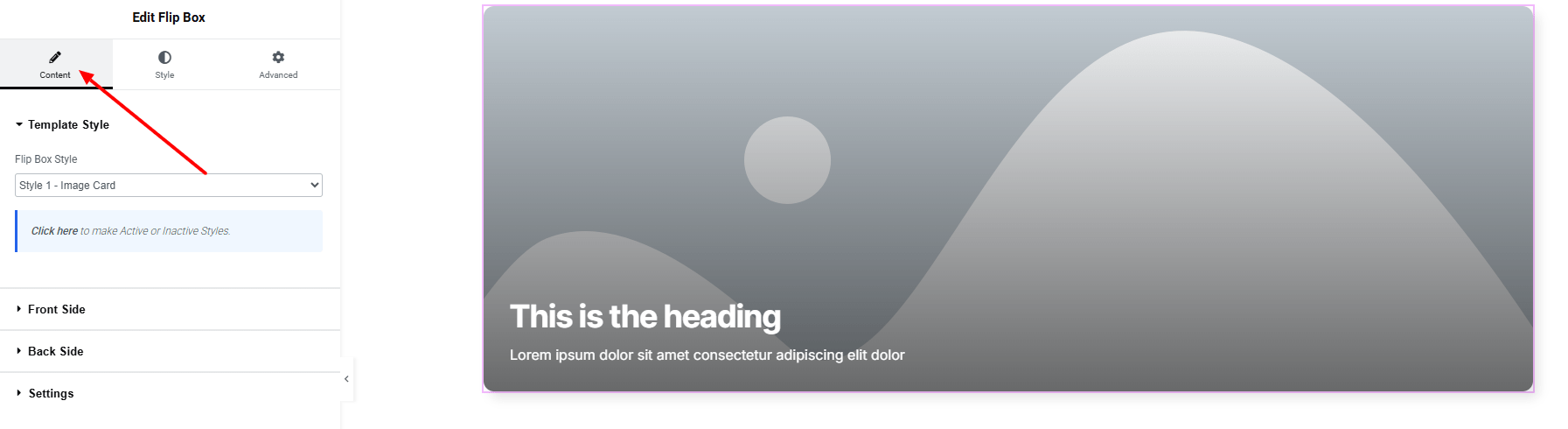
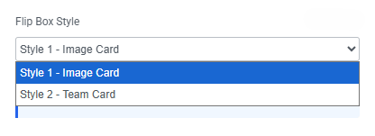
Template Style:
- Flip Box Style – you can choose a predefined style from here
Front Side:
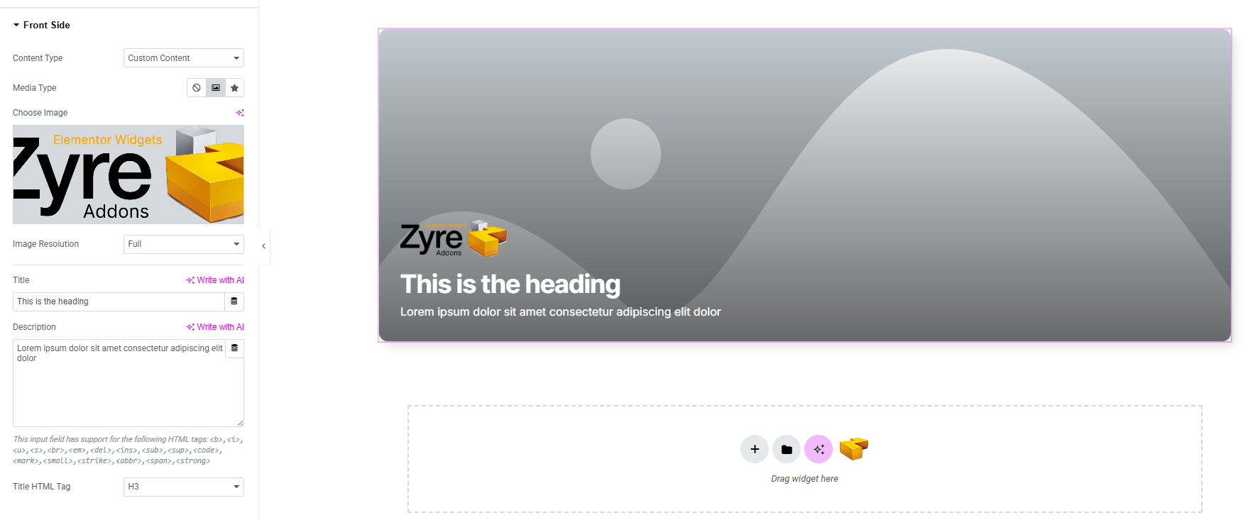
- Content Type : Choose the type of content you want to display.
- Set Custom content (for front side & back side):
- Media Type : Select Image or Icon as the media element.
- Image Resolution : Set resolution of the Image (if image selected)
- Title : Add the main heading.
- Description : Add description text.
- Title HTML Tag : Set the HTML tag for the title.
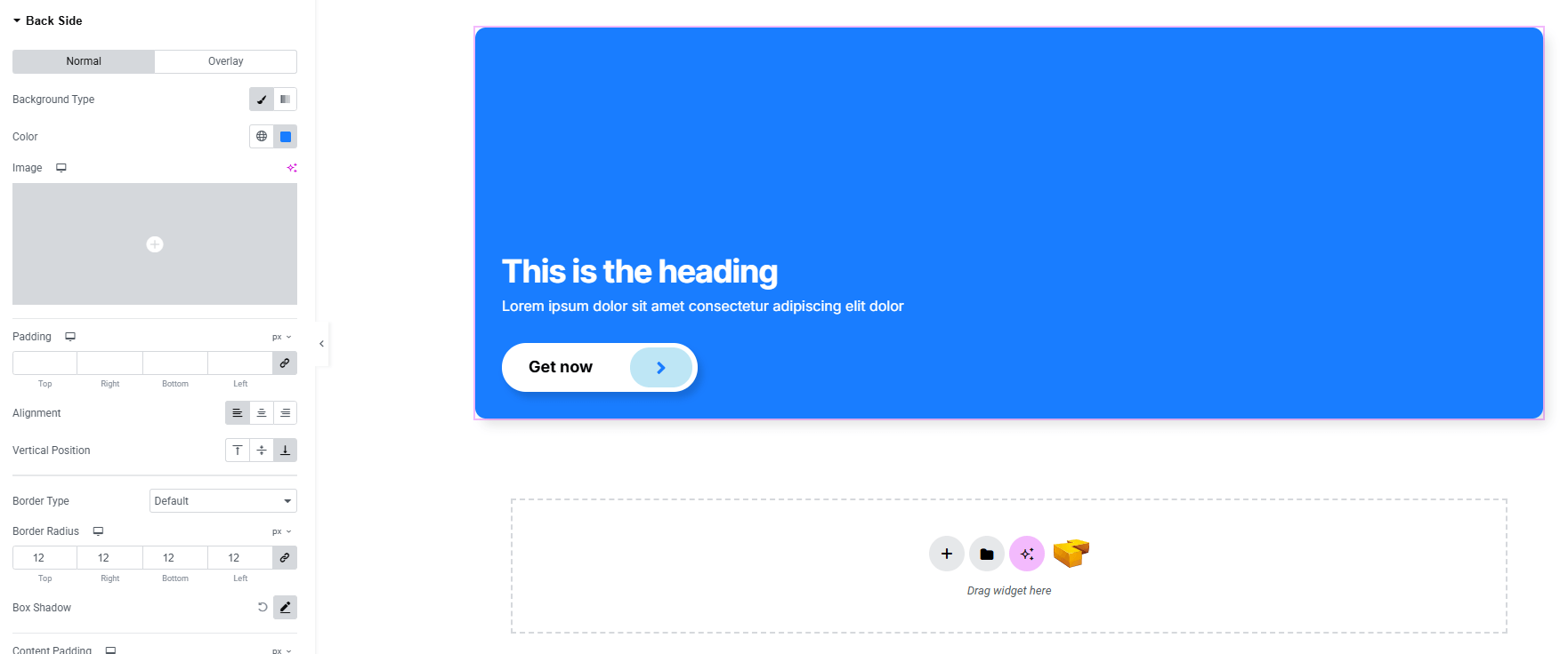
Back Side:
You’ll find the same design options for the Back side Section as in the Front side Section— giving you full freedom to style it just the way you imagine.
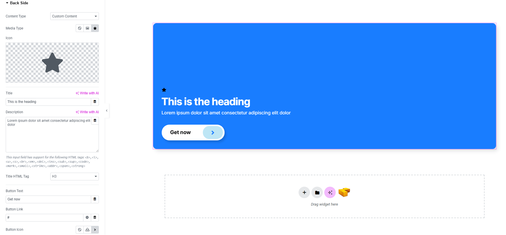
Button Only Back side content:
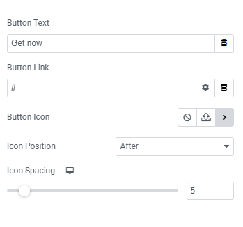
- Button Text : Insert button text.
- Button Link : Add a link URL for the button.
- Button Icon : Select an icon (including SVG).
- Icon Position : Choose the position of the icon relative to text.
- Icon Spacing : Adjust spacing between icon and text.
Settings:
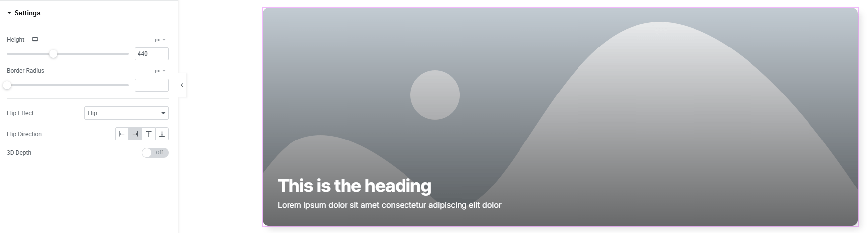
- Height : Set the flip box height for consistent sizing.
- Border Radius : Apply rounded corners to the box.
- Flip Effect : Choose the effect for the flipping transition.
- Flip Direction : Define the direction of the flip(left, right, top, bottom)
- 3D Depth : Enable and adjust the 3D depth effect for a more dynamic and realistic flip.
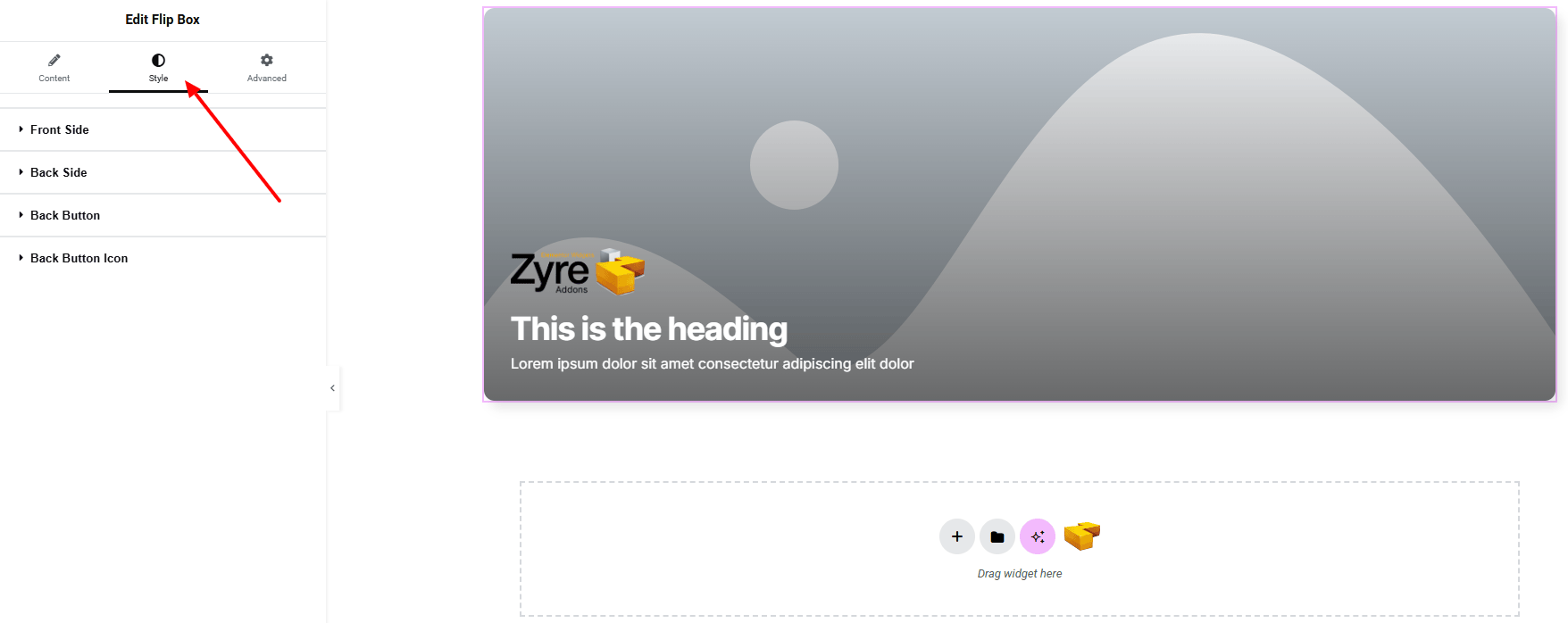
Step 3: Style tab
In the Style section, you can customize the Front Side, Back Side, Back Button, Back Button Icon.
Front Side:
- For both normal and overlay states:
- Background Type : Set unique background classic or gradient color. Explore full background settings here.
- Image : Upload and set the background image for the front side.
- Image Resolution : Control the quality of background images.
- Position : Adjust the background image position.
- Attachment : Select scroll or fixed for parallax-like effects.
- Repeat : Toggle repeating behavior for background images.
- Display Size : Fit, cover, or contain the background image as needed.
- Padding : Define inner spacing for content area.
- Alignment : Align front side content to the horizontal position.
- Vertical Position : Align front side content to the vertical position.
- Border Type : Customize border type, width and color.
- Border Radius : Control corner roundness.
- Box Shadow : Add drop shadow of the front side box.
- Image: (make sure image is set from Media Type)
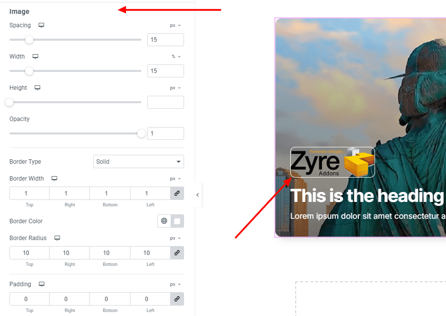
- Spacing : Define the spacing between the image and other contents.
- Width : Set a custom width for the image to fit your layout.
- Height : Set a custom height for the image to fit your layout.
- Opacity : Control the transparency of the image.
- Border Type : Customize border type, width and color.
- Border Radius : Control corner roundness.
- Padding : Adjust the inner padding around the image content for precise spacing.
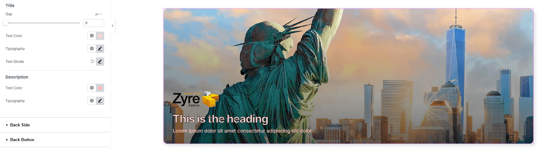
- Title:
- Gap : Define space between title and description.
- Text Color : Set text color of the title.
- Text Stroke : Add stroke width and color to create bold outlined text.
- Typography : Adjust font family, size, weight, transform, style, decoration, line height, letter spacing, and word spacing. Explore full typography settings here.
- Description:
- Text Color : Set text color of the title.
- Typography : Adjust font family, size, weight, transform, style, decoration, line height, letter spacing, and word spacing. Explore full typography settings here.
Back Side:
You’ll find the same design options for the Back Side Section as in the Front side Section— giving you full freedom to style it just the way you imagine.
Back Button:
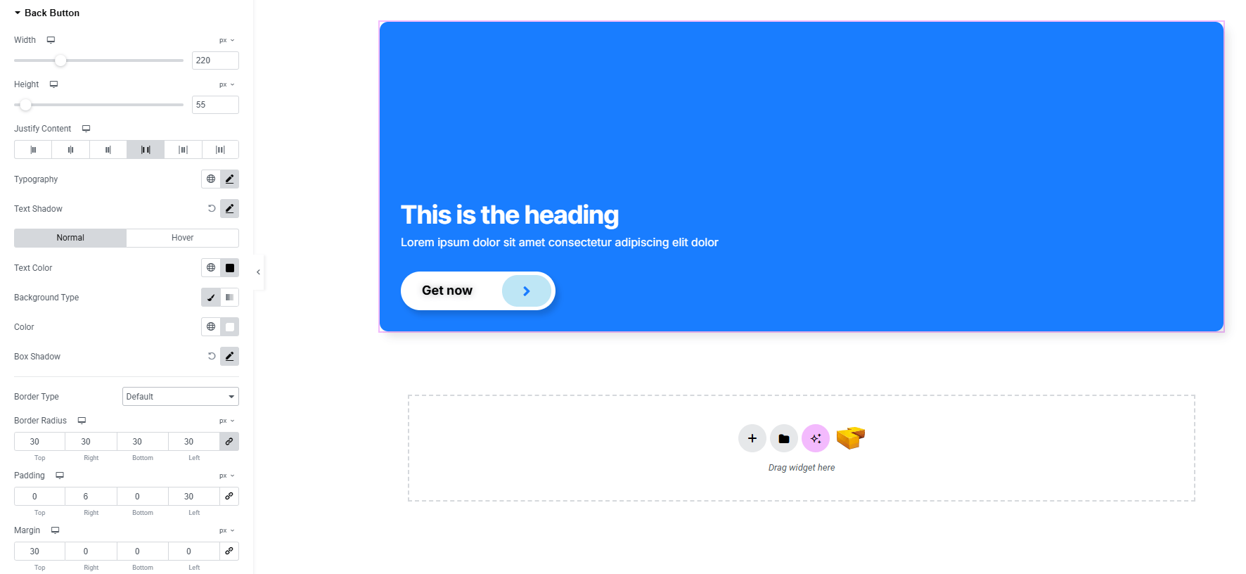
- Width & Height : Set width and height of the button.
- Justify Content : Set space between text & icon horizontally.
- Typography : Adjust font family, size, weight, transform, style, decoration, line height, letter spacing, and word spacing. Explore full typography settings here.
- Text Shadow : Add shadow effects of the text.
- For both Normal and Hover states:
- Text Color : Set text color of the button.
- Background Type with Color : Set unique background colors or gradients for normal and hover states
- Box Shadow : Apply drop shadows.
- Border Type : Customize border style, width and color.
- Border Radius : Control corner roundness.
- Padding & Margin : Adjust internal and external spacing of the button.
Back Button Icon:
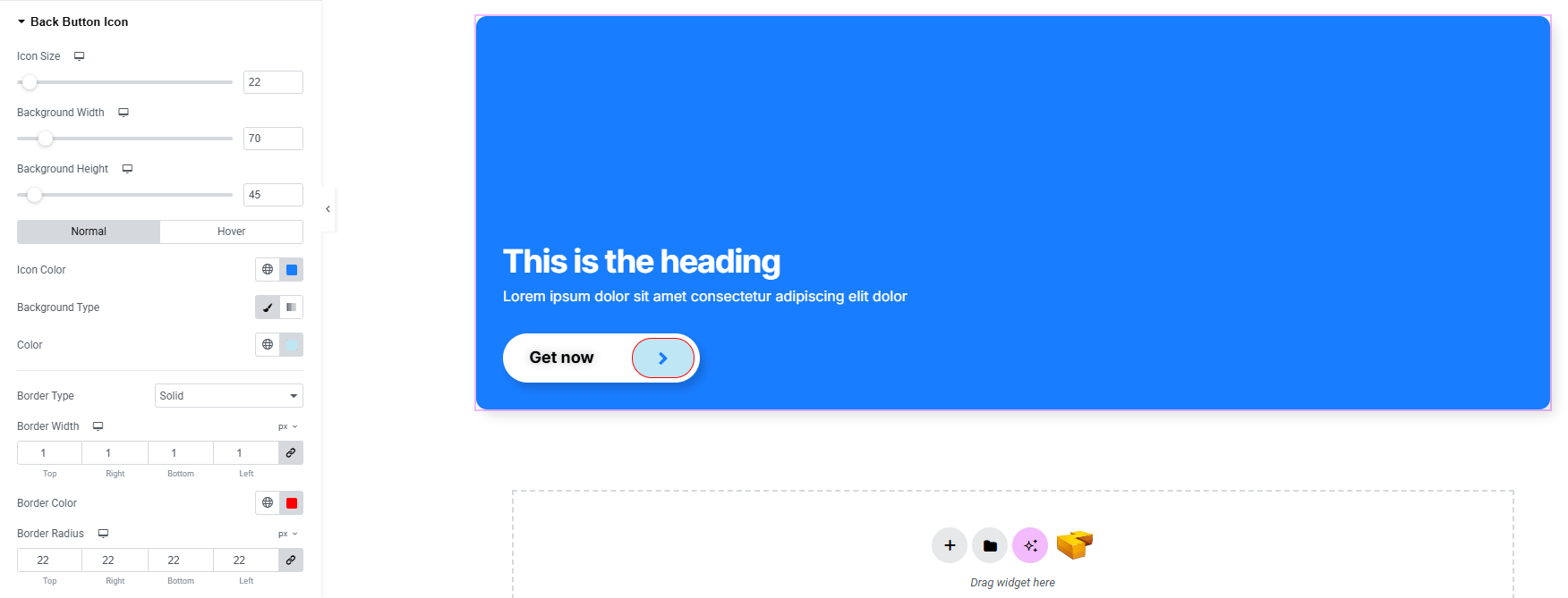
- Icon Size : Set the overall size of the icon.
- Background Width & Height : Control the background container dimensions.
- For both Normal and Hover states:
- Icon Color : Set icon color for both states.
- Background Type : Choose solid, gradient, or image backgrounds.
- Border Type : Define border style with width and color.
- Border Radius : Control rounded corners consistently.
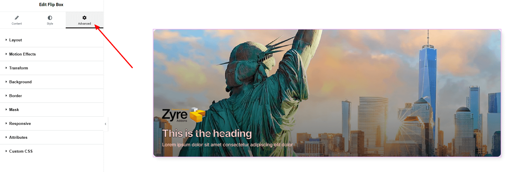
Step 4: Advance tab
If you want to customize the layout, backgrounds, or make your design more engaging, head over to the Advanced section. The Advanced panel is a default Elementor feature. Check out this document to learn more about its features.
Finally, hit the Publish button and watch your stunning Flip Box come to life on your webpage!
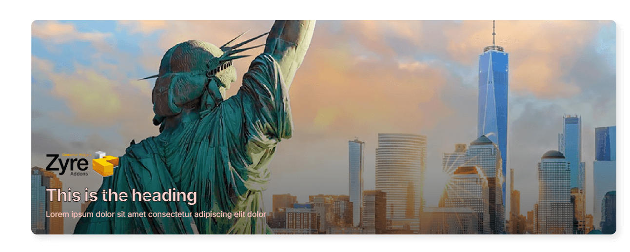
All done and ready to go!