
Fun Fact
Step-by-Step Tutorial on Using the Fun Fact Widget of Zyre Addon
The Fun Fact widget of zyre addon lets you showcase exciting stats, achievements, or milestones with eye-catching counters and animations. Perfect for highlighting numbers like completed projects, happy clients, or awards, it adds an engaging and dynamic touch to your webpage while making important figures stand out.
Learn How To Use Fun Fact Widget:
Exploring the Features of Fun Fact Widget
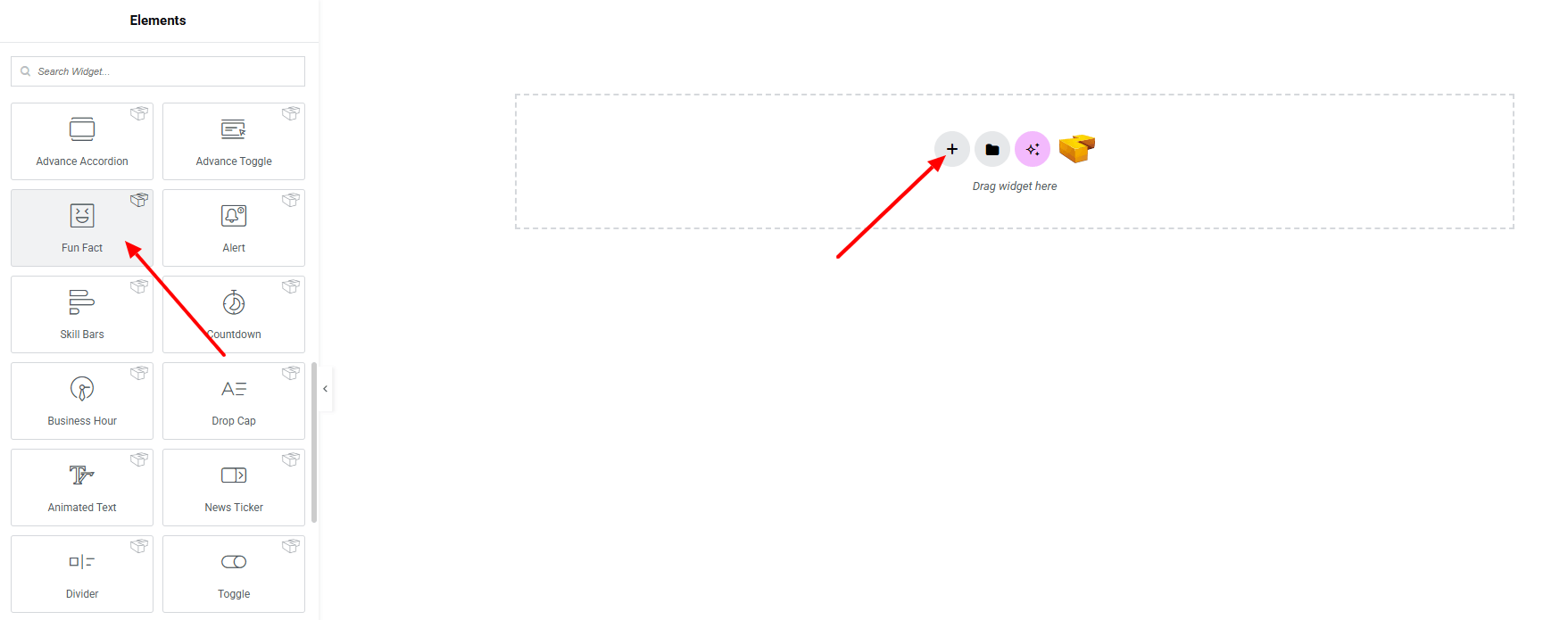
Step 1: Drag the widget
From the left panel, search or choose the Fun Fact Widget of Zyre Addon and simply drag it into your desired section.
Step 2: Content tab
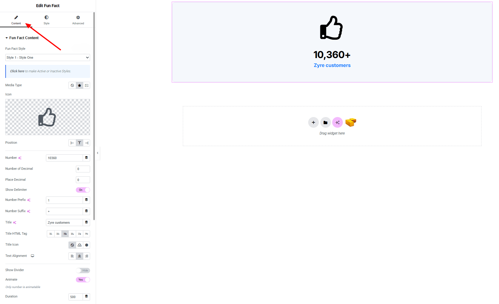
Fun Fact Content:
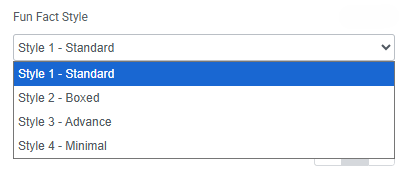
- Fun Fact Style : You can choose a predefined style from here
- Media Type : Select between Image or Icon as the media element.
- Position : Adjust the media position (left, right, top)
- Number : Input the primary numeric value.
- Number of Decimals : Define how many decimal points to display.
- Place Decimal : Set the decimal placement.
- Show Decimal (Toggle) : Enable/disable decimal visibility.
- Number Prefix : Add characters or text before the number.
- Number Suffix : Add characters or text after the number.
- Title : Add a title.
- Title HTML Tag : Set the HTML tag for the title.
- Title Icon : Optional icon before the title.
- Show Divider (Toggle) : Display a divider under the number.
- Animate (Toggle) : Enable counter animation.
- Duration : Set animation duration (in ms).
Step 3: Style tab
In the Style section, you can customize the Icon/Image, Content, Number and Title — but make sure you have added the contents first.
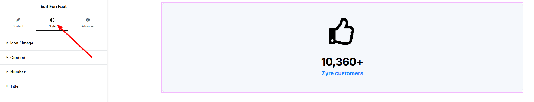
Icon/image:
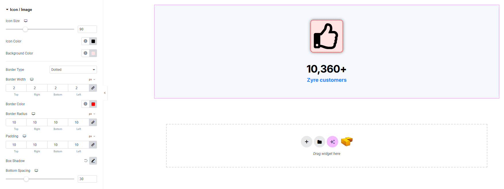
- Icon Size : Adjust the size of the icon.
- Icon Color : Choose the icon color.
- Background-color : Set background color of the icon. Explore full background settings here.
- Border Type : Customize border type, width and color.
- Border Radius : Control corner roundness.
- Padding : Control inner spacing around the icon/image.
- Box Shadow : Add drop shadow effects to the icon/image box.
- Bottom Spacing : Adjust the bottom space of the icon/image.
Content:
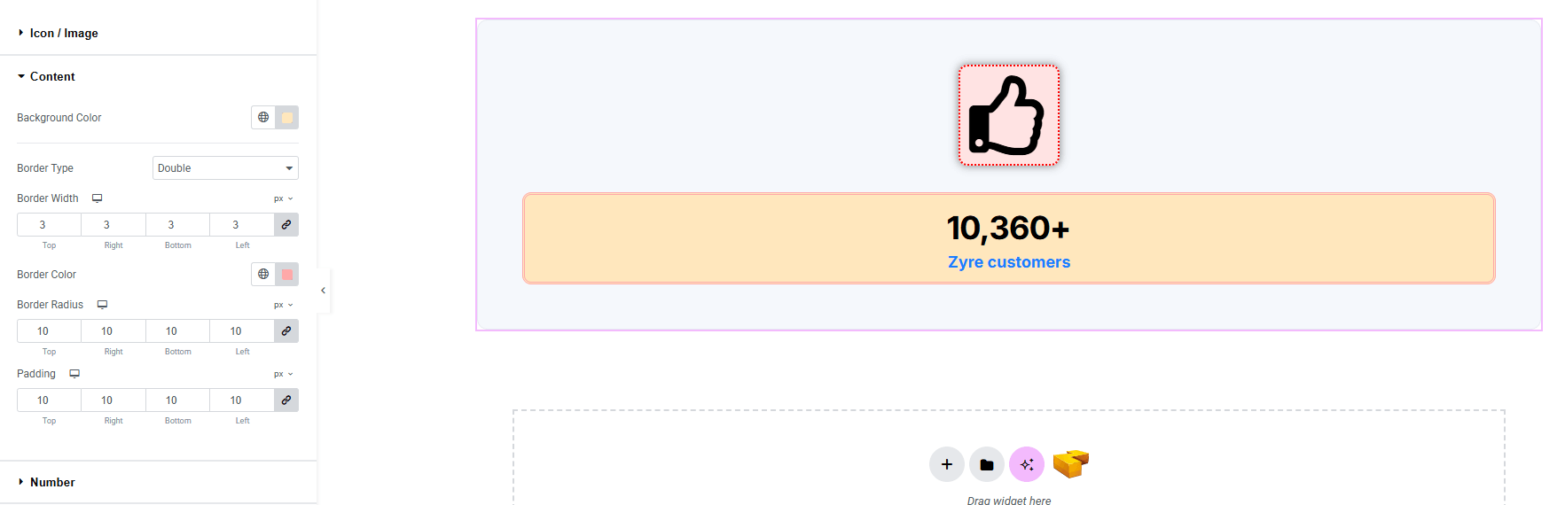
- Background-color : Set background color of the content area. Explore full background settings here.
- Border Type : Customize border type, width and color.
- Border Radius : Control corner roundness.
- Padding : Control inner spacing around the content area.
Number:
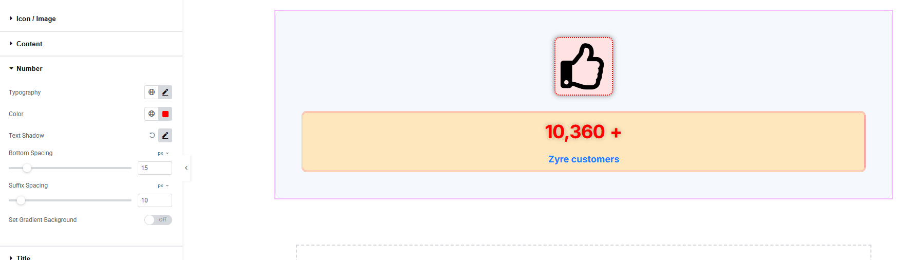
- Typography : Adjust font family, size, weight, transform, style, decoration, line height, letter spacing, and word spacing. Explore full typography settings here.
- Color : Choose the color of the number.
- Text Shadow : Add shadow effect of the number text.
- Bottom Spacing : Adjust spacing in the bottom.
- Suffix Spacing : Adjust spacing before the suffix
- Set Gradient Background : Set gradient background color of the number.
Title:
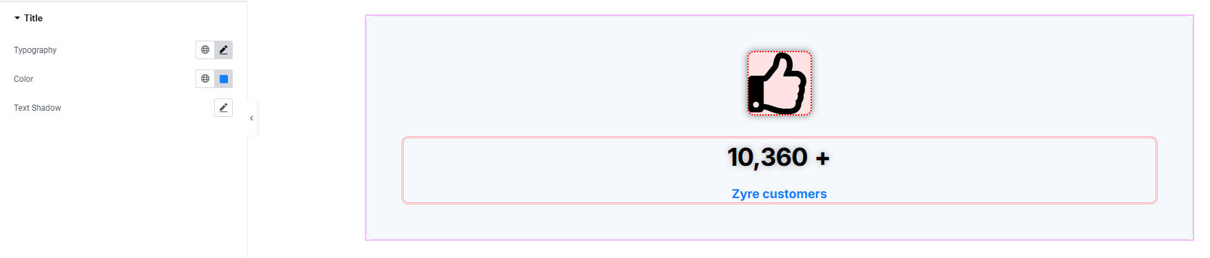
- Typography : Adjust font family, size, weight, transform, style, decoration, line height, letter spacing, and word spacing. Explore full typography settings here.
- Color : Set color of the title.
- Text Shadow : Set shadow effect of the text.
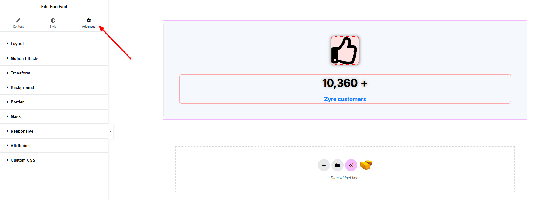
Step 4: Advance tab
If you want to customize the layout, backgrounds, or make your design more engaging, head over to the Advanced section. The Advanced panel is a default Elementor feature. Check out this document to learn more about its features.
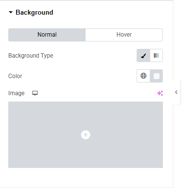
Background:
For both Normal and Hover state you can set background color or image of the full widget.
Finally, hit the Publish button and watch your stunning fun fact come to life on your webpage!
That’s a wrap — you’re ready!