
Image Grid
Step-by-Step Tutorial on Using the Image Grid Widget of Zyre Addon
The Image Grid Widget of Zyre Addon combines functionality with style, ensuring your website is both informative and visually captivating. With sleek layouts, unique effects, and complete customization, it transforms simple lists into impactful design elements.
Learn How To Use Image Grid Widget:
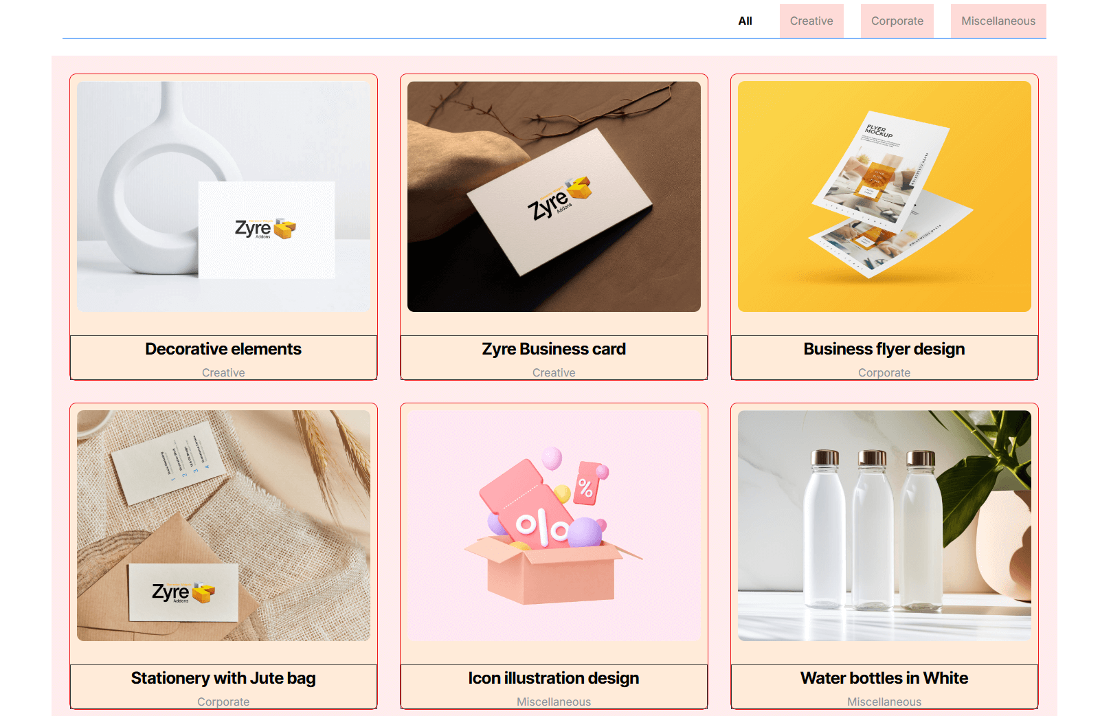
Exploring the Features of Image Grid Widget
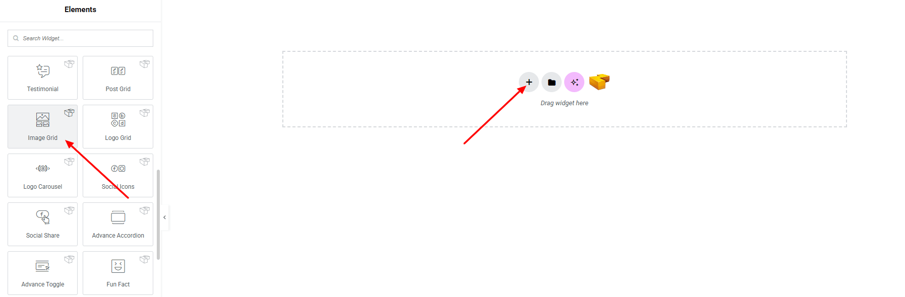
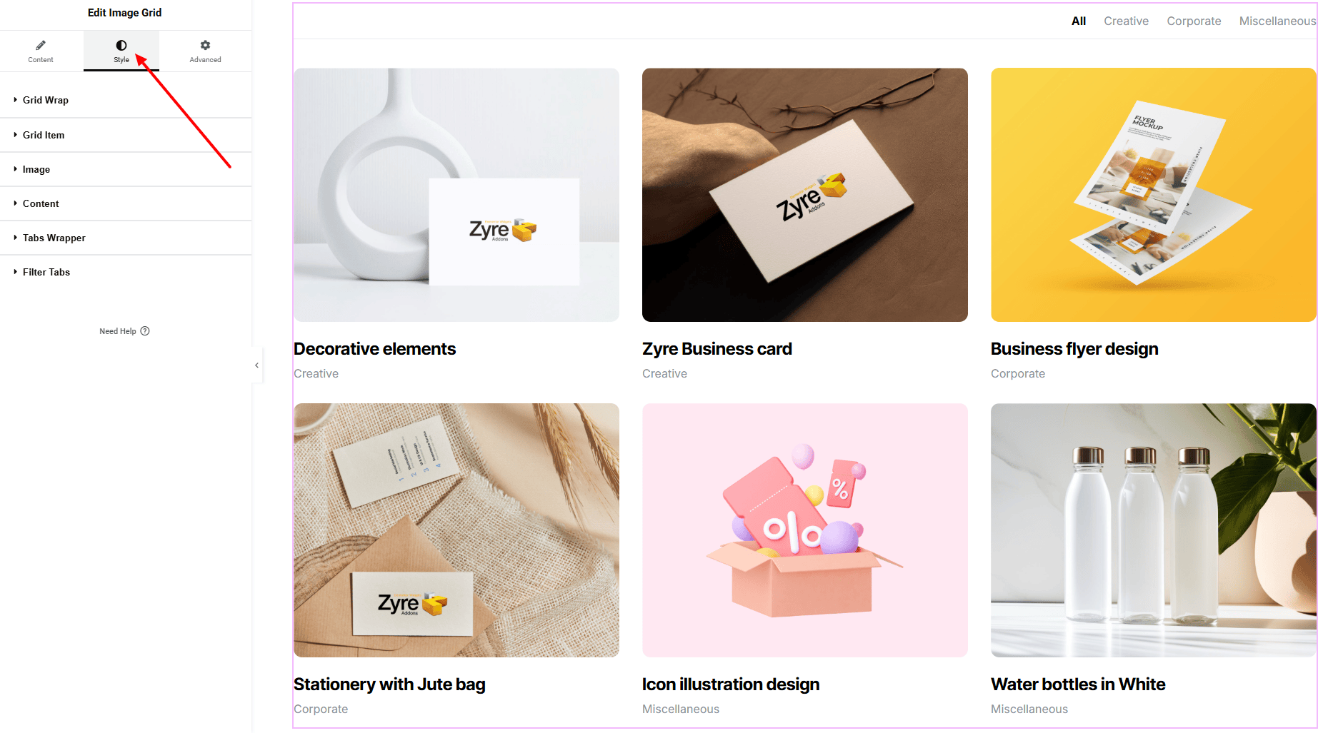
Step 1: Drag the widget
From the left panel, search or choose the Image Grid of Zyre Addon and simply drag it into your desired section.
Step 2: Content tab
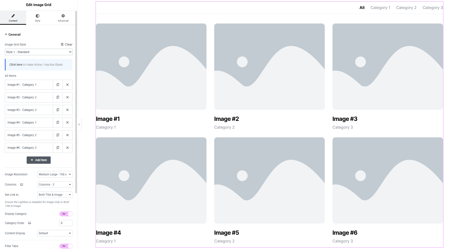
Image Grids Content:
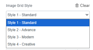
- Image Grid Style : You can choose a predefined style from here
- Image All Items : Create and manage multiple Image items.
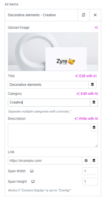
- Upload Image : Select or upload the image for the grid item.
- Title : Add a title text for the image item.
- Category : Assign a category to help organize and filter images.
- Description : Add a short description or caption for the image.
- Link : Set a custom link for the image item.
- Span Width : Control how many columns the image spans in the grid layout.
- Span Height : Control how many rows the image spans in the grid layout.
- Image Resolution : Choose the resolution size for grid images.
- Columns : Set the number of columns in the image grid layout.
- Set Link To : Decide where the link applies—image, title, content or both image and title.
- Display Category (Toggle) : Show or hide image categories in the grid.
- Category Order : Control the order in which categories appear.
- Content Display : Choose whether content appears by default or on image overlay.
- Filter Tabs (Toggle) : Enable category-based filter tabs for the grid.
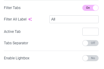
- Filter “All” Label : Customize the text for the default “All” filter tab.
- Active Tab : Set which filter tab is active by default.
- Tabs Separator (Toggle) : Show or hide a separator between filter tabs.
- Enable Lightbox (Toggle) : Turn the image lightbox on or off.
- Open Lightbox On : Choose whether the lightbox opens on image click or button click.
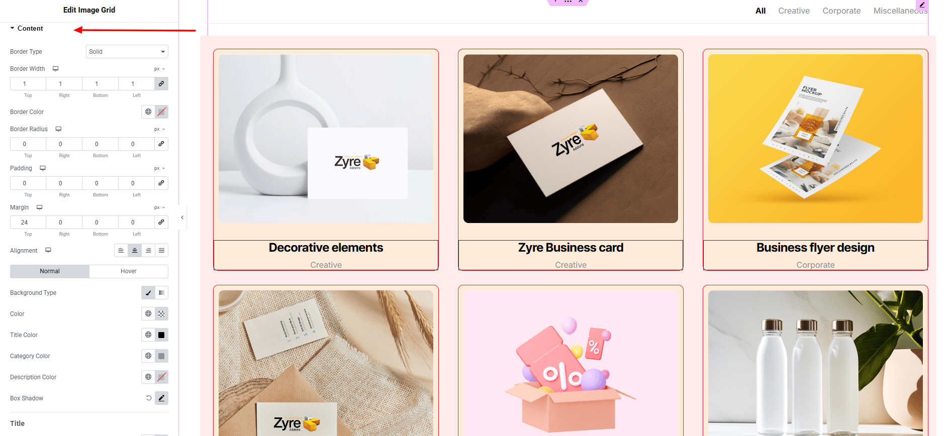
Step 3: Style tab
In the Style section, you can customize the Grid wrap, Grid items, images, content, Tabs Wrapper, Filter Tabs — but make sure you have added them first.
Grid Wrap:
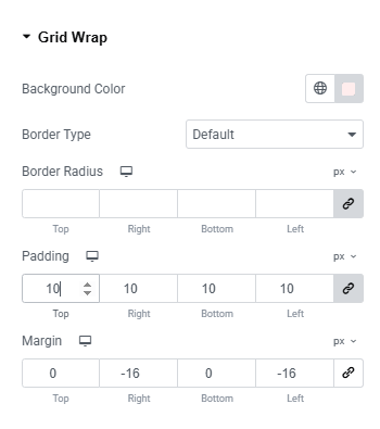
- Background Color : Set the background color of the entire image grid wrapper. Explore full background settings here.
- Border Type : Customize the border style, including width and color.
- Border Radius : Control the roundness of the grid wrapper corners.
- Padding : Adjust the inner spacing inside the grid wrapper.
- Margin : Control the outer spacing around the grid wrapper.
Grid Item:
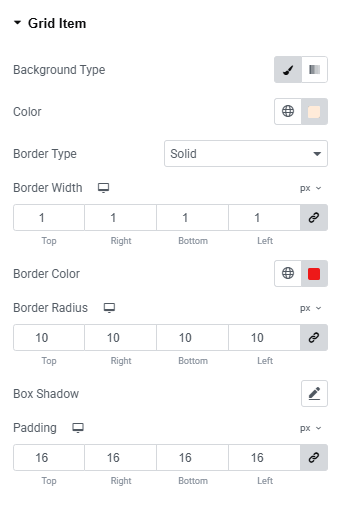
- Background Type : Set unique background colors or gradients. Explore full background settings here.
- Border Type : Define border style, width, and color.
- Border Radius : Apply rounded corners to each item.
- Box Shadow : Apply drop shadow on each grid item.
- Padding : Add inner spacing of each item.
Image:
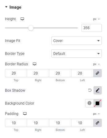
- Height : Set a fixed or auto height for each grid image.
- Image Fit : Control how the image fits inside its container (cover, contain, fill, etc.).
- Border Type : Customize the image border with style, width, and color.
- Border Radius : Adjust the corner roundness of the images.
- Box Shadow : Apply drop effects to add depth to the images.
- Background Color : Set a background color behind the images.
- Padding : Control the spacing between the image and its container.
Content:
- Border Type : Define the border style for the content area.
- Border Radius : Control the roundness of the content container corners.
- Padding : Adjust inner spacing within the content area.
- Margin : Set outer spacing around the content container.
- Alignment : Choose how the content is aligned inside the grid item.
- For both Normal & Hover States:
- Background Type : Select the background style and color for the content area.
- Title Color : Set the color of the image title.
- Category Color : Customize the category text color.
- Description Color : Adjust the description text color.
- Box Shadow : Apply shadow effects to the content area.
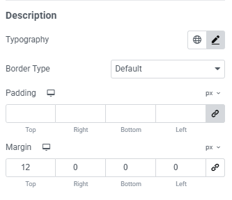
Title:
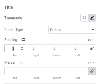
- Typography: here you can customize the font family, size, weight, transform, style, decoration, line height, letter spacing, and word spacing for your text. Explore full typography settings here.
- Border Type : Set the border style, color, width around the title text.
- Padding : Adjust the inner spacing around the title.
- Margin : Control the spacing outside the title element.
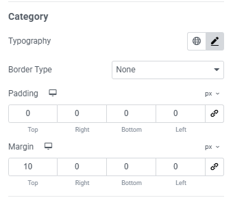
Category:
Here have same options for Category as same as for Title.
Description:
Here have same options for Description as same as for Title.
Tabs Wrapper:
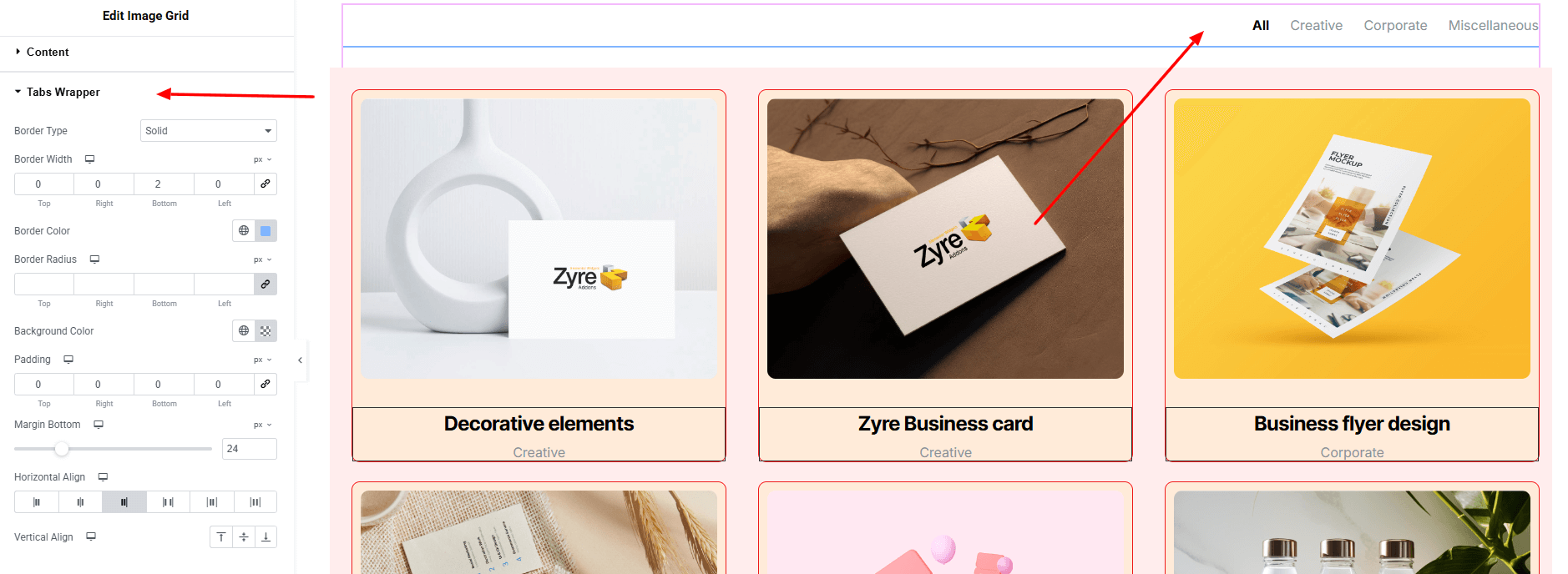
- Border Type : Customize the border style with type, width, and color of the tabs container.
- Border Radius : Control the corner roundness of the tabs wrapper.
- Background Color : Set the background color behind the filter tabs.
- Padding : Adjust the inner spacing within the tabs wrapper.
- Margin Bottom : Control the spacing below the tabs section.
- Horizontal Align : Align the tabs horizontally (left, center, right).
- Vertical Align : Set the vertical alignment of the tabs within the wrapper.
Filter Tabs:
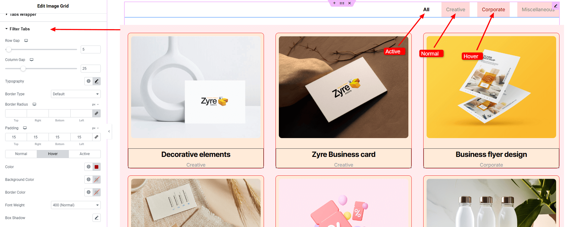
- Row Gap : Set the vertical spacing between filter tabs.
- Column Gap : Control the horizontal spacing between filter tabs.
- Typography: here you can customize the font family, size, weight, transform, style, decoration, line height, letter spacing, and word spacing for your text. Explore full typography settings here.
- Border Type : Define the border style for the filter tabs.
- Border Radius : Adjust the corner roundness of the tabs.
- Padding : Control the inner spacing of each tab.
- States for Normal, Hover & Active :
- Color : Set the text color for each tab state.
- Background Color : Customize the background color .
- Box Shadow : Apply shadow effects to enhance depth and visual feedback across different states.
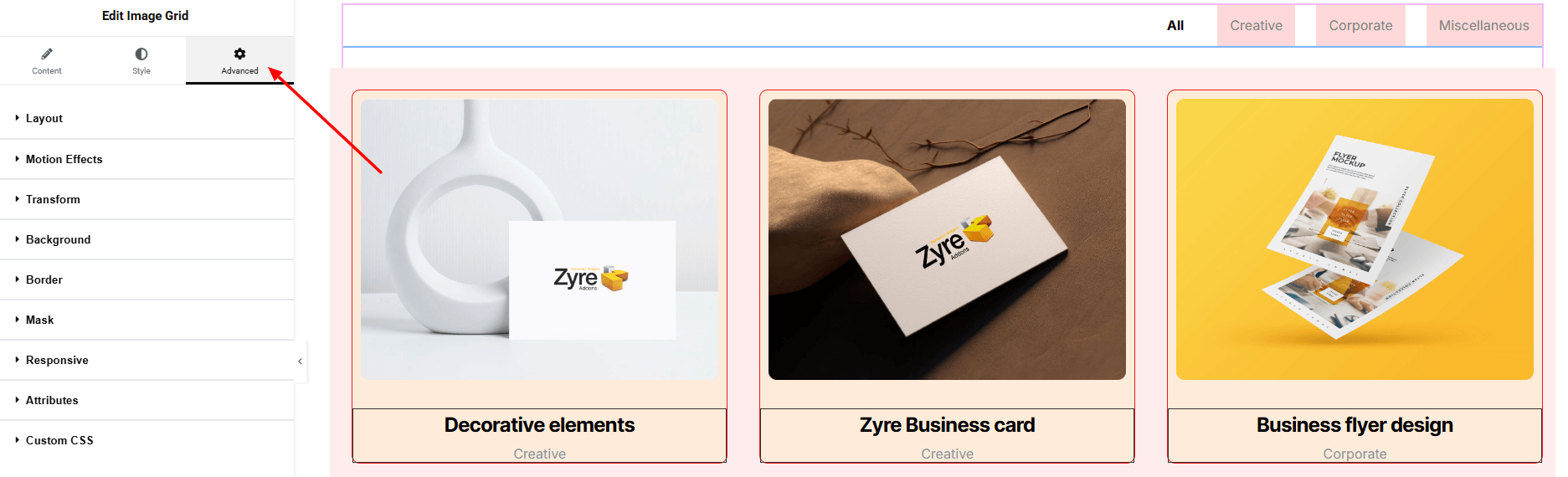
Step 4: Advance tab
If you want to customize the layout, backgrounds, or make your design more engaging, head over to the Advanced section. The Advanced panel is a default Elementor feature. Check out this document to learn more about its features.
Finally, hit the Publish button and watch your stunning Image Grid come to life on your webpage!
Everything’s in place!