
Info Box
Step-by-Step Tutorial on Using the Info Box Widget of Zyre Addon
The Info box Widget of Zyre Addon combines functionality with style, ensuring your website is both informative and visually captivating. With sleek layouts, unique effects, and complete customization, it transforms simple lists into impactful design elements.
Learn How To Use Info Box Widget:
Exploring the Features of Info Box Widget
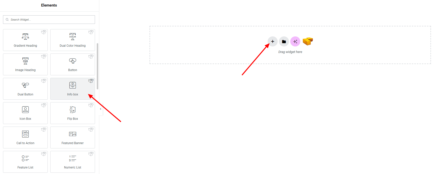
Step 1: Drag the widget
From the left panel, search or choose the Info Box of Zyre Addon and simply drag it into your desired section.
Step 2: Content tab
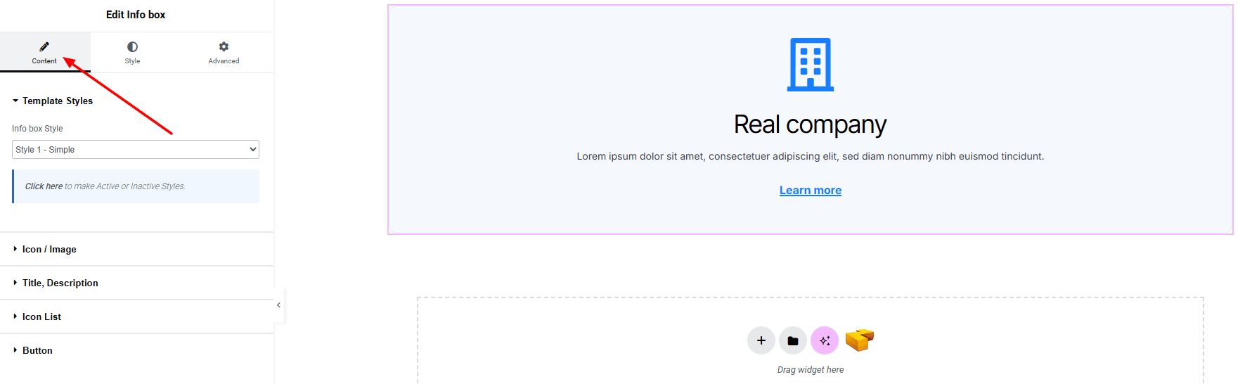
Template Styles:
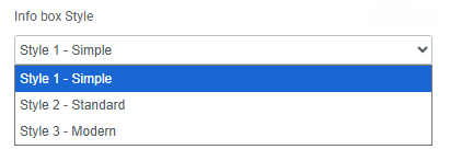
- Info Box Style : You can choose a predefined style from here
Icon/ Image:
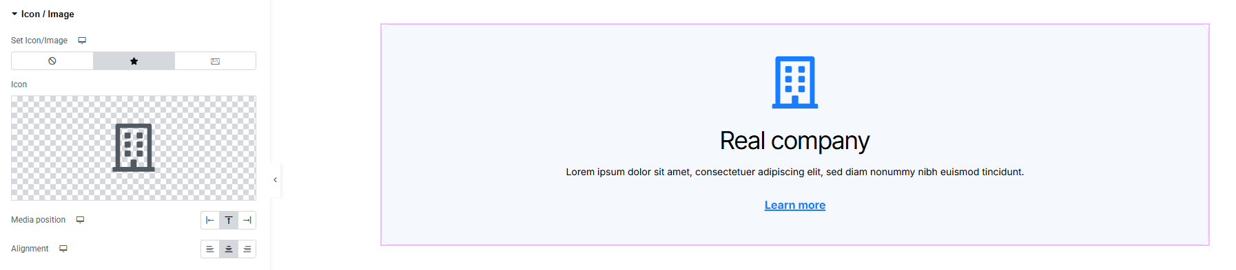
- Set icon/image : Set icon or image for info box.
- Media Position : Set the position of the image/icon.
- Alignment : Set the alignment of the icon/image.
Title, Description:
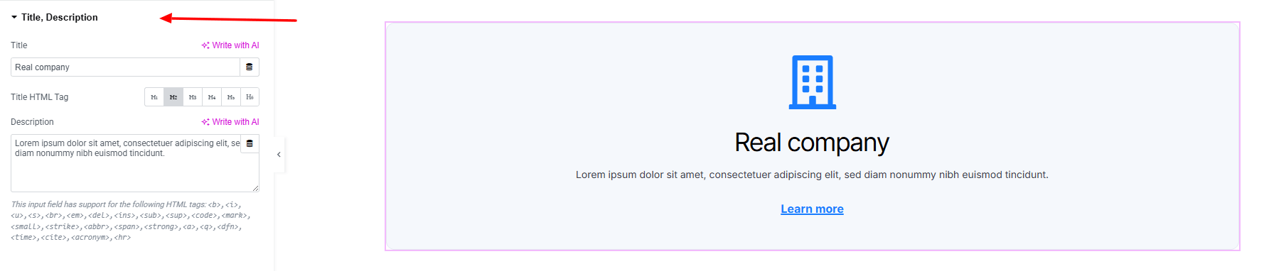
- Title : Add a title.
- Title HTML Tag : Choose the HTML tag for title.
- Description : Add a description.
Icon List:
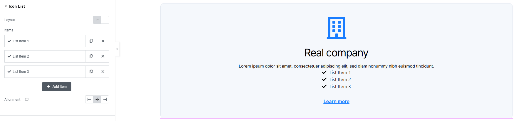
- Layout : Choose layout between inline or block.
- Items : Add items on the info box.
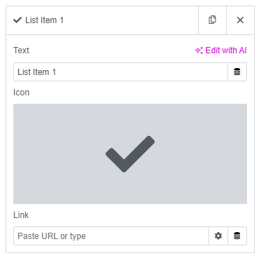
- Text : Set text for list item.
- Icon : Set a icon from icon library.
- Link : Set URL on each list item.
- Alignment : Set icon list alignment.
Button:
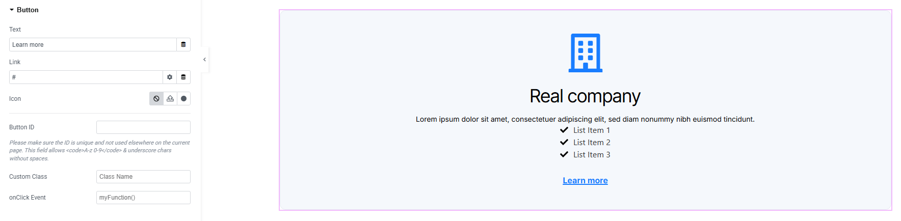
- Text : Add text of the button
- Link : Add a link to the button
- Icon : Set an icon (including SVG)
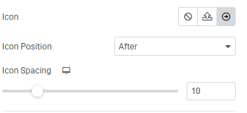
- Icon Position : Adjust the icon’s position (before/after text)
- Icon Spacing : Control the space between icon and text
- Button ID : Assign a unique ID to the button.
- Custom Class : Add custom CSS class.
- Onclick Event : Set a JavaScript action on button click.
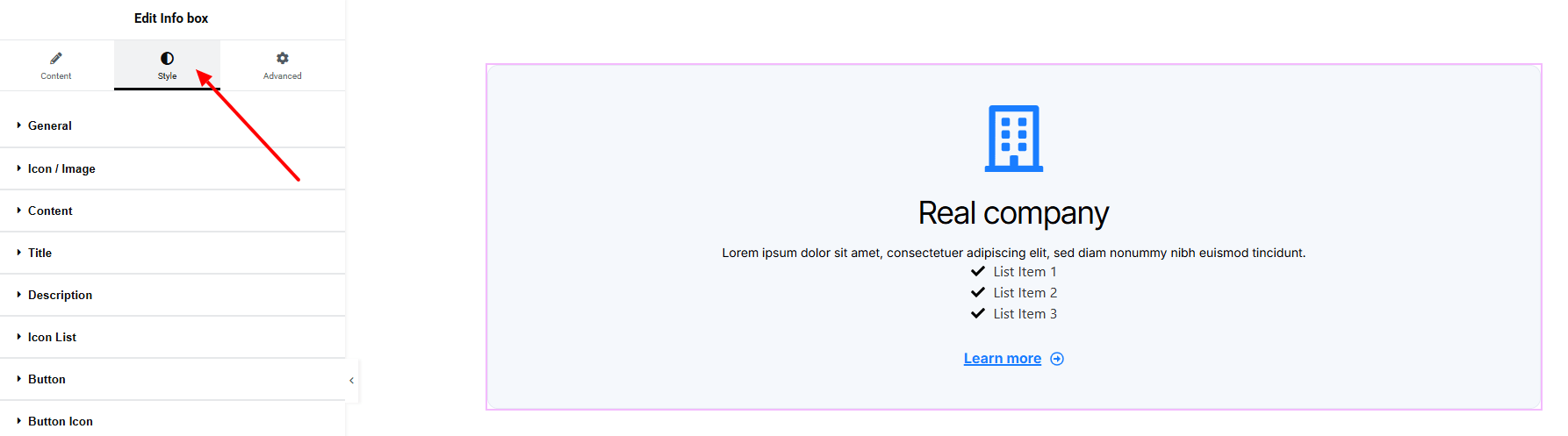
Step 3: Style tab
In the Style section, you can customize the General, Icon/image, Content, Title, Description, Icon list, Button, Button Icon — but make sure you have added them first.
General:
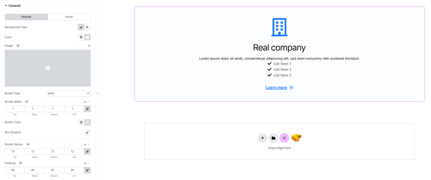
- For both normal and hover states:
- Background Type : Set background colors or gradients or image. Explore full background settings here.
- Border Type : Define border style, width, and color.
- Box Shadow : Apply drop shadow, with separate settings for hover interaction.
- Border Radius : Apply rounded corners to each item.
- Padding : Add inner space.
Icon/Image:
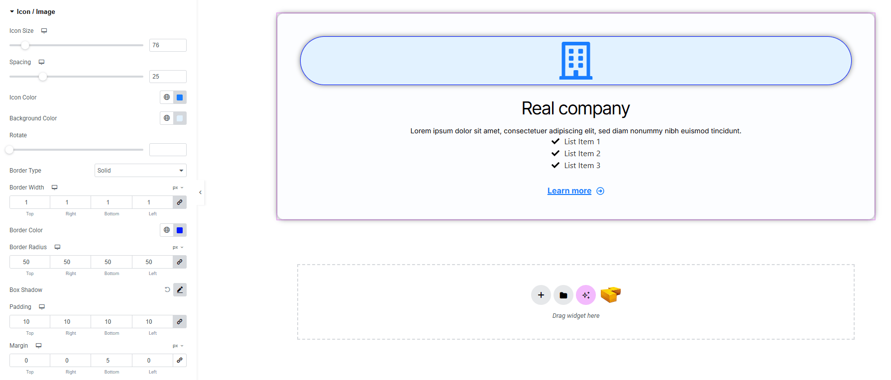
- Icon Size : Adjust the size of the icon.
- Spacing : Adjust the spacing between the icon and other contents.
- Icon color : Set the icon color.
- Background color : Set the background color of the icon/image. Explore full background settings here.
- Rotate : Rotate the icon/image to a custom angle.
- Border Type : Define border style, width and color.
- Border Radius : Control corner roundness.
- Box Shadow : Apply drop shadow of the icon box.
- Padding : Add inner spacing of the element.
- Margin : Add outer spacing of the element.
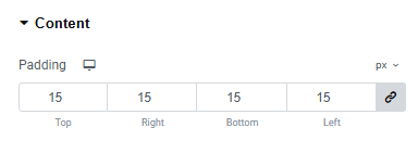
Content:
- Padding : Adjust inner spacing around content area.
Title:
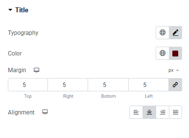
- Typography : Adjust font family, size, weight, transform, style, decoration, line height, letter spacing, and word spacing. Explore full typography settings here.
- Text Color : Set the Title text color.
- Margin : Add outer spacing of the title.
- Alignment : Set alignment of the title.
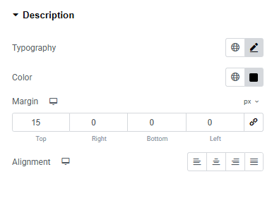
Description:
You’ll find the same design options for the Description as in the Title — giving you full freedom to style it just the way you imagine.
Icon List:
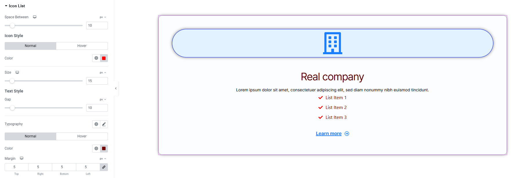
- Space Between : Space between each icon list.
Icon Style
- Color : Set icon colors for normal and hover states.
- Size : Adjust the icon size.
Text Style
- Gap : Adjust gap between icon and text.
- Typography : Adjust font family, size, weight, transform, style, decoration, line height, letter spacing, and word spacing. Explore full typography settings here.
- Color : Set text color.
- Margin : Add outer spacing of the icon list item.
Button:
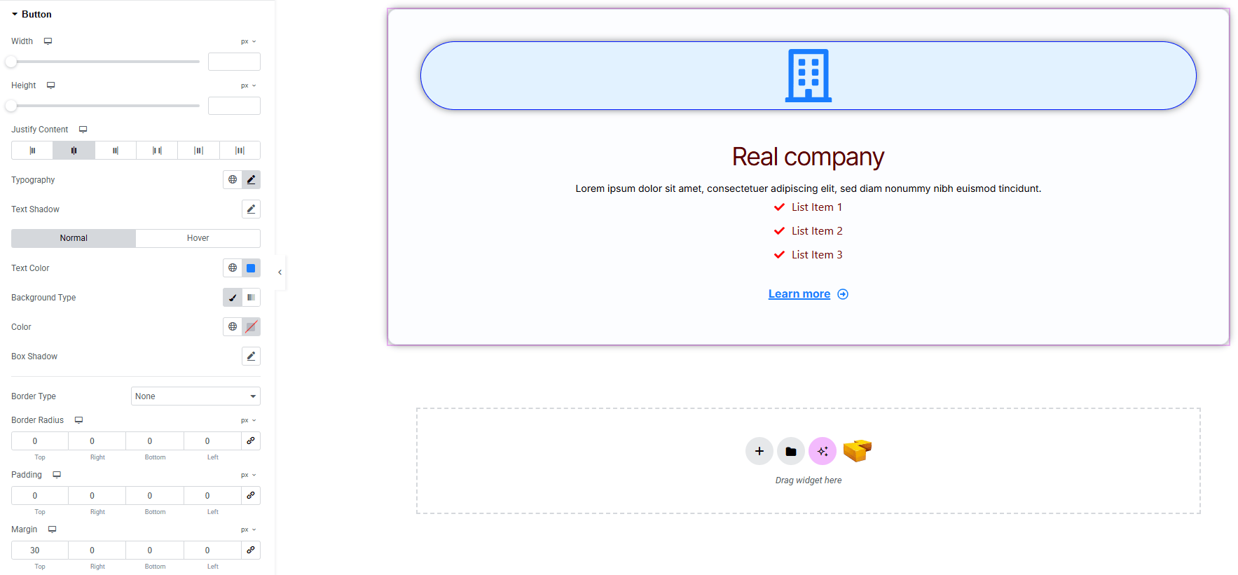
- Width : Set the overall button width.
- Height : Define the button height.
- Justify Content : Control the alignment of button content.
- Typography : Adjust font family, size, weight, transform, style, decoration, line height, letter spacing, and word spacing. Explore full typography settings here.
- Text Shadow : Apply shadow effect to the button text.
- For both normal & hover States:
- Text Color : Set button text color
- Background Type : Choose solid, gradient, or image background
- Box Shadow : Add drop shadow effects for both normal and hover states.
- Border Type : Define border style, width and color.
- Border Radius : Control corner roundness.
- Padding : Control inner spacing of the button.
- Margin : Adjust outer spacing around the button.
Button Icon:
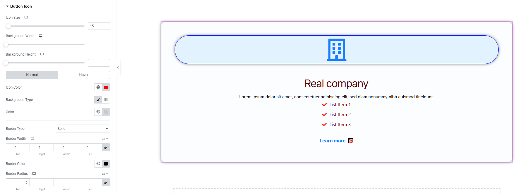
- Icon Size : Adjust the size of the button icon.
- Background Width & Height : Define the dimensions of the icon container.
- For both Normal & Hover States:
- Icon Color : Choose the icon color for normal and hover states.
- Background Type : Set background colors or gradients. Explore full background settings here.
- Border Type : Define border style, width and color.
- Border Radius : Control corner roundness.
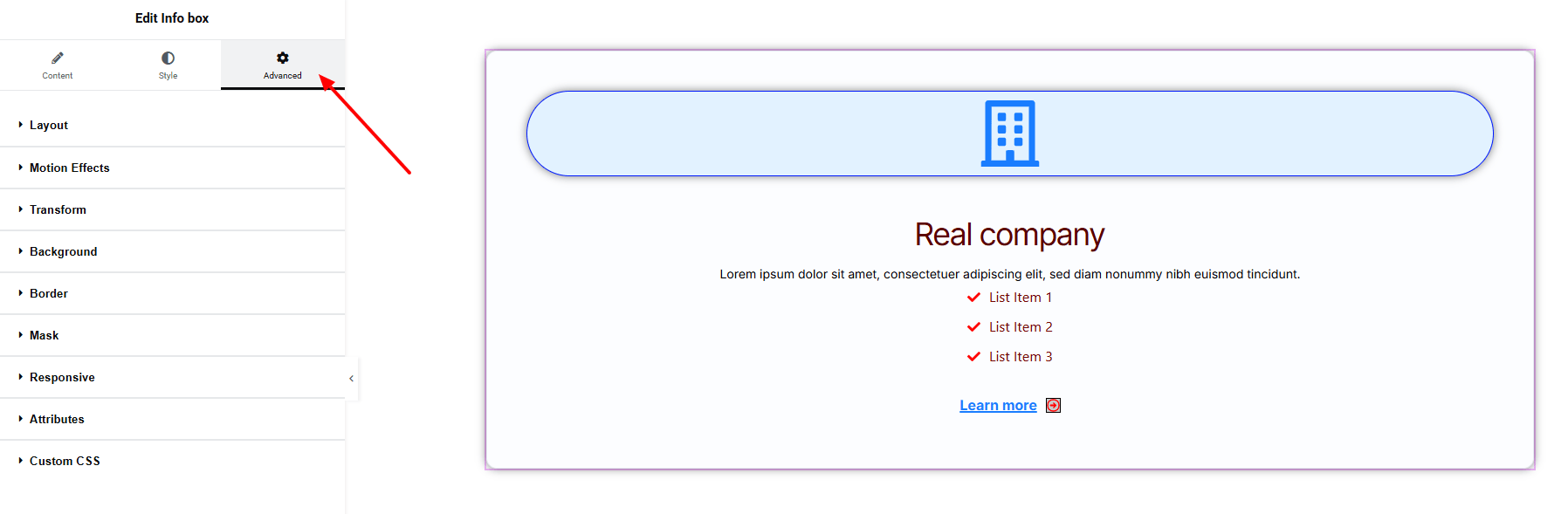
Step 4: Advance tab
If you want to customize the layout, backgrounds, or make your design more engaging, head over to the Advanced section. The Advanced panel is a default Elementor feature. Check out this document to learn more about its features.
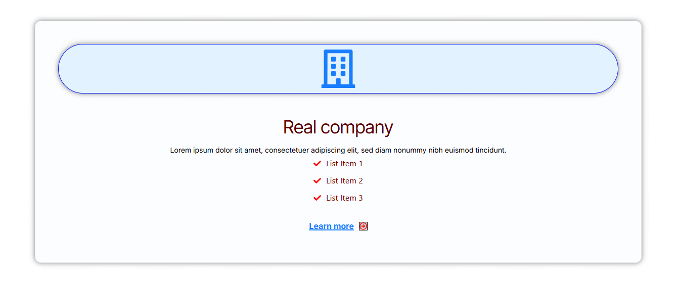
Finally, hit the Publish button and watch your stunning Info Box come to life on your webpage!
That’s a wrap — you’re ready!