
Logo Carousel
Step-by-Step Tutorial on Using the Image Carousel Widget of Zyre Addon.
With Zyre Addon’s logo Carousel Widget, you can showcase multiple logos in a sleek, interactive slider. From product galleries to portfolio showcases, this widget lets you control navigation, autoplay, and styling—turning simple images into an engaging scrolling experience.
Learn How To Use Logo Carousel Widget:
Exploring the Features of Logo Carousel Widget.
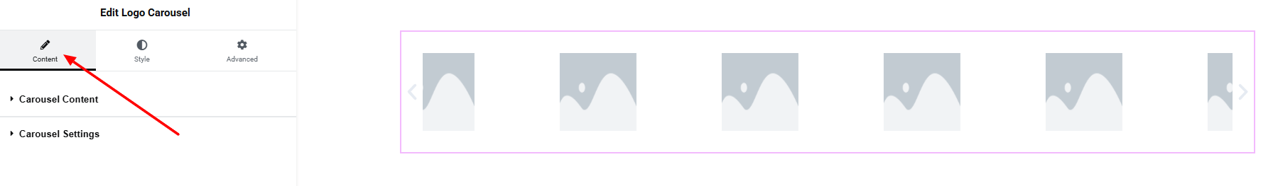
Step 1: Drag the widget
From the left panel, search or choose the logo Carousel of Zyre Addon and simply drag it into your desired section.
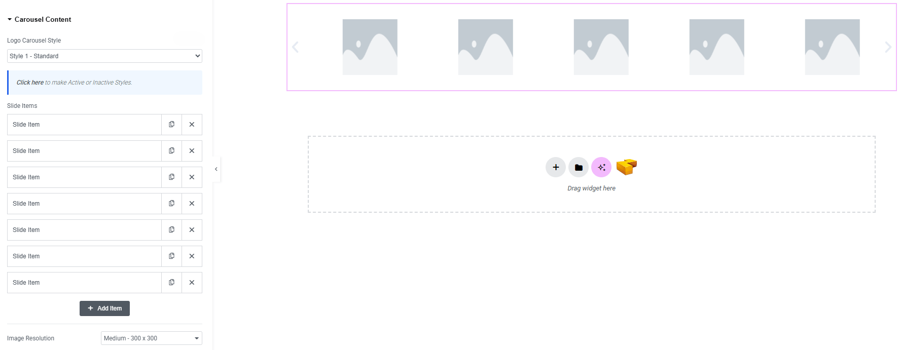
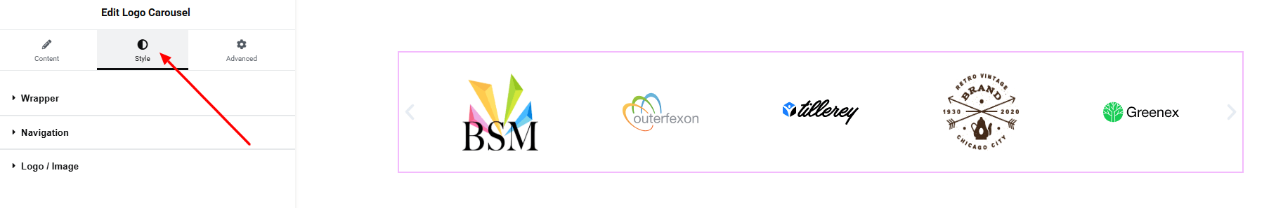
Step 2: Content tab
Carousel Content:
- Image Carousel Style : Currently only one style is available here.
- Slide Item : Create and manage multiple slide items.
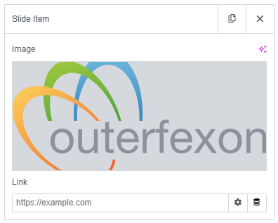
- Image : Upload a custom image.
- Link : Set URL for the logo carousel item.
- Image Resolution : Control the quality of list images.
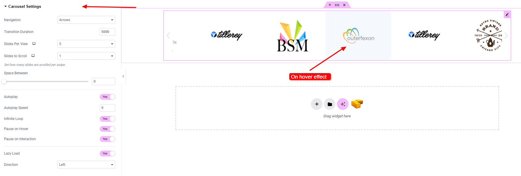
Carousel Settings:
- Navigation : Choose how users navigate between slides (arrows, pagination, both, or none).
- Transition Duration : Control the speed of slide transitions.
- Slides per View : Set how many slides are visible at once.
- Slides to Scroll : Set how many slides are scrolled per swipe.
- Space Between : Adjust the gap between slides.
- Autoplay : Enable automatic slide transitions.
- Autoplay Speed : Set the time interval for autoplay.
- Infinite Loop : Loop slides continuously without stopping.
- Pause on Hover : Stop autoplay when the user hovers over the carousel.
- Pause on Interaction : Stop autoplay when interacting with the carousel.
- Lazy Load : Load images only when needed to improve performance.
- Direction : Choose the slide direction (left, right).
Step 3: Style tab
In the Style section, you can customize the Wrapper, Navigation, Logo/Image – but make sure you have added them first.
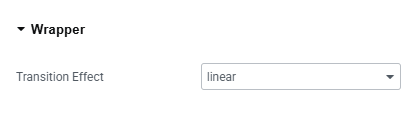
Wrapper:
- Transition Effect : Choose the animation effect used when slides change (e.g., slide, fade).
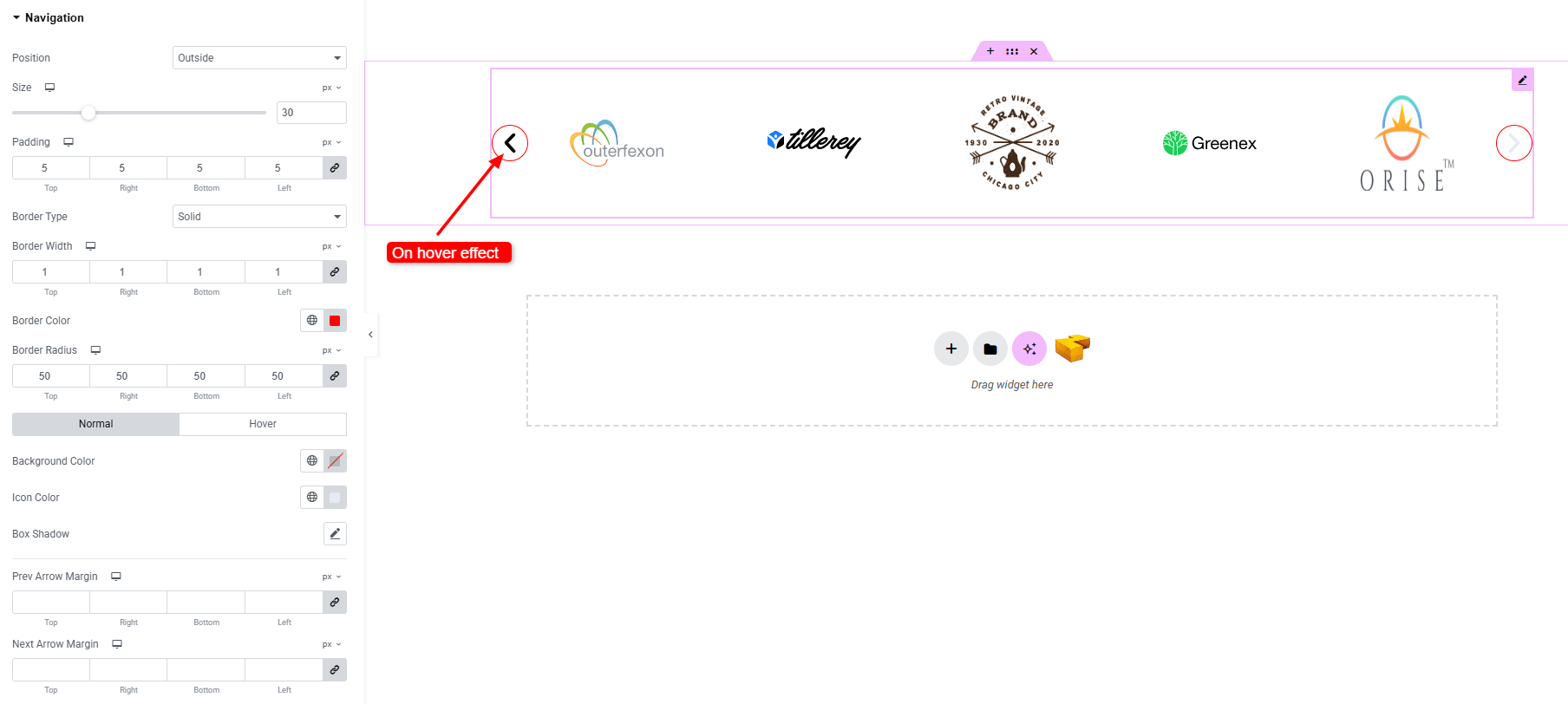
Navigation:
- Position : Set the placement of navigation arrows (outside, inside)
- Size : Adjust the overall arrow size.
- Padding : Control spacing inside the navigation arrows.
- Border Type : Customize border style, width, and color.
- Border Radius : Round the corners of the arrows area.
- Normal & Hover States –
- Background Color : Choose arrow background color.
- Icon Color : Set arrow icon color.
- Box Shadow : Apply drop shadow effects.
- Prev Arrow Margin : Adjust spacing around the previous arrow.
- Next Arrow Margin : Adjust spacing around the next arrow.
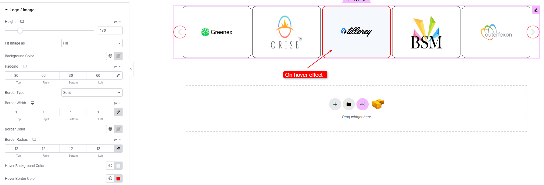
Logo/Image:
- Height : Set the height of the logo or image.
- Fit Image As : Control how the image fits inside its container (cover, contain, fill, etc.).
- Background Color : Set unique background colors or gradients.
- Padding : Adjust inner spacing within the item content.
- Border Type : Customize border style, width, and color.
- Border Radius : Adjust corner roundness of the image.
- Hover Background Color : Set each item’s background color on hover state.
- Hover Border Color : Set each item’s border color on hover state.
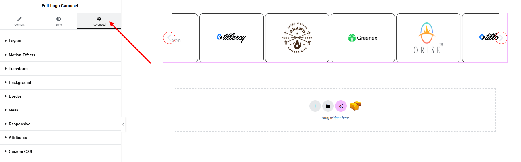
Step 4: Advance tab
If you want to customize the layout, backgrounds, or make your design more engaging, head over to the Advanced section. The Advanced panel is a default Elementor feature. Check out this document to learn more about its features.
Finally, hit the Publish button and watch your stunning logo Carousel come to life on your webpage!
That’s a wrap — you’re ready!