
Post Grid
Step-by-Step Tutorial on Using the Post Grid Widget of Zyre Addon
The Post Grid Widget of Zyre Addon combines functionality with style, ensuring your website is both informative and visually captivating. With sleek layouts, unique effects, and complete customization, it transforms simple lists into impactful design elements.
Learn How To Use Post Grid Widget:
Exploring the Features of Post Grid Widget.
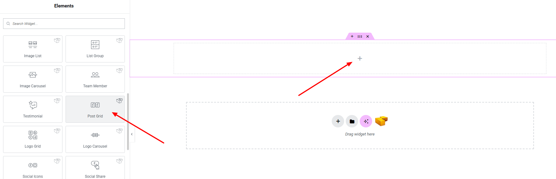
Step 1: Drag the widget
From the left panel, search or choose the Post Grid of Zyre Addon and simply drag it into your desired section.
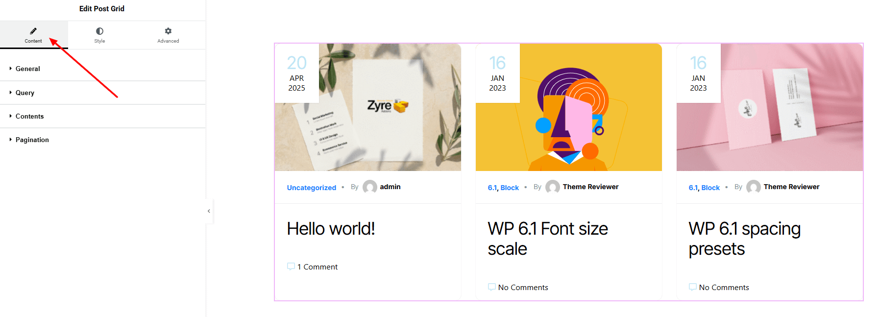
Step 2: Content tab
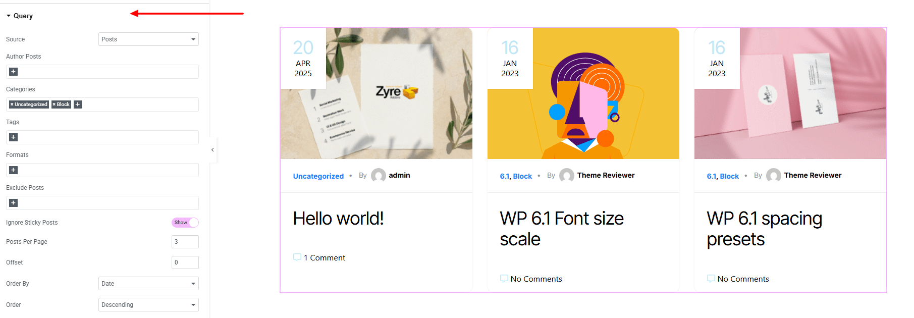
On content tab here it has General, Query, Contents and Pagination
General:
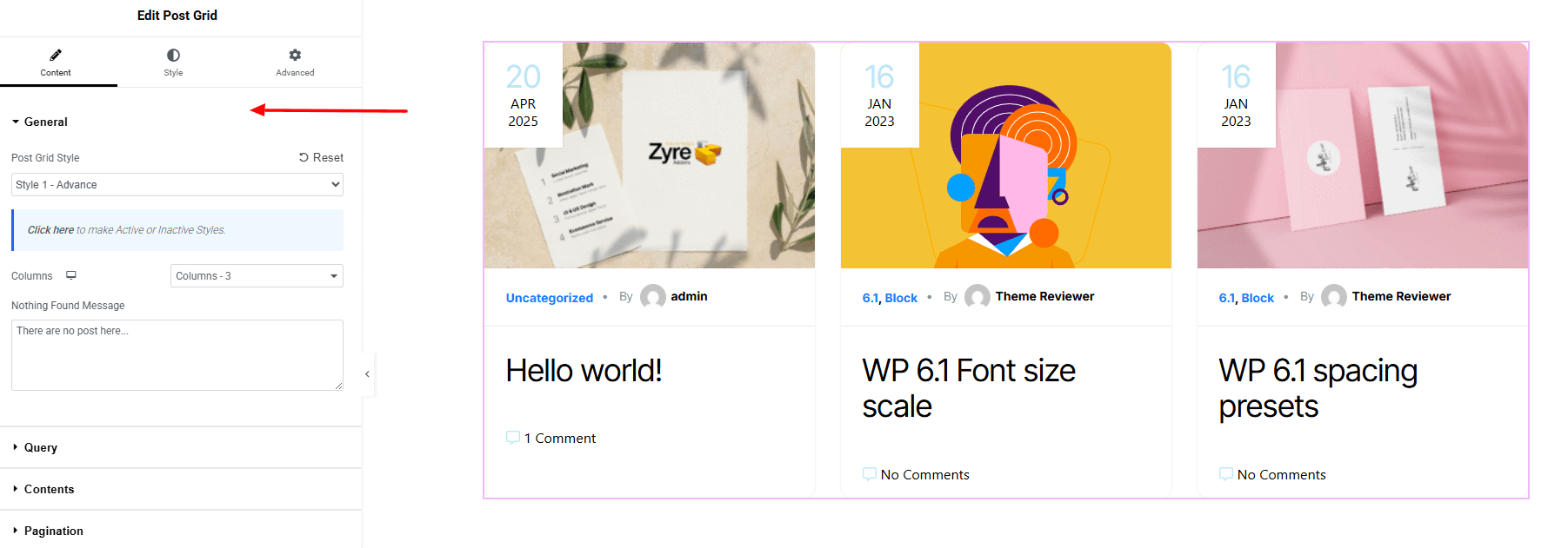
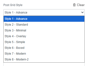
- Archive Posts Style : You can choose a predefined style from here
- Columns : Set the number of columns to display posts in a grid layout.
- Nothing Found Message : Customize the message shown when no posts are available in the post grid.
Query:
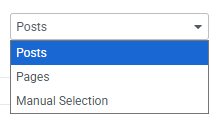
- Source : Choose the content source (Posts, Pages, or Manual Selection).
- Author Posts : Display posts from specific authors.
- Categories : Filter posts by selected categories.
- Tags : Show posts associated with certain tags.
- Formats : Filter posts by post formats.
- Exclude Posts : Remove specific posts from the grid.
- Ignore Sticky Posts – Choose whether to include or skip sticky posts.
- Posts Per Page : Set the number of posts displayed per page.
- Offset : Skip a defined number of posts before displaying results.
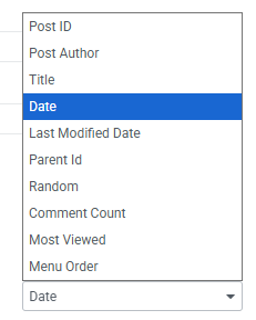
- Order By : Choose the sorting criteria.
- Order : Set display order (Ascending or Descending).
Contents:
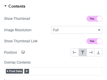
- Show Thumbnail : Enable or disable the post thumbnail display.
- Image Resolution : Choose the image size or resolution for thumbnails.
- Show Thumbnail Link : Make the thumbnail clickable and linked to the post.
- Position : Set the position of the thumbnail (e.g., top, left, right).
- Overlay Contents : set the contents that will show on the overlay.
Header Meta:
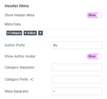
- Show Header Meta : Enable or disable the display of header meta info.
- Meta Data : Choose which meta elements to show (author, date, category, etc).
- Author Prefix : Set custom text before the author’s name.
- Show Author Avatar : Display or hide the author’s avatar.
- Category Separator : Define the symbol or text used to separate multiple categories.
- Category Prefix : Set custom text before category names.
- Meta Separator : Choose the separator between different meta elements.
- Display : set the header meta before or after content body.
Post Date:
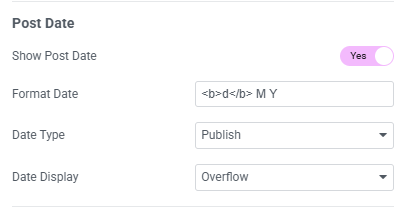
- Show Post Date : Enable or disable the display of the post date.
- Format Date : Choose the format for displaying the date (e.g., d/m/Y).
- Date Type : Select which date to show (published, modified).
- Date Display : Control how the date appears (overflow, normal).
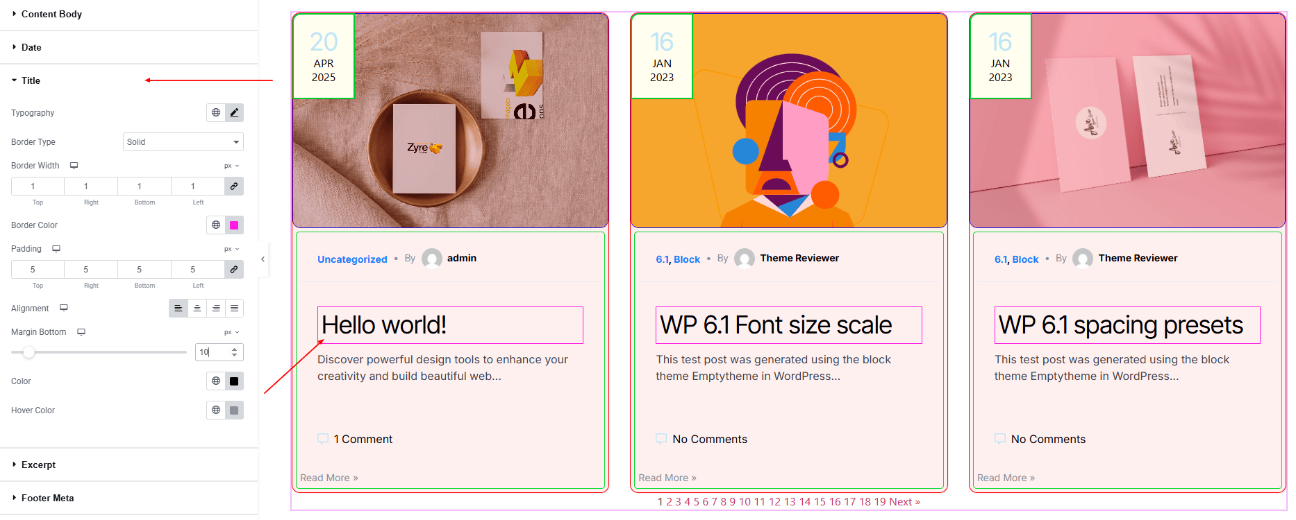
Title:
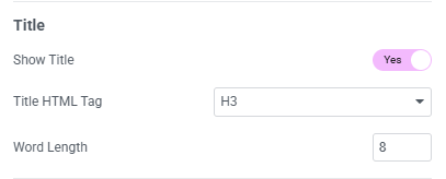
- Show Title : Enable or disable the display of the post title.
- Title HTML Tag : Choose the heading tag for the title.
- Word Length : Set the maximum number of words shown in the title.
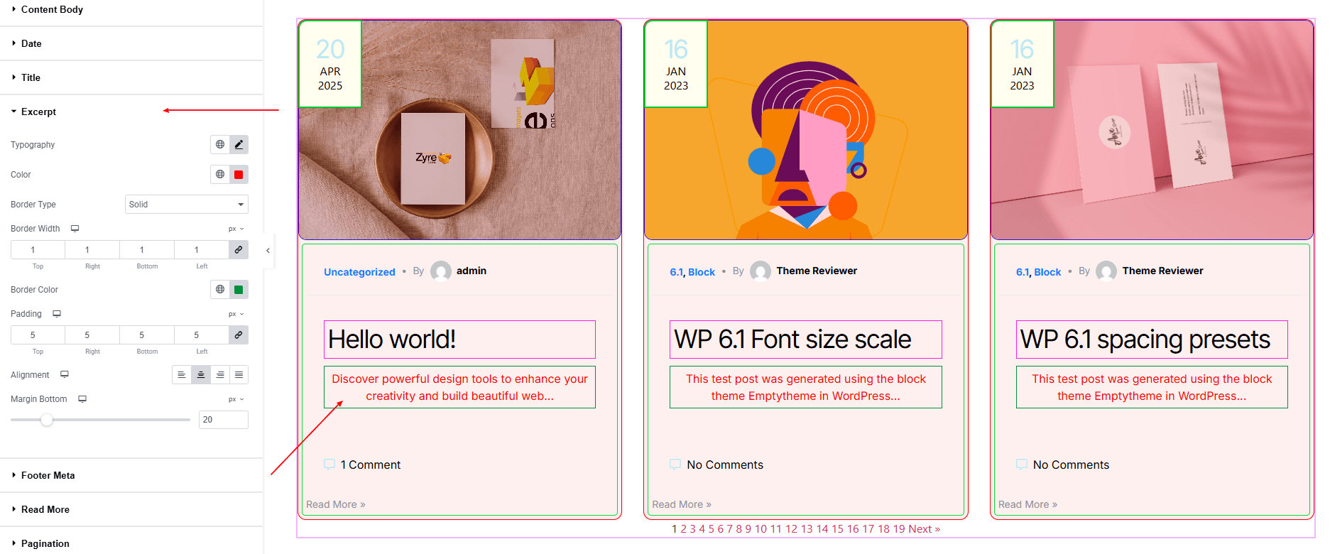
Excerpt:
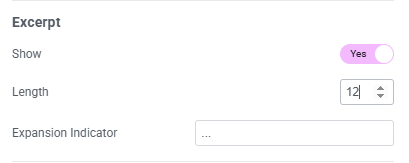
- Show : Enable or disable the post excerpt display.
- Length : Set the number of words to display in the excerpt.
- Expansion Indicator : Choose the text or symbol (e.g., “…”) that appears after the excerpt.
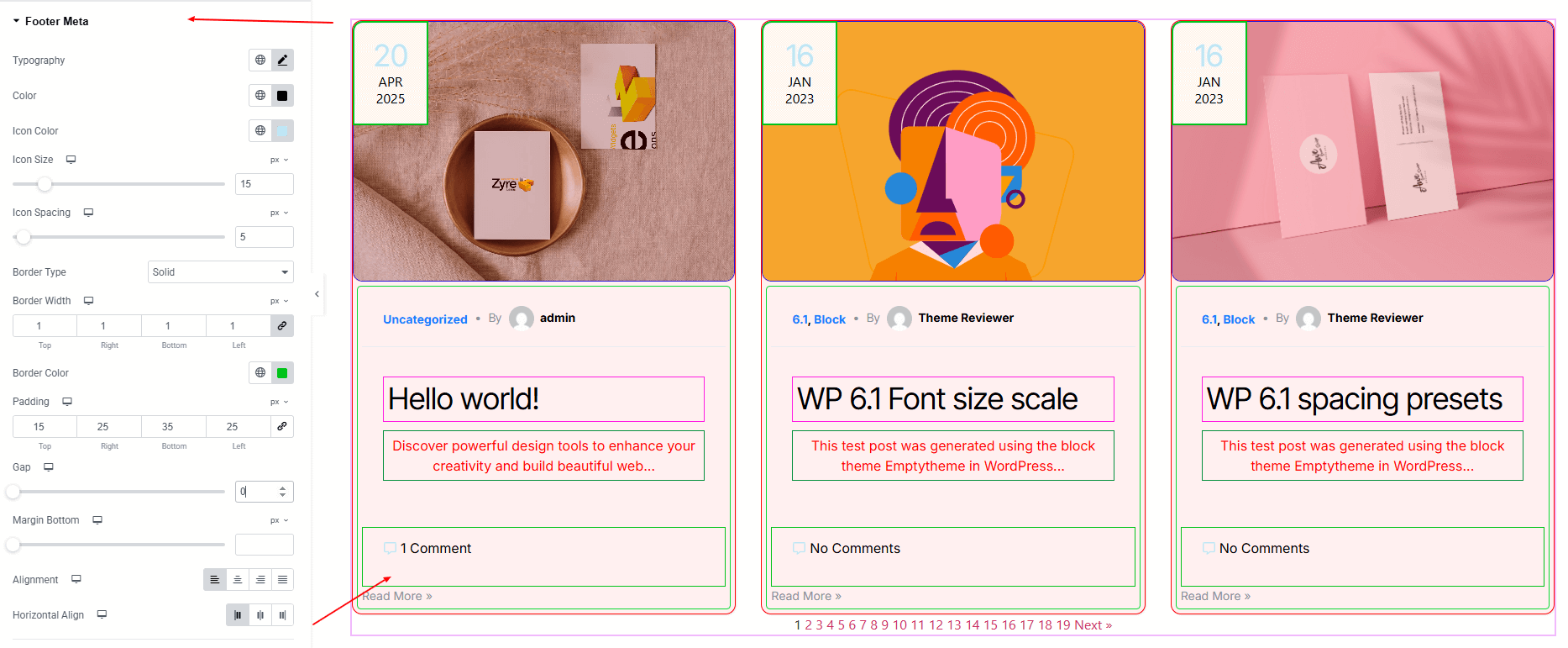
Footer Meta:
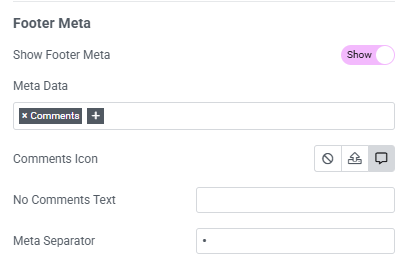
- Show Footer Meta : Enable or disable the display of footer meta info.
- Meta Data : Select which meta elements to display (comments, tags, etc.).
- Comments Icon : Show or hide an icon alongside the comments count.
- No Comments Text : Set custom text to display when there are no comments.
- Meta Separator : Define the separator between different footer meta elements.
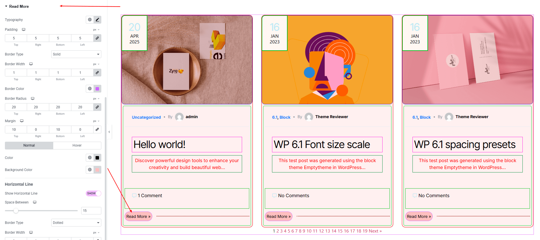
Read More:
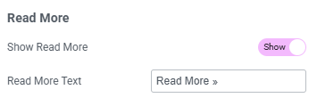
- Show Read More : Enable or disable the “Read More” link/button.
- Read More Text : Customize the text for the read more link (e.g., “Read More”).
- Content Display : Choose how the read more appears (normal, overflow).
Pagination:
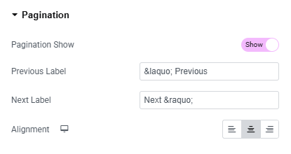
- Pagination Show : Turn pagination on or off.
- Previous Label : Set custom text for the “Previous” button.
- Next Label : Set custom text for the “Next” button.
- Alignment : Control the pagination alignment (left, center, or right).
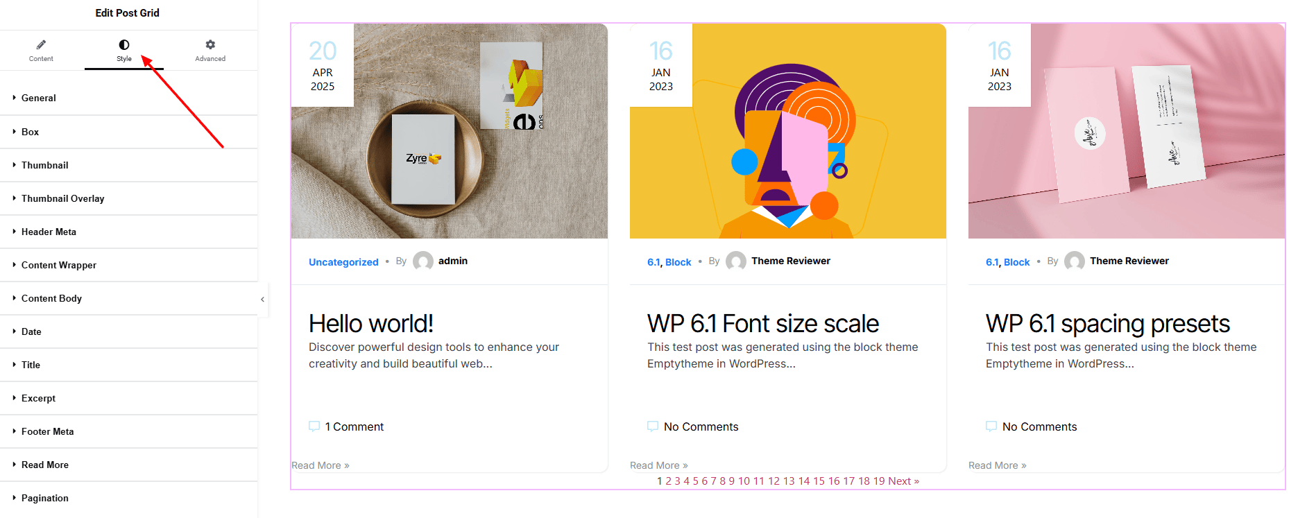
Step 3: Style tab
In the Style section, you can customize the General, Box, Thumbnail, Header Meta, Content Body, Date, Title, Excerpt, Footer Meta, Read More, Pagination — but make sure you have added them first.
General:
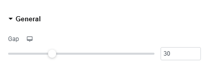
- Gap : Set the spacing between post columns or Rows.
Box:
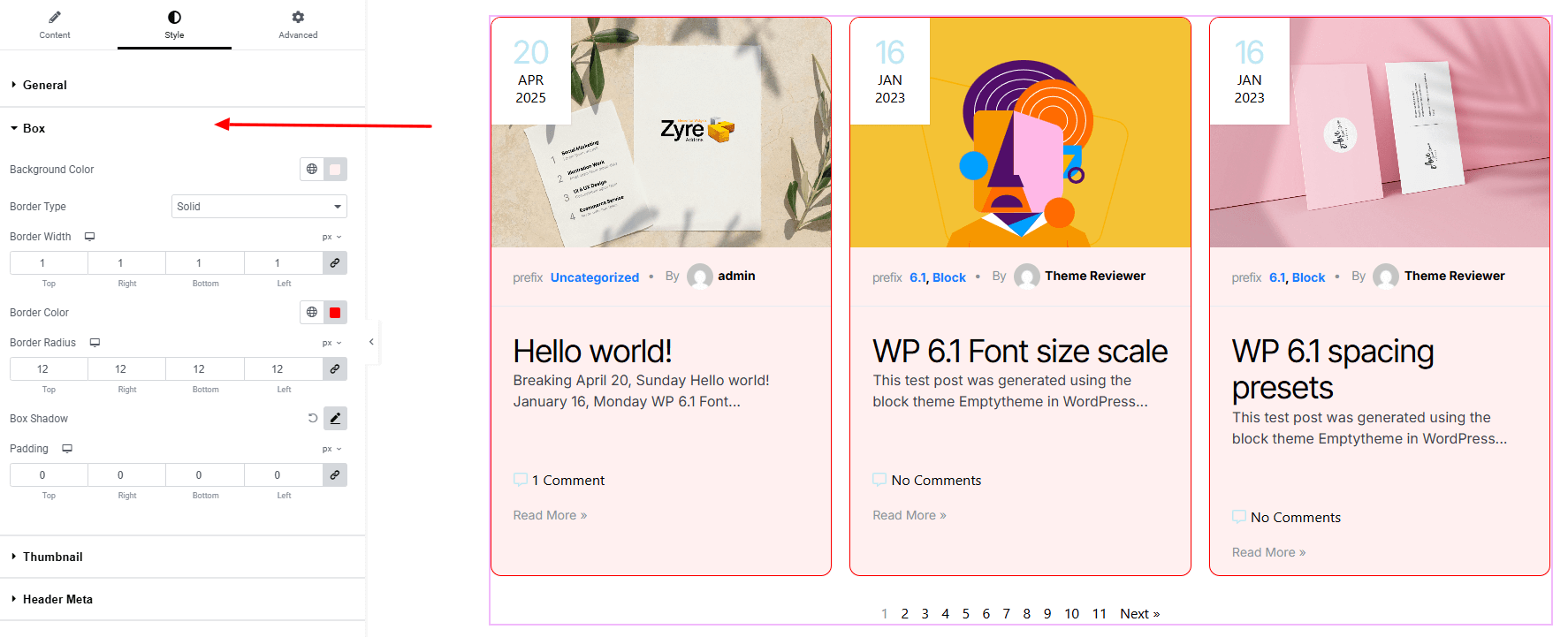
- Background Color : Set background color on each post. Explore full background settings here.
- Border Type : Define border style, width, and color.
- Border Radius : Control corner roundness.
- Box Shadow : Apply drop shadow on each post.
- Padding : Add inner spacing to balance text and visuals.
Thumbnail:
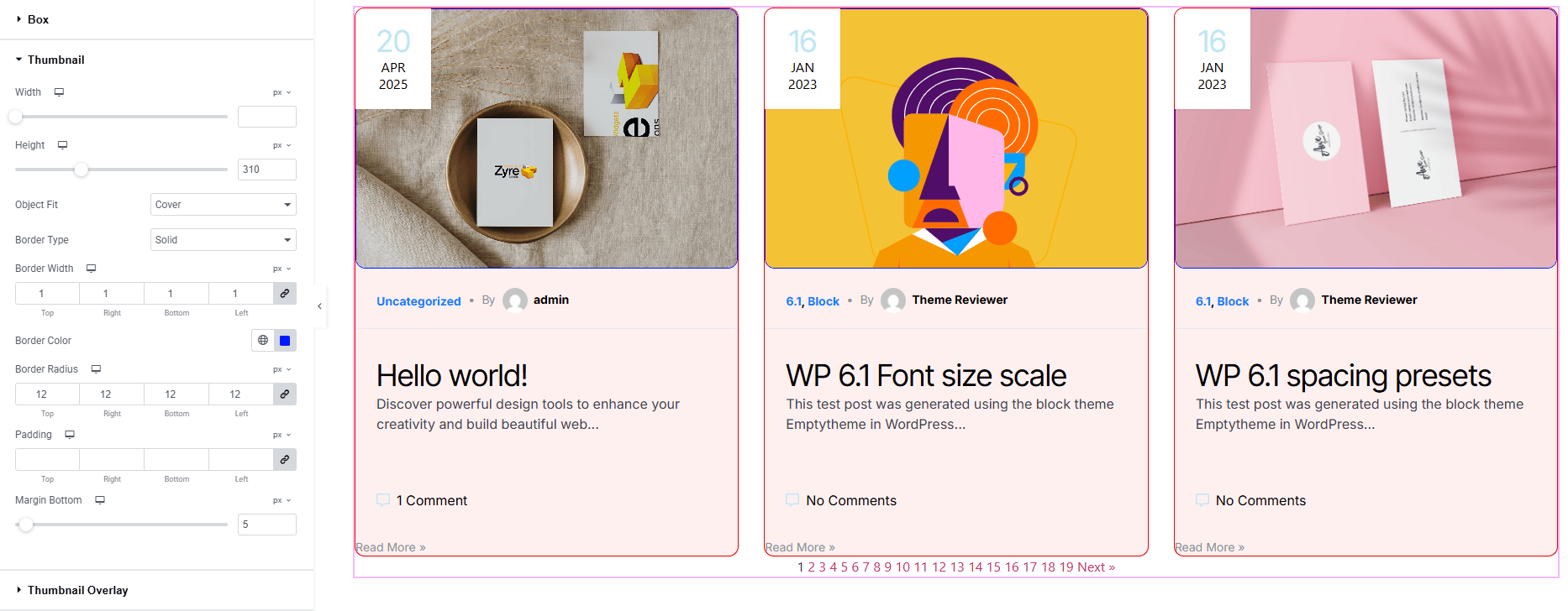
- Width : Set the width of the thumbnail.
- Height : Define the height of the thumbnail.
- Object Fit : Choose how the image fits within the thumbnail area.
- Border Type : Define border style, width, and color.
- Border Radius : Control corner roundness.
- Padding : Adjust the inner spacing around the thumbnail.
- Margin Bottom : Control the outer spacing on bottom of the thumbnail.
Thumbnail Overlay:
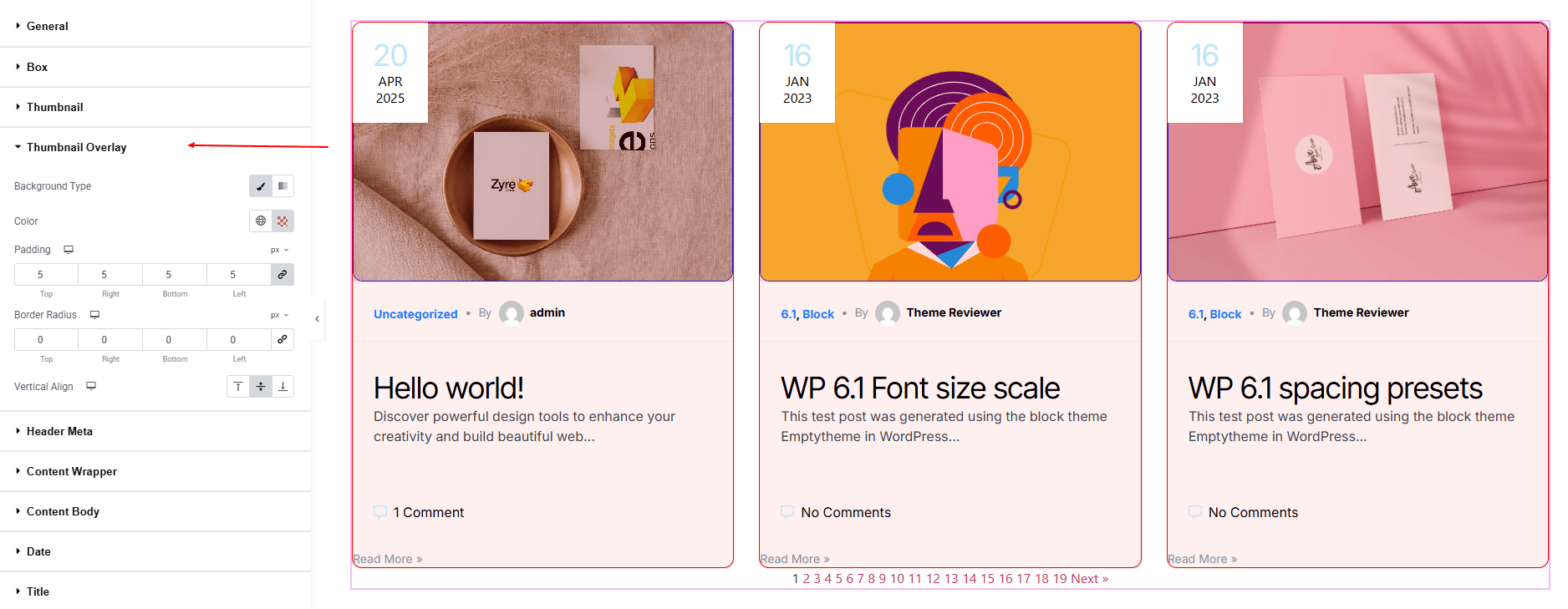
- Background Type : Set the thumbnail overlay background. Explore full background settings here.
- Padding : Adjust inner spacing inside the container.
- Border Radius : Round the corners of the container.
- Vertical Align : Align the meta content vertically.
Header Meta:
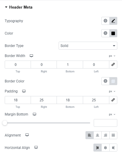
- Typography : Here you can customize the font family, size, weight, transform, style, decoration, line height, letter spacing, and word spacing for your text. Explore full typography settings here.
- Color : Set the text color for meta elements.
- Border Type : Define border style, width, and color.
- Padding : Adjust inner spacing inside the post meta container.
- Margin Bottom : Control the spacing below the section.
- Alignment : Align the meta text (left, center, right, justify)
- Horizontal Align : Align the meta content horizontally (left, center, right).
Avatar:
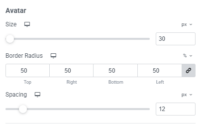
- Size : Adjust the width and height of the author avatar.
- Border Radius : Round the corners of the avatar.
- Spacing : Control the gap between the avatar and avatar text.
Prefix:
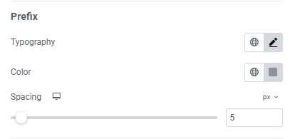
- Typography : Here you can customize the font family, size, weight, transform, style, decoration, line height, letter spacing, and word spacing for your text. Explore full typography settings here.
- Color : Set the color for both normal and hover states.
- Spacing : Control the distance between prefix and following content.
Separator:
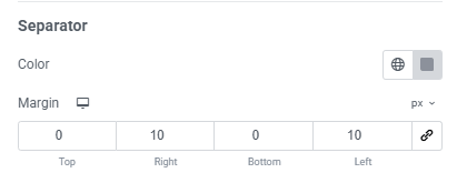
- Color : Set the color of the separator.
- Margin Bottom : Control the spacing around the section.
Link Colors:

- Color : Set the color of the link
- Hover Color : Set the link color on hover.
Content Wraper:
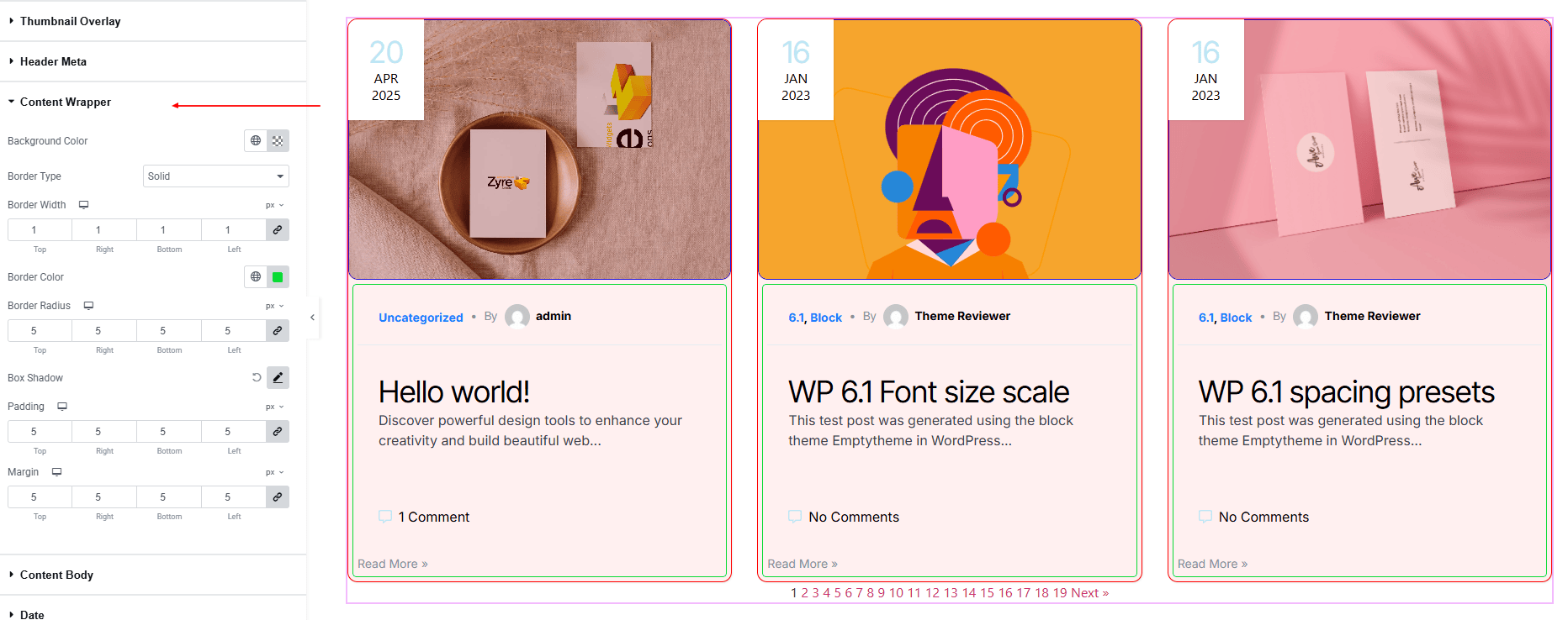
- Background Color : Set the date container background. Explore full background settings here.
- Border Type : Define border style, width, and color.
- Border Radius : Round the edges of the date container.
- Box Shadow : Add drop shadow effects.
- Padding : Adjust inner spacing inside the content body.
- Margin : Adjust spacing outside of the content body.
Content Body:
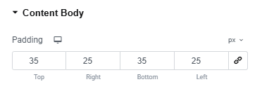
- Padding : Adjust inner spacing inside the content body.
Date:
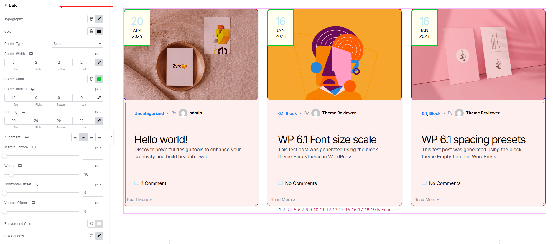
- Typography : Here you can customize the font family, size, weight, transform, style, decoration, line height, letter spacing, and word spacing for your text. Explore full typography settings here.
- Color : Set the text color.
- Border Type : Define border style, width, and color.
- Border Radius : Round the edges of the date container.
- Padding : Manage inner spacing.
- Alignment : Align the date section.
- Margin Bottom : Control spacing below the date.
- Width : Set fixed width for the date box.
- Horizontal Offset : Shift the date’s horizontal position precisely.
- Vertical Offset : Shift the date’s vertical position precisely.
- Background Color : Set the date container background. Explore full background settings here.
- Box Shadow : Add drop shadow effects.
HTML b Tag/Element : Make sure you added HTML b Tags in “Format Date” input. e.g. <b>d</b> M Y
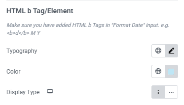
- Typography : Here you can customize the font family, size, weight, transform, style, decoration, line height, letter spacing, and word spacing for your text. Explore full typography settings here.
- Color : Set text color.
- Display Type : Set display type (Block, Inline)
Title:
- Typography : Here you can customize the font family, size, weight, transform, style, decoration, line height, letter spacing, and word spacing for your text. Explore full typography settings here.
- Border Type : Define border style, width, and color.
- Padding : Manage inner spacing.
- Alignment : Align the title section.
- Margin Bottom : Control spacing below title.
- Color : Set the color of the title.
- Hover Color : Set the title color on hover.
Excerpt:
- Typography : Here you can customize the font family, size, weight, transform, style, decoration, line height, letter spacing, and word spacing for your text. Explore full typography settings here.
- Color : Set the excerpt text color.
- Border Type : Define border style, width, and color.
- Padding : Manage inner spacing inside the excerpt box.
- Alignment : Align the excerpt text (left, center, right, justified).
- Margin Bottom : Adjust spacing below the excerpt.
Footer Meta:
- Typography : Here you can customize the font family, size, weight, transform, style, decoration, line height, letter spacing, and word spacing for your text. Explore full typography settings here.
- Color : Set the footer meta text color.
- Icon Color : Set the icon color of the footer meta section.
- Icon Size : Adjust the icon size.
- Icon Spacing : Adjust the space after the icon.
- Border Type : Define border style, width, and color.
- Padding : Manage inner spacing inside the footer meta.
- Gap : Manage spacing between each footer meta.
- Margin Bottom : Adjust spacing below the footer meta.
- Alignment : Align the meta text (left, center, right, justify)
- Horizontal Align : Align the meta content horizontally (left, center, right).
Prefix:
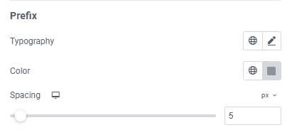
- Typography : Here you can customize the font family, size, weight, transform, style, decoration, line height, letter spacing, and word spacing for your text. Explore full typography settings here.
- Color : Set the prefix text color.
- Spacing : Control the space after the prefix text.
Separator:
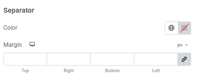
- Color : Set the color of the separator.
- Margin : Manage outer spacing of the separator.
Link Colors:
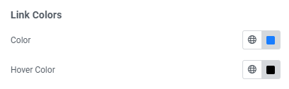
- Color : Set the color of the link
- Hover Color : Set the link color on hover.
Read More:
- Typography : Here you can customize the font family, size, weight, transform, style, decoration, line height, letter spacing, and word spacing for your text. Explore full typography settings here.
- Padding : Manage inner spacing inside the button.
- Border Type : Define border style, width, and color.
- Border Radius : Round the edges of the button container.
- Margin : Adjust spacing around the button.
- For both normal and hover states:
- Color : Set button text color.
- Background Color : Set background color of the button. Explore full background settings here.
Horizontal Line:
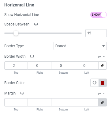
- Show Horizontal Line : Toggle for showing horizontal line
- Space Between : manage spacing between the lines.
- Border Type : Define border style, width, and color.
- Margin : Adjust spacing top the button.
Pagination:
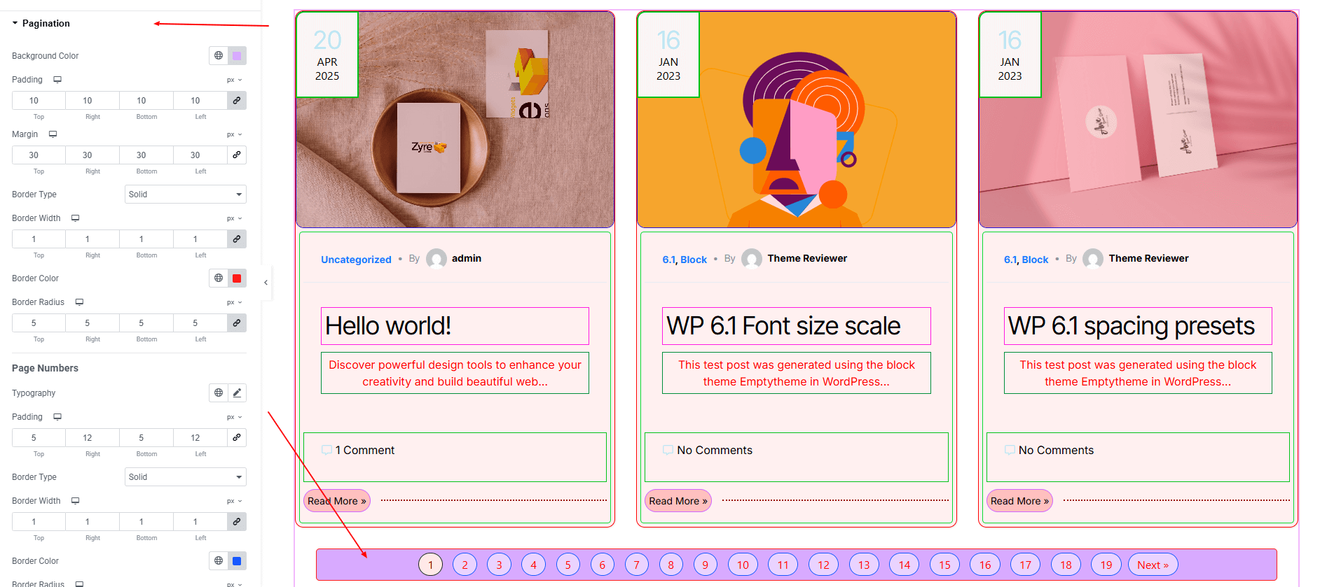
- Background Color : Set the pagination container background. Explore full background settings here.
- Padding : Manage inner spacing inside the pagination.
- Margin : Manage outer spacing outside the pagination.
- Border Type : Define border style, width, and color.
- Border Radius : Round the edges of the border container.
Page Numbers:
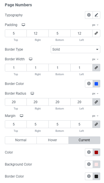
- Typography : Here you can customize the font family, size, weight, transform, style, decoration, line height, letter spacing, and word spacing for your text. Explore full typography settings here.
- Padding : Manage inner spacing inside the pagination page number.
- Border Type : Define border style, width, and color.
- Border Radius : Round the edges of the border container.
- Margin : Manage spacing outside the pagination page number.
- For both normal, hover & current states:
- Color : Set pagination page number color.
- Background Color : Set pagination background color of the page number. Explore full background settings here.
- Border Color : set border color for hover and current states
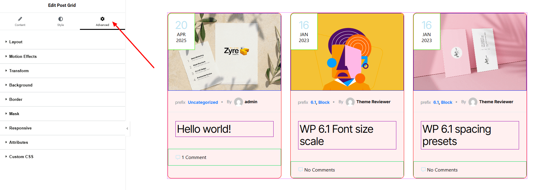
Step 4: Advance tab
If you want to customize the layout, backgrounds, or make your design more engaging, head over to the Advanced section. The Advanced panel is a default Elementor feature. Check out this document to learn more about its features.
Finally, hit the Publish button and watch your stunning post grid come to life on your webpage!
That’s a wrap — you’re ready!