
Subscription Form
Step-by-Step Tutorial on Using the Subscription Form Widget of Zyre Addon
With Zyre Addon’s Subscription Form Widget, you can create sleek and customizable signup forms to grow your email list. Style input fields, buttons, and layouts while integrating smoothly with your favorite email marketing tools.
Learn How To Use Subscription Form Widget:
Exploring the Features of Subscription Form Widget
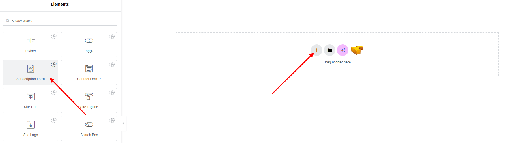
Step 1: Drag the widget
From the left panel, search or choose the subscription Form of Zyre Addon and simply drag it into your desired section.
Step 2: Content tab
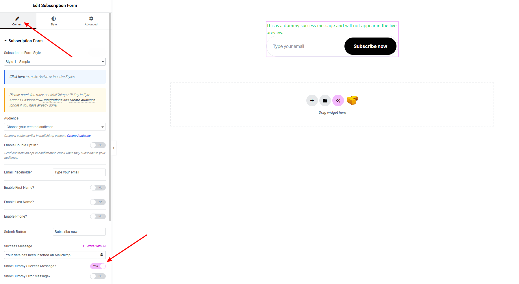
Subscription Form:
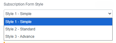
- Subscription Form Style : You can choose a predefined style from here
- Audience : Create a audience/list in mailchimp account Create Audience
- Enable Double Opt In? : Send contacts an opt-in confirmation email when they subscribe to your audience.
- Email Placeholder : Input text on the email placeholder.
- Email Field : Input the email on input field.
- Enable First Name? : Toggle to show or hide the first name field.
- Enable Last Name? : Toggle to show or hide the last name field.
- Enable Phone? : Toggle to show or hide the phone number field.
- Submit Button : Customize the text and style of the submission button.
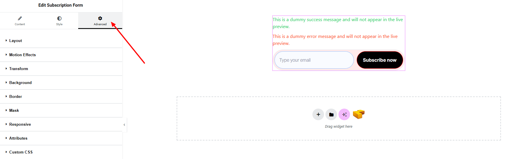
- Success Message : Set the message displayed after a successful subscription.
- Show Dummy Success Message? : Enable test mode to preview a fake success message.
- Show Dummy Error Message? : Enable test mode to preview a fake error message.
Step 3: Style tab
In the Style section, you can customize the General, Input Fields, Submit Button, Response Message.
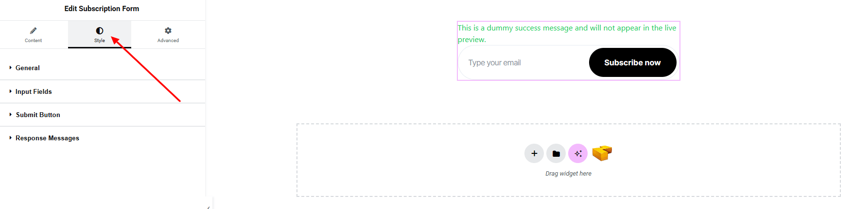
General:
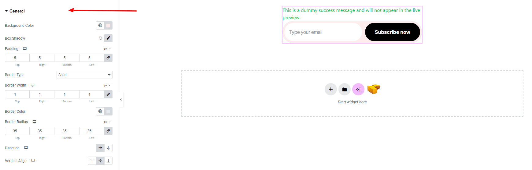
- Background Color : Set the background color of the form container. Explore full background settings here.
- Box Shadow : Apply drop shadow effects.
- Padding : Adjust inner spacing.
- Border Type : Set border style, width and color.
- Border Radius : Control corner roundness.
- Direction : Arrange form fields in horizontal or vertical layout.
- Vertical Align : Control the vertical alignment of form content.
Input Fields:
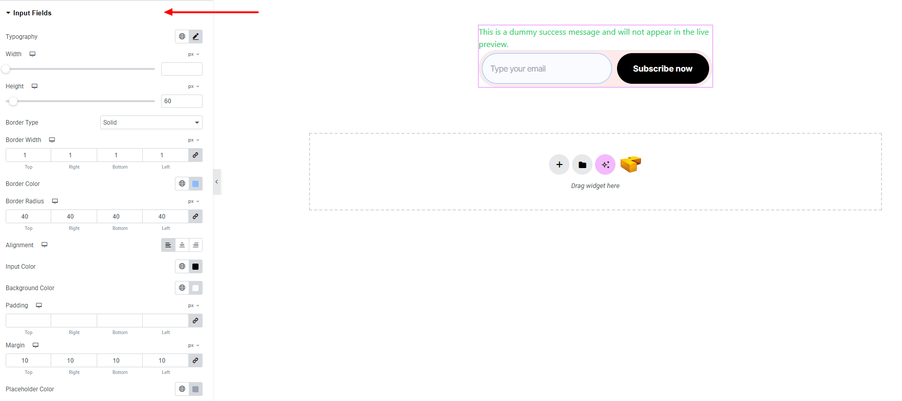
- Typography : Adjust font family, size, weight, transform, style, decoration, line height, letter spacing, and word spacing. Explore full typography settings here.
- Width : Set width of the input section.
- Height : Set height of the input section.
- Border Type : Set border style, width and color.
- Border Radius : Control corner roundness.
- Alignment : Align the input fields within the container.
- Input Color : Set a custom color for input field.
- Background Color : Set the input background color. Explore full background settings here.
- Padding : Adjust inner spacing.
- Margin : Adjust outer spacing.
- Placeholder Color : Customize the color of placeholder text.
Submit Button:
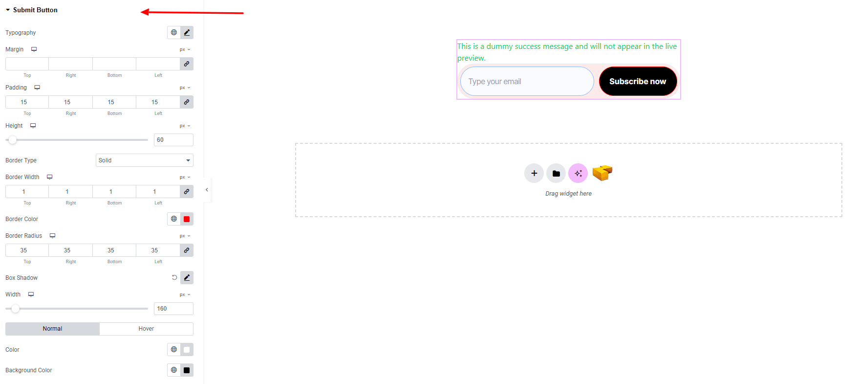
- Typography : Adjust font family, size, weight, transform, style, decoration, line height, letter spacing, and word spacing. Explore full typography settings here.
- Margin : Adjust outer spacing.
- Padding : Adjust inner spacing.
- Height : Set the height of the button.
- Border Type : Set border style, width and color.
- Border Radius : Control corner roundness of the button.
- Box Shadow : Apply drop shadow.
- Width : Set width of the button.
- Color : Set text color of the button for both normal and hover state.
- Background Color : Set background color of the button for both normal and hover state. Explore full background settings here.
Response Messages:
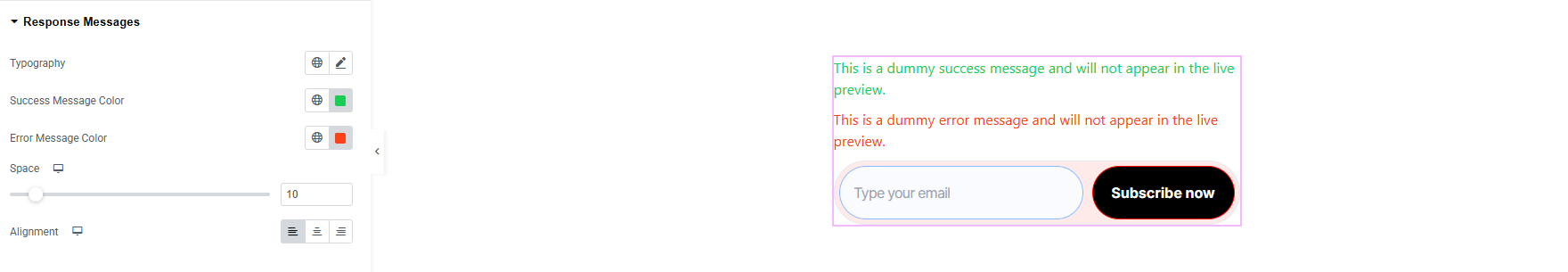
- Typography : Adjust font family, size, weight, transform, style, decoration, line height, letter spacing, and word spacing. Explore full typography settings here.
- Success Message Color : Set the text color for success messages.
- Error Message Color : Set the text color for error messages.
- Space : Control the spacing around the response message area.
- Alignment : Align the response message (left, center, right).
Step 4: Advance tab
If you want to customize the layout, backgrounds, or make your design more engaging, head over to the Advanced section. The Advanced panel is a default Elementor feature. Check out this document to learn more about its features.
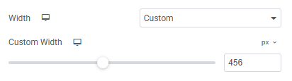
Layout:
- Width: set custom the width on the full container.
Finally, hit the Publish button and watch your stunning Subscription Form come to life on your webpage!

That’s a wrap — you’re ready!