
Team Member
Step-by-Step Tutorial on Using the Team Member Widget of Zyre Addon
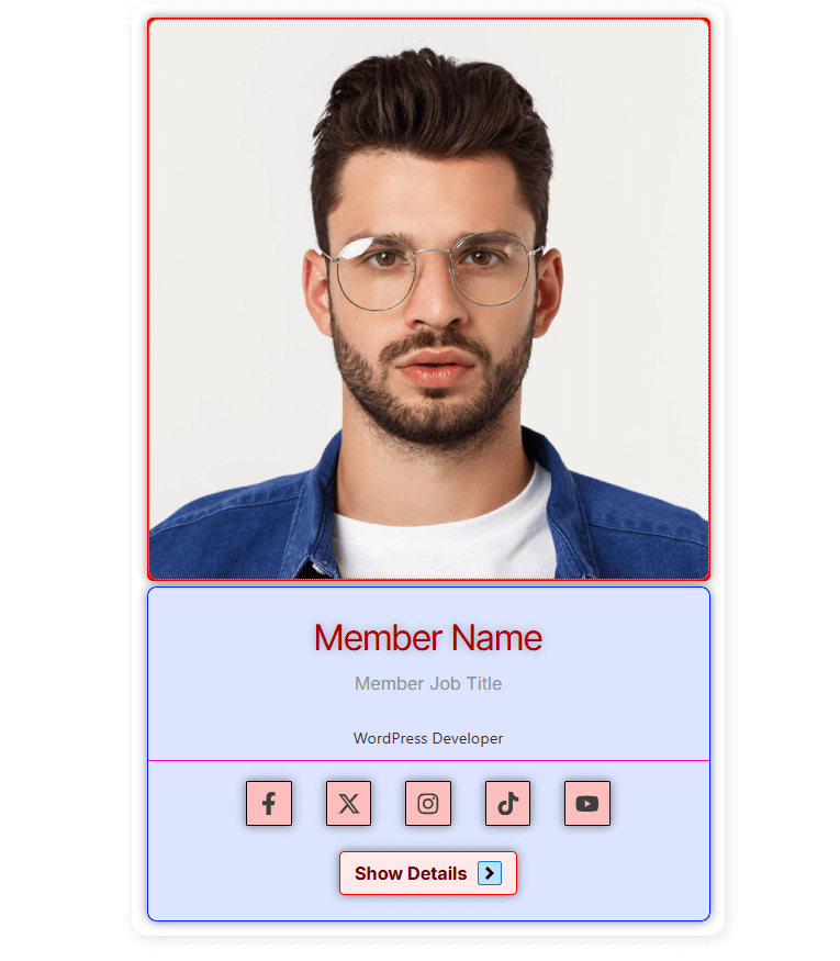
The Team Member Widget lets you showcase your team in a stylish and professional way. Add a profile image, name, designation, bio, and social links with full control over layout, alignment, and design. Perfect for highlighting your team’s personality while keeping your website modern and engaging.
Learn How To Use Team Member Widget:
Exploring the Features of Team Member Widget
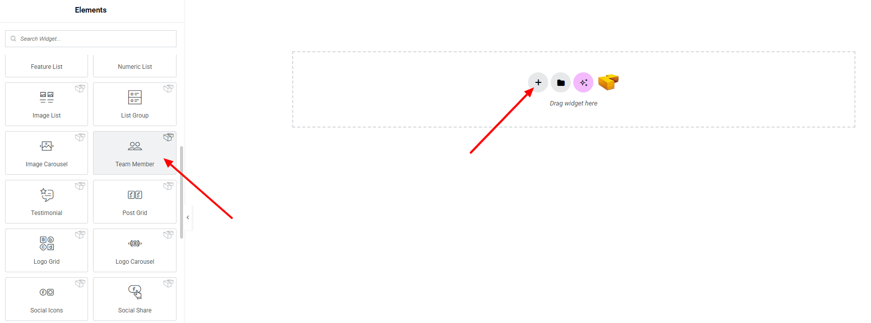
Step 1: Drag the widget
From the left panel, search or choose the Team Member of Zyre Addon and simply drag it into your desired section.
Step 2: Content tab
On the Content tab of Team Member here it have Template Style, Information, Social Links, Details Button.

Template Style:
- Team Member Style : You can choose a predefined style from here

Information:

- Photo : Select member’s image from the media library.
- Image Resolution : Define the resolution for sharper display.
- Position : Adjust the position of the image.
- Name : Enter team member’s name.
- Job Title : Enter member’s job title.
- Short Bio : Enter member’s bio shortly.
- Name HTML Tag : Choose the HTML tag for the name.
- Alignment : Position the information element.
Social Links:
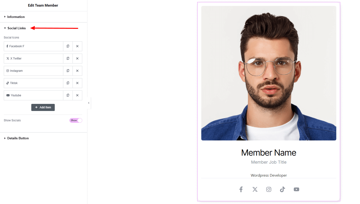
- Social Icons : Create and manage multiple feature items.
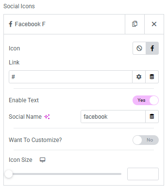
- Icon : Upload the social media icon.
- Link : Set URL for the social list item.
- Enable text (when Toggle Enable)
- Social Name : Set the name of each social media.
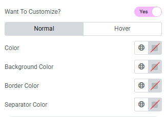
- Want To Customize? (when Toggle Enable)
For both normal and hover state:- Color : Set icon color.
- Background color : Set background color.
- Border color : Set border color of each icon.
- Separator color : Set the separator color.
- Icon size : Set icon size of the social icons.
- Show Socials : Enable toggle for showing socials.
Details Button:
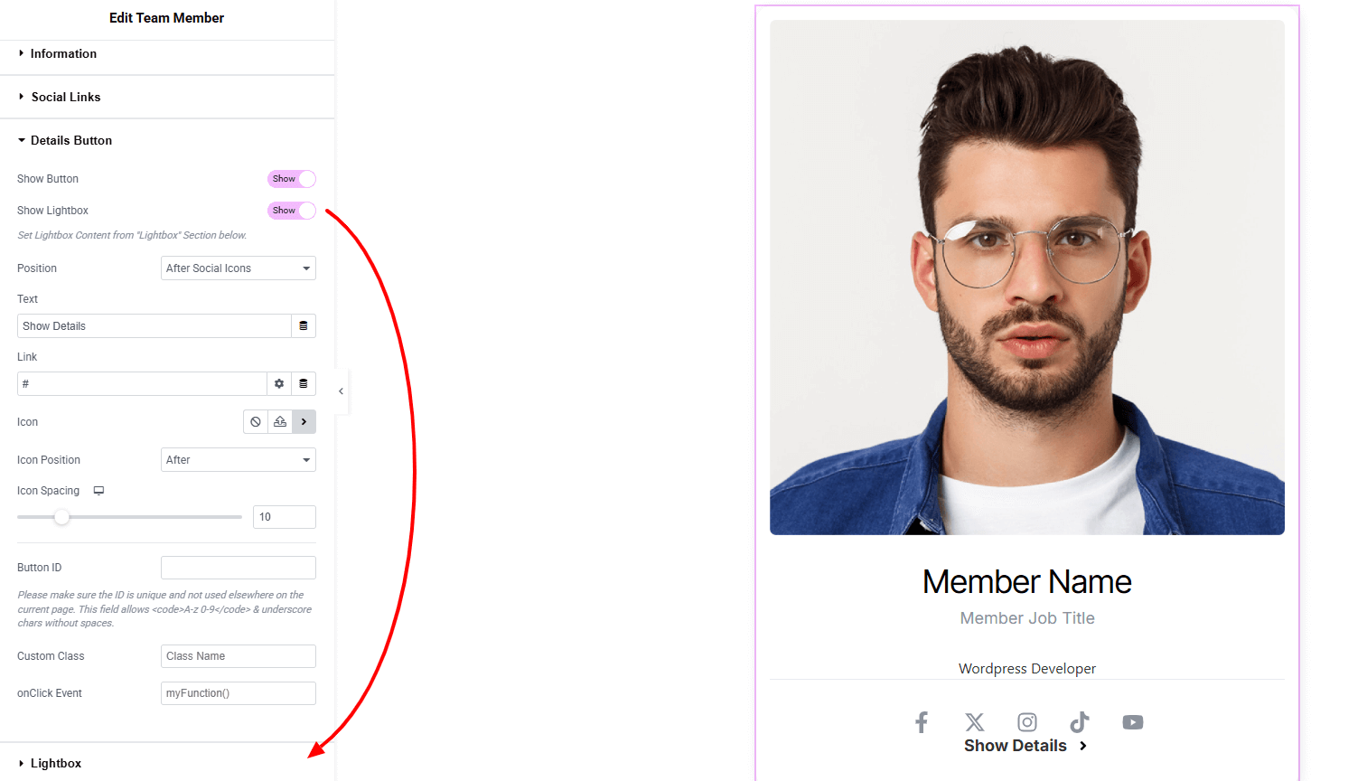
- Show Button : Enable toggle for showing button.
- Show Lightbox : Toggle to enable lightbox. now clicking on the button will appear lightbox.
- Position : Set the button’s position.
- Text : Enter button text.
- Link : Add a link URL for the button.
- Icon : Select an icon (including SVG).
- Icon Position : Choose the position of the icon relative to text.
- Icon Spacing : Adjust spacing between icon and text.
- Button ID : Assign a unique ID to the button.
- Custom Class : Add a custom CSS class for styling.
- Onclick Event : Define a custom onclick event action.
Lightbox:
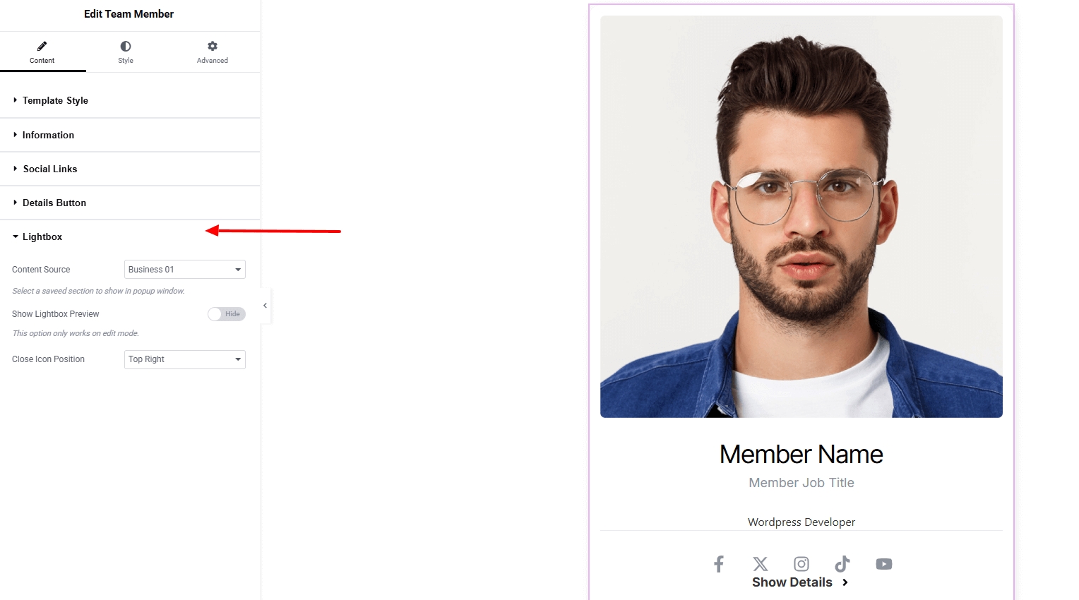
- Content Source : Select a content from your saved template to show in popup window.
- Show Lightbox Preview : Preview the lightbox, it helps to design. This option only works on edit mode.
- Close Icon Position : Set the position of the close icon.
Step 3: Style tab
In the Style section, you can customize the Photo Holder, Photo, Content body, Name, Job Title, Bio, Social, Social Icon, Social Name, Details Button, Button Icon, Lightbox — but make sure you have added them first.
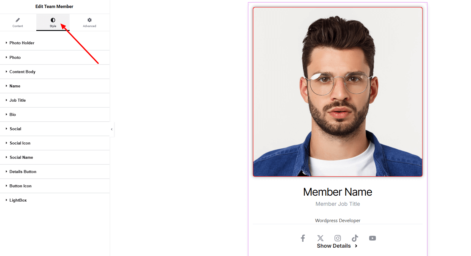
Photo Holder:
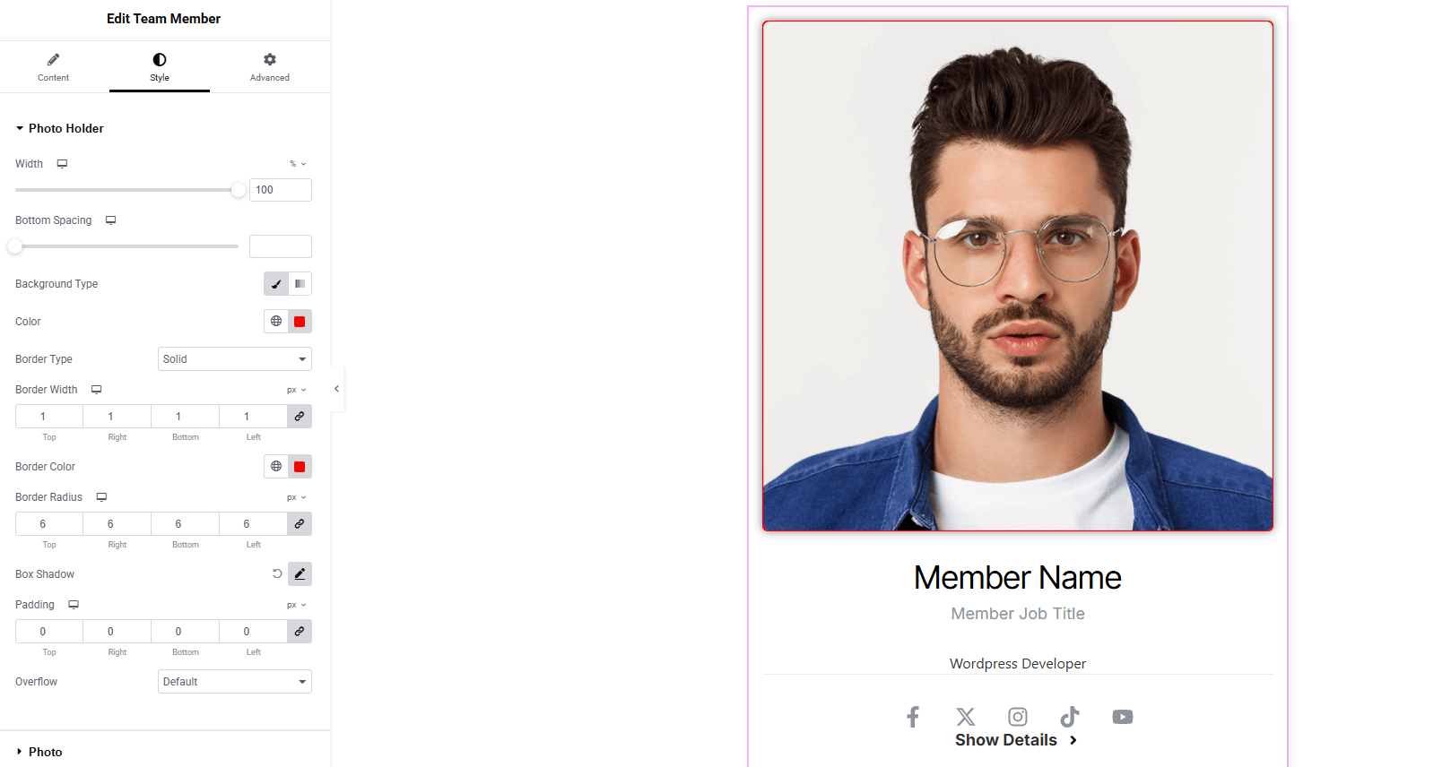
- Width : Set the width of the photo holder.
- Bottom Spacing : Adjust spacing below the photo.
- Background Type : Choose classic or gradient background. Explore full background settings here.
- Color : Set background color.
- Border Type : Customize border style, width, and color.
- Border Radius : Control corner roundness.
- Box Shadow : Add drop shadow.
- Padding : Control inner spacing of the photo holder.
- Overflow : Manage how overflowing content is displayed.
Photo:
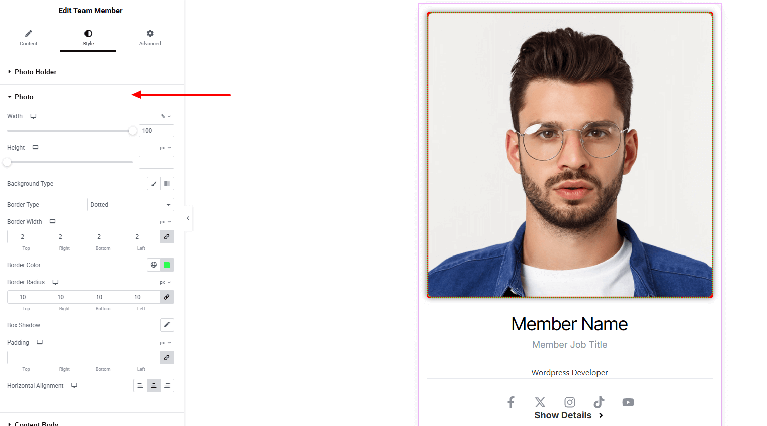
- Width : Set the photo width.
- Height : Set the photo height.
- Background Type : Choose classic or gradient background. Explore full background settings here.
- Border Type : Define border style, width, color.
- Border Radius : Control corner roundness.
- Box Shadow : Add drop shadow around the photo.
- Padding : Adjust inner spacing around the photo.
- Horizontal Alignment : Align the photo (top, middle, bottom)
Content Body:
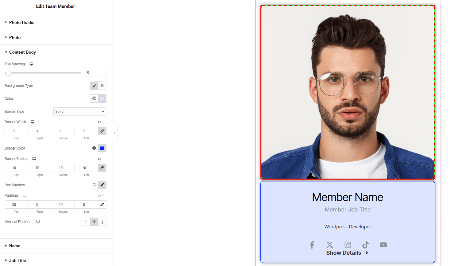
- Top Spacing : Adjust spacing on top position.
- Background Type : Choose color for classic or gradient background. Explore full background settings here.
- Border Type : Define border style, width, color.
- Border Radius : Control corner roundness.
- Box Shadow : Add drop shadow around the content area.
- Padding : Adjust inner spacing around the content.
- Vertical Position : Set contents position vertically (top, middle, bottom)
Name:
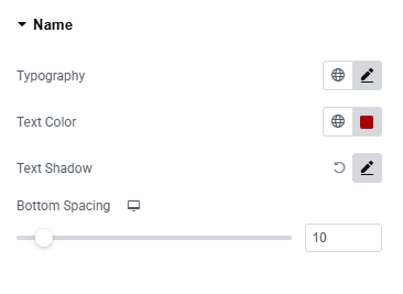
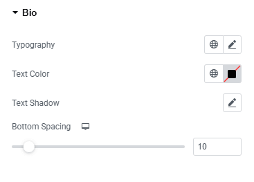
- Typography : Adjust font family, size, weight, transform, style, decoration, line height, letter spacing, and word spacing. Explore full typography settings here.
- Text Color : Set the name text color.
- Text Shadow : Set shadow of the text.
- Bottom Spacing : Adjust spacing below the name.
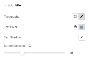
Job Title:
You’ll find the same design options for the Job Title Section as in the Name Section— giving you full freedom to style it just the way you imagine.
Bio:
You’ll find the same design options for the Bio Section as in the Name Section— giving you full freedom to style it just the way you imagine.
Social:
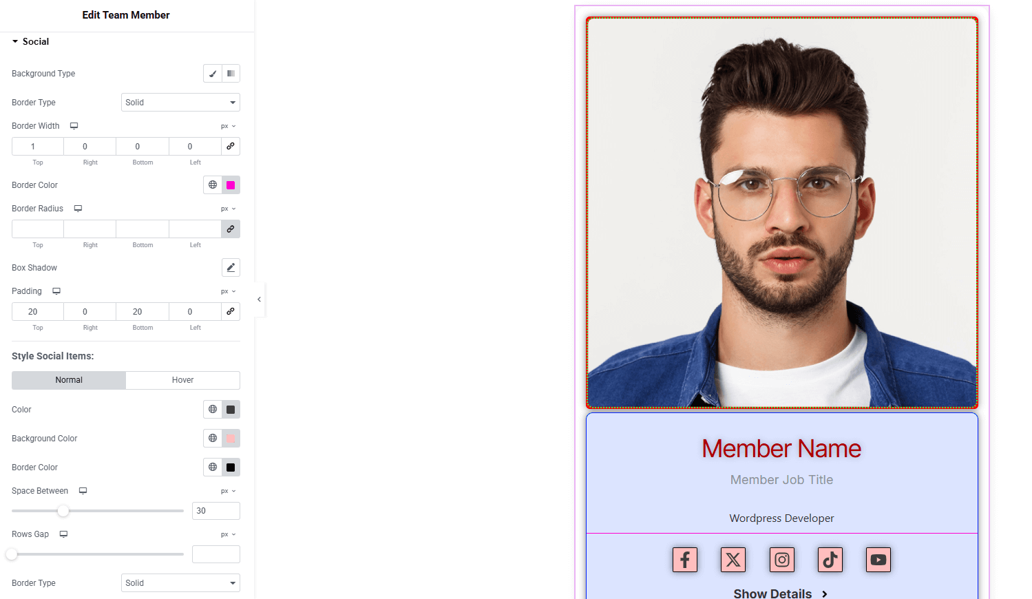
- Background Type : Choose classic or gradient background. Explore full background settings here.
- Border Type : Set border style, width, color.
- Border Radius : Control corner roundness.
- Box Shadow : Apply drop shadow.
- Padding : Adjust inner spacing.
Style Social Items
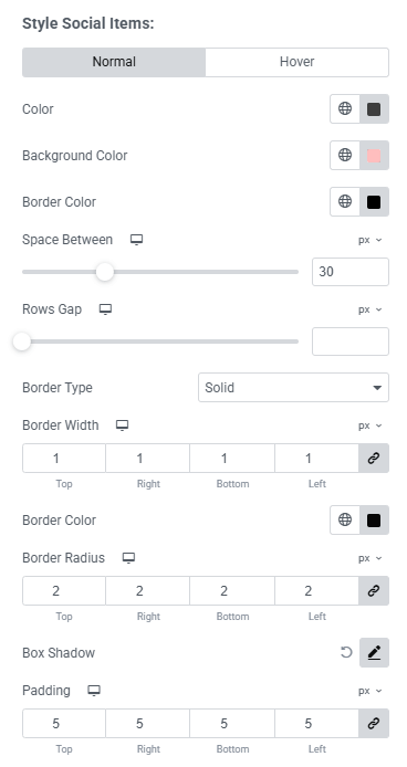
- For both normal and hover states:
- Color : Set icon color.
- Background Color : Set background color.
- Border Color : Define border color.
- Space Between : Adjust spacing between social icons.
- Rows Gap : Control gap between rows.
- Border Type : Set border style, width, color.
- Border Radius : Control corner roundness.
- Box Shadow : Add drop shadow to items.
- Padding : Manage inner spacing of each item.
Social Icon:
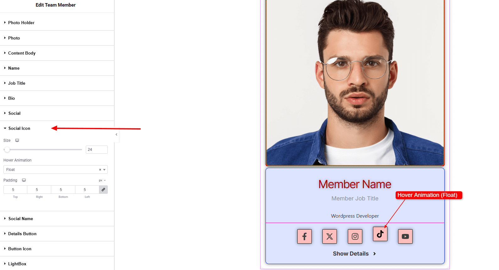
- Size : Adjust social icon size.
- Hover Animation : Choose an animation style when the icon is hovered.
- Padding : Manage inner spacing of each icon.
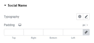
Social Name: (make sure to Enable text on social links & add social name)
- Typography : Adjust font family, size, weight, transform, style, decoration, line height, letter spacing, and word spacing. Explore full typography settings here.
- Padding : Manage the inner spacing inside the name.
Details Button:
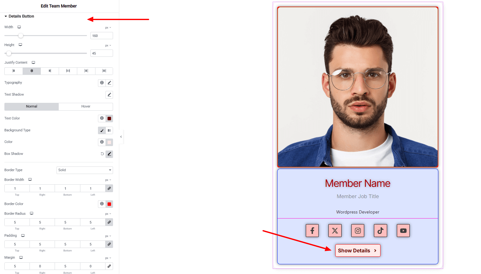
- Width & Height : Define the button’s dimensions.
- Justify Content : Align text and icon inside the button.
- Typography : Set font family, size, weight, transform, style, decoration, line height, and spacing. Explore full typography settings here.
- Text Shadow : Add text shadow effect.
- Text Color : Choose text colors for both Normal and Hover states.
- Background type with color : Set classic or gradient background (linear or radial). Explore full background settings here.
- Box Shadow : Control drop shadow effect for Normal and Hover states.
- Border type : Define border style with width, and color.
- Border Radius : Control corner roundness.
- Padding : Manage inner spacing for text and icons.
- Margin : Control spacing outside the button.
Button Icon:
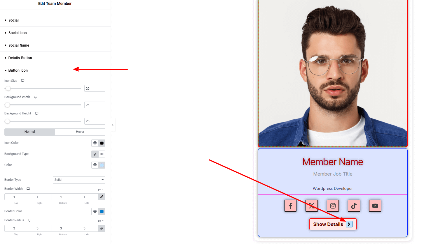
- Icon Size : Adjust the icon’s dimension.
- Background Width & Height : Set width height for the icon background area.
- Icon Color : Set the icon color for both Normal and Hover states.
- Background type : Set classic or gradient background (linear or radial) for both Normal and Hover states. Explore full background settings here.
- Border Type : Define border style with width, color.
- Border Radius : Control corner roundness.
LightBox:
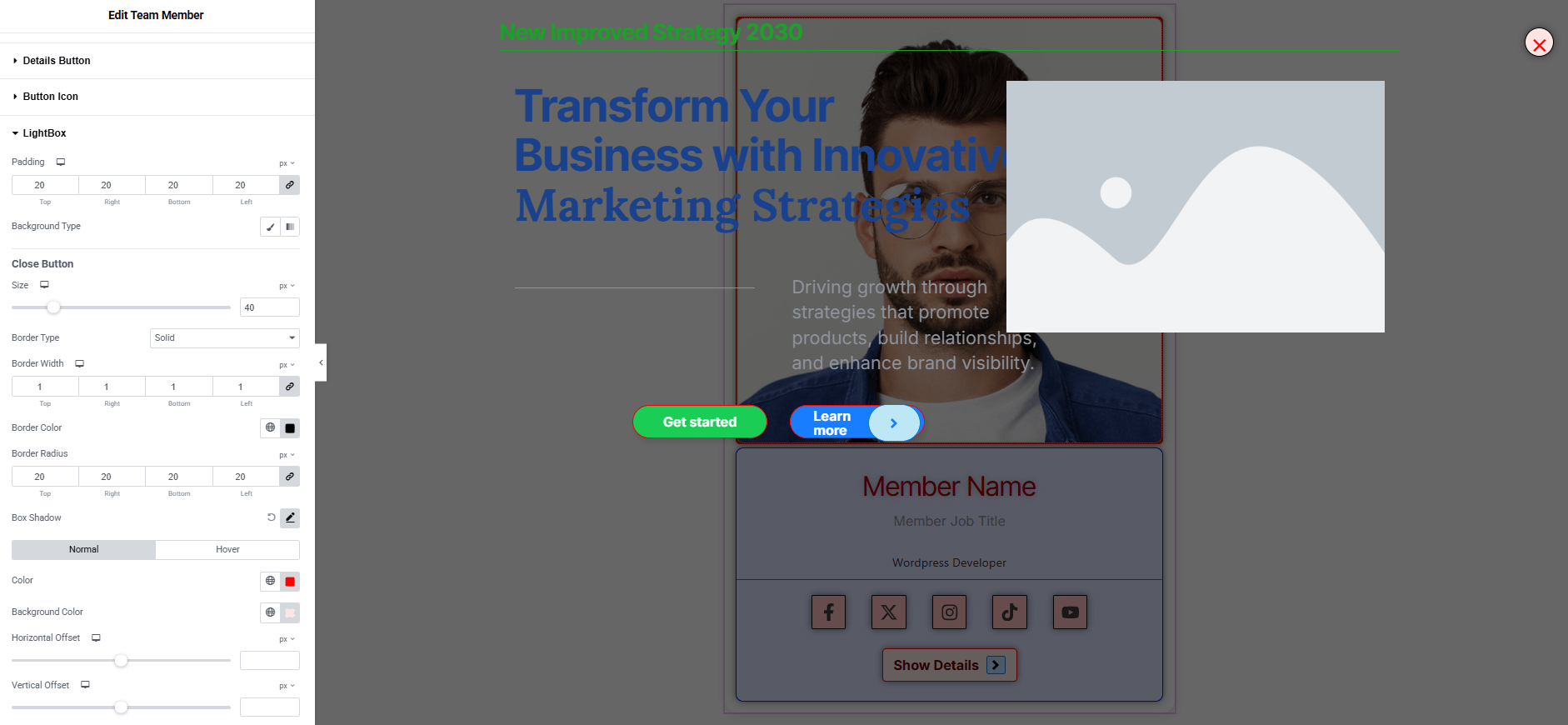
- Padding : Manage inner spacing.
- Background type : Set classic or gradient background (linear or radial). Explore full background settings here.
Close Button:
- Size : Adjust the close icon’s dimension.
- Border Type : Define border style with width, color.
- Border Radius : Control corner roundness.
- Box Shadow : Control drop shadow effect.
- Color : Set the icon color for both Normal and Hover states.
- Background color : Set background color for both Normal and Hover states. Explore full background settings here.
- Horizontal Offset : Set the close button icon horizontally.
- Vertical Offset : Set the close button icon vertically.
Step 4: Advance tab
If you want to customize the layout, backgrounds, or make your design more engaging, head over to the Advanced section. The Advanced panel is a default Elementor feature. Check out this document to learn more about its features.
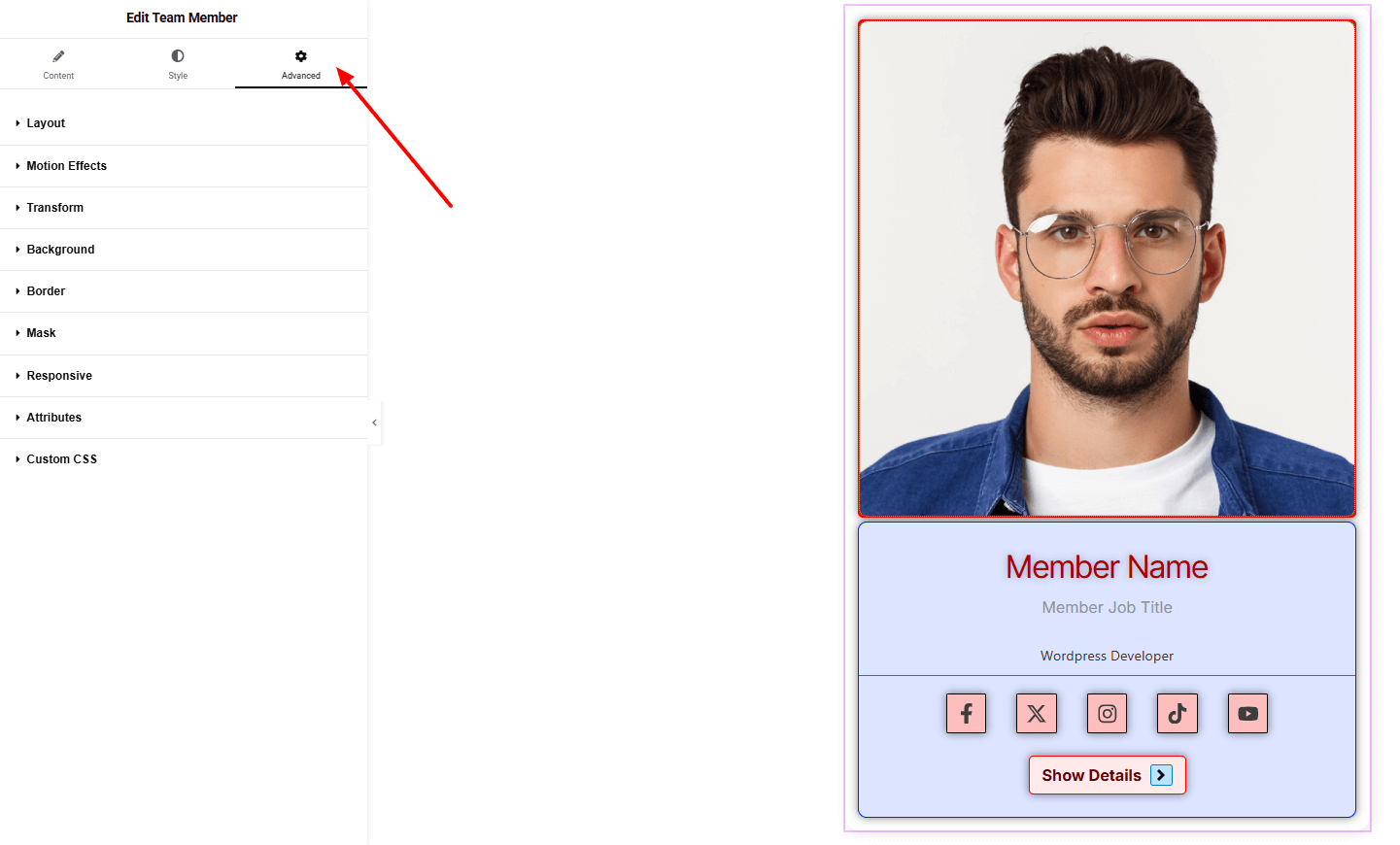
Layout

- Margin : Set spacing outside the full container
- Padding : Set spacing inside the full container.
- Width : Set the width of the full container.
Finally, hit the Publish button and watch your stunning Team Member come to life on your webpage!
Everything’s in place!