
Testimonial
Step-by-Step Tutorial on Using the Testimonial Widget of Zyre Addon
The Testimonial Widget lets you showcase your team in a stylish and professional way. Add a profile image, name, designation, bio, and social links with full control over layout, alignment, and design. Perfect for highlighting your team’s personality while keeping your website modern and engaging.
Learn How To Use Testimonial Widget:
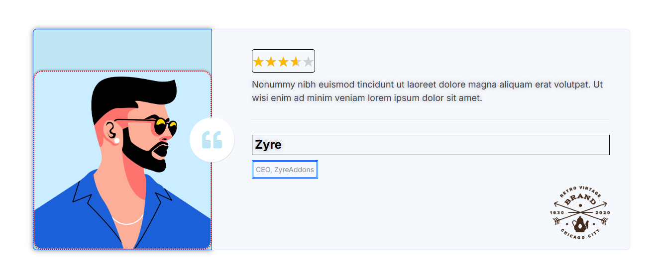
Exploring the Features of Testimonial Widget
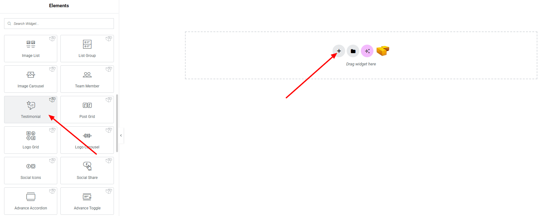
Step 1: Drag the widget
From the left panel, search or choose the Testimonial of Zyre Addon and simply drag it into your desired section.
Step 2: Content tab

On the Content tab of Team Member here it have Template Style, Information, Social Links, and Details Button.
Template Style:
- Testimonial Style : You can choose a predefined style from here

Testimonial Content:

- Image : Select image from the media library.
- Image Resolution : Define the resolution for sharper display.
- Position : Adjust the position of the image.
- Quote Icon : Set quote icon (including SVG)
- Icon Position : Set the icon position (above, below)
- Rating : Set rating manually.
- Rating Type : Set rating type (star, number)
- Content : Set content in details.
- Author Name : Enter author name.
- Designation : Enter author designation.
- Logo : Set logo from the media library.
- Author HTML Tag : Choose the HTML tag for the author.
- Alignment : Positioning the contents.
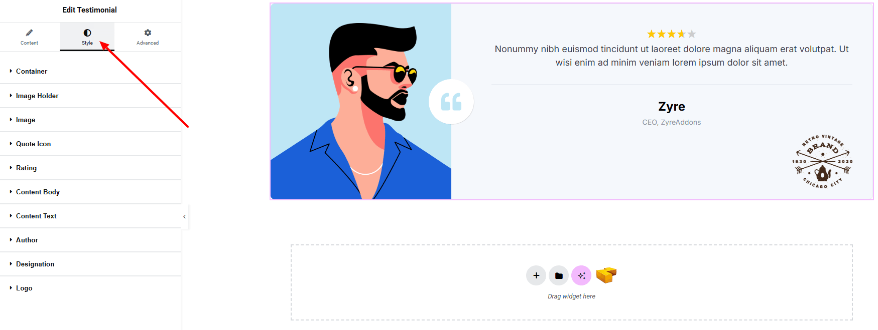
Step 3: Style tab
In the Style section, you can customize the Container, Image Holder, Image, Quote Icon, Rating, Content body, Content Text, Author, Designation, Logo— but make sure you have added them first.
Container:

- Gap Between : Adjust gap between image and content Body.
Image Holder:
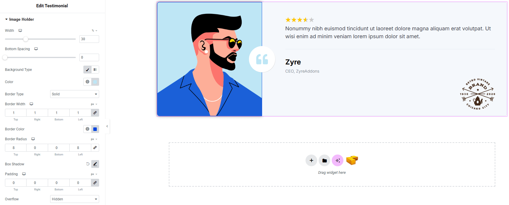
- Width : Set the photo width.
- Bottom Spacing : Set space on bottom.
- Background Type : Choose classic or gradient background. Explore full background settings here.
- Border Type : Define border style, width, and color.
- Border Radius : Control corner roundness.
- Box Shadow : Add drop shadow around the image holder.
- Padding : Adjust inner spacing around the Image.
- Overflow : Manage how overflowing content is displayed.
Image:
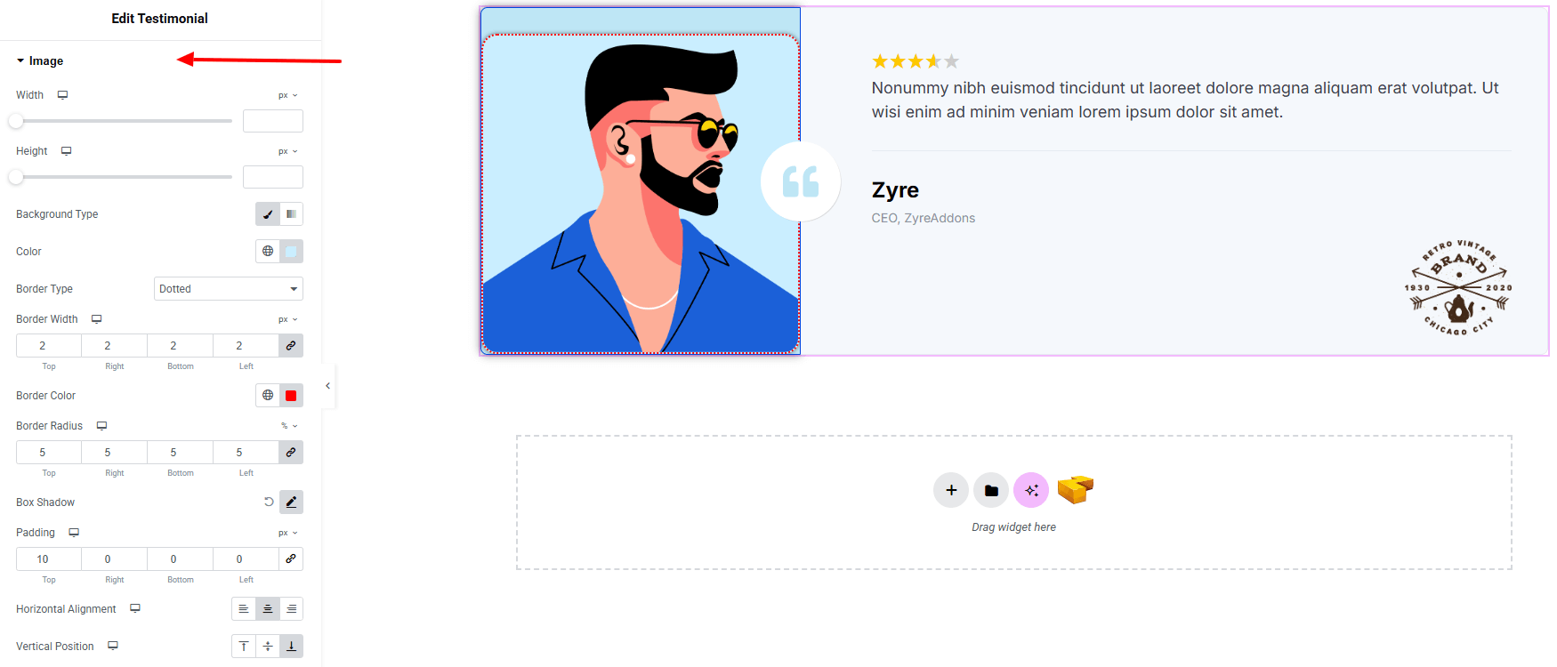
- Width : Set width of the image.
- Height : Set height of the image.
- Background Type : Choose classic or gradient background. Explore full background settings here.
- Border Type : Set border style, width, and color.
- Border Radius : Control corner roundness.
- Box Shadow : Apply drop shadow.
- Padding : Adjust inner spacing.
- Horizontal Alignment : Set the alignment horizontally.
- Vertical Position : Set the image position vertically.
Quote Icon:
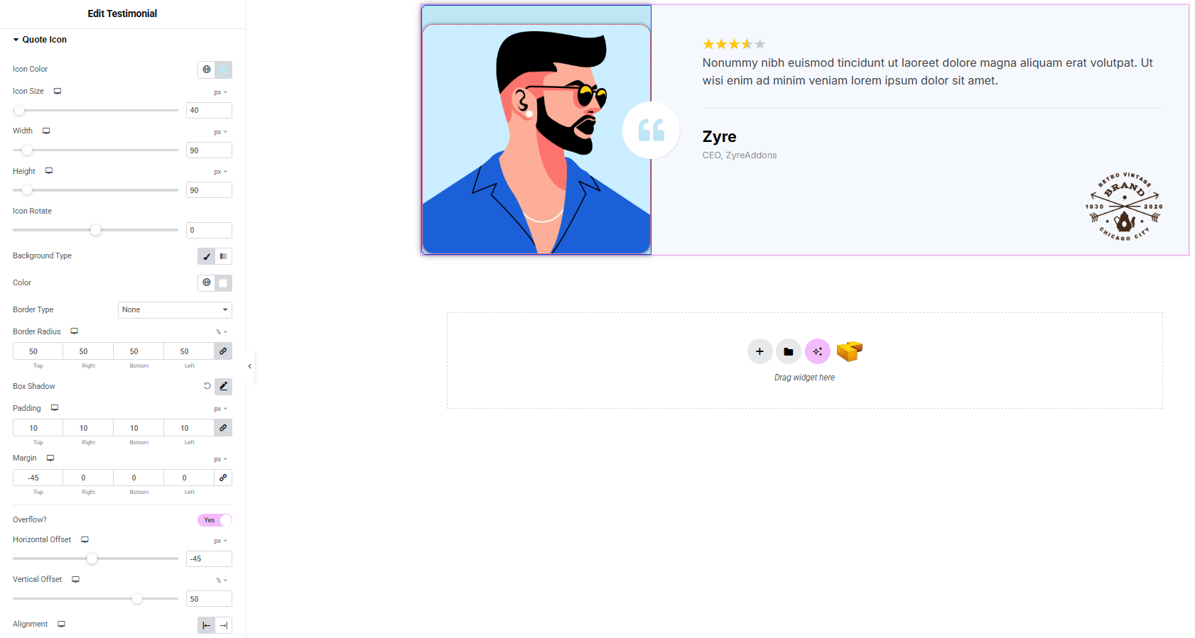
- Icon Color : Set icon color.
- Icon Size : Set icon size.
- Width : Set width of the icon wrapper.
- Height : Set height of the icon wrapper.
- Icon Rotate : Set icon rotation.
- Background Type : Choose classic or gradient background. Explore full background settings here.
- Border Type : Set border style, width, and color.
- Border Radius : Control corner roundness.
- Box Shadow : Apply drop shadow.
- Padding : Adjust inner spacing.
- Margin : Adjust outer spacing.
- Overflow? (when Toggle Enable)
- Horizontal Offset : Set the icon horizontally.
- Vertical Offset : Set the icon vertically.
- Alignment : Set alignment horizontally (Left, Right)
Rating:
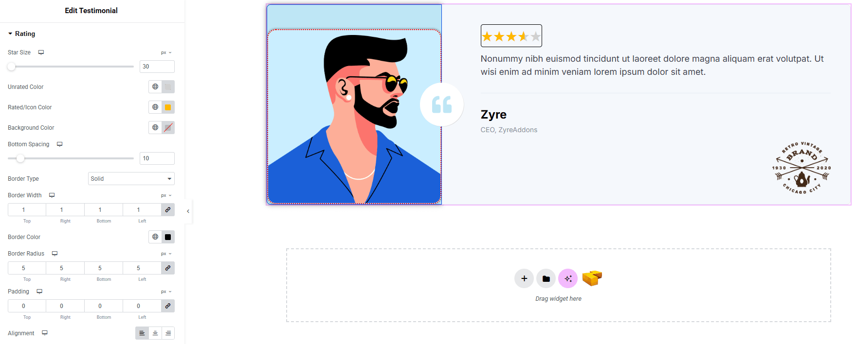
- Star Size : Adjust the size of the rating stars.
- Unrated Color : Set the color for empty stars.
- Rated/Icon Color : Choose the color for filled stars.
- Background Color : Define the background behind the rating. Explore full background settings here.
- Bottom Spacing : Control the space below the rating section.
- Border Type : Set border style, width, color.
- Border Radius : Control corner roundness.
- Padding : Manage inner spacing around the rating area.
- Alignment : Align the rating (left, center, right)
Content Body:
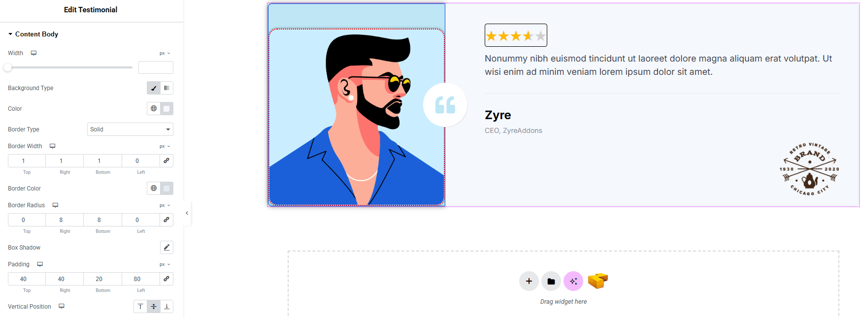
- Width : Set width of the full content body.
- Background Type : Choose classic or gradient background. Explore full background settings here.
- Border Type : Set border style, width, color.
- Border Radius : Control corner roundness.
- Box Shadow : Apply drop shadow.
- Padding : Adjust inner spacing.
- Vertical Position : Set the content position vertically.
Content Text:
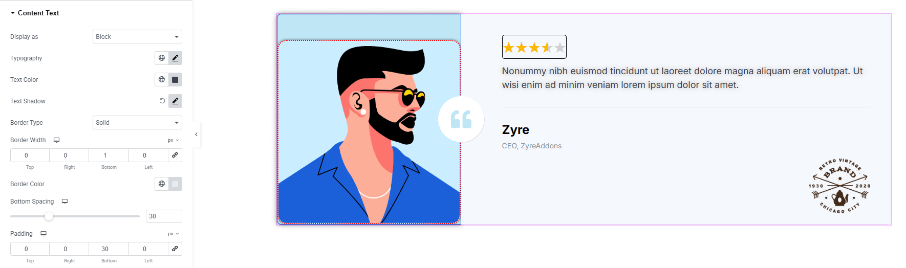
- Display As : Choose how the content is displayed (block, inline-block, inline)
- Typography : Adjust font family, size, weight, transform, style, decoration, line height, letter spacing, and word spacing. Explore full typography settings here.
- Text Color : Set the text color.
- Text Shadow : Set shadow of the text.
- Border Type : Set border style, width and color.
- Bottom Spacing : Adjust the space in bottom.
- Padding : Manage inner spacing of the content.
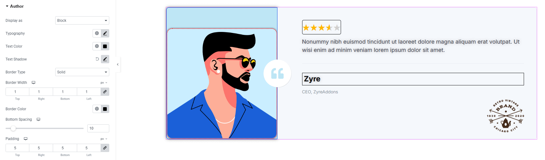
Author:
You’ll find the same design options for the Author as in the Content Text — giving you full freedom to style it just the way you imagine.
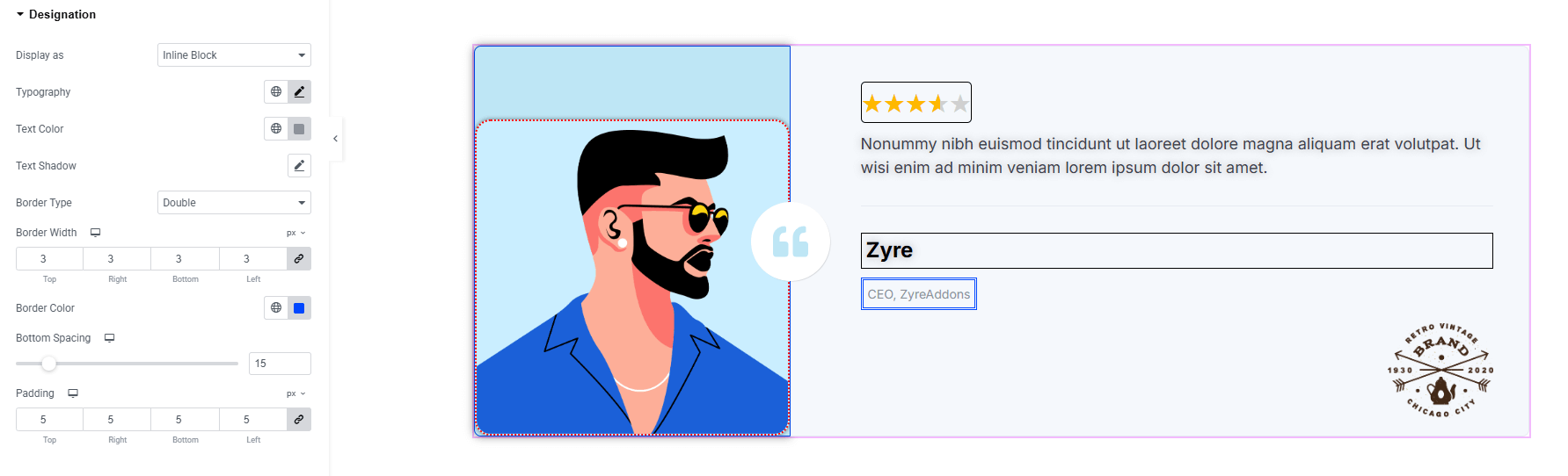
Designation:
You’ll find the same design options for the Designation as in the Content Text — giving you full freedom to style it just the way you imagine.
Logo:
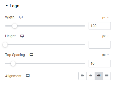
- Width : Set width of the logo.
- Height : Set height of the logo.
- Top Spacing : Adjust spacing top of the logo.
- Alignment : Align the logo (left, center, right)
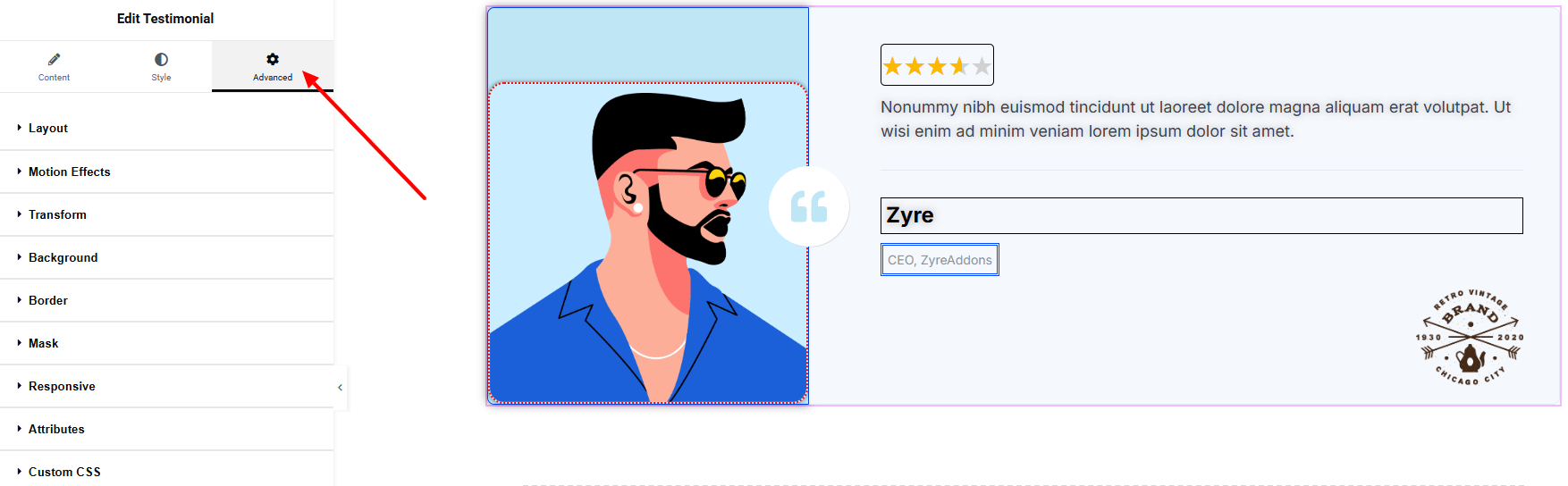
Step 4: Advance tab
If you want to customize the layout, backgrounds, or make your design more engaging, head over to the Advanced section. The Advanced panel is a default Elementor feature. Check out this document to learn more about its features.
Finally, hit the Publish button and watch your stunning Testimonial come to life on your webpage!
Everything’s good to go now!