
Toggle
Step-by-Step Tutorial on Using the Toggle Widget of Zyre Addon
With Zyre Addon’s Toggle Widget, you can add sleek collapsible sections that don’t just look good—they make your content more interactive. Whether you’re creating a FAQ page, product details, or knowledge base, this widget transforms static text into clickable content blocks that encourage user engagement and keep readers scrolling longer.
Learn How To Use Toggle Widget:
Exploring the Features of Toggle Widget
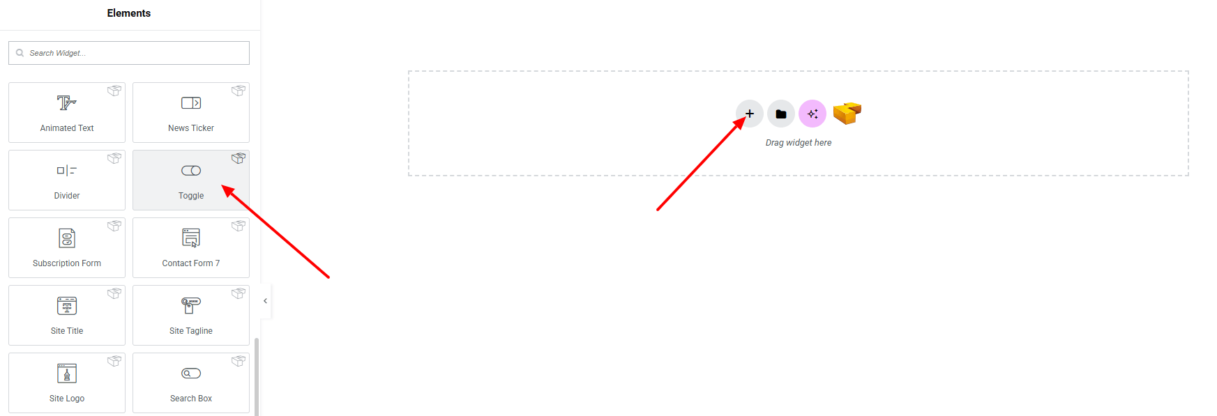
Step 1: Drag the widget
From the left panel, search or choose the Toggle of Zyre Addon and simply drag it into your desired section.
Step 2: Content tab
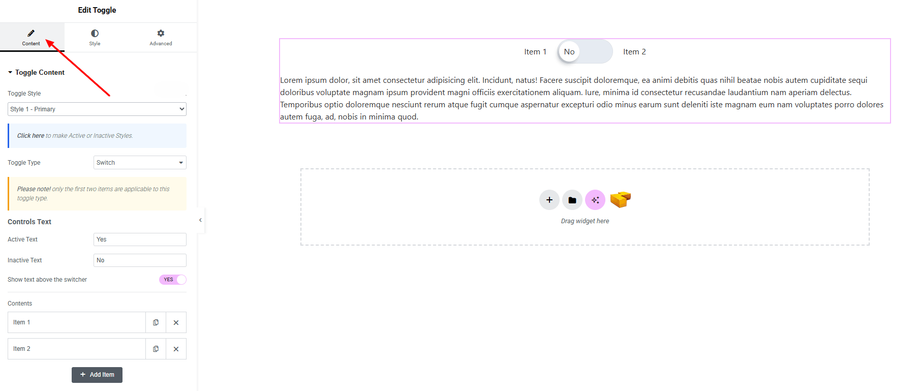
Toggle Content:
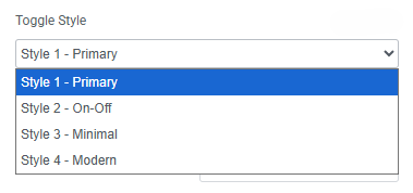
- Toggle Style : You can choose a predefined style from here
- Toggle Type : Choose toggle type (switch, Button)
- Controls Text (when toggle type switch selected)
- Active Text : Set active text on toggle
- Inactive Text : Set inactive text on toggle
- Show text above the switcher : Enable active, inactive text shown above the switcher button
- Contents : Set individual toggle contents.
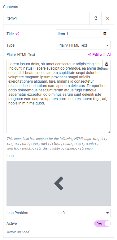
- Title : Set the toggle’s title text.
- Type : Choose between different content display types.
- Plain/HTML Text : Add content either as plain text or with HTML formatting.
- Icon : Select an icon to display alongside the title.
- Icon Position : Define the icon appears left or right the title.
- Active : Enable option to have the toggle opened by default.
Step 3: Style tab
In the Style section, you can customize the Toggle Bar, Toggle Bar Inner, Toggle Text, Switch, Switch Handle, Switch Handle Text, Content— but make sure you have added them first.
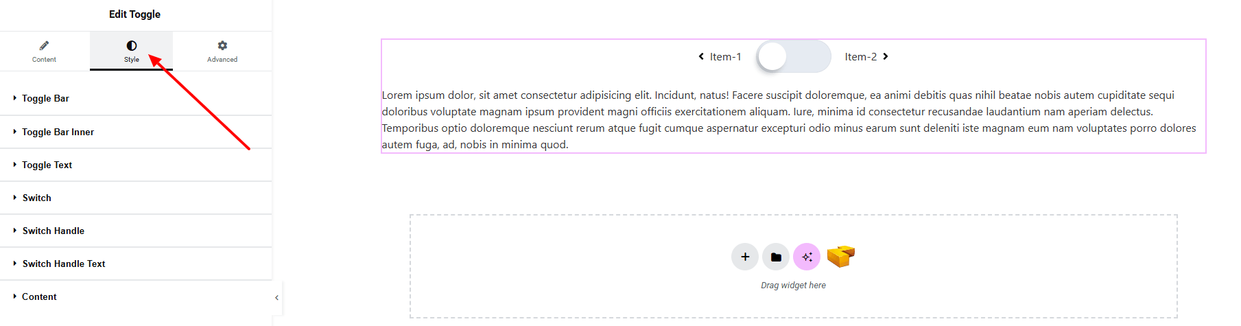
Toggle Bar:
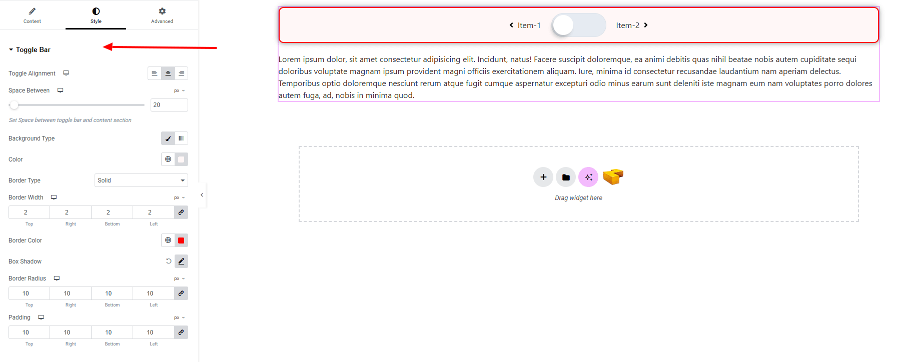
- Toggle Alignment : Align the toggle bar (left, center, right)
- Space Between : Adjust the spacing between the toggle and content.
- Background Type : Set background colors or gradients. Explore full background settings here.
- Border Type : Define border style, width and color.
- Box Shadow : Apply drop shadow.
- Border Radius : Apply rounded corners to the element.
- Padding : Add inner space.
Toggle Bar Inner:
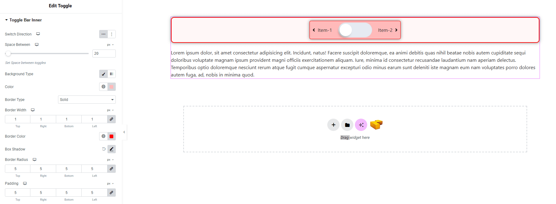
- Switch Direction : Control the direction of the toggle switch.
- Space Between : Set spacing between toggles.
- Background Type : Choose background type with color. Explore full background settings here.
- Border Type : Define border style, width and color.
- Box Shadow : Apply drop shadow effect around the toggle bar.
- Border Radius : Adjust corner roundness.
- Padding : Control inner spacing of the toggle bar.
Toggle Text:
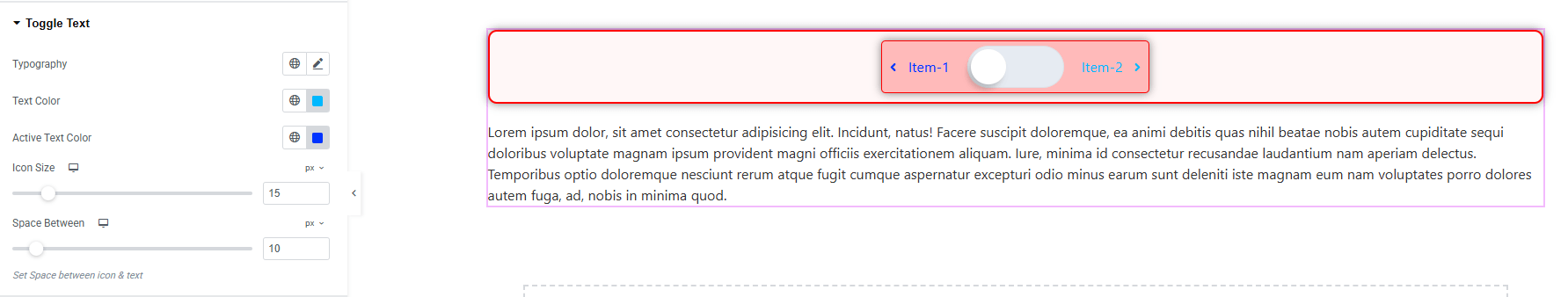
- Typography : Adjust font family, size, weight, transform, style, decoration, line height, letter spacing, and word spacing. Explore full typography settings here.
- Text Color : Set color of the text.
- Active Text Color : Set text color for active text.
- Icon Size : Adjust the icon size.
- Space Between : Set space between icon and text.
Switch:
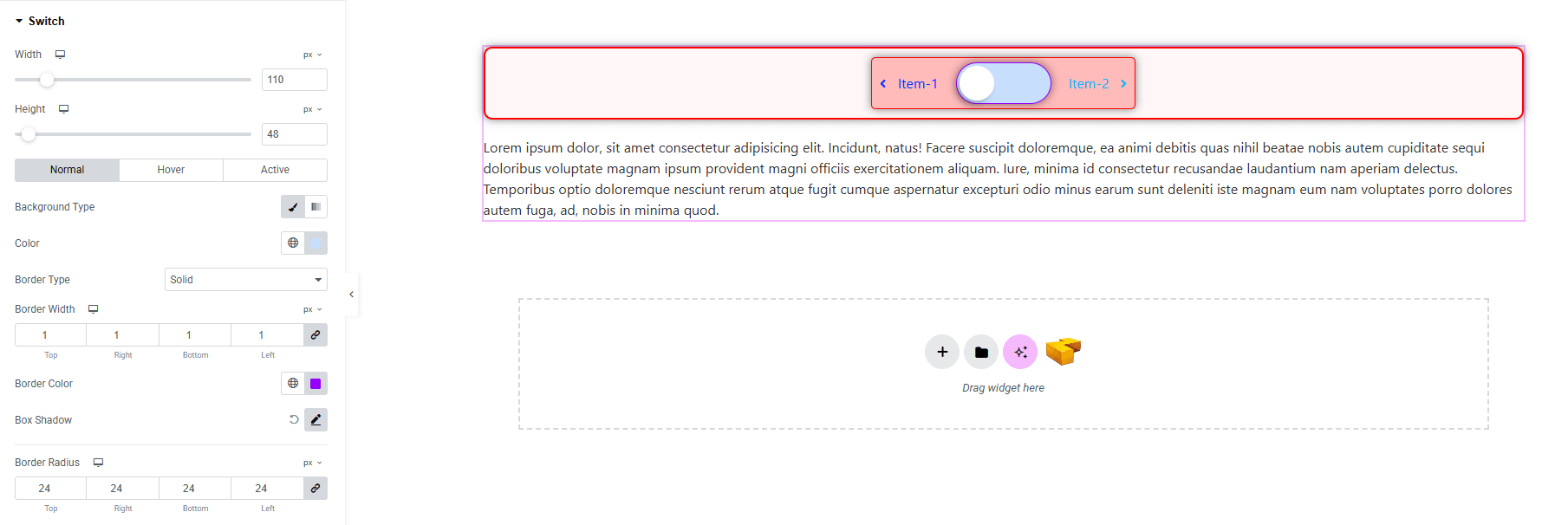
- Width : Set the width of the switch.
- Height : Set the height of the switch.
- For Normal / Hover / Active states:
- Background Type with Color : Customize background styling. Explore full background settings here.
- Border Type : Choose border style, width, and color.
- Box Shadow : Apply drop shadow effects.
- Border Radius : Control corner roundness.
Switch Handle:
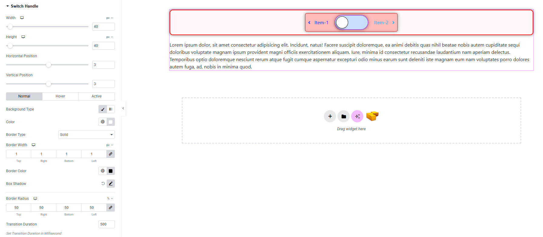
- Width : Set the handle width.
- Height : Set the handle height.
- Horizontal Position : Adjust the position horizontally.
- Vertical Position : Adjust the position vertically.
- For Normal / Hover / Active states:
- Background Type with Color : Style the handle background. Explore full background settings here.
- Border Type : Choose border style, width, and color.
- Box Shadow : Add drop shadow effects.
- Border Radius : Control corner roundness.
- Transition Duration : Set smooth animation speed for state changes.
Switch Handle Text:
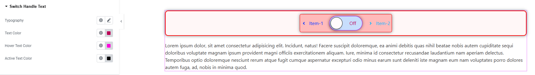
- Typography : Adjust font family, size, weight, transform, style, decoration, line height, letter spacing, and word spacing. Explore full typography settings here.
- Text Color : Set color of the text.
- Hover Text Color : Set hover color of the text.
- Active Text Color : Set active color of the text.
Content:
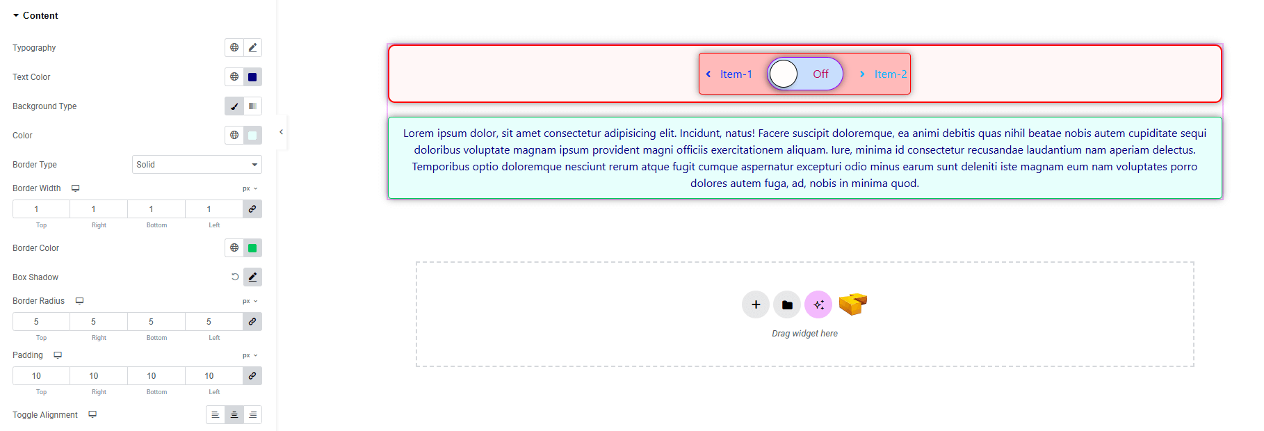
- Typography : Adjust font family, size, weight, transform, style, decoration, line height, letter spacing, and word spacing. Explore full typography settings here.
- Text Color : Set color of the text.
- Background Type : Choose background type with color options. Explore full background settings here.
- Border Type : Choose border style, width, and color.
- Box Shadow : Add drop shadow effects.
- Border Radius : Control corner roundness.
- Padding : Control inner spacing of the content.
- Toggle Alignment : Set the text alignment (left, center, right)
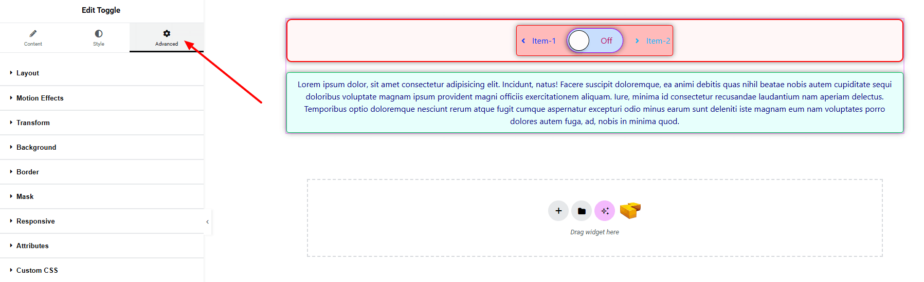
Step 4: Advance tab
If you want to customize the layout, backgrounds, or make your design more engaging, head over to the Advanced section. The Advanced panel is a default Elementor feature. Check out this document to learn more about its features.
Finally, hit the Publish button and watch your stunning Toggle come to life on your webpage!
You’re fully set up!