
Search Box
Step-by-Step Tutorial on Using the Search Box Widget of Zyre Addon
Enhance your website’s usability with the Search Box Widget from Zyre Addon for Elementor. This widget allows you to create stylish and highly customizable search forms, helping users quickly find content across your website while maintaining a clean and modern design.
Learn How To Use Search Box Widget:
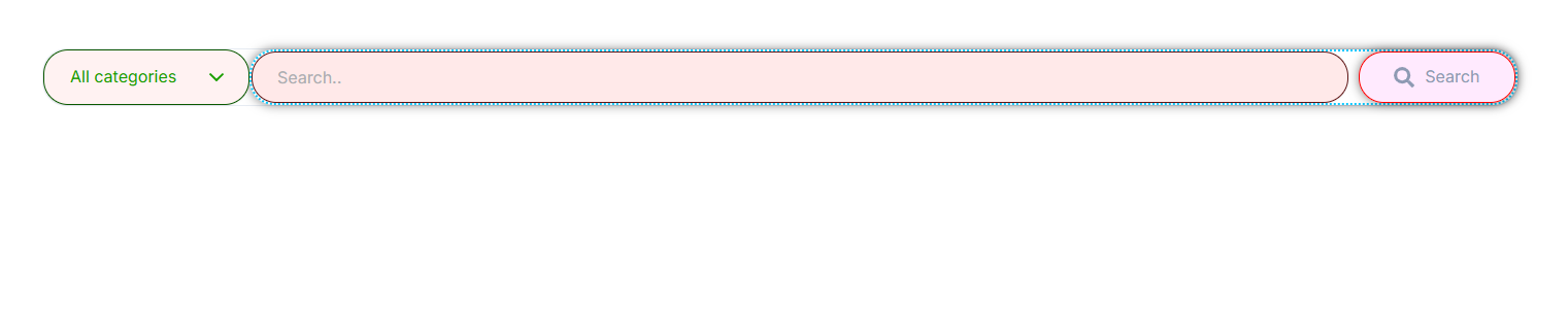
Exploring the Features of Search Box Widget
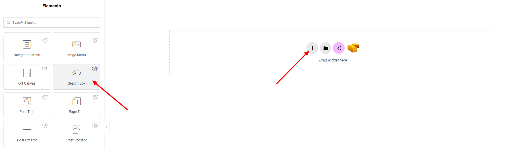
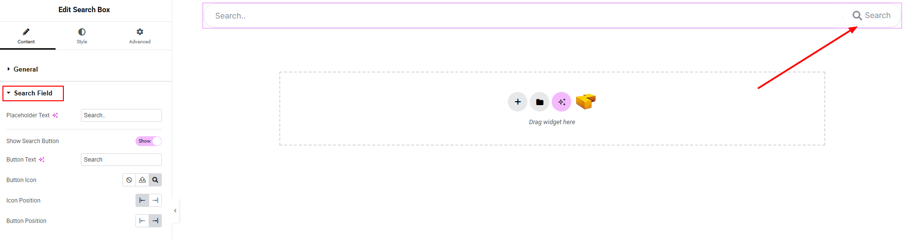
Step 1: Drag the widget
From the left panel, search or choose the Search Box Widget of Zyre Addon and simply drag it into your desired section.
Step 2: Content tab
On the Content section, you’ll find options for General and Search Field.
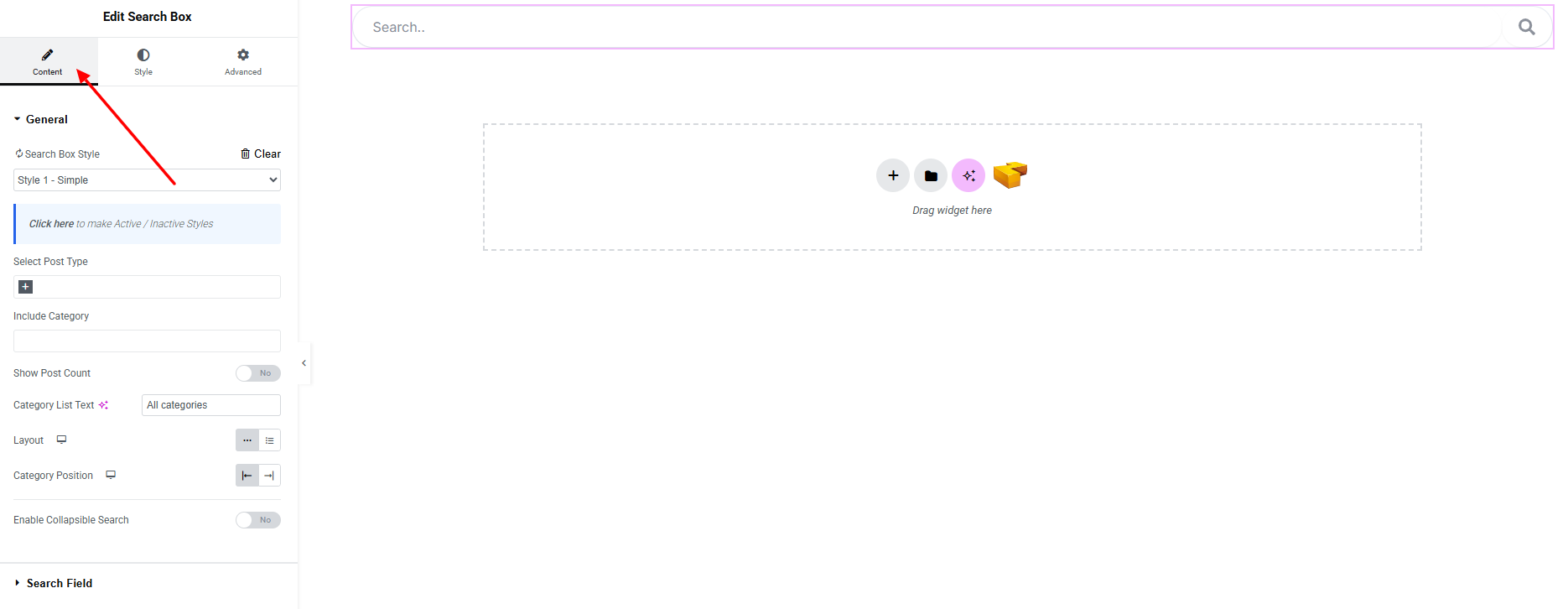
General:
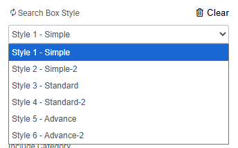
- Search Box Style – you can choose a predefined style from here.
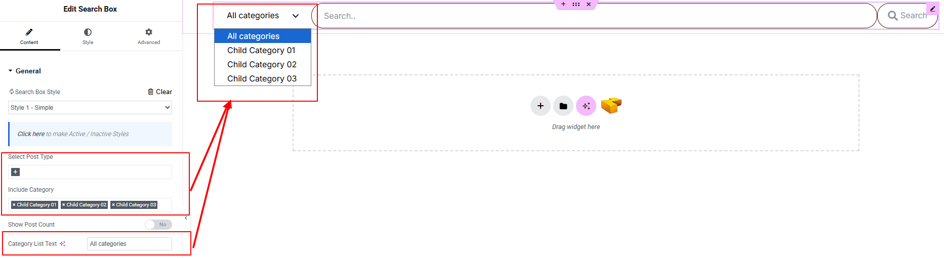
- Select Post Type: Choose which post type (posts, pages, or custom post types) will be included in search results.
- Include Category: Filter search results by specific categories.
- Show Post Count: Enable to display the number of posts available in each category.
- Category List Text: Set the label text for the category dropdown.
- Layout: Select the layout style of the search box (Block/Inline).
- Category Position: Define where the category selector appears relative to the search field.
Collapsible Search
- Enable Collapsible Search: Turn on to display the search box in a collapsible format.
When enabled, additional options appear:
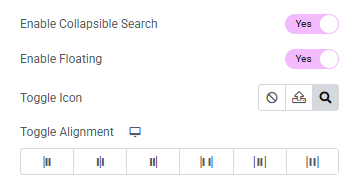
- Enable Floating: Display the toggle button as a floating element.
- Toggle Icon: Choose the icon for opening the search box.
- Toggle Alignment: Set the alignment of the toggle button.
Search Field:
- Placeholder Text: Set the text displayed inside the search input field as a hint for users.
- Show Search Button: Enable or disable the visibility of the search button.
- Button Icon: Can set icon for the search button.
- Icon Position: Define the position of the icon relative to the button text.
- Button Position: Set where the search button appears in relation to the input field.
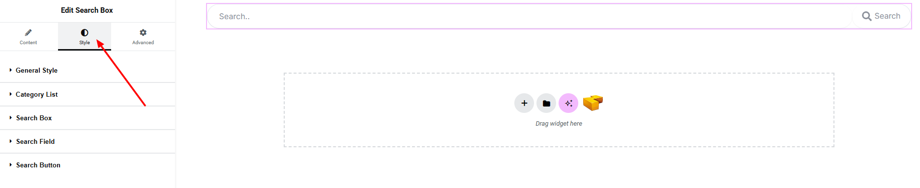
Step 3: Style tab
In the Style section, you can customize the General Style, Category List, Search Box, Search Field, and Search Button.
General:
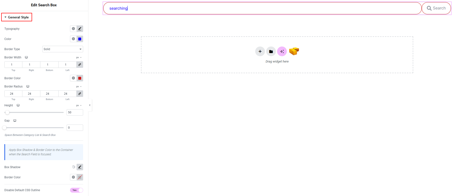
- Typography: here you can customize the font family, size, weight, transform, style, decoration, line height, letter spacing, and word spacing for your text. Explore full typography settings here.
- Color: Set the text color inside the search field.
- Border Type: Define border style, width, color, and radius.
- Height: Adjust the height of the search input field.
- Gap: Space Between Category List & Search Box
- Box Shadow: Apply shadow effects to the search field.
- Border Color: Set or override the border color.
- Disable Default CSS Outline: Remove the default browser outline when the field is focused.
Apply Box Shadow & Border Color to the Container when the Search Field is focused.
Category List:
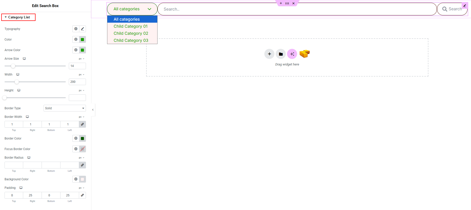
- Typography: here you can customize the font family, size, weight, transform, style, decoration, line height, letter spacing, and word spacing for your text. Explore full typography settings here.
- Color: Set the text color for the category list.
- Arrow Color: Define the color of the dropdown arrow icon.
- Arrow Size: Adjust the size of the dropdown arrow.
- Width: Set the width of the category dropdown.
- Height: Define the height of the category field.
- Border Type: Customize border style, width, color, and radius.
- Focused Border Color: Set border color when the field is active/focused.
- Background Color: Define the background color of the dropdown.
- Padding: Adjust inner spacing of the category field.
Search Box:
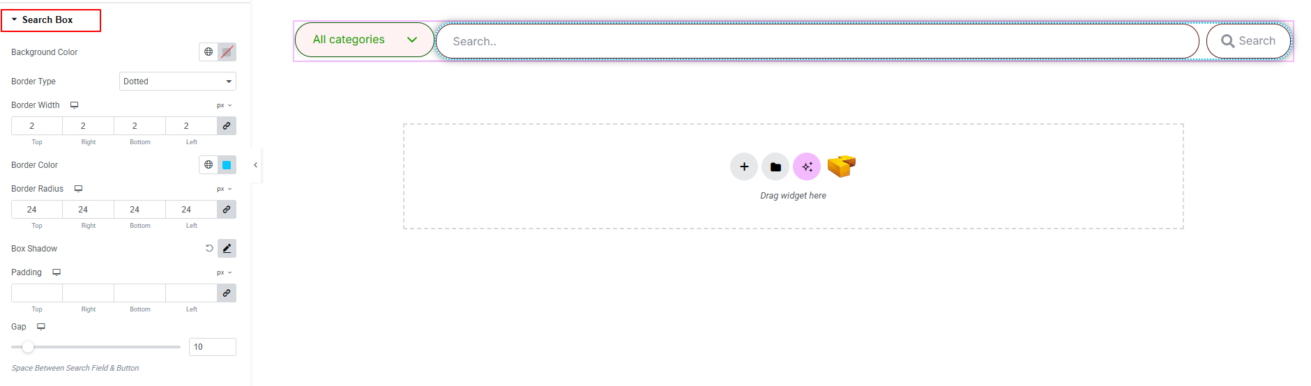
Controls the overall styling of the search box container.
- Background Color: Set the background color of the search box.
- Border Type: Customize border style, width, color, and radius.
- Box Shadow: Apply drop shadow effects to the search box.
- Padding: Adjust inner spacing within the search box.
- Gap: Control spacing Between Search Field & Button.
Search Field:
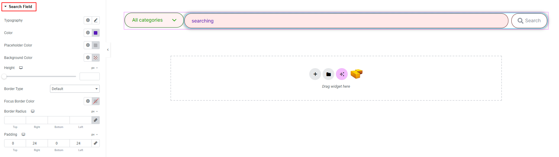
Controls the appearance of the search input field.
- Typography: here you can customize the font family, size, weight, transform, style, decoration, line height, letter spacing, and word spacing for your text. Explore full typography settings here.
- Color: Set the text color inside the search field.
- Placeholder Color: Define the color of the placeholder text.
- Background Color: Set the background color of the input field.
- Height: Adjust the height of the search field.
- Border Type: Customize border style, width, color, and radius.
- Padding: Adjust inner spacing of the input field.
Search Button:
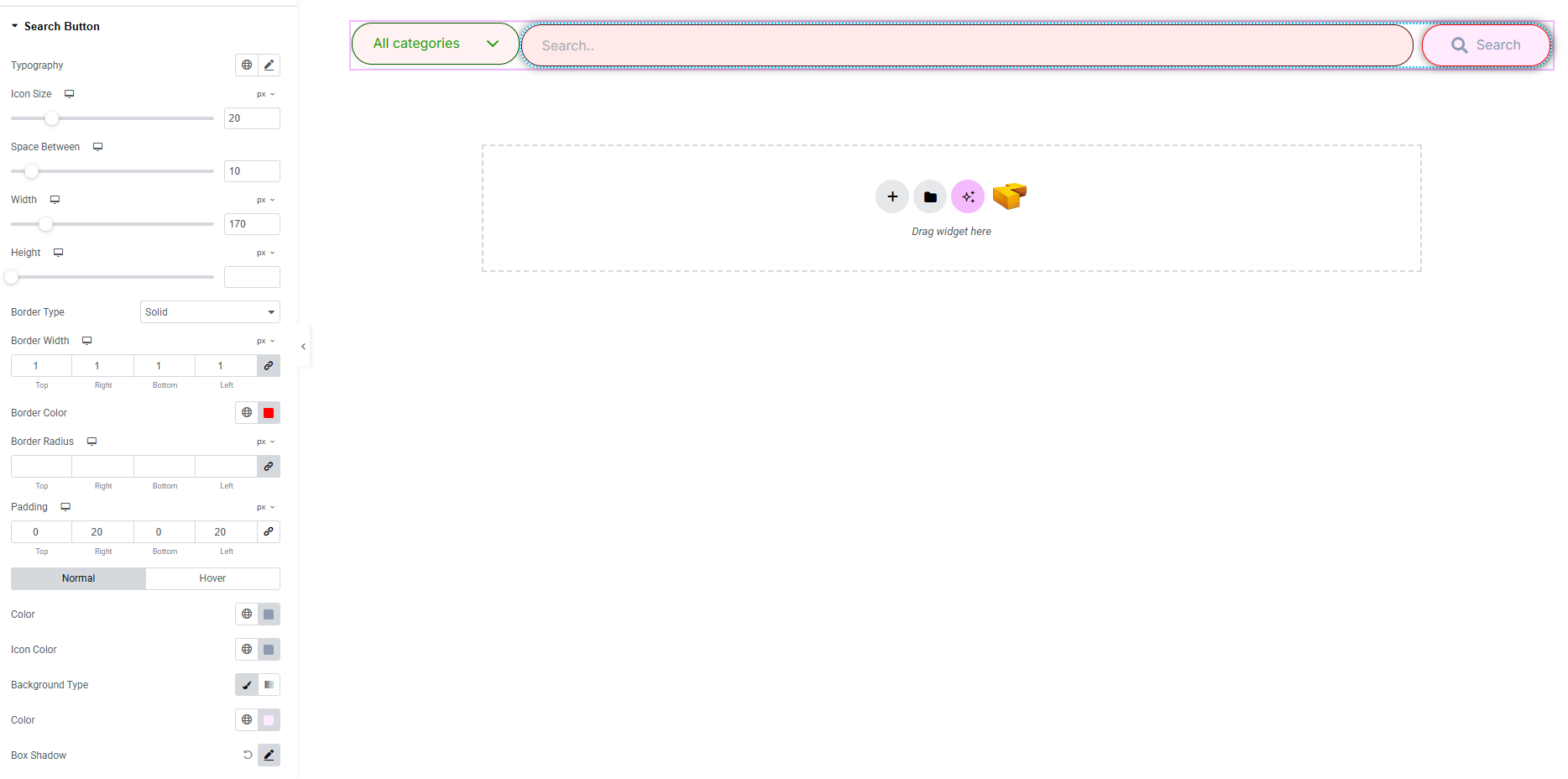
Controls the appearance of the search button.
- Typography: here you can customize the font family, size, weight, transform, style, decoration, line height, letter spacing, and word spacing for your text. Explore full typography settings here.
- Icon Size: Adjust the size of the button icon.
- Space Between: Control spacing between icon and text.
- Width: Set the width of the search button.
- Height: Define the height of the button.
- Border Type: Customize border style, width, color, and radius.
- Padding: Adjust inner spacing of the button.
Normal & Hover States:
- Color: Set text color.
- Icon Color: Change icon color.
- Background Type: Define background style.
- Box Shadow: Apply drop shadow effects.
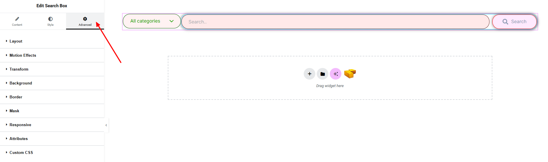
Step 4: Advance tab
If you want to customize the layout, backgrounds, or make your design more engaging, head over to the Advanced section. The Advanced panel is a default Elementor feature. Check out this document to learn more about its features.
Finally, hit the Publish button and watch your stunning Search Box come to life on your webpage!
All done and ready to go!