
Off Canvas
Step-by-Step Tutorial on Using the Off Canvas Widget of Zyre Addon
Design smarter interactions using the Off Canvas Widget from Zyre Addon for Elementor. Whether you want to display menus, filters, or additional content in a sleek sliding panel, this widget gives you full control to create modern, space-saving layouts that enhance user experience without cluttering your page.
Learn How To Use Off Canvas Widget:
Exploring the Features of Off Canvas Widget
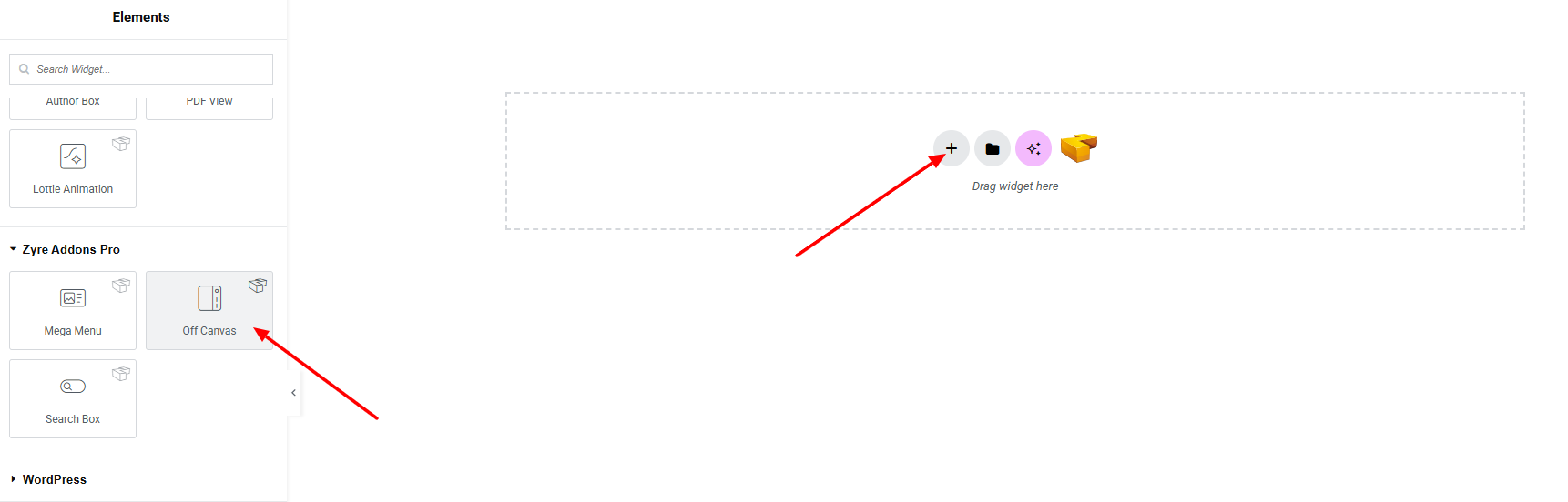
Step 1: Drag the widget
From the left panel, search or choose the Off Canvas Widget of Zyre Addon and simply drag it into your desired section.
Step 2: Content tab
On the Content section, you’ll find options for General, Toggle, Close Bar, and Settings.
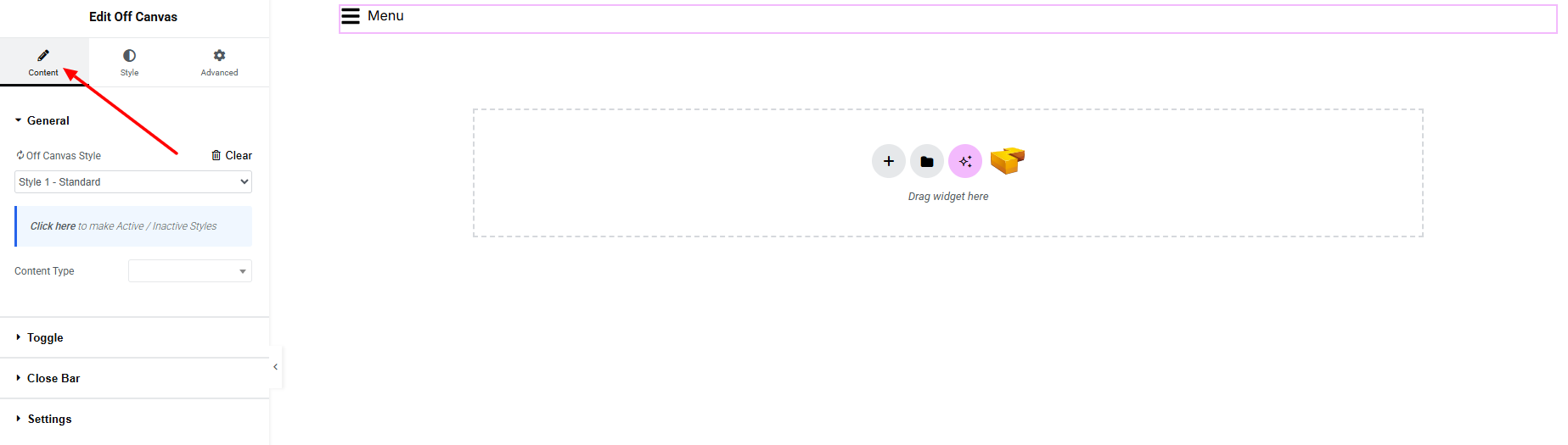
General:
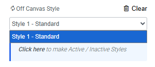
- Off Canvas Style – you can choose a predefined style from here. Currently only one style is available.
- Content Type – Defines what content will be displayed inside the Off Canvas panel.
- Sidebar: Displays a selected WordPress sidebar.
- Choose Sidebar – You can create and manage sidebars from:
Dashboard → Appearance → Widgets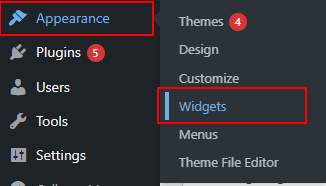
- Choose Sidebar – You can create and manage sidebars from:
- Custom Content: Allows you to add and design content manually within the widget settings.
- Saved Section: Lets you use any previously saved Elementor section.
- Saved Widget: Allows you to insert a saved Elementor widget.
- Saved Page Template: Enables you to display a full saved page template inside the off-canvas panel.
- Sidebar: Displays a selected WordPress sidebar.
Toggle:
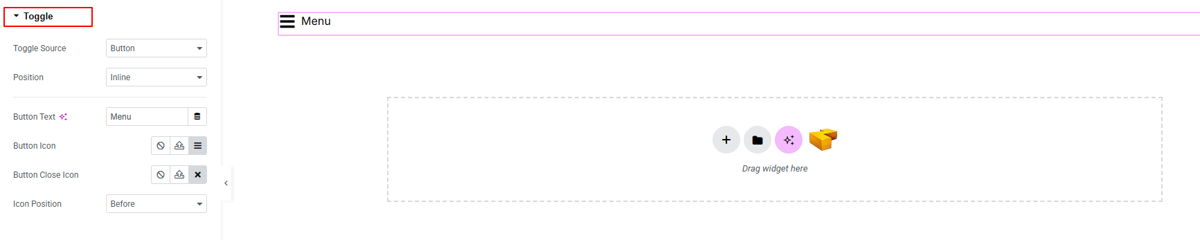
- Toggle Source: Choose what triggers the off-canvas (button, element class, element ID).
- Position: Set where the panel appears (inline, floating).
- Button Text: Define the text shown with toggle button.
- Button Icon: Select an icon for the toggle button.
- Button Close Icon: Choose the icon used to close the panel.
- Icon Position: Set the icon placement relative to the button text(before, after).
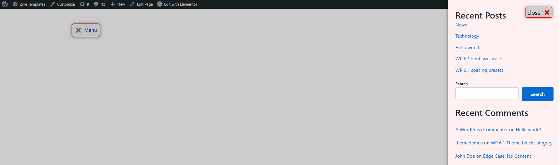
Close Bar:
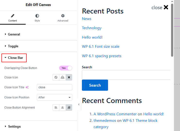
Controls how the close button appears and behaves inside the Off Canvas panel.
- Overlapping Close Button: Enable to place the close button over the panel content.
- Close Icon: Select the icon used for closing the panel.
- Close Icon Title: Add a title for the close icon.
- Close Icon Position: Set where the close icon appears with the icon title.
- Close Button Alignment: Adjust the alignment of the close button (left, center, right).
Settings:
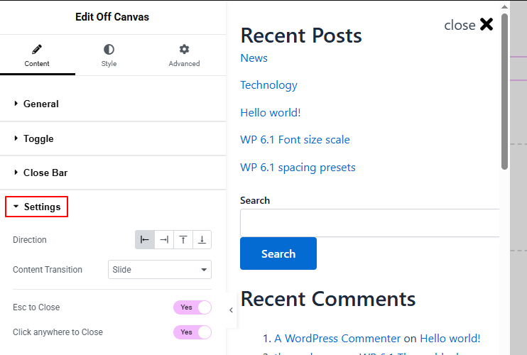
Controls the behavior and animation of the Off Canvas panel.
- Direction: Choose the direction from which the panel appears (left, right, top, or bottom).
- Content Transition: Select the animation effect for how the panel enters and exits.
- Esc to Close: Enable to allow closing the panel using the ESC key.
- Click Anywhere to Close: Enable to close the panel when clicking outside of it.
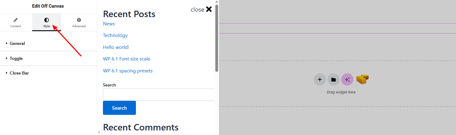
Step 3: Style tab
In the Style section, you can customize the General, Toggle, Close Bar.
General:
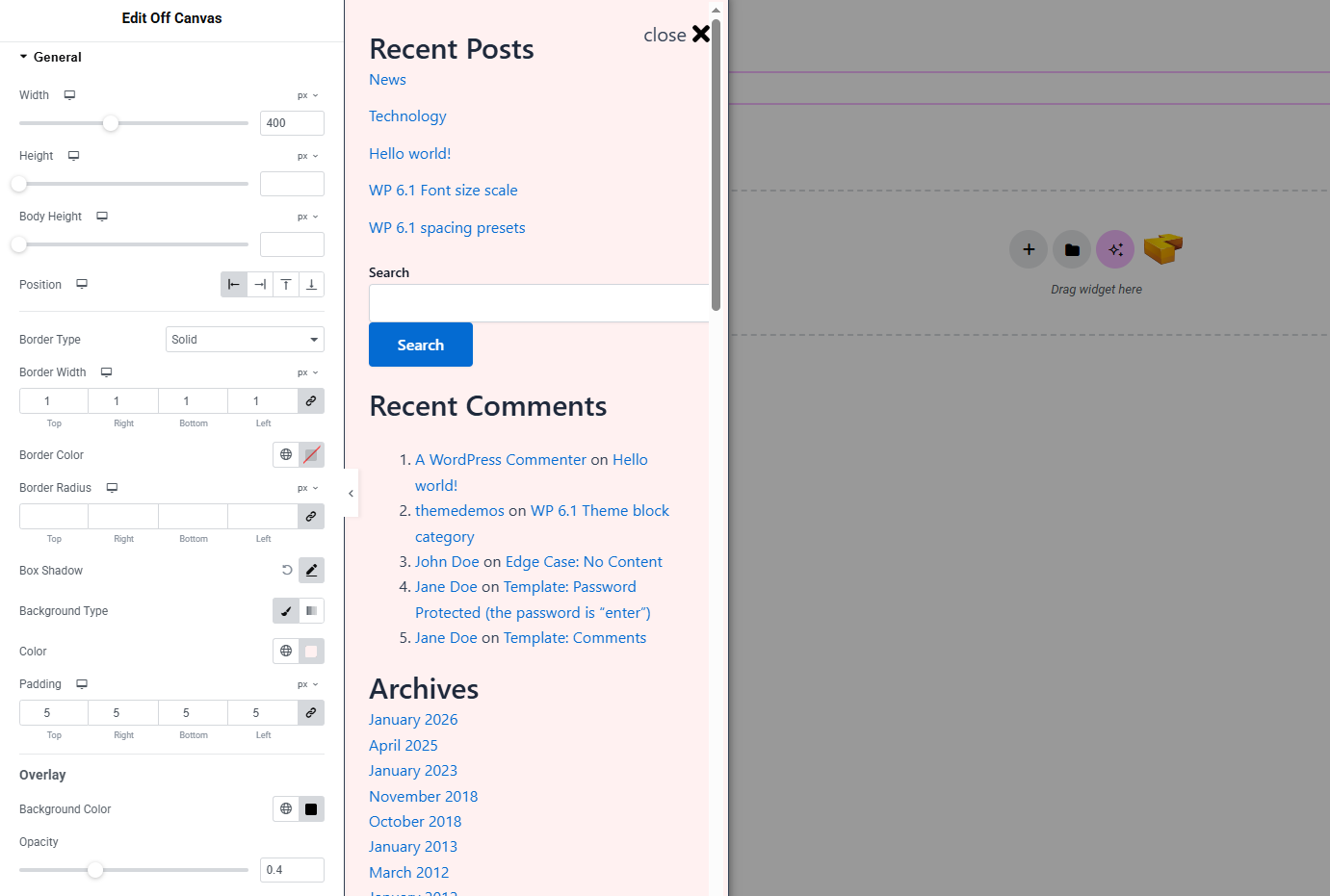
- Width: Set the width of the off-canvas panel.
- Height: Define the full height of the panel.
- Body Height: Adjust the height of the inner content area.
- Position: Set the panel’s alignment on the screen.
- Body Type: Customize the panel container with width, background color, and border radius.
- Box Shadow: Apply shadow effects to the panel for depth.
- Background Type: Set unique background classic or gradient color. Explore full background settings here.
- Padding: Adjust spacing inside the panel.
Overlay
- Background Color: Set the overlay color behind the panel.
- Opacity: Control the transparency level of the overlay.
Toggle:
Controls the appearance of the toggle button or icon that opens the Off Canvas panel.
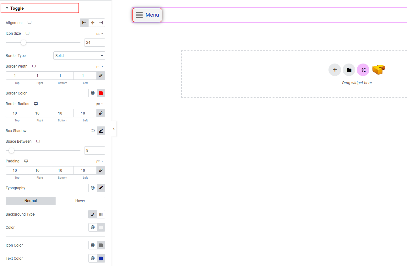
- Alignment: Set the alignment of the toggle button.
- Icon Size: Adjust the size of the toggle icon.
- Border Type: Customize border style, width, color, and radius.
- Box Shadow: Apply drop shadow effects to the toggle button.
- Space Between: Control spacing between icon and text.
- Padding: Adjust inner spacing of the toggle button.
- Typography: here you can customize the font family, size, weight, transform, style, decoration, line height, letter spacing, and word spacing for your text. Explore full typography settings here.
- For both Normal and Hover states:
- Border Type: Set different border styles for normal and hover states.
- Icon Color: Change icon color for normal and hover states.
- Text Color: Adjust text color for normal and hover states.
Close Bar:
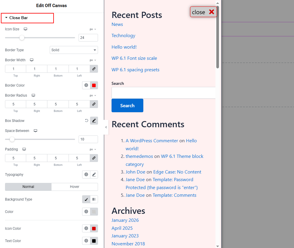
Controls the styling of the close button inside the Off Canvas panel.
- Icon Size: Adjust the size of the close icon.
- Border Type: Customize border style, width, color, and radius.
- Box Shadow: Apply shadow effects to the close button.
- Space Between: Control spacing between icon and text.
- Padding: Adjust inner spacing of the close button.
- Typography: here you can customize the font family, size, weight, transform, style, decoration, line height, letter spacing, and word spacing for your text. Explore full typography settings here.
- For both Normal and Hover states:
- Background Type: Set unique background classic or gradient color. Explore full background settings here.
- Icon Color: Change icon color for normal and hover states.
- Text Color: Adjust text color for normal and hover states.
Button Wrapper
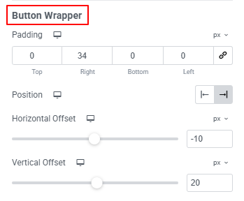
- Padding: Control spacing around the close button container.
- Position: Set the position of the close button wrapper.
- Horizontal Offset: Adjust horizontal placement.
- Vertical Offset: Adjust vertical placement.
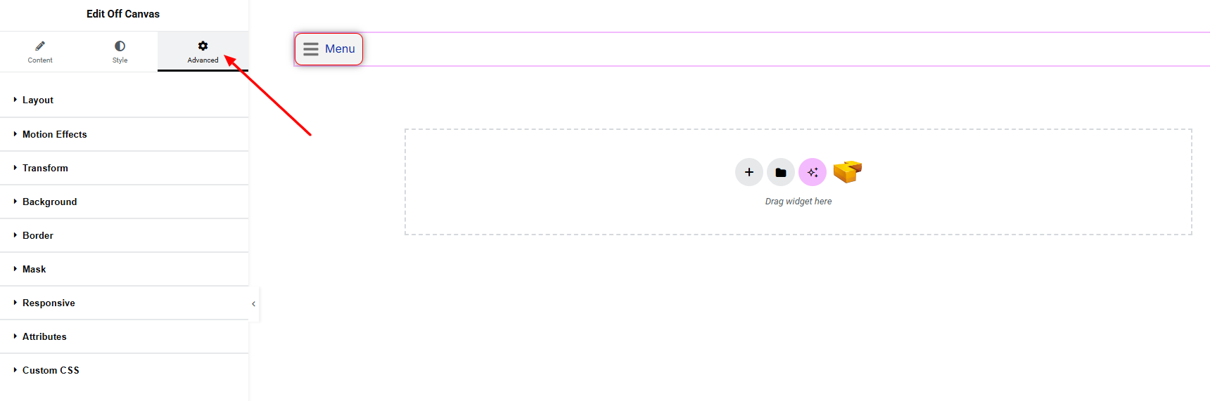
Step 4: Advance tab
If you want to customize the layout, backgrounds, or make your design more engaging, head over to the Advanced section. The Advanced panel is a default Elementor feature. Check out this document to learn more about its features.
Finally, hit the Publish button and watch your stunning Off Canvas come to life on your webpage!
All done and ready to go!