
Alert
Step-by-Step Tutorial on Using the Alert Widget of Zyre Addon
Grab your visitors’ attention instantly using the Alert Widget of Zyre Addon for Elementor. With customizable styles, you can make important messages stand out and enhance your webpage’s user experience.
Learn How To Use Alert Widget:
Exploring the Features of Alert Widget
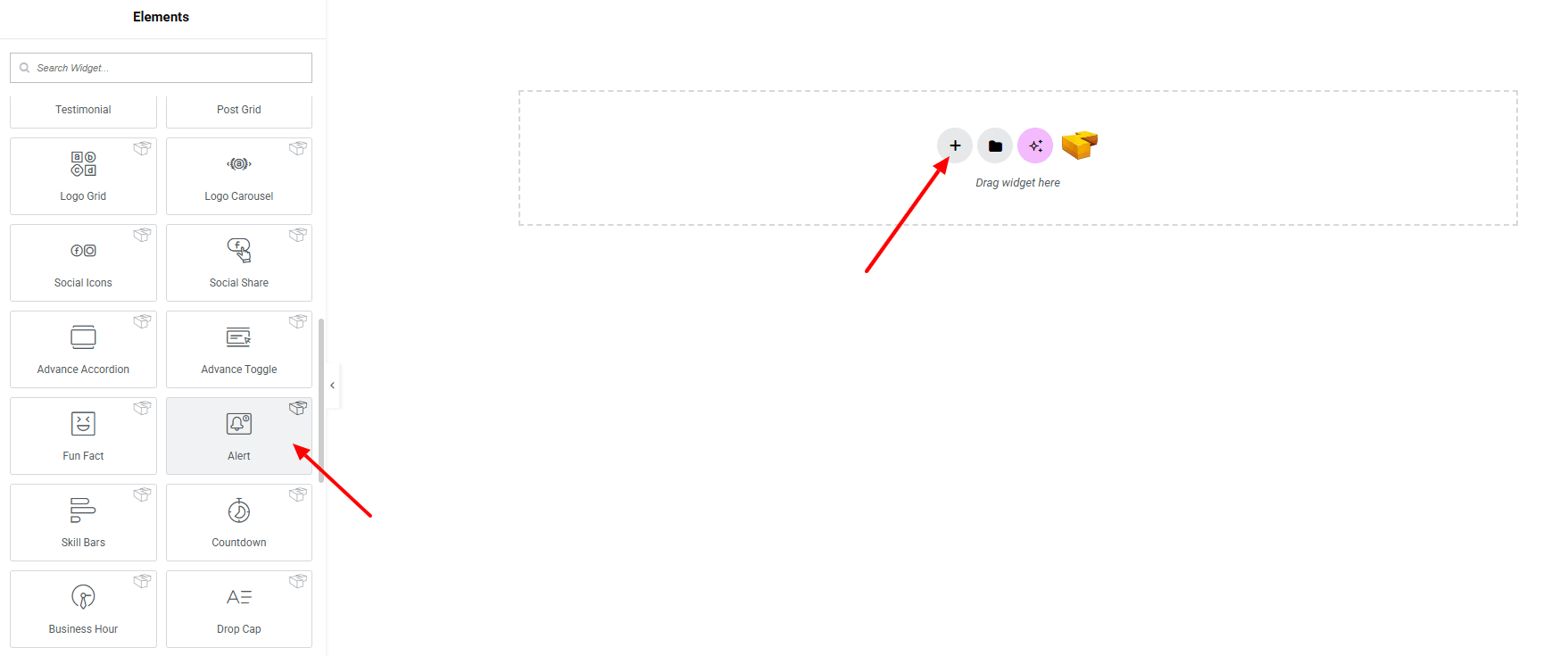
Step 1: Drag the widget
From the left panel, search or choose the Alert Widget of Zyre Addon and simply drag it into your desired section.
Step 2: Content tab
Alert Content:
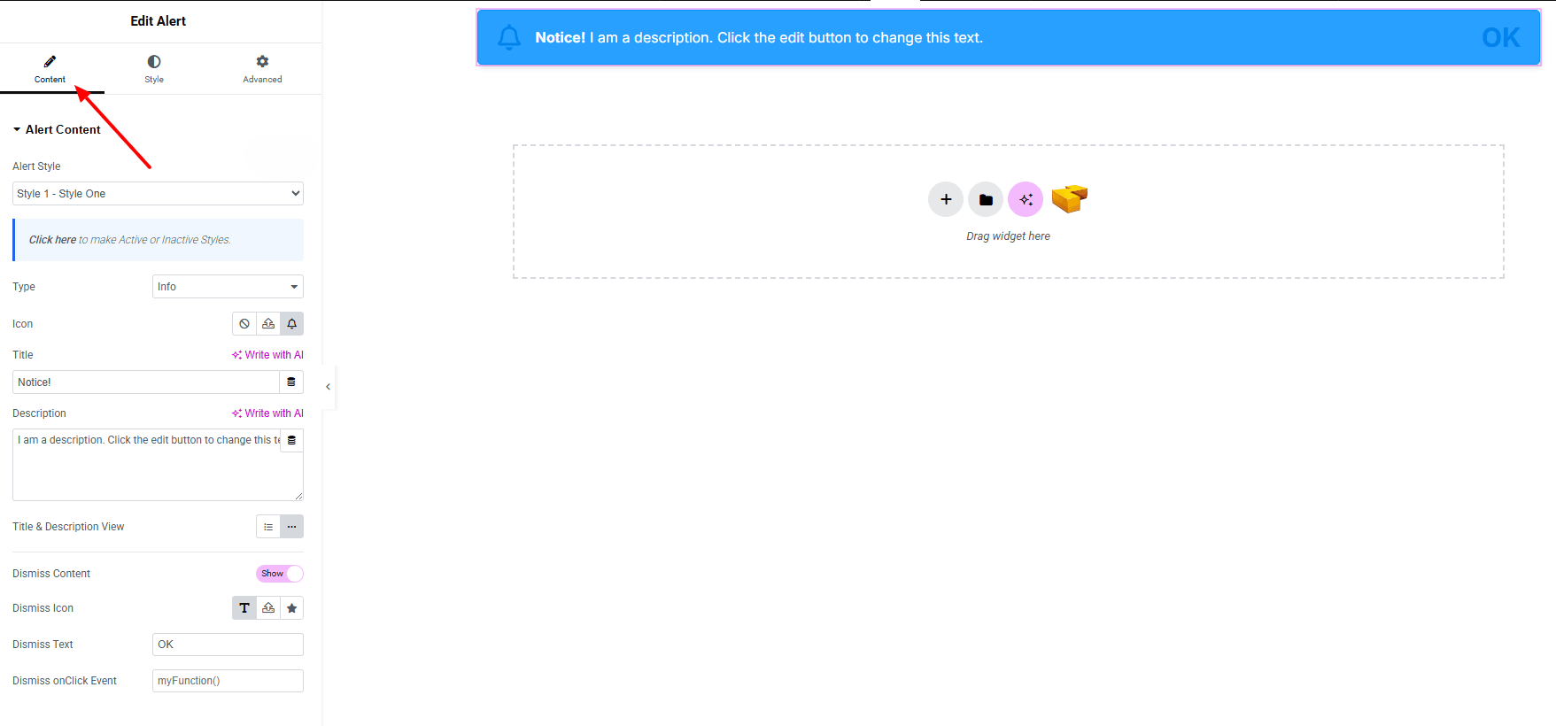
- Alert Style : Currently, one style is available.
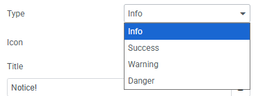
- Type : Choose from 4 different alert types
- Icon : Set any icon (including SVG)
- Title : Add and customize the alert title.
- Description : Add and customize the alert description.
- Layout : Choose between block or inline display.
- Dismiss Content : Enable dismiss functionality with a custom icon or text.
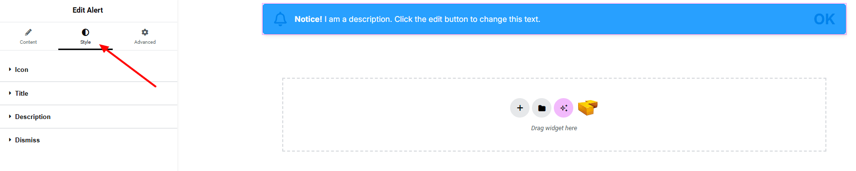
Step 3: Style tab
In the Style section, you can customize the Icon, Title, Description, Dismiss — but make sure you have added the contents first.
Icon:
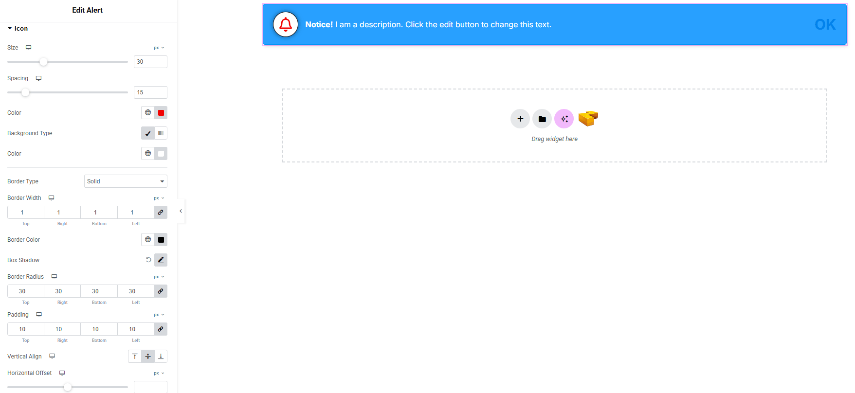
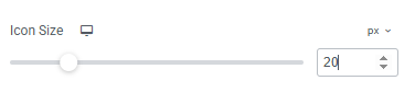
- Size : Adjust the size of the icon.
- Spacing : Set spacing between icon and text.
- Color : Choose the icon color.
- Background Type : Set background color for classic or gradient. Explore full background settings here.
- Border : Customize border type, width and color.
- Border Radius : Apply rounded corners to the icon.
- Shadow : Add shadow effects to the icon.
- Padding : Control inner spacing around the icon.
- Vertical Alignment : Adjust the icon’s vertical position.
- Horizontal Offset : Fine-tune horizontal positioning.
- Vertical Offset : Fine-tune vertical positioning.
Title:
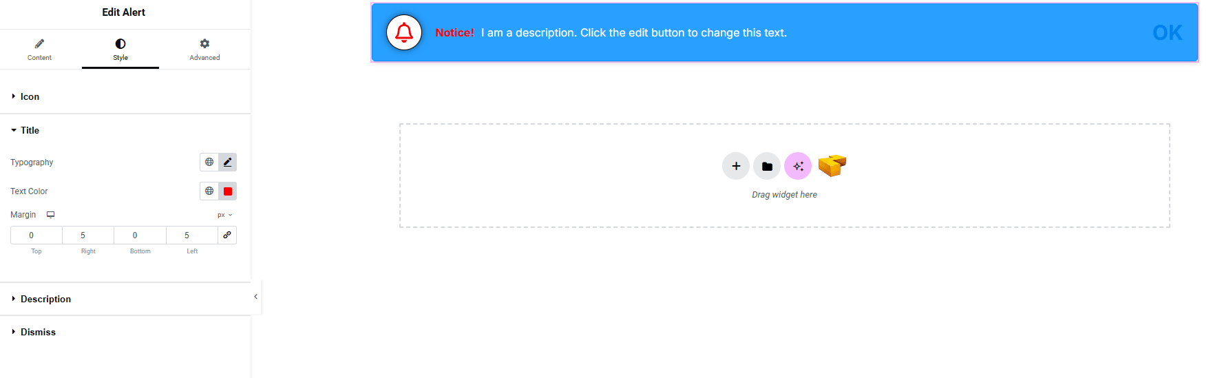
- Typography : Adjust font family, size, weight, transform, style, decoration, line height, letter spacing, and word spacing. Explore full typography settings here.
- Text Color : Set the color of the title text.
- Margin : Adjust outer spacing of the title.
Description:
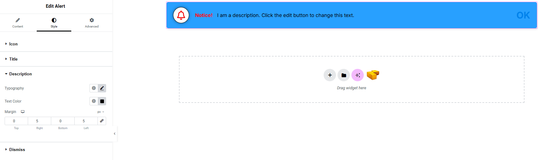
You’ll find the same design options for the Description as in the Title — giving you full freedom to style it just the way you imagine.
Dismiss:
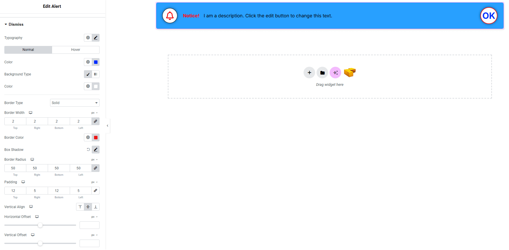
- Typography : Adjust font family, size, weight, transform, style, decoration, line height, letter spacing, and word spacing. Explore full typography settings here.
- Icon Size (make sure icon is set from Dismiss Icon) : Set the icon size.
- Color : Set text/icon color for both normal and hover states.
- Background Type : Choose background color for both normal and hover states. Explore full background settings here.
- Border : Customize border type, width and color.
- Border Radius : Apply rounded corners to the item.
- Padding : Control inner spacing around the icon/text.
- Vertical Alignment : Set vertical positioning.
- Horizontal Offset : Fine-tune horizontal positioning.
- Vertical Offset : Fine-tune vertical positioning.
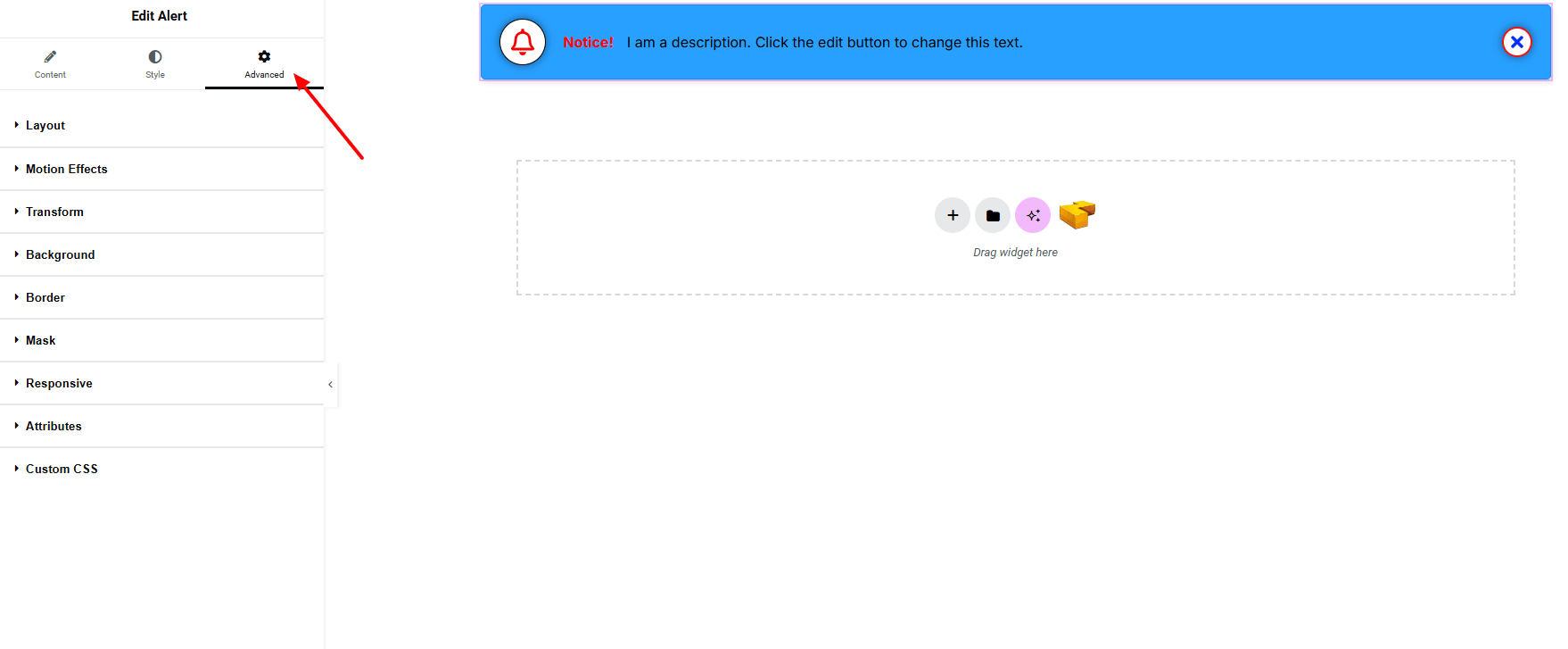
Step 4: Advance tab
If you want to customize the layout, backgrounds, or make your design more engaging, head over to the Advanced section. The Advanced panel is a default Elementor feature. Check out this document to learn more about its features.
Finally, hit the Publish button and watch your stunning Alert come to life on your webpage!

All done and ready to go!