
Call to Action
Step-by-Step Tutorial on Using the Call to Action Widget of Zyre Addon
Boost conversions and capture user attention with the Call to Action Widget from Zyre Addon. This powerful widget lets you design engaging CTAs with customizable titles, descriptions, buttons, and backgrounds. Add hover effects, layouts, and responsive styles to create professional call-to-action sections that inspire clicks—perfect for driving sales, sign-ups, or traffic.
Learn How To Use Call to Action Widget:
Exploring the Features of Call to Action Widget
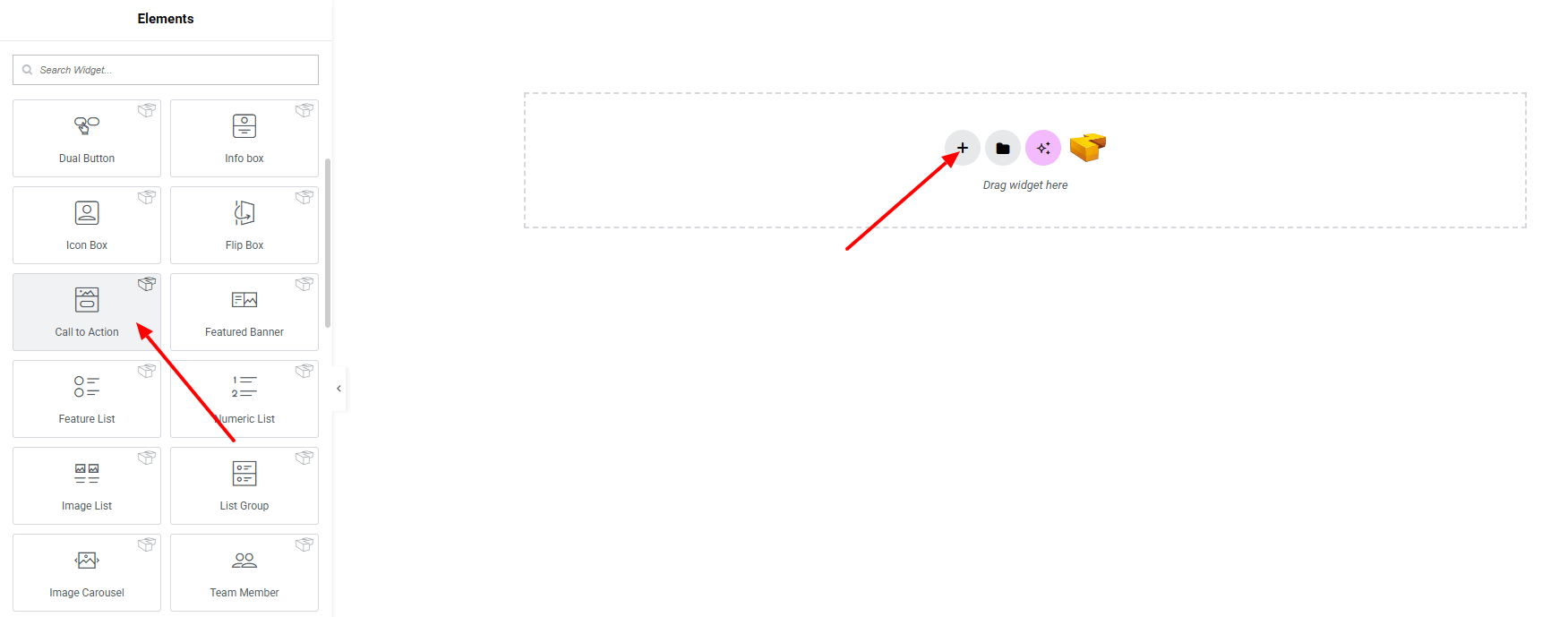
Step 1: Drag the widget
From the left panel, search or choose the Call to Action of Zyre Addon and simply drag it into your desired section.
Step 2: Content tab
On content tab of call to action here it have content for Template style, Main Image, Content, Button and Ribbon.
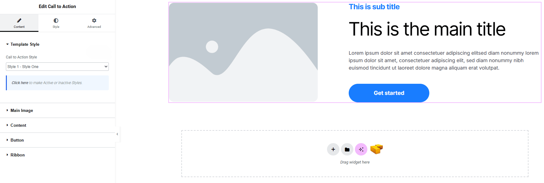
Template Style:
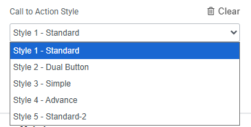
- Call to Action Style : you can choose a predefined style from here
Main Image:
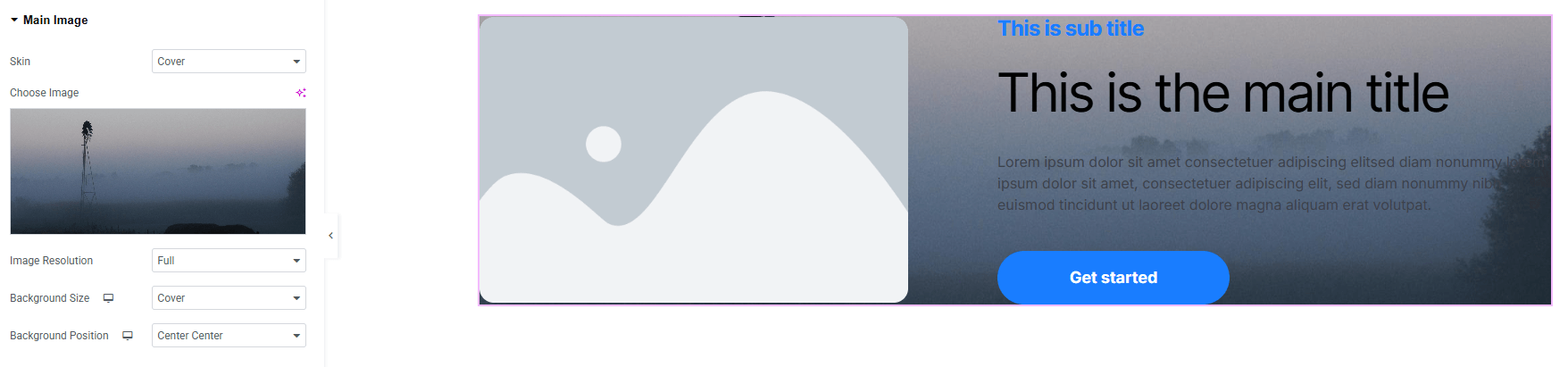
- Skin : Select the display type of the content (cover for overflow content)
- Choose Image : Select the image from the media library.
- Image Resolution : Define the resolution for sharper display.
- Background Size : Set how the background image is scaled.
- Background Position : Adjust the position of the background.
Content:
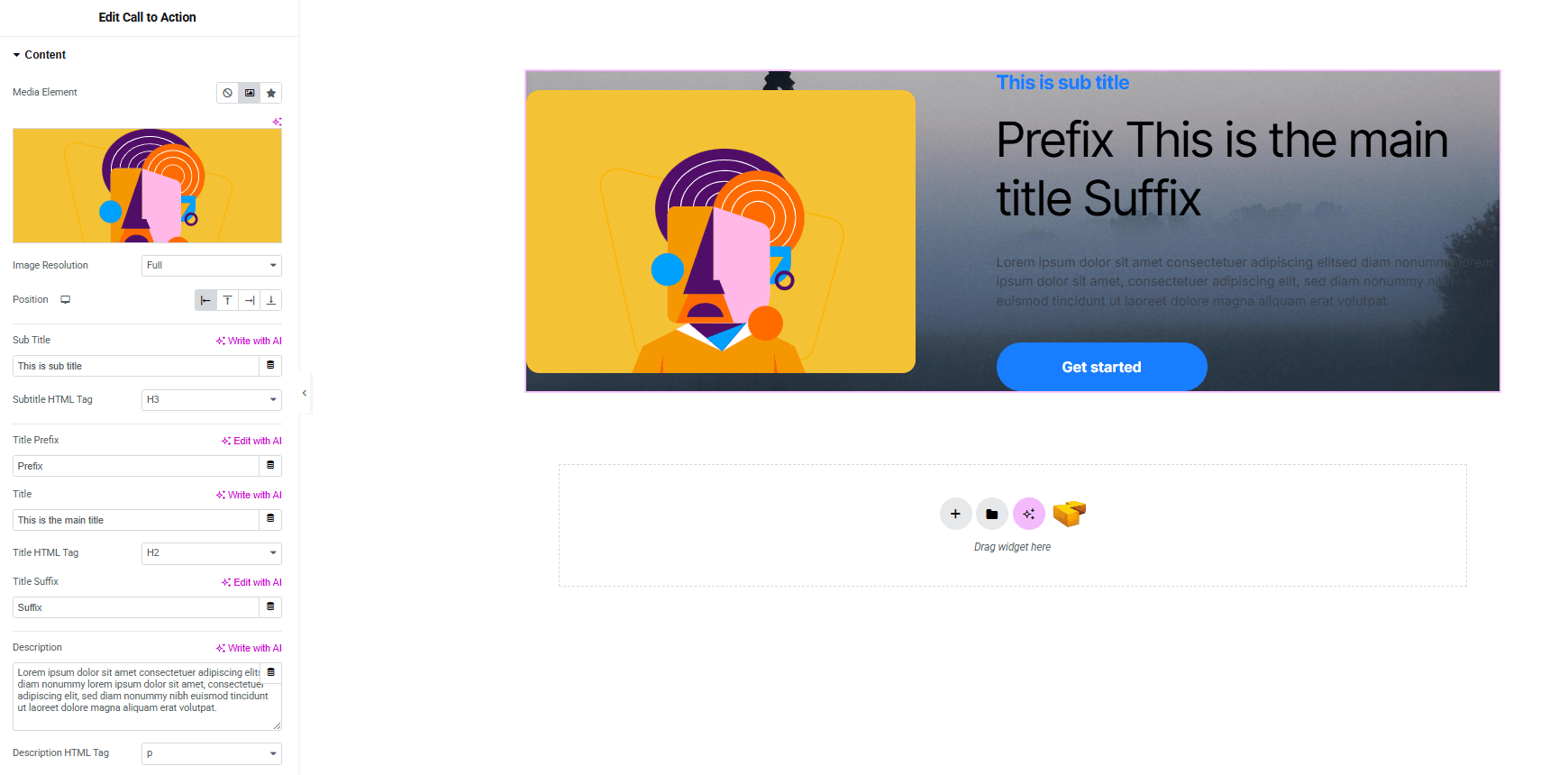
- Media Element : Add an image or icon.
- Image Resolution : Define the resolution for sharper display.
- Position : Adjust the position of the media content.
- Subtitle : Enter subtitle text.
- Subtitle HTML Tag :Choose the HTML tag for the subtitle.
- Title Prefix : Add prefix text before the main title.
- Title : Enter the main title text.
- Title HTML Tag : Set the HTML tag for the title.
- Title Suffix : Add suffix text after the main title.
- Description : Add description text.
- Description HTML Tag : Choose the HTML tag for the description.
Button:
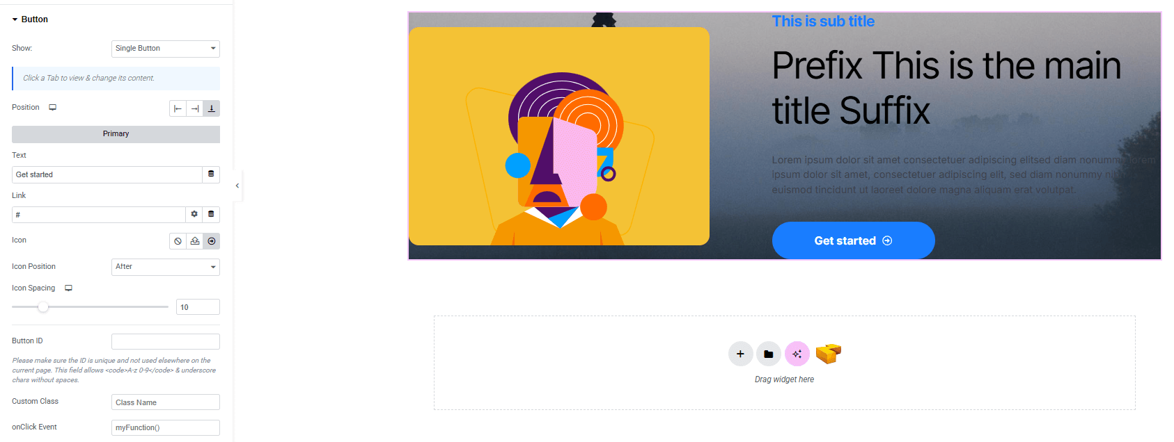
- Show : Show the Single, Double button or hide it.
- Position : Set the button’s position.
- Text : Enter button text.
- Link : Add a link URL for the button.
- Icon : Select an icon (including SVG).
- Icon Position : Choose the position of the icon relative to text.
- Icon Spacing : Adjust spacing between icon and text.
- Button ID : Assign a unique ID to the button.
- Custom Class : Add a custom CSS class for styling.
- Onclick Event : Define a custom onclick event action.
Ribbon:
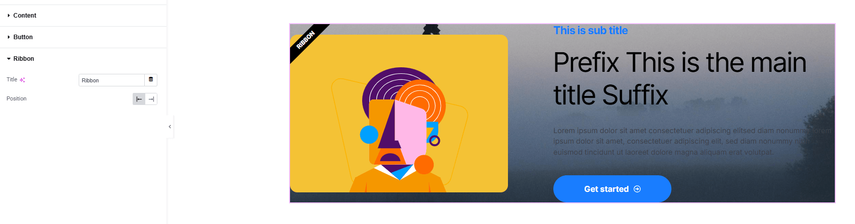
- Title : Enter the title text.
- Position : Set the ribbon’s position.
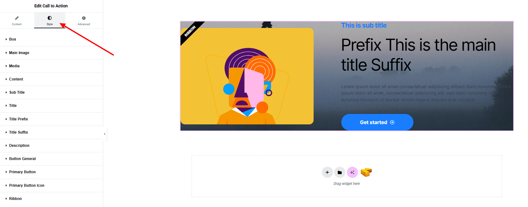
Step 3: Style tab
In the Style section, you can customize the Box, Main image, Media, Content, Sub Title, Title, Title Prefix, Title Suffix, Description, Button General, Primary Button, Primary Button Icon, Ribbon — but make sure you have added them first.
Box:
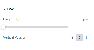
- Border Radius : Apply rounded corners to each item.
- Vertical Position : Add inner space.
Main Image:
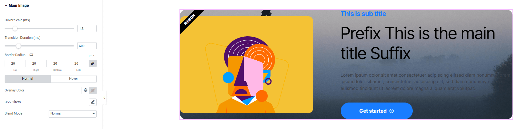
- Hover Scale : Adjust how much the image zooms in/out on hover.
- Transition Duration : Set smooth animation timing for hover effects.
- Border Radius : Apply rounded corners to the image frame.
- Overlay (both for normal and hover states)
- Overlay Color : Add a color overlay for styling.
- CSS Filters : Apply filters on image.
- Blend Mode : Control how the image blends with background/overlay.
Media:
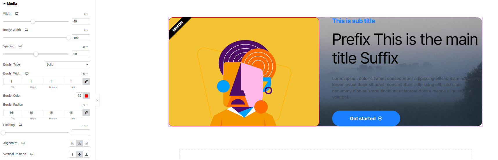
- Width : Set the overall width of the media container.
- Image width : Define the width of the image.
- Spacing : Control the spacing between the media element and other content.
- Border : Customize border type, width and color.
- Border Radius : Apply rounded corners to the media element.
- Padding : Add inner spacing around the media element.
- Alignment : Position the media element.
- Vertical Position : Align the media vertically (if media position is set to left or right).
Content:
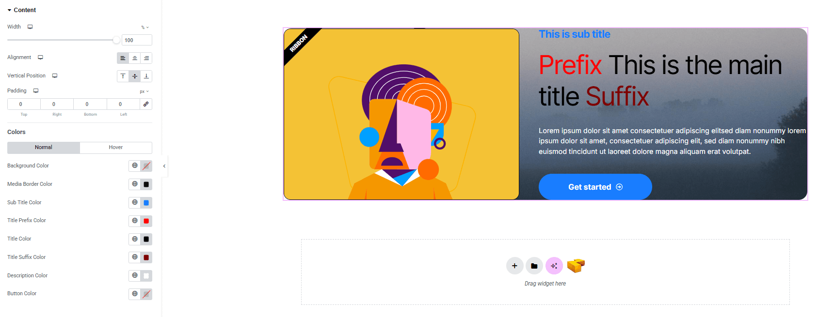
- Width : Define the overall width of the content area.
- Alignment : Position the content.
- Vertical Position : Adjust vertical alignment within the container.
- Padding : Control inner spacing around the content.
- Colors (both for normal and hover states)
- Background Color : Set the content area background.
- Media Border Color : Style the border color of media elements.
- Subtitle Color : Define the text color for subtitles.
- Title Prefix Color : Style the prefix text.
- Title Color : Customize the main title color.
- Title Suffix Color : Style the suffix text color.
- Description Color : Set the color for description text.
- Button Color : Customize button text/icon color.
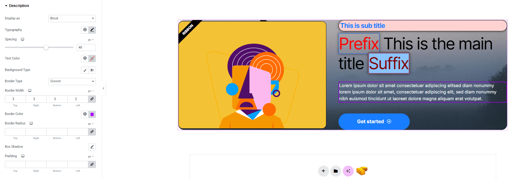
Sub Title:
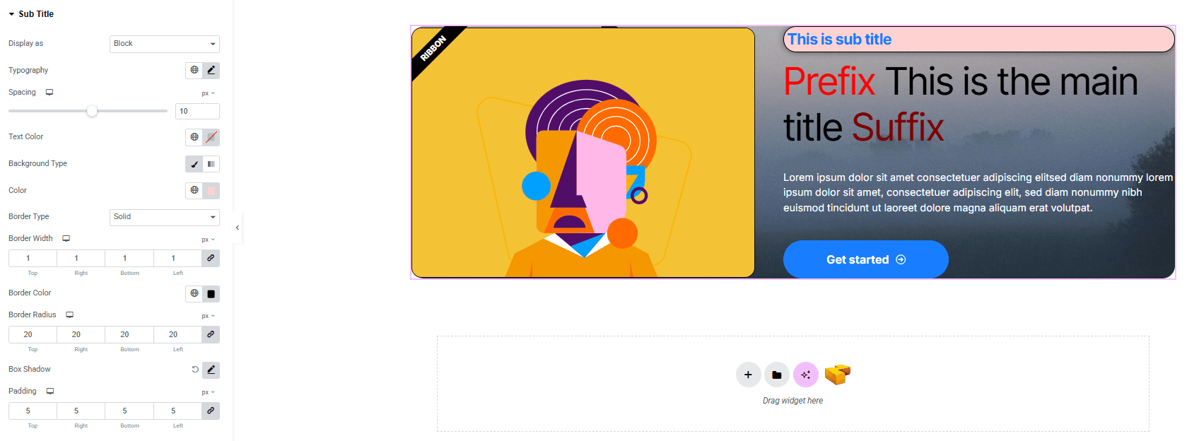
- Display As : Choose the display type of subtitle.
- Typography : Adjust font family, size, weight, transform, style, decoration, line height, letter spacing, and word spacing. Explore full typography settings here.
- Spacing : Adjust the bottom space of the subtitle.
- Text Color : Set the subtitle text color.
- Background type : Set classic or gradient background color (linear or radial). Explore full background settings here.
- Border : Define border type with width and color.
- Border Radius : Apply rounded corners to the subtitle area.
- Box Shadow : Add drop shadow.
- Padding : Control the inner spacing around the subtitle.
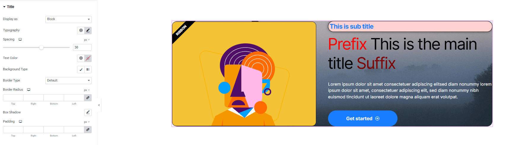
Title:
You’ll find the same design options for the Title Section as in the Sub Title Section— giving you full freedom to style it just the way you imagine.
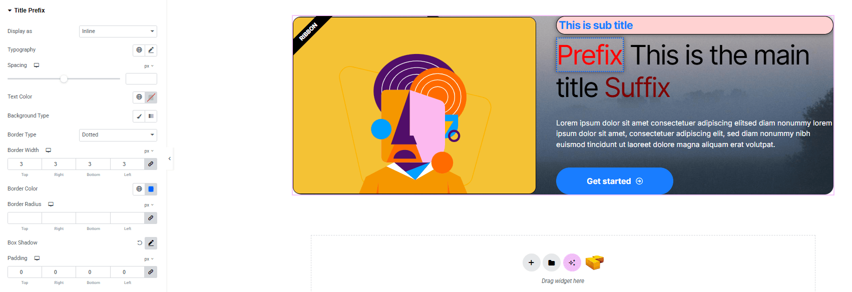
Title Prefix:
You’ll find the same design options for the Title Prefix Section as in the Sub Title Section— giving you full freedom to style it just the way you imagine.
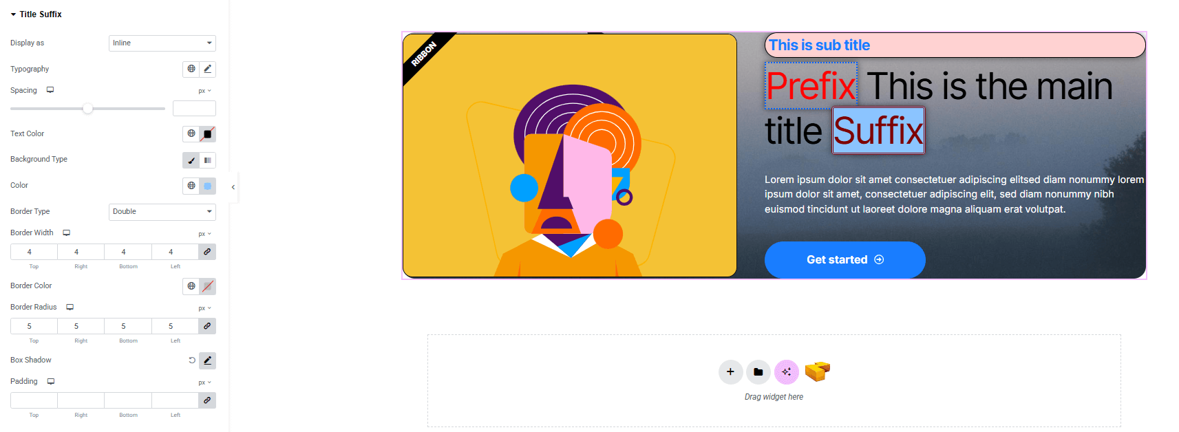
Title Suffix:
You’ll find the same design options for the Title Suffix Section as in the Sub Title Section— giving you full freedom to style it just the way you imagine.
Description:
You’ll find the same design options for the Description as in the Sub Title section— giving you full freedom to style it just the way you imagine.
Button General:
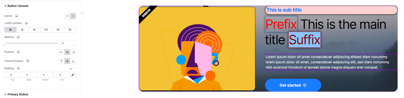
- Layout : Choose the overall button layout style.
- Justify Content : Align buttons horizontally.
- Spacing : Adjust the space between multiple buttons.
- Position : Set the button’s position relative to the container.
- Vertical Position : Control the button’s alignment along the vertically.
- Padding : Manage the inner spacing inside the button container.
Primary Button:
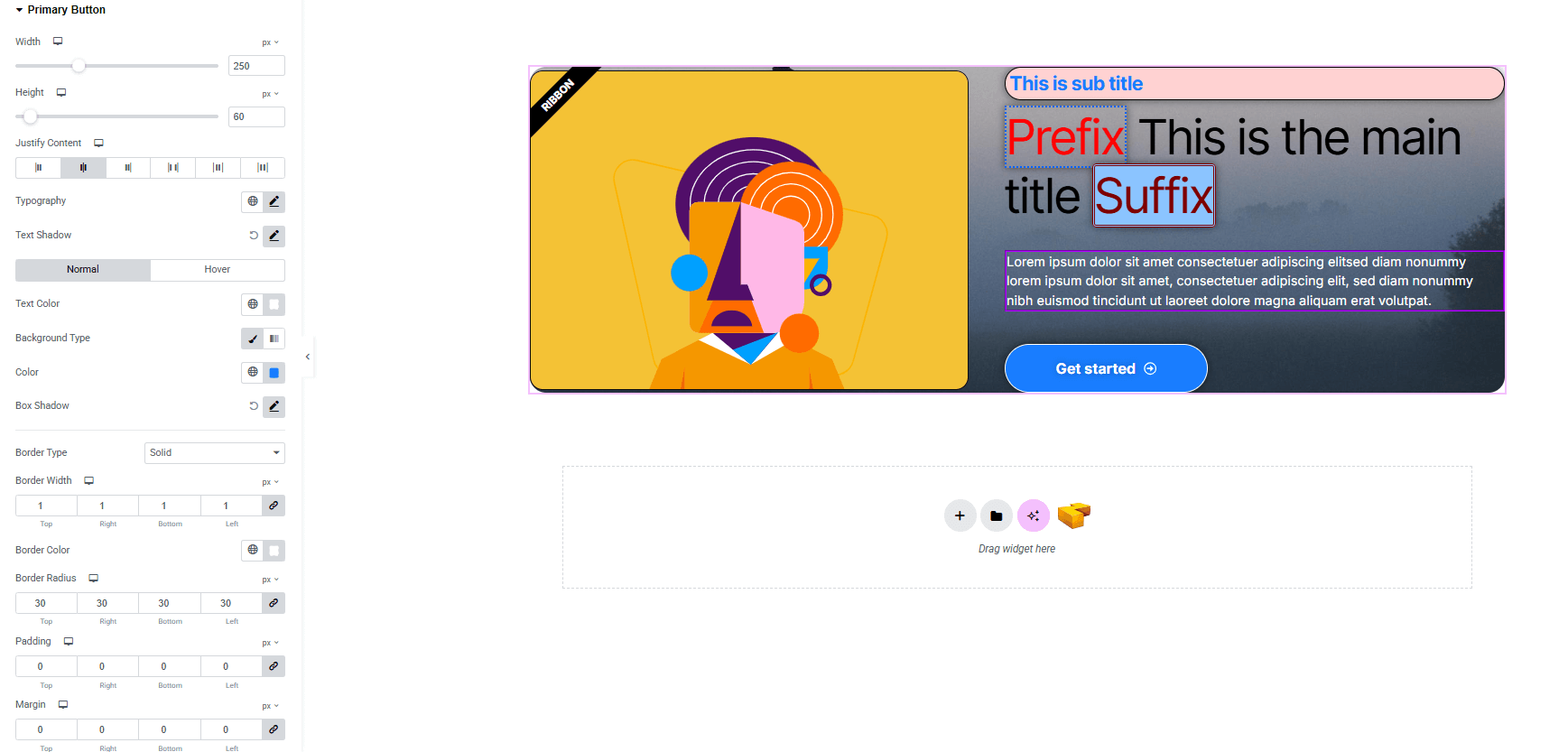
- Width & Height : Define the button’s dimensions.
- Justify Content : Align text and icon inside the button.
- Typography : Set font family, size, weight, transform, style, decoration, line height, and spacing. Explore full typography settings here.
- Text Shadow : Add text shadow effect.
- Text Color : Choose text colors for both Normal and Hover states.
- Background type : Set classic or gradient background (linear or radial). Explore full background settings here.
- Box Shadow : Control drop shadow effect for Normal and Hover states.
- Border : Define border type with width and color.
- Border Radius : Apply rounded corners to the button.
- Padding : Manage inner spacing for text and icons.
- Margin : Control spacing outside the button.
Primary Button Icon:
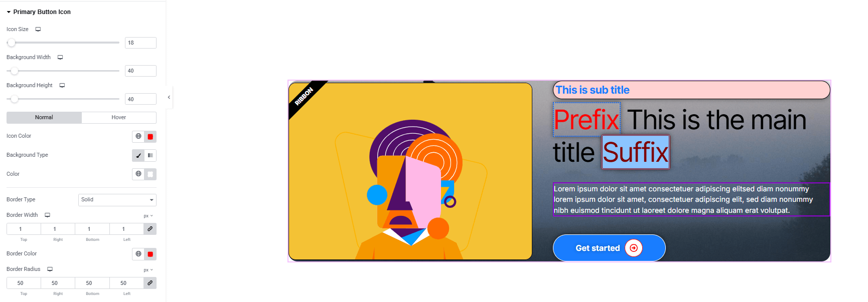
- Icon Size : Adjust the icon’s dimension.
- Background Width & Height : Set width & height for the icon background area.
- Icon Color : Set the icon color for both Normal and Hover states.
- Background type : Set classic or gradient background (linear or radial) for both Normal and Hover states. Explore full background settings here.
- Border : Define border type with width and color.
- Border Radius : Apply rounded corners to the button icon area.
Ribbon:
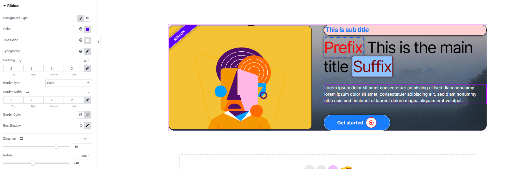
- Background type : Set classic or gradient background (linear or radial). Explore full background settings here.
- Color : Set the background color of the ribbon.
- Text Color : Set the text color.
- Typography : Set font family, size, weight, transform, style, decoration, line height, and spacing. Explore full typography settings here.
- Padding : Manage inner spacing.
- Border : Define border type with width and color.
- Box Shadow : Control drop shadow effect.
- Distance : Set the ribbon’s distance from the edge.
- Rotate : Set the ribbon angle for positioning.
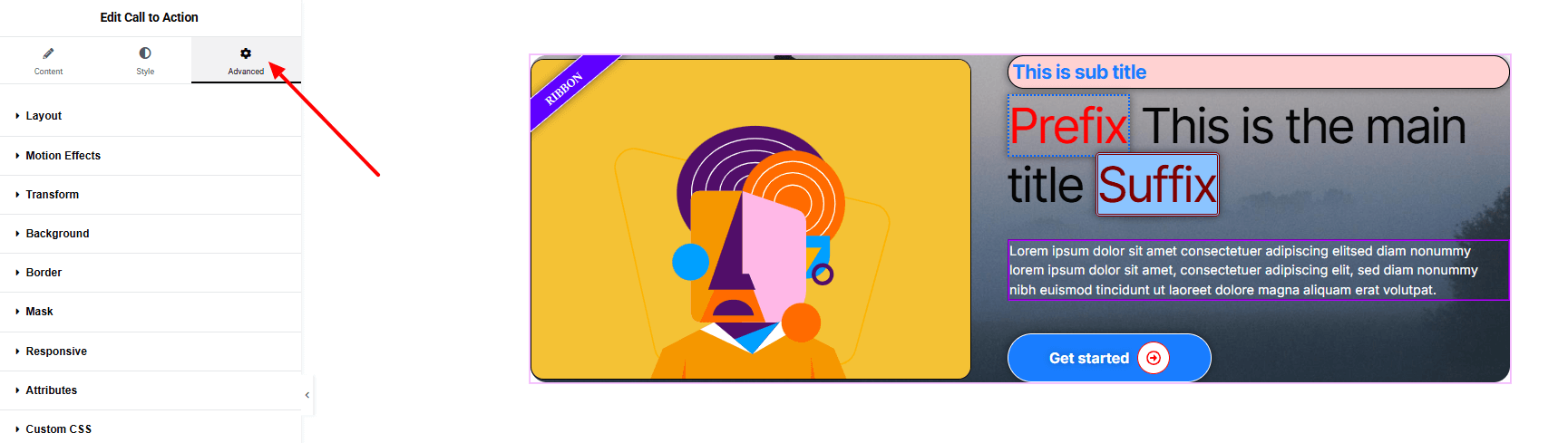
Step 4: Advance tab
If you want to customize the layout, backgrounds, or make your design more engaging, head over to the Advanced section. The Advanced panel is a default Elementor feature. Check out this document to learn more about its features.
Finally, hit the Publish button and watch your stunning Call to Action come to life on your webpage!
You’re fully set up now!