
Dual Button
Step-by-Step Tutorial on Using the Dual Button Widget of Zyre Addon
The Dual Button Widget in Zyre Addon empowers you to design modern, professional dual buttons for your Elementor site. With customizable effects and styles, you can instantly upgrade the look and feel of your webpage.
Learn How To Use Dual Button Widget:
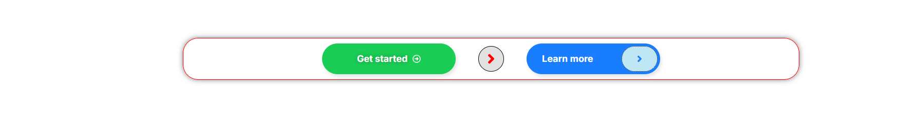
Exploring the Features of Dual Button Widget
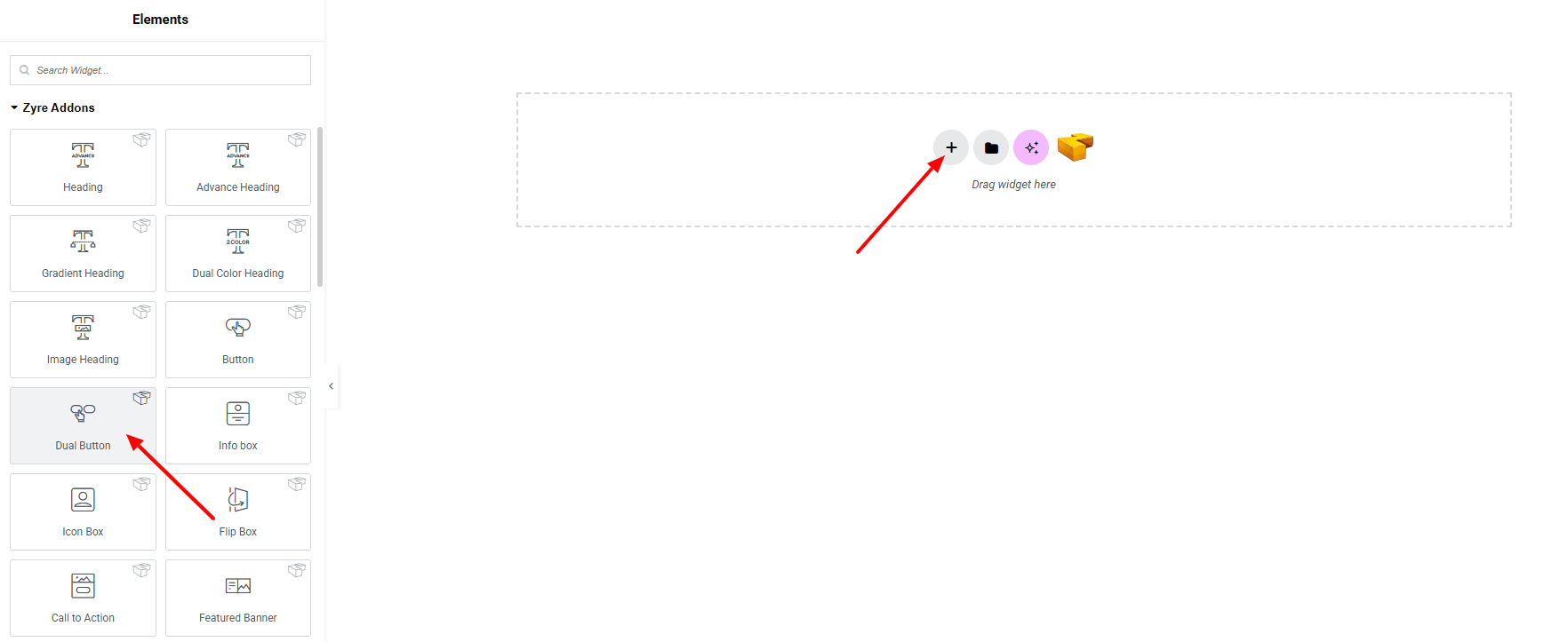
Step 1: Drag the widget
From the left panel, search or choose the Dual Button Widget of Zyre Addon and simply drag it into your desired section.
Step 2: Content tab
Dual Button Content:
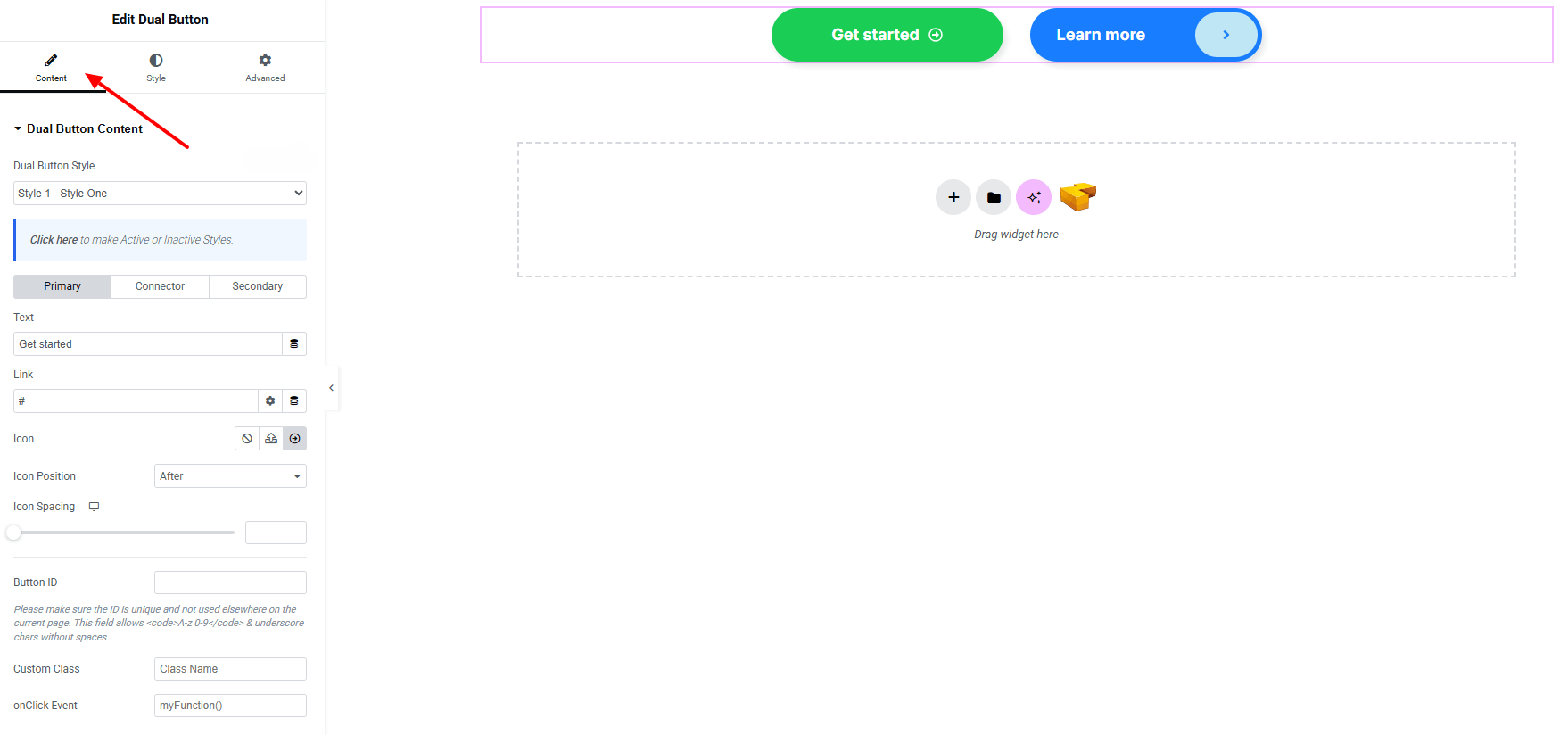
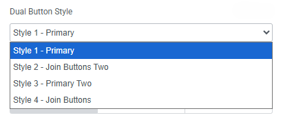
- Dual Button Style : You can choose a predefined style from here
- Primary Button and Secondary Button
- Text : Set the primary button text.
- Link : Add a URL for the button.
- Icon : Set an icon (including SVG)
- Icon Position : Adjust the icon’s position (before/after text)
- Icon Spacing : Control the space between icon and text
- Button ID : Assign a unique ID to the button.
- Custom Class : Add custom CSS class.
- Onclick Event : Set a JavaScript action on button click.
- Connector
- Enable Connector : Toggle on/off.
- Connector Type : Choose between:
- Text
- Connector Text : Add custom text for the connector.
- Icon
- Icon Selection : Choose an icon for the connector
- Text
Step 3: Style tab
In the Style section, you can customize: General, Primary Button, Secondary Button, Connector, Primary Button Icon and Secondary Button Icon (make sure you’ve added the icon first).
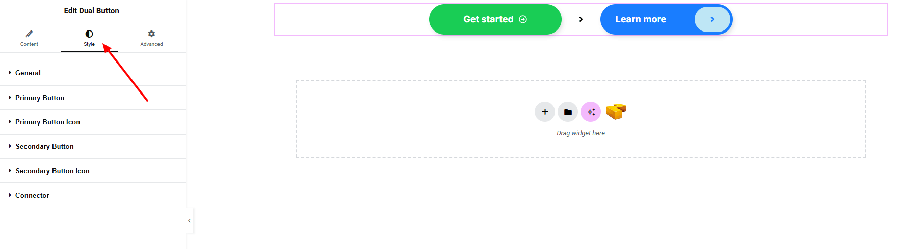
General:
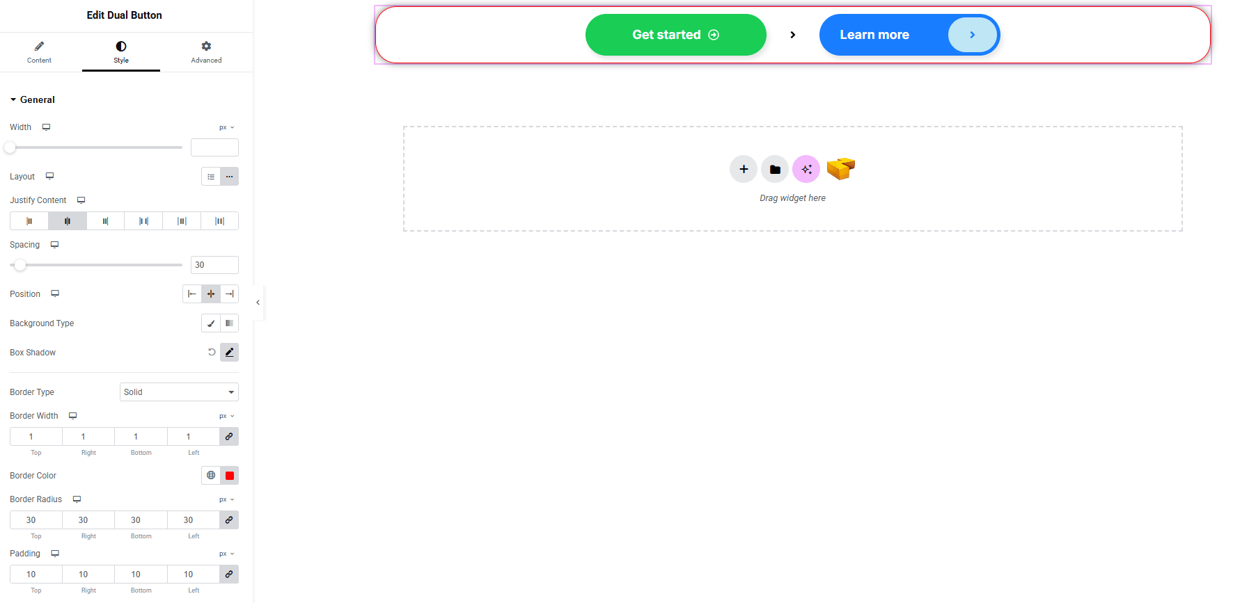
- Width : Set the full container width for the dual button.
- Layout : Choose button layout (inline / block)
- Justify Content : Align the buttons horizontally.
- Spacing : Control the space between primary, connector, and secondary buttons.
- Position : Adjust the overall button group positioning.
- Background Type : Set classic or gradient background (linear or radial). Explore full background settings here.
- Box Shadow : Customize drop shadow for the container.
- Border Style : Customize border type, width and color.
- Border Radius : Apply rounded corners to the area.
- Padding : Adjust inner spacing of the container.
Primary Button & Secondary Button:
Primary button and Secondary button have same options for styling.
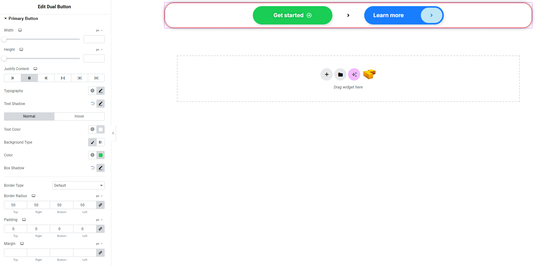
- Height & Width : Set custom button dimensions.
- Justify content : Justify contents of the button with icon.
- Typography : Customize font family, size, weight, transform, style, decoration, line height, letter spacing, and word spacing. Explore full typography settings here.
- Text Shadow : Apply a shadow effect to the button text.
- Text Color : Set text color for both normal and hover states.
- Background Type : Choose classic or gradient background for normal and hover states. Explore full background settings here.
- Box Shadow : Apply a drop shadow effect to the button container.
- Border Type : Set border style with width and color.
- Border Radius : Control corner roundness to the button.
- Padding : Adjust inner spacing of the button.
- Margin : Control outer spacing of the button.
Primary Button icon & Secondary Button icon:
Primary button icon and Secondary button icon have same options for styling.
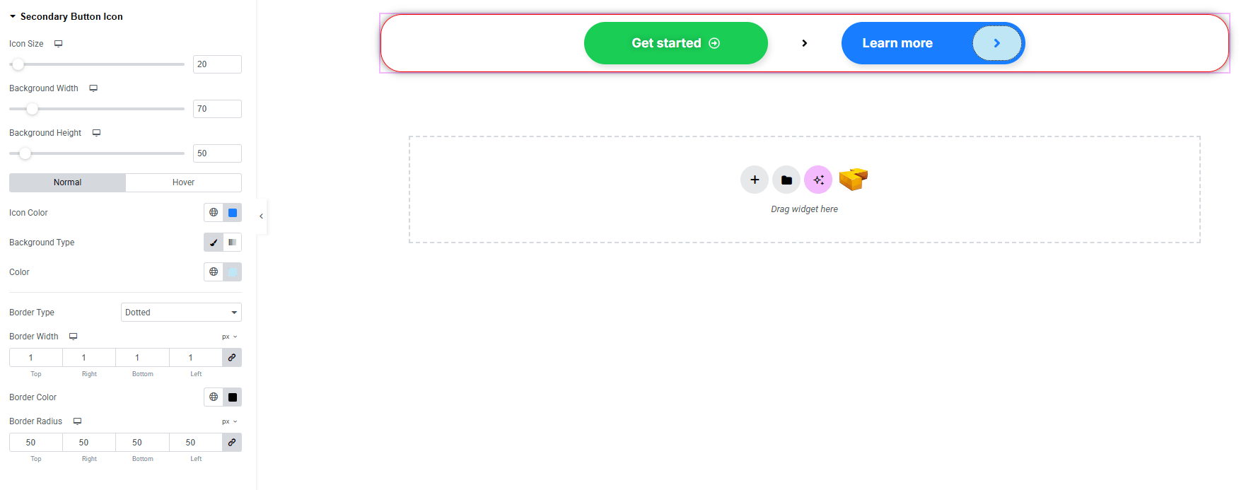
- Icon Size : Adjust the size of the icon.
- Background Width & Height : Set width and height of the icon background area.
- Icon Color : Choose icon color for both normal and hover states.
- Background Color : Choose classic or gradient background for normal and hover states. Explore full background settings here.
- Border Type : Set border style with width and color.
- Border Radius : Control corner roundness to the button icon.
Connector:
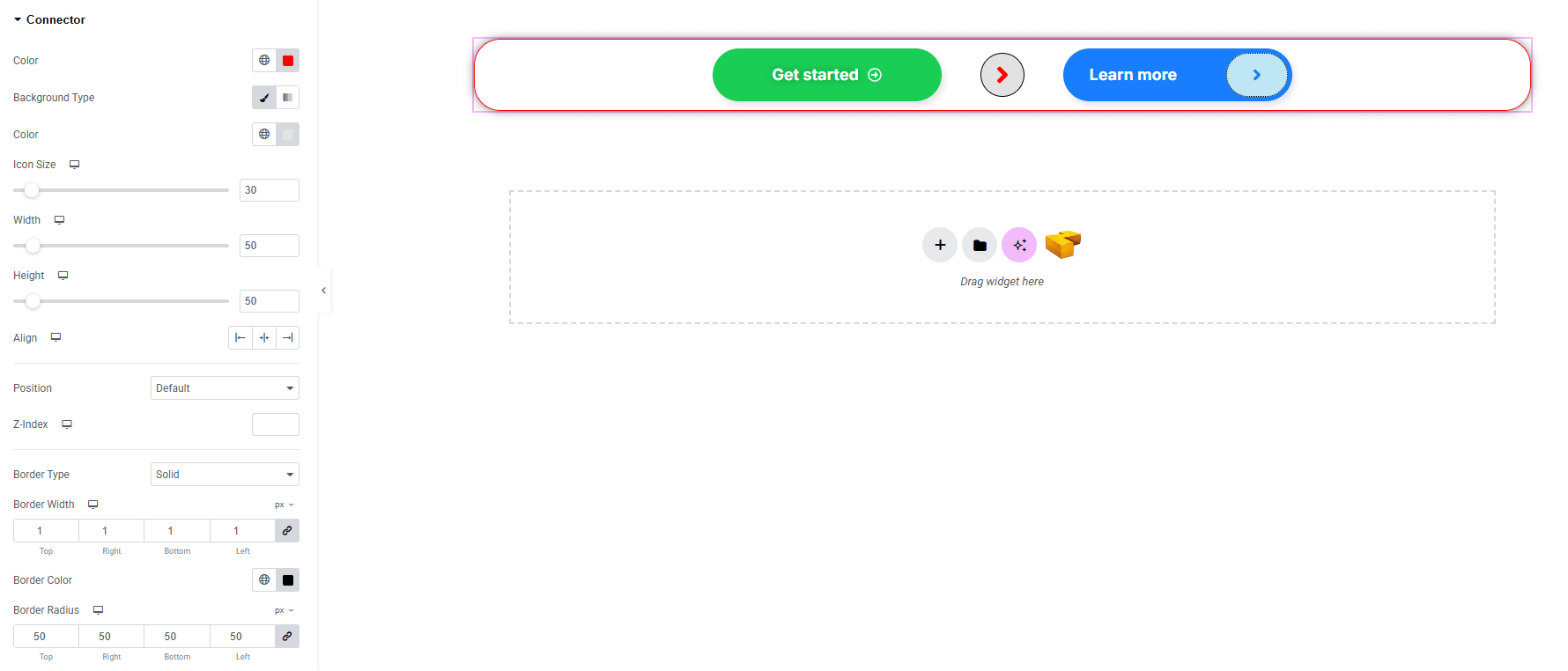
- Typography (make sure you have selected the text on connector type) : Adjust font family, size, weight, transform, style, decoration, line height, letter spacing, and word spacing. Explore full typography settings here.
- Color : Set color for text or icon.
- Background Type : Set classic or gradient background (linear or radial). Explore full background settings here.
- Background Color : Set color for background
- Icon Size (make sure you have selected the icon on connector type) : Set the icon size.
- Width & Height : Define connector box dimensions.
- Align : Control alignment within the dual button.
- Position : Adjust connector placement.
- Z-Index : Set stacking order.
- Border Type : Set border style with width and color.
- Border Radius : Control corner roundness to the connector.
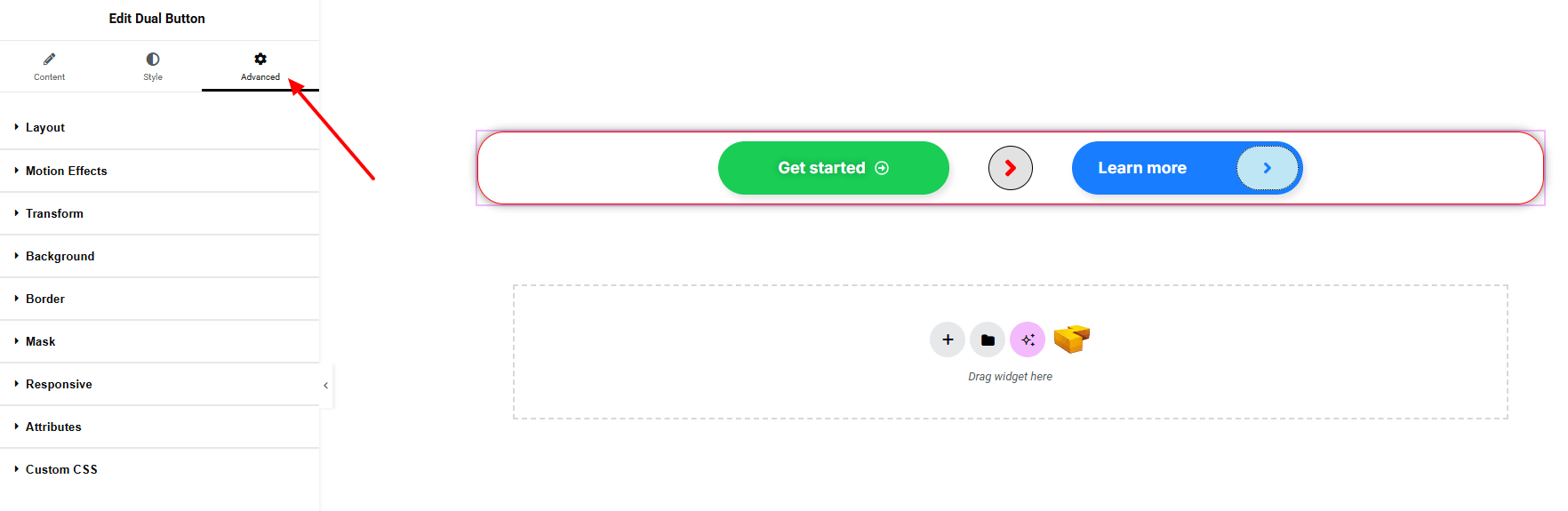
Step 4: Advance
If you want to customize the layout, backgrounds, or make your design more engaging, head over to the Advanced section. The Advanced panel is a default Elementor feature. Check out this document to learn more about its features.
Finally, hit the Publish button and watch your stunning Buttons come to life on your webpage!
You’re all set!