
Social Share
Step-by-Step Tutorial on Using the Social Share Widget of Zyre Addon
The Social Share widget of Zyre addon makes it easy for visitors to share your content across popular social platforms. With customizable icons, layouts, and styling options, it boosts engagement and helps your content reach a wider audience directly from your website.
Learn How To Use Social Share Widget:
Exploring the Features of Social Share Widget
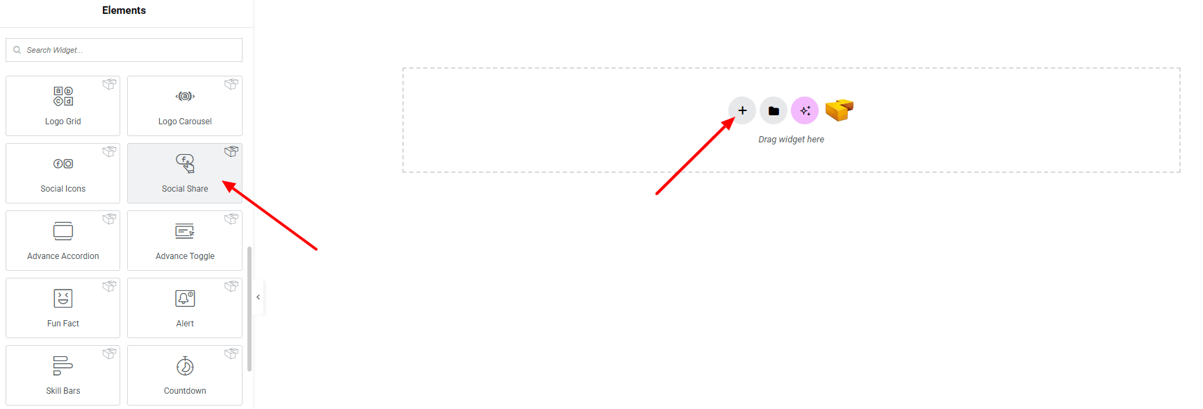
Step 1: Drag the widget
From the left panel, search or choose the Social Share of Zyre Addon and simply drag it into your desired section.
Step 2: Content tab
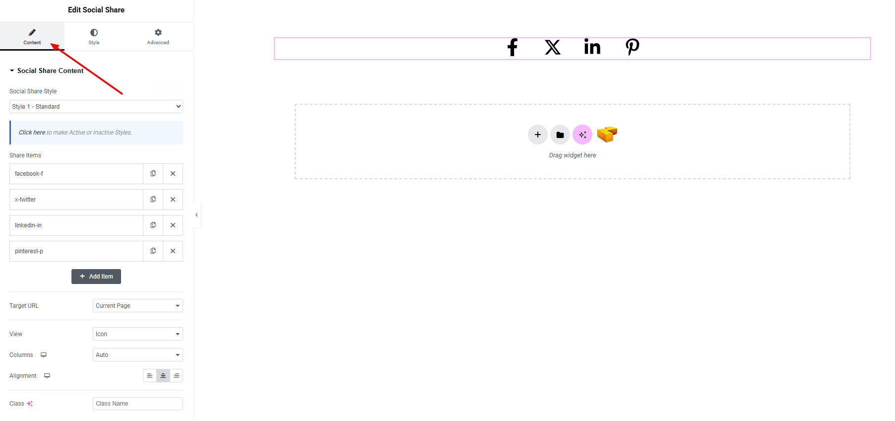
Social Share Content:
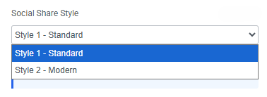
- Social Share Style : You can choose a predefined style from here
- Share Items : Create and manage multiple feature items.
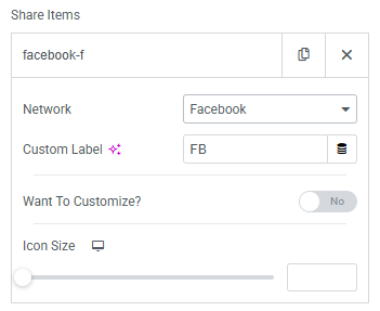
- Network : Select the social network from the list.
- Custom Label : Can set any custom label of the item.
- Want To Customize? (when Toggle Enable)
For both normal and hover state: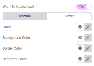
- Color : Set icon and label color.
- Background color : Set background color. Explore full background settings here.
- Border color : Set border color of each icon.
- Separator color : Set the separator color.
- Icon size : Set icon size of the social icons.
- Target URL : Set the link to be shared (current page or custom).
- View : Choose layout style for social items.
- Columns : Define the number of columns to arrange the items.
- Alignment : Set horizontal alignment of items (left, center, right).
- Class : Add a CSS class for custom styling.
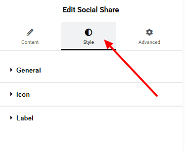
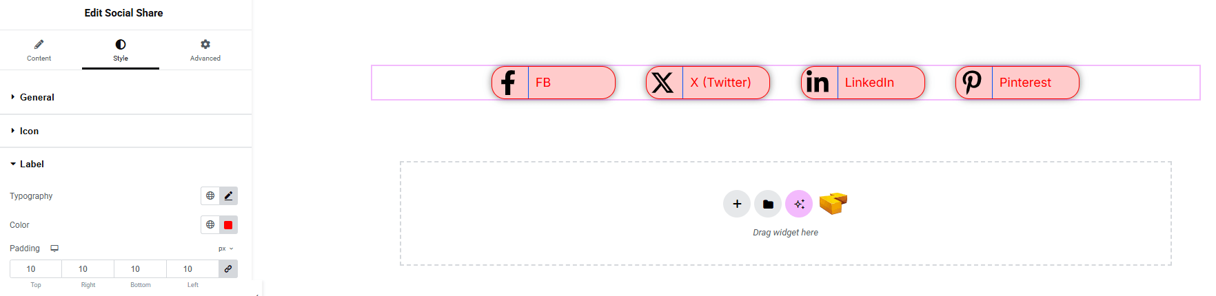
Step 3: Style tab
In the Style section, you can customize the General, Icon, Label — but make sure you have added them first.
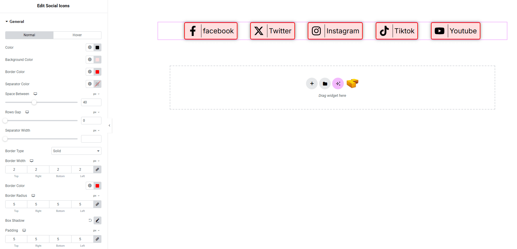
General:
- For both normal and hover states:
- Color : Set icon and label color.
- Background color : Set background color. Explore full background settings here.
- Border color : Set border color of each wrapper.
- Separator Color : Set the separator color.
- Space Between : Control spacing between each social part horizontally.
- Rows Gap : Control spacing between each social part vertically.
- Separator Width : Set the width of the separator.
- Border Type : Define border style, width, and color of social part.
- Border Radius : Control corner roundness.
- Box Shadow : Apply drop shadow.
- Padding : Add inner spacing of each social part.
Icon:
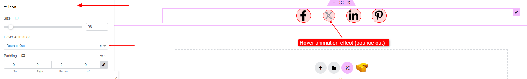
- Size : Adjust the size of the icon.
- Hover Animation : Choose an animation style when the icon is hovered.
- Padding : Set spacing inside each icon wrapper.
Label: (make sure on social share content view should be “icon and text”)
- Typography : Adjust font family, size, weight, transform, style, decoration, line height, letter spacing, and word spacing. Explore full typography settings here.
- Color : Set the label color.
- Padding : Set spacing inside each social label.
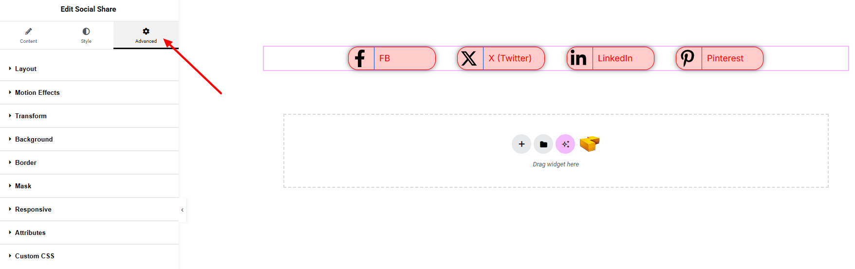
Step 4: Advance tab
If you want to customize the layout, backgrounds, or make your design more engaging, head over to the Advanced section. The Advanced panel is a default Elementor feature. Check out this document to learn more about its features.
Finally, hit the Publish button and watch your stunning Social Share come to life on your webpage!
That’s a wrap — you’re ready!