
Business Hour
Step-by-Step Tutorial on Using the Business Hour Widget of Zyre Addon.
Your website should not only look good but also keep your visitors informed. The Business Hour Widget by Zyre Addon allows you to display operating times with style, using customization features that align with your site’s design. Keep things clear, modern, and user-friendly—all in one widget.
Learn How To Use Business Hour Widget:
Exploring the Features of Business Hour Widget
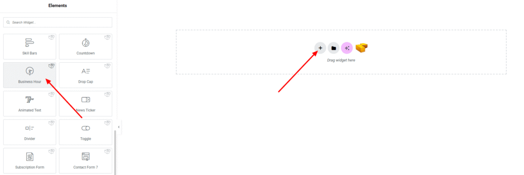
Step 1: Drag the widget
From the left panel, search or choose the Business Hour of Zyre Addon and simply drag it into your desired section.
Step 2: Content tab
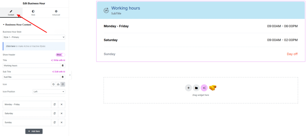
Business Hour Content:
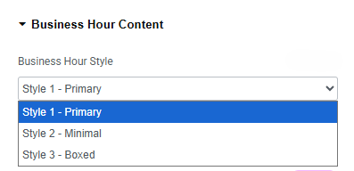
- Business Hour Style : You can choose a predefined style from here
- Show Header : Enable toggle for show the header.
- Title : Set title on header.
- Sub Title : Set subtitle on header.
- Icon : Select an icon to display alongside the header.
- Icon Position : Define the icon appears left or right the header.
- Business Hour Items:
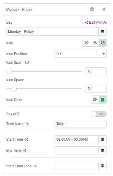
- Day : Select or set the day of the week.
- Icon : Add an icon to represent the day/task.
- Icon Position : Choose where the icon will be placed (left/right).
- Icon Size : Adjust the size of the icon.
- Icon Space : Set spacing between the icon and text.
- Icon Color : Set color of the icon.
- Day Off : Enable/disable toggle to mark the day as closed.
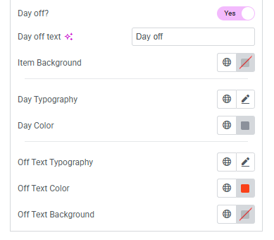
- Day Off Text : Set custom text to display when a day is marked as off.
- Item Background : Choose the background color for the day item.
- Day Typography : Customize typography for the day text.
- Day Color : Set the text color of the day.
- Off Text Typography : Customize typography for the “day off” text.
- Off Text Color : Define the text color for the “day off” text.
- Off Text Background : Apply a background color for the “day off” text.
- Task Name : Add a custom task label.
- Start Time : Define the start time.
- End Time : Define the end time.
- Start Time Label : Add a label for the start time (optional).
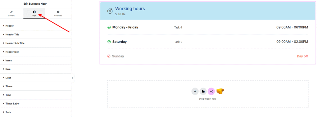
Step 3: Style tab
In the Style section, you can customize the Header, Header Title, Header Sub Title, Header Icon, Items, Item, Days, Times, Time, Times Label, Task— but make sure you have added them first.
Header:
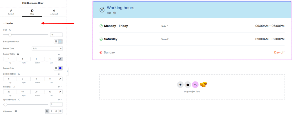
- Gap : Adjust spacing between header elements.
- Background Color : Set the background color for the header. Explore full background settings here.
- Border Type : Define border style, width, and color.
- Border Radius : Control corner roundness.
- Padding : Control inner spacing around the header content.
- Space Bottom : Add spacing below the header to separate it from the items.
- Alignment : Set the horizontal alignment of header content (left, center, right).
Header Title:
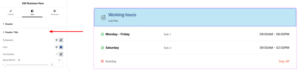
- Typography : Adjust font family, size, weight, transform, style, decoration, line height, letter spacing, and word spacing. Explore full typography settings here.
- Color : Set color of the title.
- Text Shadow : Apply text shadow effect.
- Space Bottom : Add spacing below the header.
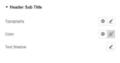
Header Sub Title:
You’ll find the same design options for the Header Sub Title Section as in the Header Section— giving you full freedom to style it just the way you imagine.
Header Icon:
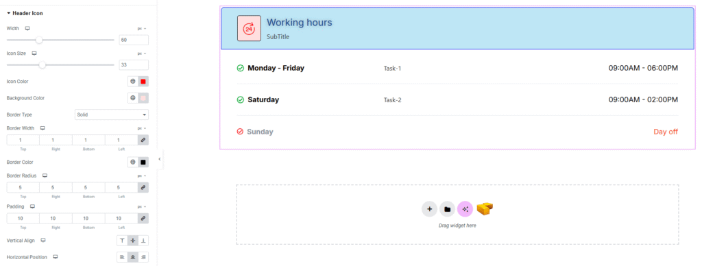
- Width : Set the width of the header icon area.
- Icon Size : Adjust the size of the icon.
- Icon Color : Choose the color of the icon.
- Background Color : Apply background color behind the header icon. Explore full background settings here.
- Border Type : Customize border style with width, and color.
- Border Radius : Control corner roundness.
- Padding : Control inner spacing around the icon.
- Vertical Align : Position the icon vertically (top, middle, bottom).
- Horizontal Position : Set the icon’s horizontal alignment (left, center, right).
Items:
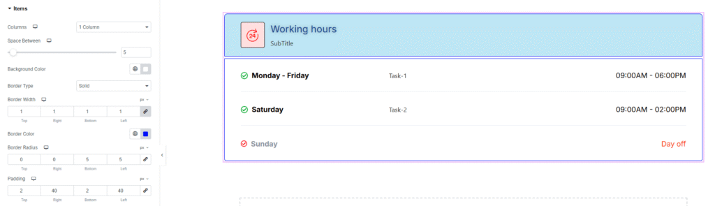
- Columns : Choose the number of columns for displaying items.
- Space Between : Adjust spacing between each item.
- Background Color : Set the background color of the items. Explore full background settings here.
- Border Type : Customize border style with width, and color.
- Border Radius : Control corner roundness.
- Padding : Adjust inner spacing around the item content.
Item:
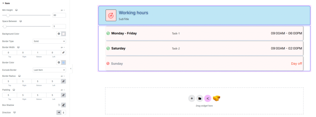
- Min Height : Set the minimum height for each item.
- Space Between : Control spacing between content inside the item.
- Background Color : Choose the background color for the item. Explore full background settings here.
- Border Type : Customize border style with width, and color.
- Border Radius : Control corner roundness.
- Padding : Control inner spacing inside each item.
- Box Shadow : Add drop shadow effects to the item.
- Direction : Define the layout direction (row/column).
Days:
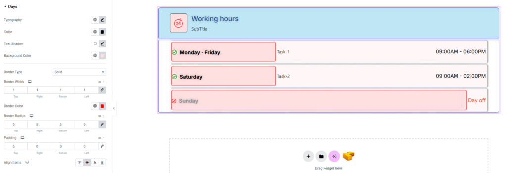
- Typography : Adjust font family, size, weight, transform, style, decoration, line height, letter spacing, and word spacing. Explore full typography settings here.
- Color : Set the text color of the day.
- Text Shadow : Add shadow effects to the day text.
- Background Color : Apply background color behind the day text. Explore full background settings here.
- Border Type : Choose border style with width, and color.
- Border Radius : Control corner roundness.
- Padding : Adjust inner spacing around the day text.
- Align Items : Set alignment (start, center, end, stretch).
Times:
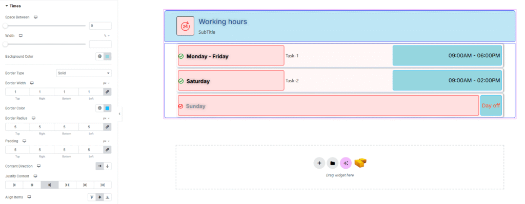
- Space Between : Control spacing between start and end times.
- Width : Set the width of the time container.
- Background Color : Apply background color. Explore full background settings here.
- Border Type : Customize border style with width, and color.
- Border Radius : Control corner roundness.
- Padding : Adjust inner spacing around the time container.
- Content Direction : Choose layout direction (row/column).
- Justify Content : dDefine horizontal alignment of time content.
- Align Items : Control vertical alignment of the time content.
Time:
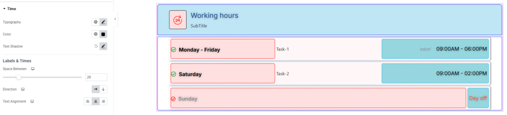
- Typography : Adjust font family, size, weight, transform, style, decoration, line height, letter spacing, and word spacing. Explore full typography settings here.
- Color : Set the text color of the day.
- Text Shadow : Add shadow effects to the day text.
Labels & Times
- Space Between : Control spacing between content inside the item.
- Direction : Define the layout direction (row/column).
- Text Alignment : Set alignment of the texts.
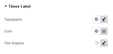
Times Label:
You’ll find the same design options for the Times Label Section as in the Time Section— giving you full freedom to style it just the way you imagine.
Task:
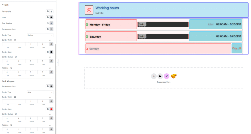
- Typography : Adjust font family, size, weight, transform, style, decoration, line height, letter spacing, and word spacing. Explore full typography settings here.
- Color : Set the text color.
- Text Shadow : Add shadow effects to the task text.
- Background Color : Apply a background color behind the task text.
- Border Type : Choose border style with width, and color.
- Border Radius : Control corner roundness.
- Padding : Adjust inner spacing around the task text.
Task Wrapper
- Background Color : Set the background color for the task container. Explore full background settings here.
- Border Type : Customize border style with width and color.
- Border Radius : Control corner roundness.
- Padding : Control inner spacing inside the task wrapper.
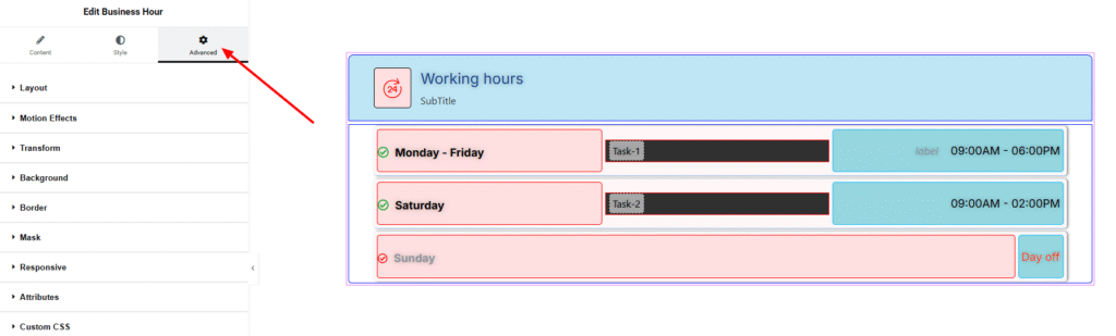
Step 4: Advance tab
If you want to customize the layout, backgrounds, or make your design more engaging, head over to the Advanced section. The Advanced panel is a default Elementor feature. Check out this document to learn more about its features.
Finally, hit the Publish button and watch your stunning Business Hour come to life on your webpage!
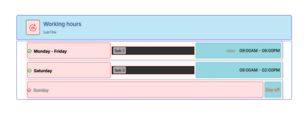
You’re all set!