
News Ticker
Step-by-Step Tutorial on Using the News Ticker Widget of Zyre Addon.
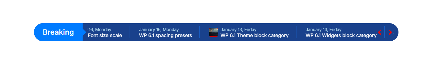
The News Ticker widget lets you display breaking news, headlines, or important updates in a smooth scrolling format. With customizable styles, animation effects, and flexible controls, you can grab attention instantly and keep your audience engaged with dynamic, real-time content.
Learn How To Use News Ticker Widget:
Exploring the Features of News Ticker Widget.
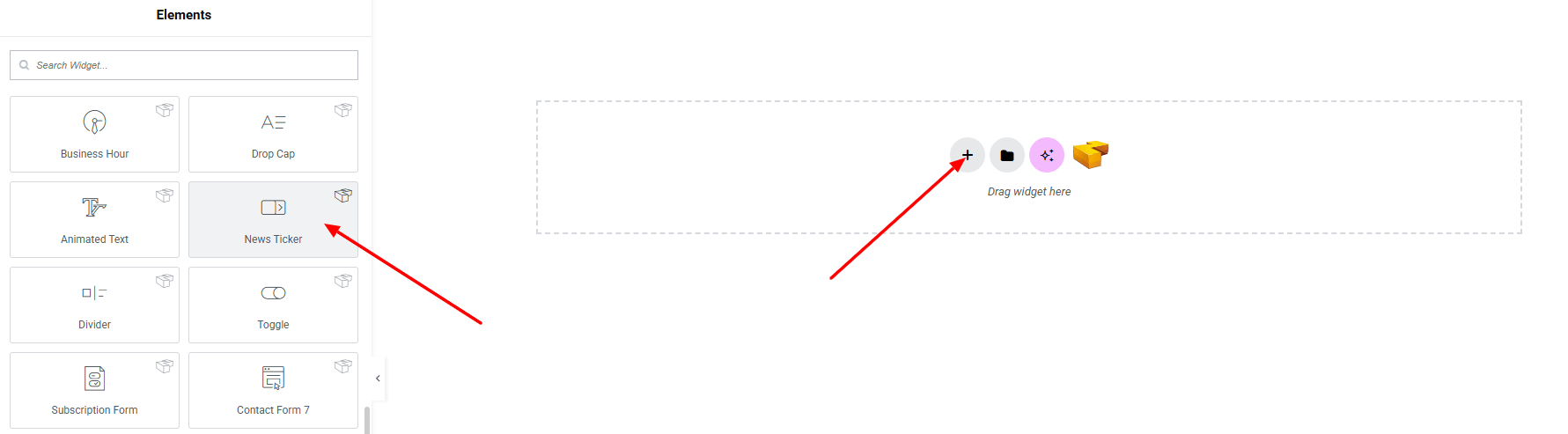
Step 1: Drag the widget
From the left panel, search or choose the News Ticker of Zyre Addon and simply drag it into your desired section.
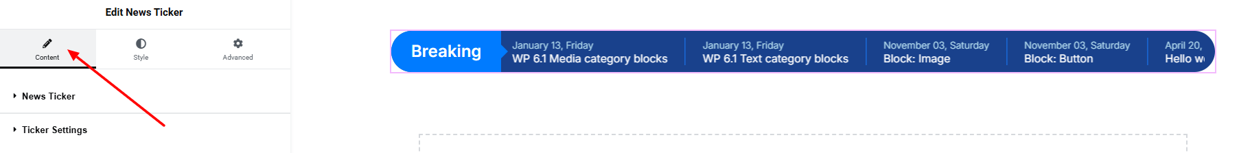
Step 2: Content tab
News Ticker:
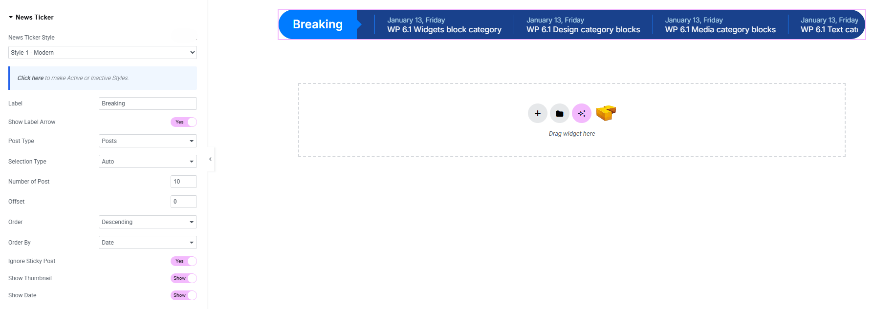
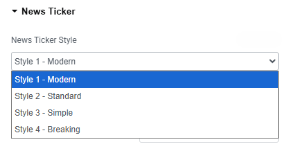
- Image Carousel Style : You can choose a predefined style from here
- Label : Set a custom label text for the ticker (e.g., Breaking).
- Show Label Arrow : Enable/disable arrow beside the label.
- Post Type : Select the type of posts to display (posts, pages).
- Selection Type : Choose how posts are selected (auto, manual).
- Number of Posts : Define how many posts appear in the ticker.
- Offset : Skip a specific number of posts before showing results.
- Order : Set display order (ascending or descending)
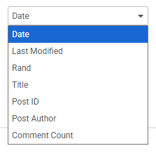
- Order By : Choose sorting criteria.
- Ignore Sticky Post : Choose whether to include or exclude sticky posts.
- Show Thumbnail : Enable/disable thumbnails alongside ticker text.
- Show Date : Display or hide post publish dates in the ticker.
Ticker Settings:
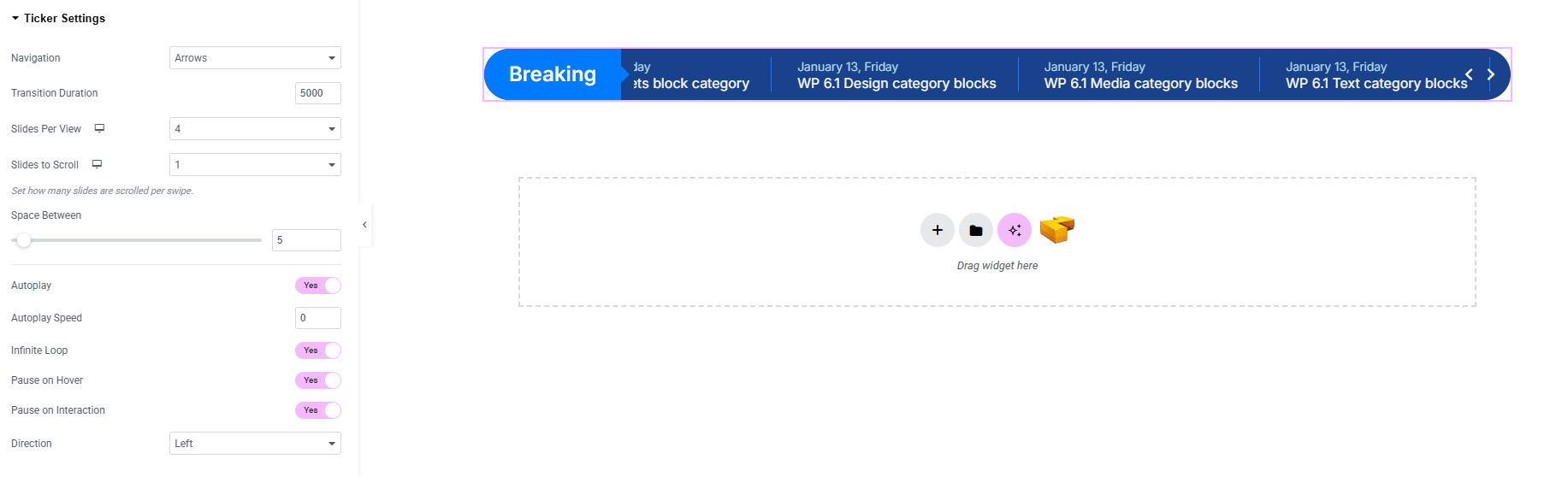
- Navigation : Choose how users navigate between slides (arrows, none).
- Transition Duration : Control the speed of slide transitions.
- Slides per View : Define how many items are visible at once.
- Slides to Scroll : Decide how many items move per navigation.
- Space Between : Control the gap between ticker items.
- Autoplay : Enable automatic slide transitions.
- Autoplay Speed : Set the time interval for autoplay.
- Infinite Loop : Make the ticker scroll endlessly.
- Pause on Hover : Pause autoplay when the user hovers.
- Pause on Interaction : Stop autoplay when interacts with the ticker.
- Direction : Set scrolling direction (left, right).
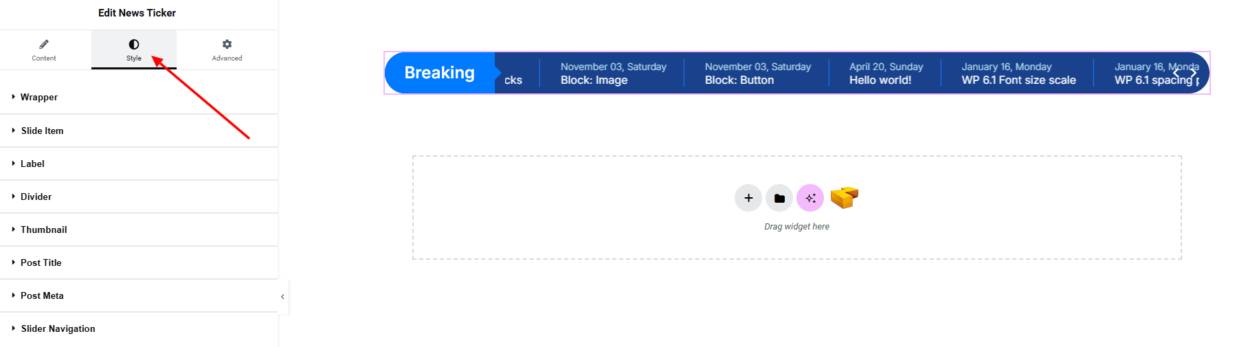
Step 3: Style tab
In the Style section, you can customize the Wrapper, Slide item, Label, Divider, Thumbnail, Post Title, Post Meta, Slider Navigation – but make sure you have added them first.
Wrapper:
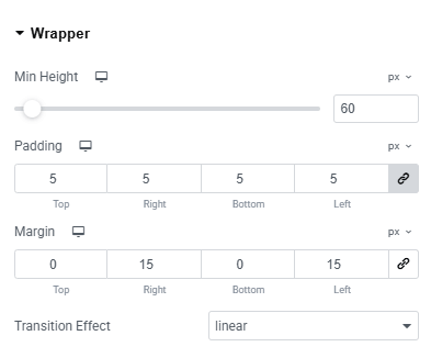
- Min Height : Set the minimum height for the ticker wrapper.
- Padding : Adjust inner spacing inside the wrapper.
- Margin : Control the outer spacing around the ticker.
- Transition Effect : Apply smooth animation effects during transitions.
Slide item:
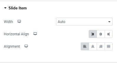
- Width : Set the width of each slide item (auto, default)
- Horizontal Align : Control horizontal positioning of content.
- Alignment : Adjust overall alignment of the slide item.
Label:
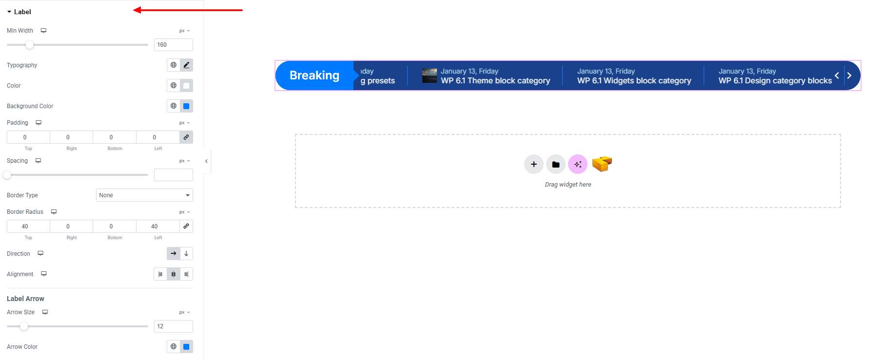
- Min Width : Set the minimum width of the label area.
- Typography : Adjust font family, size, weight, transform, style, decoration, line height, letter spacing, and word spacing. Explore full typography settings here.
- Color : Set the text color for the label.
- Background Color : Choose the background color of the label. Explore full background settings here.
- Padding : Control inner spacing inside the label.
- Spacing : Adjust the gap between the label and ticker content.
- Border Type : Define border style, width, and color.
- Border Radius : Round the label’s corners.
- Direction : Arrange the label’s orientation.
- Alignment : Position the label (left, center, right).
Label Arrow:
- Arrow Size : Adjust the size of the arrow beside the label.
- Arrow Color : Choose the arrow’s color.
Divider:
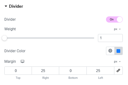
Divider – Enable or disable divider.
- Weight : Set the thickness of the divider line.
- Divider Color : Set the color of the divider.
- Margin : Adjust spacing around the divider.
Thumbnail:
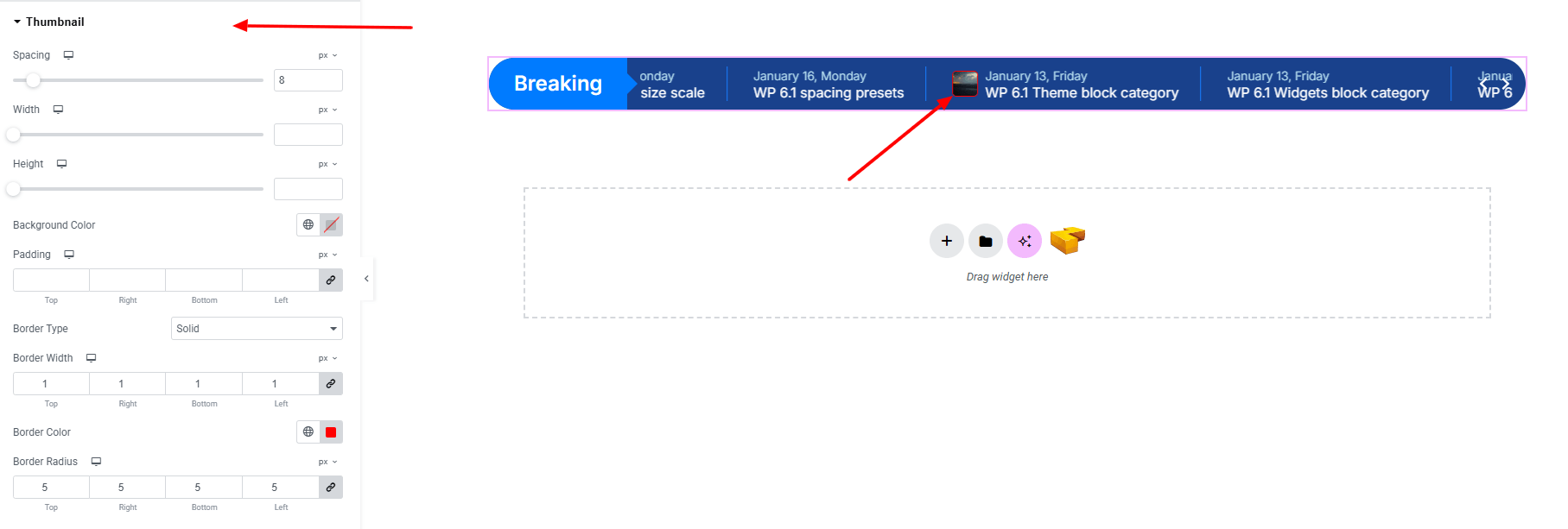
- Spacing : Control the gap between the thumbnail and text.
- Width : Set the width of the thumbnail image.
- Height : Define the height of the thumbnail image.
- Background Color : Apply a background color behind the thumbnail. Explore full background settings here.
- Padding : Adjust inner spacing inside the thumbnail container.
- Border Type : Customize border style, width, and color.
- Border Radius : Round the corners of the thumbnail.
Post Title:
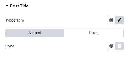
- Typography : Adjust font family, size, weight, transform, style, decoration, line height, letter spacing, and word spacing. Explore full typography settings here.
- Color : Set the post title color.
Post Meta:
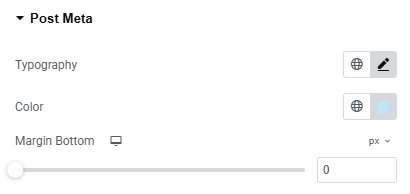
- Typography : Adjust font family, size, weight, transform, style, decoration, line height, letter spacing, and word spacing. Explore full typography settings here.
- Color : Set the post title color.
- Margin : Adjust spacing under the post meta.
Slider Navigation:
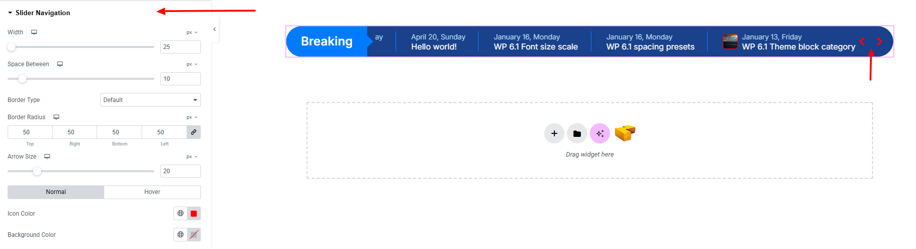
- Width : Set the overall width of the navigation container.
- Space Between : Control the gap between navigation arrows.
- Border Type : Customize border style, width, and color.
- Border Radius : Round the corners of navigation buttons.
- Arrow Size : Adjust the size of the arrow icons.
- Normal & Hover States :
- Icon Color : Choose arrow icon color.
- Background Color : Set background color for arrows area.
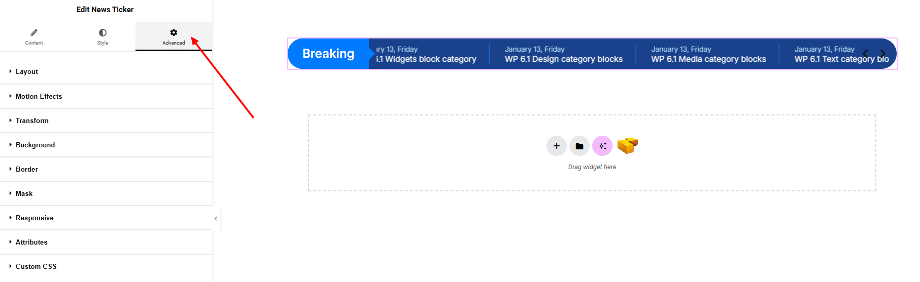
Step 4: Advance tab
If you want to customize the layout, backgrounds, or make your design more engaging, head over to the Advanced section. The Advanced panel is a default Elementor feature. Check out this document to learn more about its features.
Finally, hit the Publish button and watch your stunning News Ticker come to life on your webpage!
Everything’s good to go now!