
Advance Toggle
Step-by-Step Tutorial on Using the Advance Toggle Widget of Zyre Addon.
The Advanced Toggle widget helps you organize and present content in collapsible sections, making your webpages more interactive and user-friendly. Perfect for FAQs, product details, or knowledge bases, it allows you to display large amounts of information in a compact and stylish format with smooth toggle animations and customizable designs.
Learn How To Use Advance Toggle Widget:
Exploring the Features of Advance Toggle Widget.
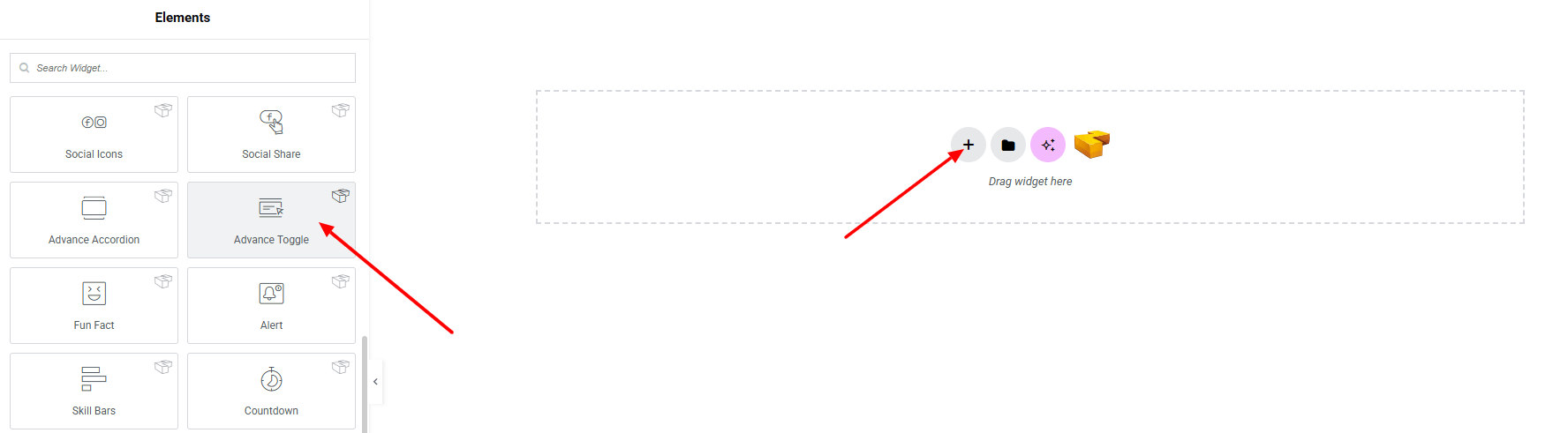
Step 1: Drag the widget
From the left panel, search or choose the Advance Toggle of Zyre Addon and simply drag it into your desired section.
Step 2: Content tab
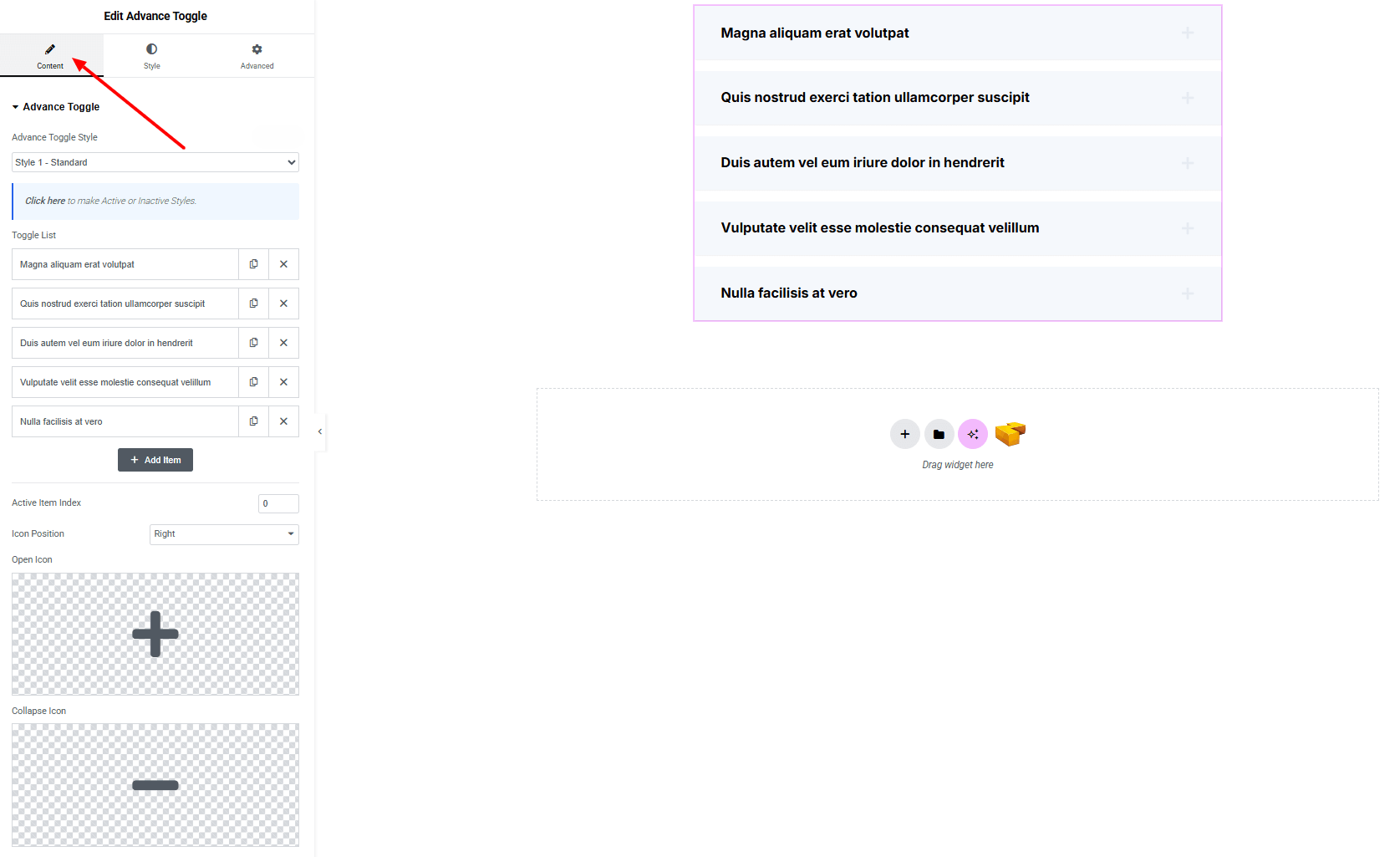
Advance Toggle:
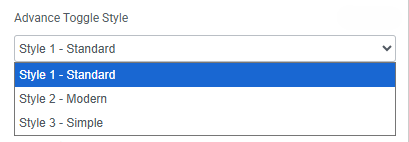
- Advance Toggle Style : You can choose a predefined style from here
- Toggle List
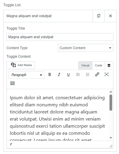
- Toggle Title : Set the title text for each Toggle item.
- Content Type : Select the type of content (custom, saved section).
- Toggle Content : Add the main content inside the toggle.
- Active Item Index : Define which toggle item is open by default.
- Icon Position : Choose where the toggle icon appears (left or right).
- Open Icon : Set the icon that shows when the toggle is expanded.
- Collapse Icon : Set the icon that shows when the toggle is collapsed.
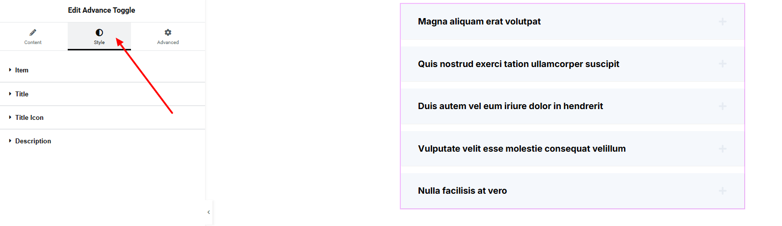
Step 3: Style tab
In the Style section, you can customize the Item, Title, Title Icon, Description – but make sure you have added them first.
Item:
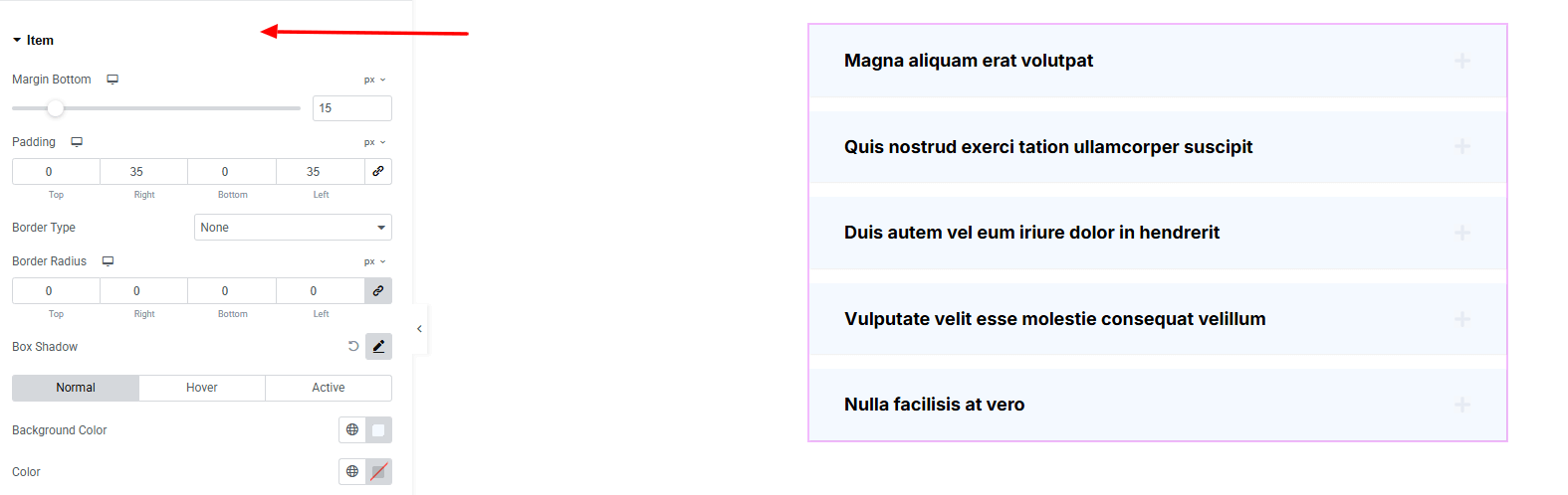
- Margin Bottom : Set spacing below each toggle item.
- Padding : Control inner spacing inside the toggle item.
- Border Type : Customize border style, width, and color.
- Border Radius : Round the corners of the toggle item.
- Box Shadow : Add drop shadow effects.
- For both Normal Hover & Active states
- Background Color : Set the background color of the item area. Explore full background settings here.
- Color : Set the text color of the item.
Title:
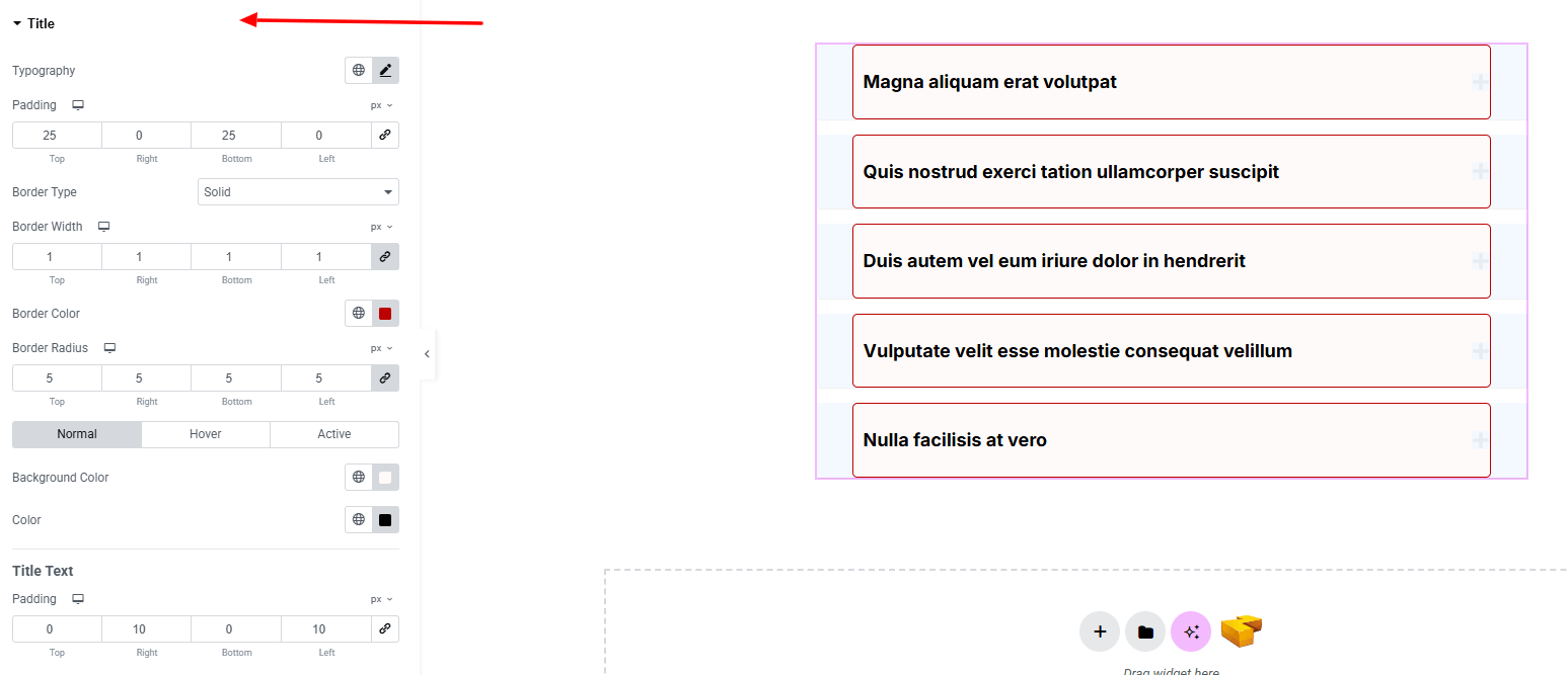
- Typography : Adjust font family, size, weight, transform, style, decoration, line height, letter spacing, and word spacing. Explore full typography settings here.
- Padding : Adjust inner spacing around the title area.
- Border Type : Define border style, width and color.
- Border Radius : Round the corners of the icon container.
- For both Normal, Hover & Active States:
- Background Color : Choose a background color for the title. Explore full background settings here.
- Color : Define the title color.
Title Text
- Padding : Control inner spacing around the text.
Title Icon:
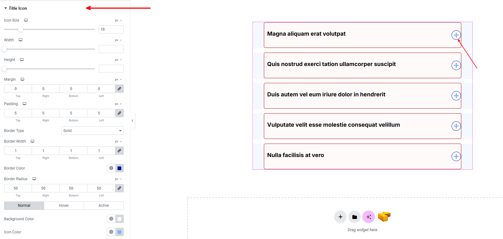
- Icon Size : Set the size of the toggle icon.
- Width : Define the width of the icon container.
- Height : Define the height of the icon container.
- Margin : Control the outer spacing around the icon.
- Padding : Adjust inner spacing inside the icon container.
- Border Type : Customize border style, width and color.
- Border Radius : Round the corners of the icon container.
- For both Normal, Hover & Active States:
- Background Color : Choose a background color for the title icon.
- Color : Define the icon color.
Description:
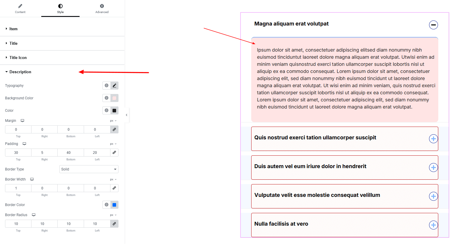
- Typography : Adjust font family, size, weight, transform, style, decoration, line height, letter spacing, and word spacing. Explore full typography settings here.
- Background Color : Set the background color of the content area. Explore full background settings here.
- Color : Choose the text color for the description.
- Margin : Control the outer spacing around the description area.
- Padding : Adjust inner spacing inside the description area.
- Border Type : Define border style, width, and color.
- Border Radius : Round the corners of the container.
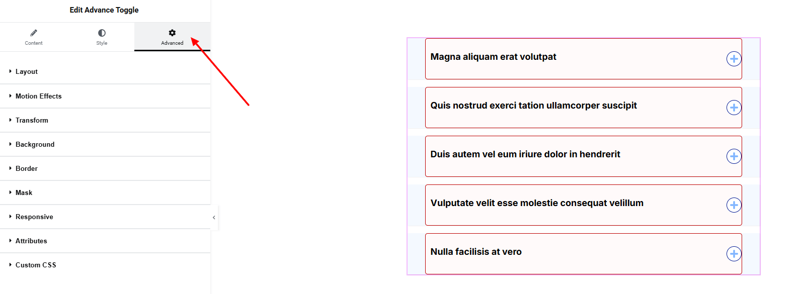
Step 4: Advance tab
If you want to customize the layout, backgrounds, or make your design more engaging, head over to the Advanced section. The Advanced panel is a default Elementor feature. Check out this document to learn more about its features.
Layout:
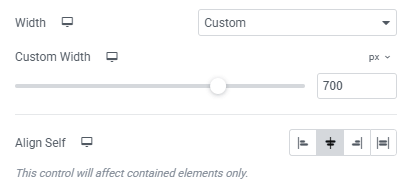
- Width : Set custom the width on the full container.
- Align Self : Align the container itself.
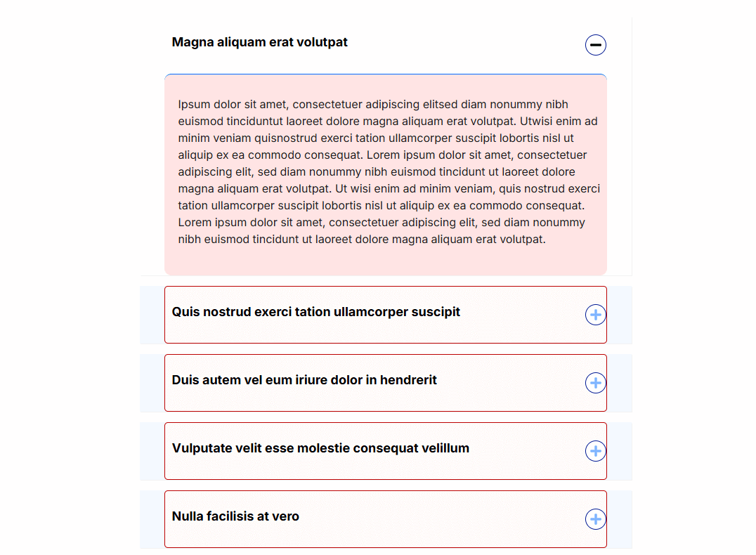
Finally, hit the Publish button and watch your stunning Advance Toggle come to life on your webpage!
You’re good to launch!