
Post Navigation
Step-by-Step Tutorial on Using the Post Navigation Widget of Zyre Addon
Transform the way users interact with your content using Zyre Addon’s Post Navigation Widget. With collapsible, stylish sections, you can organize FAQs, tutorials, or product information in a way that’s visually appealing, highly functional, and keeps readers scrolling through your content effortlessly.
Learn How To Use Post Navigation Widget:
Exploring the Features of Post Navigation Widget
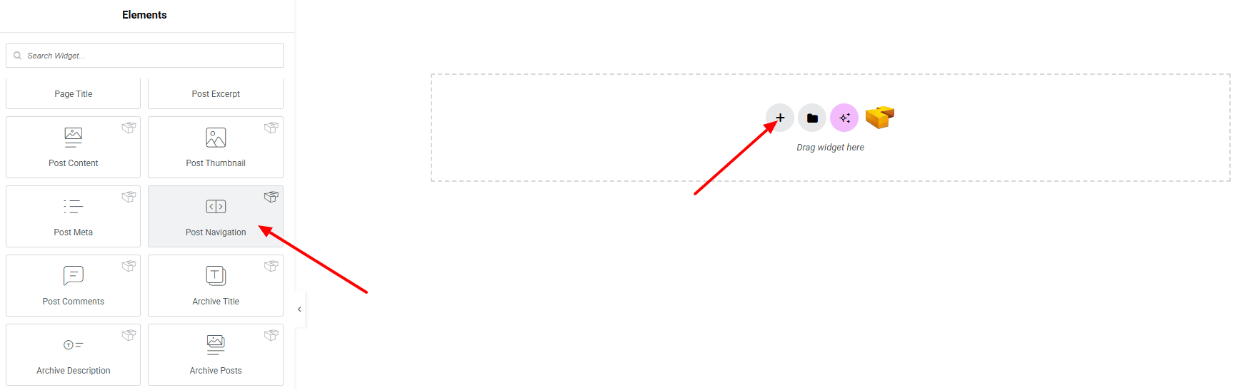
Step 1: Drag the widget
From the left panel, search or choose the Post Navigation of Zyre Addon and simply drag it into your desired section.
Step 2: Content tab
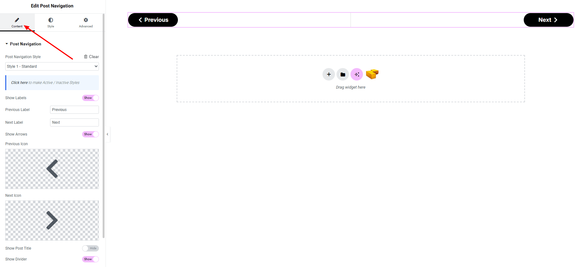
Post Navigation:
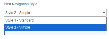
- Post Navigation Style : You can choose a predefined style from here
- Show Labels (Toggle) : Enable or disable labels for navigation.
- Previous Label : Add a custom text for the previous post link.
- Next Label : Add a custom text for the next post link.
- Show Arrows (Toggle) : Enable or disable directional arrows for navigation
- Previous Icon : Add an icon for the previous post.
- Next Icon : Add an icon for the next post.
- Show Post Title (Toggle) : Show or hide the title of the linked post in the navigation.
- Show Divider (Toggle) : Enable or disable a divider line between the previous and next navigation links.
Step 3: Style tab
In the Style section, you can customize the General, Labels, Arrows, Divider, Post Titles— but make sure you have added them first.
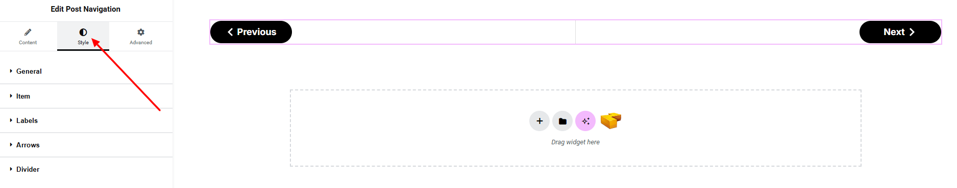
General:
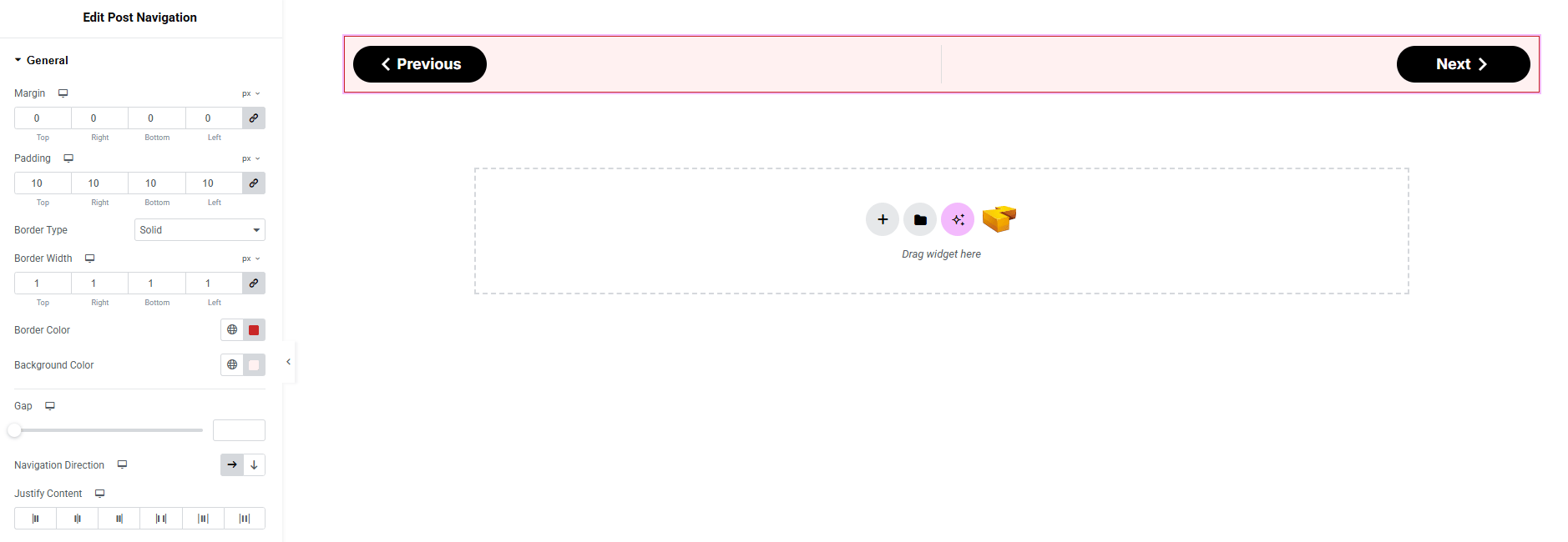
- Margin : Add outer space.
- Padding : Add inner space.
- Border Type : Define border style, width and color.
- Background Color : Set background color. Explore full background settings here.
- Gap : Control spacing between the previous and next element.
- Navigation Direction : Set direction of navigations (vertical, horizontal)
- Justify Content : Define horizontal alignment of the navigations.
Item:
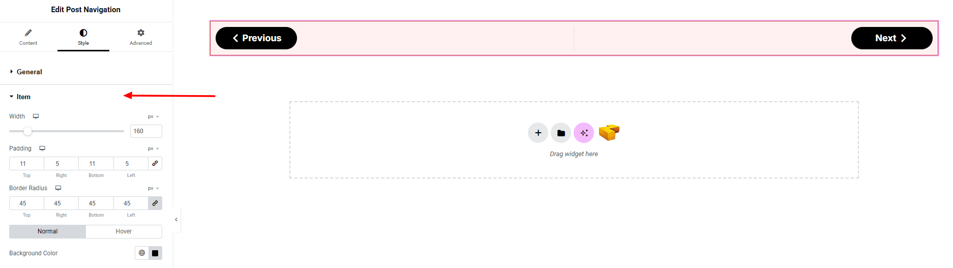
- Width : set the total width of the item.
- Padding : Add inner space.
- Border Radius : Define border roundness.
- Background Color : Set background color both for normal and hover state. Explore full background settings here.
Labels:
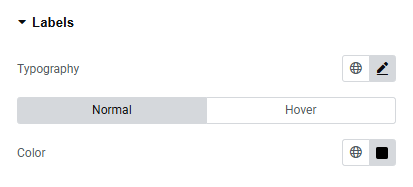
- Typography : Adjust font family, size, weight, transform, style, decoration, line height, letter spacing, and word spacing. Explore full typography settings here.
- Color : Set color of the Labels for both normal and hover states.
Arrows:
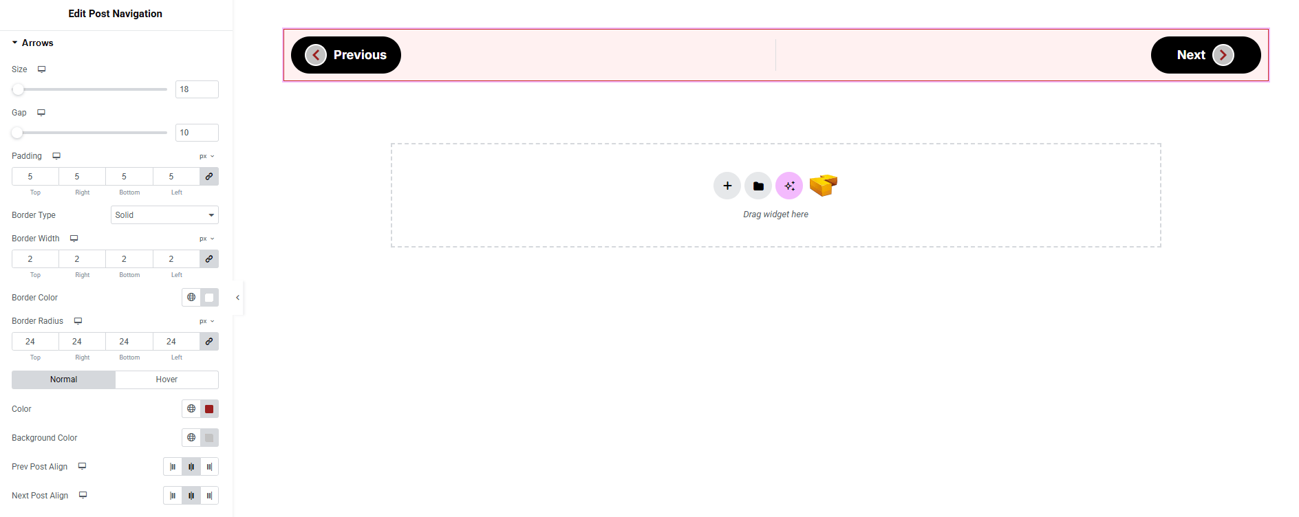
- Size : Adjust the arrow icon size.
- Gap : Adjust spacing between the arrow and content.
- Padding : Add inner space around the arrow.
- Border Type : Define border style, width and color.
- Border Radius : Control corner roundness.
- Color : Set arrow color for both normal and hover state.
- Background Color : Set background color for both normal and hover state. Explore full background settings here.
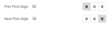
- Prev Post Align : Set the position of the previous post arrow.
- Next Post Align : Set the position of the next post arrow.
Divider:
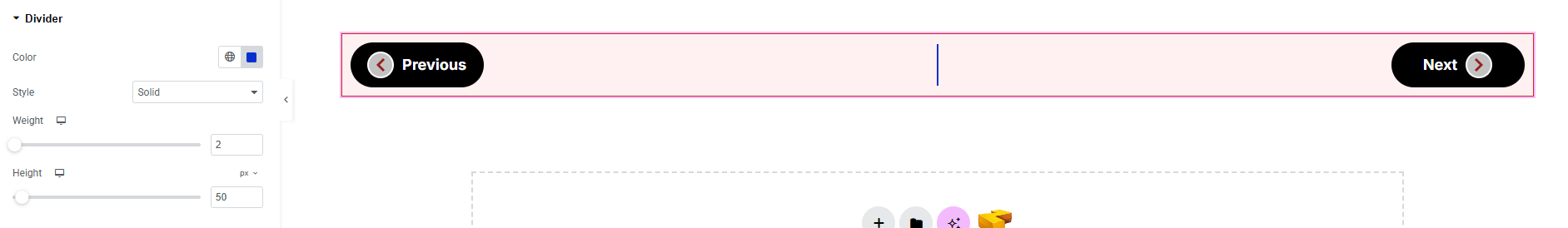
- Color : Set the color of the divider.
- Style : Choose divider style.
- Width : Set the width of the divider.
- Height : Set the height of the divider.
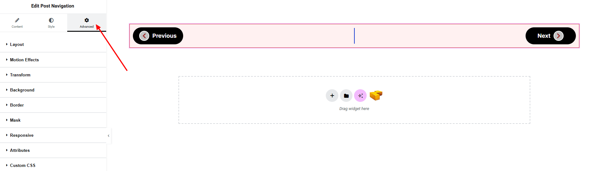
Step 4: Advance tab
If you want to customize the layout, backgrounds, or make your design more engaging, head over to the Advanced section. The Advanced panel is a default Elementor feature. Check out this document to learn more about its features.
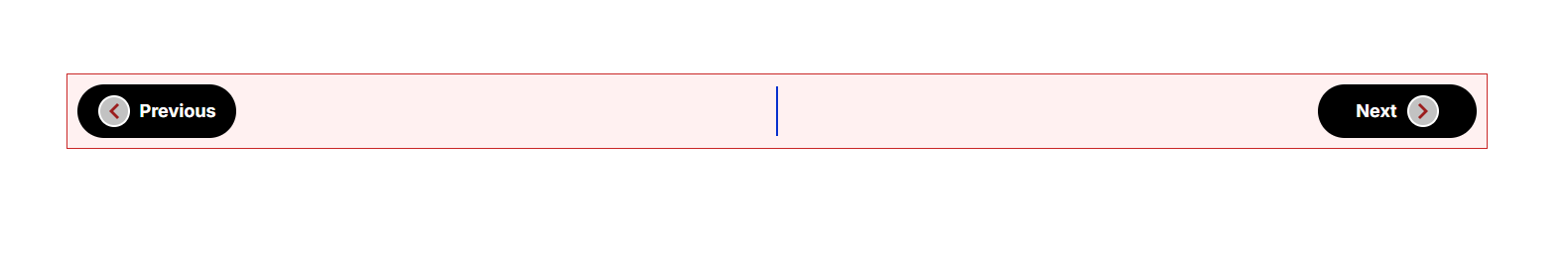
Finally, hit the Publish button and watch your stunning Post Navigation come to life on your webpage!
That’s a wrap — you’re ready!