
Post Comments
Step-by-Step Tutorial on Using the Post Comments Widget of Zyre Addon
It’s a widget to display post content dynamically. You can build a single page template from Zyre Addons > Theme Builder and choose this widget. With Zyre Addon’s Post Comments Widget, you can make your website more engaging by allowing readers to share their thoughts directly under your posts. This widget integrates seamlessly with your design, giving visitors a clean and user-friendly comment section.
Learn How To Use Post Comments Widget:
Exploring the Features of Post Comments Widget
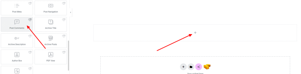
Step 1: Drag the widget
From the left panel, search or choose the Post Comments Widget of Zyre Addon and simply drag it into your desired section.
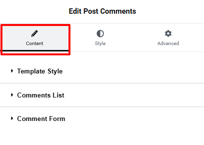
Step 2: Content tab
On content tab you will find some options for Template style, Comments List and Comment Form.
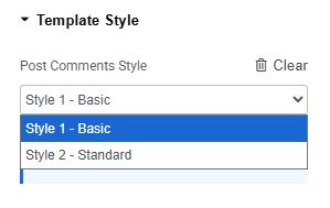
Template Style:
- Post Comments Style : Here we have two style so far.
Comments List:
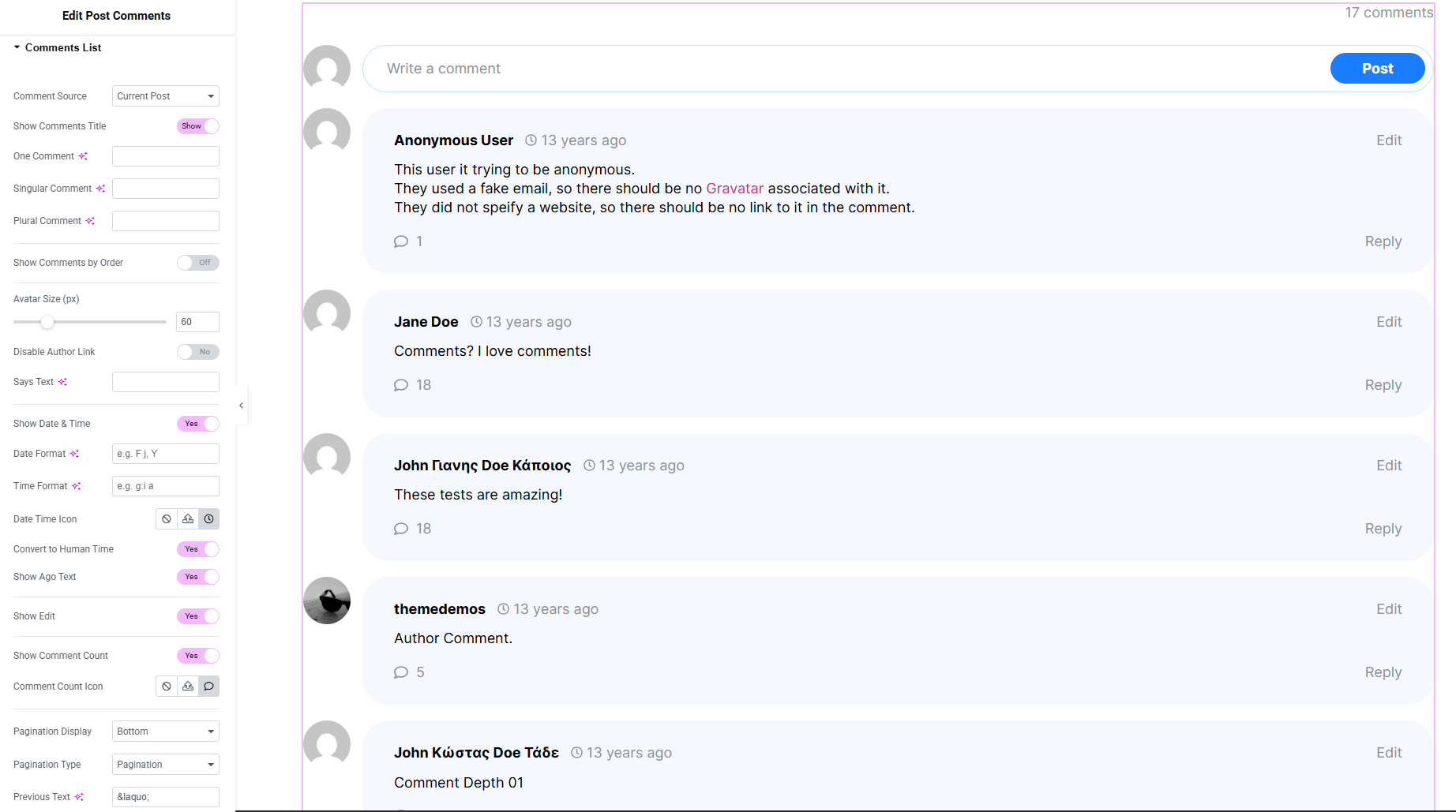
- Comment Source : Select the source of the comments to display.
- Show Comments Title : Enable or disable the display of the comments title.
- One Comment Text : Customize the label for a single comment.
- Singular Comment Text : Set the text shown when there is one comment.
- Plural Comment Text : Set the text shown when there are multiple comments.
- Show Comments by Order : Set comment order toggle.
- Avatar Size : Define the size of the commenter’s avatar.
- Disable Author Link : Turn Off or on the link on the author’s name.
- Says Text : Edit or remove the “says” text displayed after the author’s name.
- Show Date and Time : Enable or disable to display the comment’s date and time.
- Date Format : Customize how the comment date is displayed.
- Time Format : Customize how the comment time is displayed.
- Show Edit (Toggle) : Enable or disable the edit link for comments.
- Show Comment Count : Enable or disable count of the comments.
- Comment Count Icon : Set Comment count icon.
- Pagination Display for Position : Control where pagination appears (top, bottom, or both).
- Pagination Previous Text : Set custom text for the “previous” pagination link.
- Pagination Next Text : Set custom text for the “next” pagination link.
Comments Form:
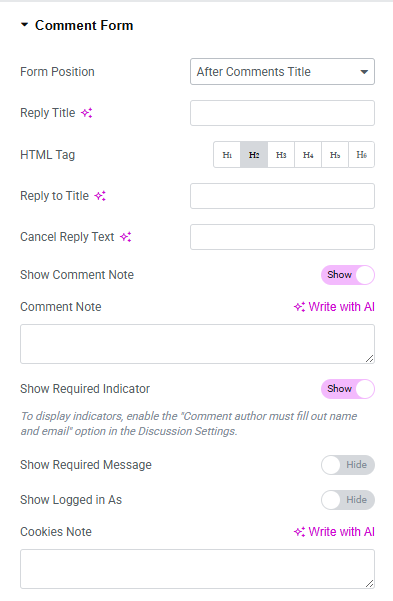
- Form Position : Set the position of the form.
- Reply Title : Set the title text displayed above the comment form.
- HTML Tag : Choose the HTML tag for the reply title.
- Reply To Title : Customize the text shown when replying to a specific comment.
- Cancel Reply Text : Define the text for the cancel reply link.
- Show Comment Note : Enable or disable the note that appears above the form.
- Comment Note : Customize the note text shown above the comment form.
- Show Required Indicator : Toggle visibility of the required field indicator.
- Show Required Message : Toggle visibility of the required fields message.
- Required Message : Customize the message shown for required fields.
- Show Logged In As : Show or hide the “logged in as” text for signed-in users.
- Cookies Note : Display or customize the cookies consent message.
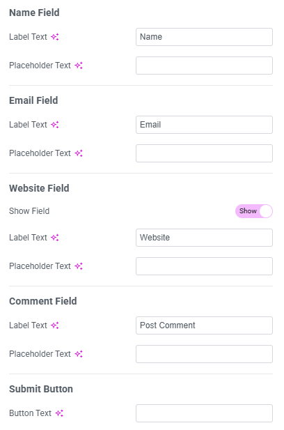
Name Field
- Label Text : Customize the label for the name field.
- Placeholder Text : Set placeholder text for the name field.
Email Field
- Label Text : Customize the label for the email field.
- Placeholder Text : Set placeholder text for the email field.
Website Field
- Show field : Show or hide the website field.
- Label Text : Customize the label for the website field.
- Placeholder Text : Set placeholder text for the website field.
Comment Field
- Label Text : Customize the label for the comment text area.
- Placeholder Text : Set placeholder text for the comment box.
Submit Button
- Button Text : Customize the text displayed on the submit button.
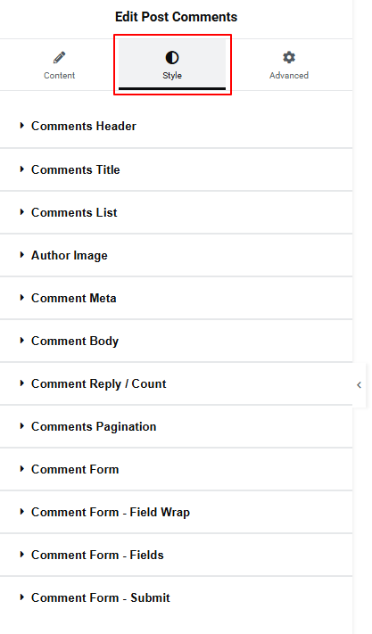
Step 3: Style tab
On style tab you can style the Comments Title, Comments List, Author Image, Comment Meta, Comment Body, Comment Reply, Comment Pagination, Comment Form, Comment Form – Field Wrap, Comment Form – Fields, Comment Form – Submit – But make sure you have added them first.
Comments Header:
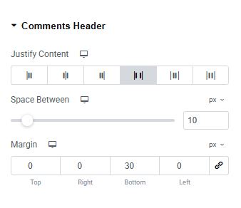
- Justify Content : set the header position.
- Space Between : set the spacing between the header contents.
- Margin : Set outer space around the header.
Comments Title:
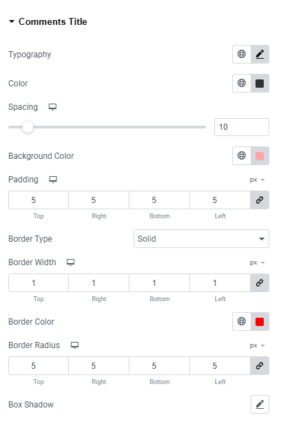
- Typography : Here you can customize the font family, size, weight, transform, style, decoration, line height, letter spacing, and word spacing for your text. Explore full typography settings here.
- Color : Choose colors for paragraphs.
- Spacing : Adjust space between the title and other contents.
- Background Color : Set the background color of the title section. Explore full background settings here.
- Padding : Adjust inner spacing around the element.
- Border Type : Define border style, width and color.
- Border Radius : Control corner roundness.
- Box Shadow : Apply drop shadow on the title section.
Comments List:
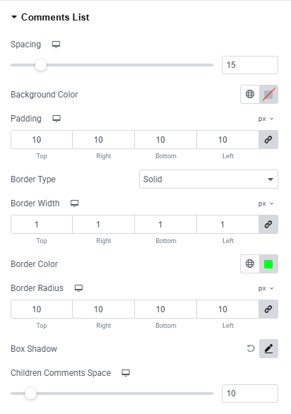
- Spacing : Adjust space between each comment lists.
- Background Color :Set the background color of the title section. Explore full background settings here.
- Padding : Adjust inner spacing around the element.
- Border Type : Define border style, width and color.
- Border Radius : Control corner roundness.
- Box Shadow : Apply drop shadow on the comment section.
- Children Comments Space : Adjust space between each child comment.
Comment Item
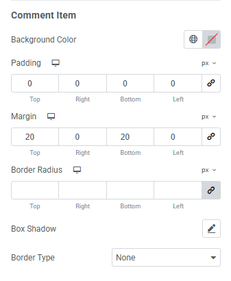
- Background Color :Set the background color of the title section. Explore full background settings here.
- Padding : Adjust inner spacing around the element.
- Margin : Adjust outer spacing around the element.
- Border Radius : Control corner roundness.
- Box Shadow : Apply drop shadow on the comment section.
- Border Type : Define border style, width and color.
Author Image:
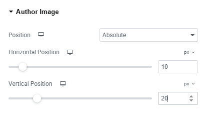
- Position : Set the position of the image.
- Horizontal Position : Adjust the image position horizontally.
- Vertical Position : Adjust the image position vertically.
Comment Meta:
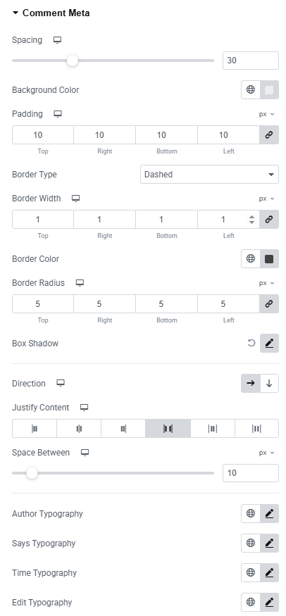
- Spacing : Adjust the overall spacing around the comment meta section.
- Background Color : Set a background color for the meta area. Explore full background settings here.
- Padding : Control the inner spacing inside the comment meta box.
- Border Type : Define border style, width and color.
- Border Radius : Control corner roundness.
- Direction : Set the layout direction (row or column).
- Justify Content : Control the alignment of meta items
- Space Between : Define the gap between meta elements.
- Author Typography : Customize author’s font family, size, weight, transform, style, decoration, line height, letter spacing, and word spacing for your text. Explore full typography settings here.
- Says Typography : Customize say’s font family, size, weight, transform, style, decoration, line height, letter spacing, and word spacing for your text. Explore full typography settings here.
- Time Typography : Customize time’s font family, size, weight, transform, style, decoration, line height, letter spacing, and word spacing for your text. Explore full typography settings here.
- Edit Typography : Customize edit font family, size, weight, transform, style, decoration, line height, letter spacing, and word spacing for your text. Explore full typography settings here.
- For both normal and hover states:
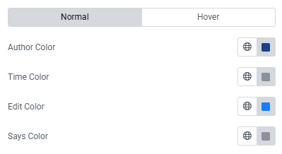
- Author Color : Set author color.
- Time Color : Set time color.
- Edit Color : Set edit color.
- Says Color : Set says color.
Comment Body:
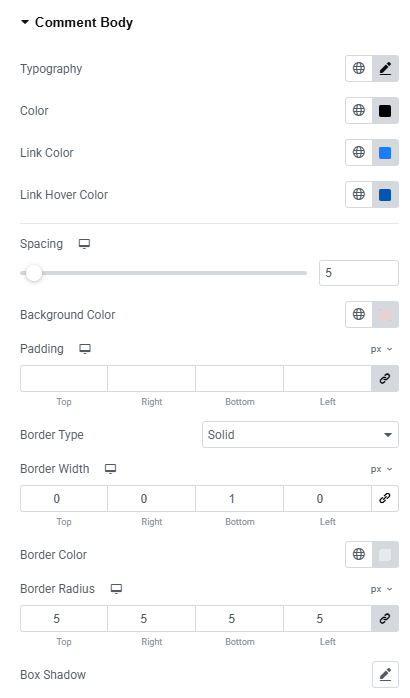
- Typography : Customize the font family, size, weight, transform, style, decoration, line height, letter spacing, and word spacing for your text. Explore full typography settings here.
- Color : Set the font color.
- Link Color : Set color of the link.
- Link Hover Color : Set color of the link on hover.
- Spacing : Adjust space on each comment.
- Padding : Adjust inner spacing around the element.
- Border Type : Define border style, width and color.
- Border Radius : Control corner roundness.
- Box Shadow : Apply drop shadow on the comment section.
Comment Reply:
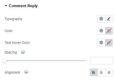
- Typography : Here you can customize the font family, size, weight, transform, style, decoration, line height, letter spacing, and word spacing for your text. Explore full typography settings here.
- Color : Choose colors for comment.
- Text Hover Color : Set text color on hover.
- Spacing : Adjust space on comment reply.
- Alignment : Set alignment of the reply (left, center, right)
Comments Pagination:
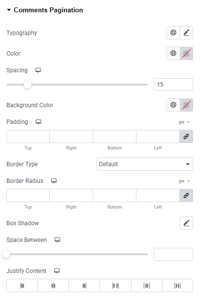
- Typography : Here you can customize the font family, size, weight, transform, style, decoration, line height, letter spacing, and word spacing for your text. Explore full typography settings here.
- Color : Choose colors for comment.
- Spacing : Adjust space on comment pagination.
- Background Color : Set the background color of the pagination. Explore full background settings here.
- Padding : Adjust inner spacing around the element.
- Border Type : Define border style, width and color.
- Border Radius : Control corner roundness.
- Box Shadow : Apply drop shadow on the pagination.
- Space Between : Adjust the space between each pagination.
- Justify Content : Set the justify position of the content.
Page Numbers:
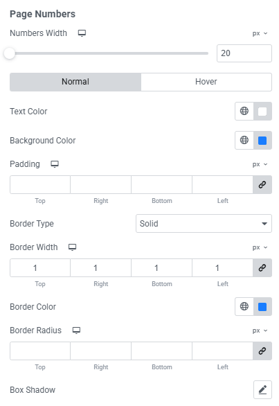
- Numbers Width : Set the width of each pagination number box.
- Text Color : Choose the text color for both normal and hover states.
- Background Color : Set the background color for both normal and hover states. Explore full background settings here.
- Padding : Adjust the inner spacing around the pagination numbers.
- Border Type : Define border style, width and color.
- Border Radius : Control corner roundness.
- Box Shadow : Apply drop shadow on the pagination numbers.
Page Numbers: Current
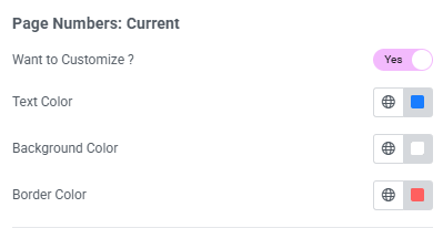
- Want to Customize? : Enable or disable customization for the active page number.
- Text Color : Set the text color of the current page number.
- Background Color : Choose a background color for the current page number. Explore full background settings here.
- Border Color : Customize the border color of the current page number.
Previous & Next Buttons
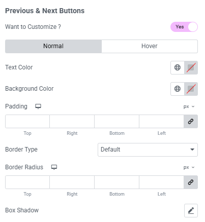
- Want to Customize? : Enable or disable customization for the active page number.
- Text Color : Set the text color of the current page number.
- Background Color : Choose a background color for the current page number. Explore full background settings here.
- Padding : Adjust the inner spacing around the buttons.
- Border Type : Define border style, width and color.
- Border Radius : Control corner roundness.
- Box Shadow : Apply drop shadow on the buttons.
Comment Form:
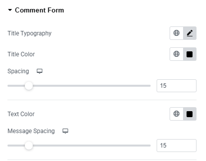
- Title Typography : Here you can customize the font family, size, weight, transform, style, decoration, line height, letter spacing, and word spacing for your text. Explore full typography settings here.
- Title Color : Set text color of the comment form.
- Spacing : Set spacing from the other content.
- Text Color : Set color of the text color.
- Message Spacing : Set spacing from the message.
Typography Styles
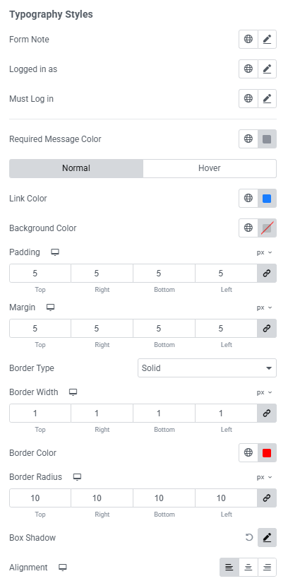
- Form Note : Customize the font family, size, weight, transform, style, decoration, line height, letter spacing, and word spacing for your text.
- Logged In As : Customize the font family, size, weight, transform, style, decoration, line height, letter spacing, and word spacing for your text.
- Must Log In : Customize the font family, size, weight, transform, style, decoration, line height, letter spacing, and word spacing for your text.
- Required Message Color : Set the text color for the required message.
- Link Color : Define link text colors for both normal and hover states.
- Background Color : Set background colors for both normal and hover states. Explore full background settings here.
- Padding : Control the inner spacing around the elements.
- Margin : Adjust the outer spacing of the area.
- Border Type : Define border style, width and color.
- Border Radius : Control corner roundness.
- Box Shadow : Apply drop shadow.
- Alignment : Control the alignment of form elements.
Comment Form – Field Wrap:
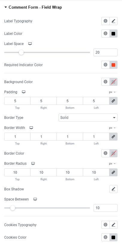
- Label Typography : Set typography of the comment form label.
- Label Color : Set the color of the label.
- Label space : Set space around the label.
- Required Indicator Color : Set indicator color that required.
- Background Color : Set color of the background. Explore full background settings here.
- Padding : Control the inner spacing around the elements.
- Border Type : Define border style, width and color.
- Border Radius : Control corner roundness.
- Box Shadow : Apply drop shadow.
- Space Between : Set space around the element.
- Cookies Typography : Set the same typography style of the cookies.
- Cookies Color : Set the color of the cookies.
Comment Form – Fields:
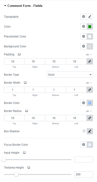
- Typography : Here you can customize the font family, size, weight, transform, style, decoration, line height, letter spacing, and word spacing for your text. Explore full typography settings here.
- Text Color : Choose the color for input and textarea text.
- Placeholder Color : Customize the color of placeholder text.
- Background Color : Set the background color of the form fields. Explore full background settings here.
- Padding : Adjust inner spacing inside the input and textarea fields.
- Border Type : Define border style, width and color.
- Border Radius : Control corner roundness.
- Box Shadow : Apply drop shadow.
- Focus Border Color : Set the border color when a field is active or focused.
- Input Height : Define the height of the input fields.
- Text area Height : Define the height of the text area field.
Comment Form – Submit:
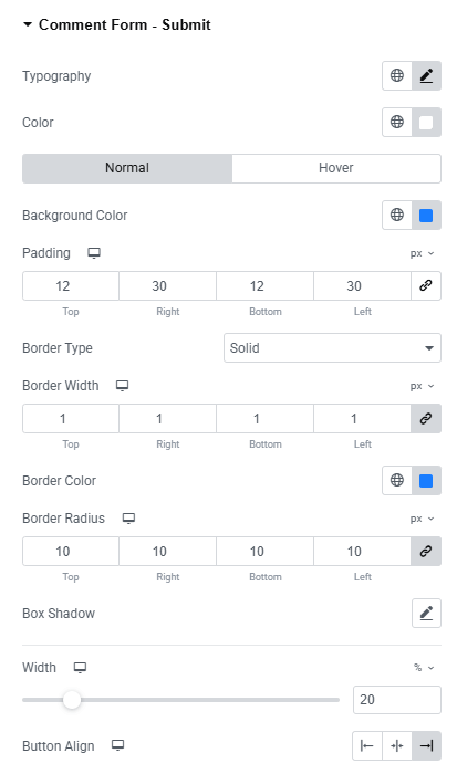
- Typography : Here you can customize the font family, size, weight, transform, style, decoration, line height, letter spacing, and word spacing for your text. Explore full typography settings here.
- Color : Choose the color for submit.
- Background Color : Set the background color for both normal and hover state. Explore full background settings here.
- Padding : Adjust inner spacing inside the element.
- Border Type : Define border style, width and color.
- Border Radius : Control corner roundness.
- Box Shadow : Apply drop shadow.
- Width : Adjust the width of the submit button.
- Button Align : Adjust the alignment of the button.
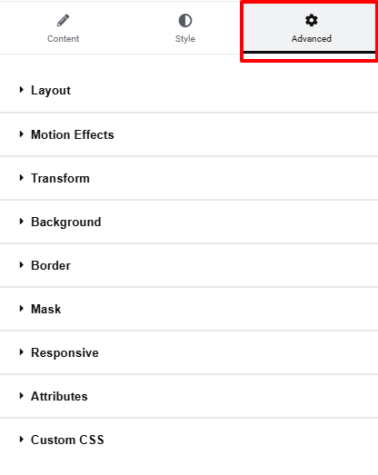
Step 4: Advance tab
If you want to customize the layout, backgrounds, or make your design more engaging, head over to the Advanced section. The Advanced panel is a default Elementor feature. Check out this document to learn more about its features.
Everything’s in place!